Design Of This Website
Meta page describing Gwern.net, the self-documenting website’s implementation and experiments for better ‘semantic zoom’ of hypertext; technical decisions using Markdown and static hosting.
Gwern.net is implemented as a static website compiled via Hakyll from Pandoc Markdown and hosted on a dedicated server (due to expensive cloud bandwidth).
It stands out from your standard Markdown static website by aiming at good typography, fast performance, and advanced (ie. 1980s-era) hypertext browsing features (at the cost of great implementation complexity); the 4 design principles are: aesthetically-pleasing minimalism, accessibility/progressive-enhancement, speed, and a ‘semantic zoom’ approach to hypertext use.
Unusual features include the monochrome esthetics, sidenotes instead of footnotes on wide windows, efficient dropcaps, smallcaps, collapsible sections, automatic inflation-adjusted currency, Wikipedia-style link icons & infoboxes, custom syntax highlighting, extensive local archives to fight linkrot, and an ecosystem of “popup”/“popover” annotations & previews of links for frictionless browsing—the net effect of hierarchical structures with collapsing and instant popup access to excerpts enables iceberg-like pages where most information is hidden but the reader can easily drill down as deep as they wish. (For a demo of all features & stress-test page, see Lorem Ipsum; for detailed guidelines, the Manual of Style.)
Also discussed are the many failed experiments/changes made along the way. (Website-related bugs should be reported at Github.)
What does it take to present, for the long-term, complex, highly-referenced, link-intensive, long-form text online as effectively as possible, while conserving the reader’s time & attention?
Benefit
People who are really serious about software should make their own hardware.
Alan Kay, “Creative Think” 1982
: SpongeBob has spent hours writing a fancy calligraphic dropcap of the word 'the', and failed to write the rest of his 800-word homework essay on 'what not to do at a stoplight', illustrating the dangers for a writer of yak-shaving & typographic design.")
Time well-spent.
The sorrow of web design & typography is that it all can matter just a little how you present your pages. A page can be terribly designed and render as typewriter text in 80-column ASCII monospace, and readers will still read it, even if they complain about it. And the most tastefully-designed page, with true smallcaps and correct use of em-dashes vs en-dashes vs hyphens vs minuses and all, which loads in a fraction of a second and is SEO optimized, is of little avail if the page has nothing worth reading; no amount of typography can rescue a page of dreck. Perhaps 1% of readers could even name any of these details, much less recognize them. If we added up all the small touches, they surely make a difference to the reader’s happiness, but it would have to be a small one—say, 5%.1 It’s hardly worth it for writing just a few things.
But the joy of web design & typography is that just its presentation can matter a little to all your pages. Writing is hard work, and any new piece of writing will generally add to the pile of existing ones, rather than multiplying it all; it’s an enormous amount of work to go through all one’s existing writings and improve them somehow, so it usually doesn’t happen. Design improvements, on the other hand, benefit one’s entire website & all future readers, and so at a certain scale, can be quite useful. I feel I’ve reached the point where it’s worth sweating the small stuff, typographically.
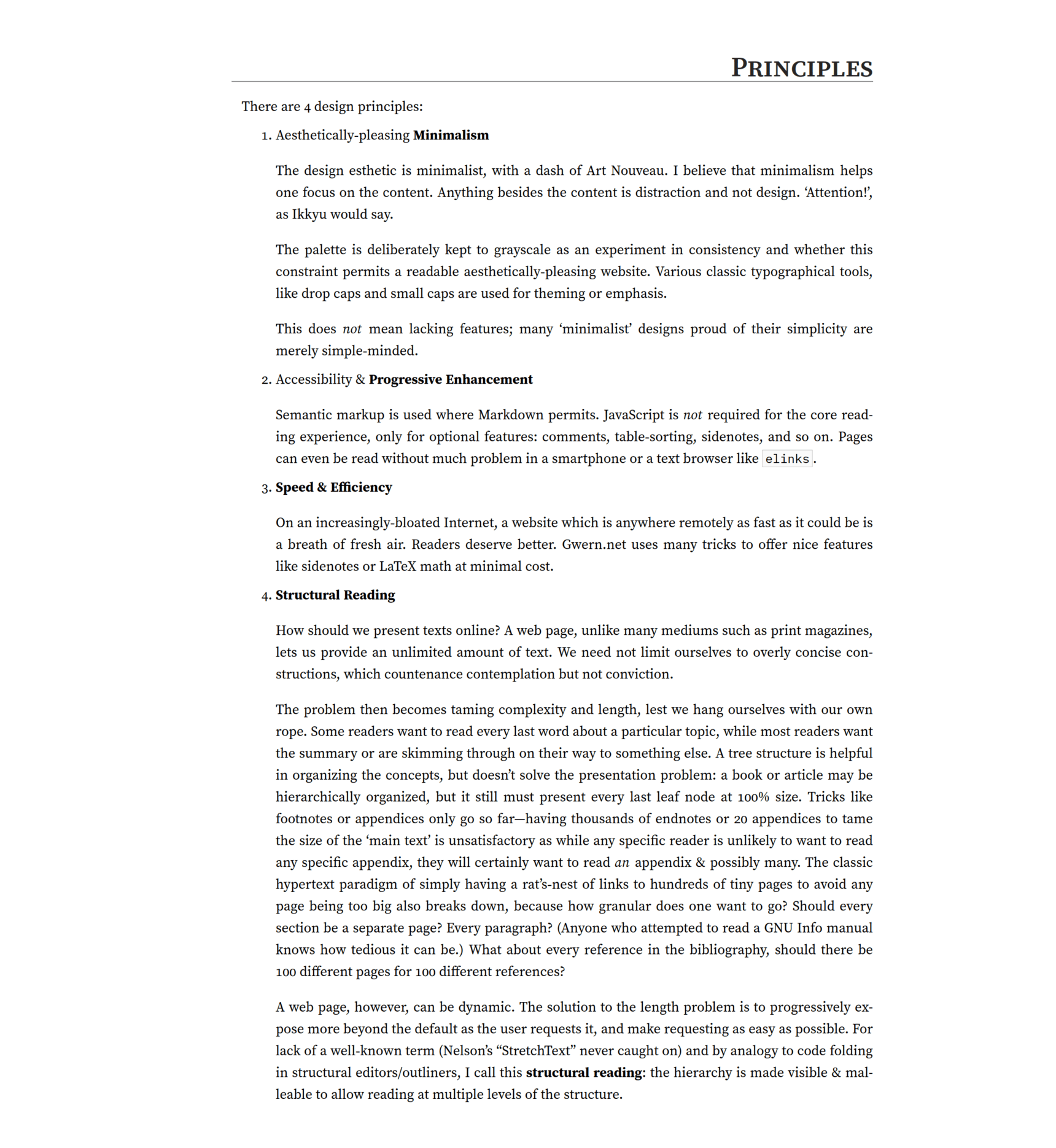
Principles
There are 4 design principles:
Aesthetically-pleasing Minimalism
The design esthetic is minimalist, with a dash of Art Nouveau. I believe that minimalism helps one focus on the content. Anything besides the content is distraction and not design. ‘Attention!’, as Ikkyu would say.2
The palette is deliberately kept to grayscale as an experiment in consistency and whether this constraint permits a readable aesthetically-pleasing website. Classic typographical tools, like dropcaps and small caps are used for theming or emphasis.3
This does not mean lacking features; many ‘minimalist’ designs proud of their simplicity are merely simple-minded.4
Accessibility & Progressive Enhancement
Semantic markup is used where Markdown permits. JavaScript is not required for the core reading experience, only for (mostly) optional features: popups & transclusions, table-sorting, sidenotes, and so on. Pages can even be read without much problem in a smartphone or a text browser like
elinks.Speed & Efficiency
On an increasingly-bloated Internet, a website which is anywhere remotely as fast as it could be is a breath of fresh air. Readers deserve better. Gwern.net uses many tricks to offer nice features like sidenotes or LaTeX math at minimal cost.
-
How should we present texts online? A web page, unlike many mediums such as print magazines, lets us provide an unlimited amount of text. We need not limit ourselves to overly concise constructions, which countenance contemplation but not conviction.
The problem then becomes taming complexity and length, lest we hang ourselves with our own rope. Some readers want to read every last word about a particular topic, while most readers want the summary or are skimming through on their way to something else. A tree structure is helpful in organizing the concepts, but doesn’t solve the presentation problem: a book or article may be hierarchically organized, but it still must present every last leaf node at 100% size. Tricks like footnotes or appendices only go so far—having thousands of endnotes or 20 appendices to tame the size of the ‘main text’ is unsatisfactory as while any specific reader is unlikely to want to read any specific appendix, they will certainly want to read an appendix & possibly many. The classic hypertext paradigm of simply having a rat’s-nest of links to hundreds of tiny pages to avoid any page being too big also breaks down, because how granular does one want to go? Should every section be a separate page? Every paragraph? (Anyone who attempted to read a GNU Info manual knows how tedious it can be.5) What about every reference in the bibliography, should there be 100 different pages for 100 different references?
A web page, however, can be dynamic. The solution to the length problem is to progressively expose more beyond the default as the reader requests it, and make requesting as easy as possible. For lack of a well-known term (Nelson’s “StretchText” never caught on) and by analogy to code folding in structural editors/outliners, I call this semantic zoom: the hierarchy is made visible & malleable to allow reading at multiple levels of the structure.
A Gwern.net page can be read at multiple structural levels, high to low: title, metadata block, abstracts, section headers, margin notes, emphasized keywords in list items, footnotes/sidenotes, collapsed sections or paragraphs, internal cross-referencing links to other sections (such as appendices) which popup for immediate reading, and fulltext links or internal links to other pages (also popping up).
So the reader can read (in increasing depth) the title/metadata, or the page abstract, or skim the headers/Table of Contents, then skim margin notes+item summaries, then read the body text, then click to uncollapse regions to read in-depth sections too, and then if they still want more, they can mouse over references to pull up the abstracts or excerpts, and then they can go even deeper by clicking the fulltext link to read the original. Thus, a page may look short, and the reader can understand & navigate it easily, but like an iceberg, those readers who want to know more about any specific point will find more under the surface.
Miscellaneous principles:
visual differences should be semantic differences
UI elements that can react should change on hover
all UI elements should have tooltips/summaries; interactive links should be either underlined or smallcaps
hierarchies & progressions should come in cycles of 3 (eg. bold > italics > smallcaps)
all numbers should be 0, 1, or ∞
if in doubt, “double it or cut it in half”
function > form
more > less
self-contained > fragmented
convention (linters/checkers) > constraints
hypertext is a great idea, we should try that!
local > remote—every link dies someday
archives are expensive short-term but cheap long-term
reader > author
give the reader agency
Festina lente: speed is the 2nd-most important feature after correctness
you must earn your ornaments
if you go overboard on minimalism, you may barely be mediocre
UI consistency is underrated
when in doubt, copy Wikipedia
be as magical as Wikipedia was
if you find yourself doing something 3 times, fix it.
website content: good, FLOSS, unrestricted topic—choose two
A Title Is A Brand
Inspirations for Gwern.net design include: English Wikipedia; Project Xanadu; Everything2; Edward Tufte; Robert Bringhurst; Christopher Alexander; Susan Kare; Vannevar Bush’s Memex; Douglas Engelbart’s NLS; GNU Info/Texinfo; the Symbolics Document Examiner; Donald Knuth; Matthew Butterick.
More specific component-level influences include Tufte CSS, Markdeep, Wikipedia Navigation Popups, Ward Cunningham’s WikiWikiWeb, Bret Victor’s explorable explanations, Andy Matuschak’s evergreen notes, Dieter Rams, and Jakob Nielsen.
Features
56. Software is under a constant tension. Being symbolic it is arbitrarily perfectible; but also it is arbitrarily changeable.
Notable features (compared to standard Markdown static sites):
link popup annotations (all types demo; ‘popover’ on small screens or mobile):
Annotations can be automatically extracted from sources (eg. Arxiv/BioRxiv/MedRxiv/Crossref), or written by hand (formatting is kept consistent by an extensive series of rewrite rules & checks, including machine learning to break up monolithic abstracts for readability); popups can be recursive, and can be manipulated in many ways—moved, fullscreened, ‘stickied’ (anchored in place), etc. Wikipedia pages are specially-supported, enabling them to be recursively navigated as well. Local Gwern.net pages & whitelisted domains can be popped up and viewed in full; PDFs can be read inside a PDF viewer; and supported source code formats can pop up syntax-highlighted versions (eg.
LinkMetadata.hs).client-side transclusion
Transclusion supports within-page or cross-page, arbitrary IDs or ranges in pages, links, annotations, etc. Transclusions are lazy by default, but can be made strict; this enables extremely large index pages, like the tags.
code folding-style collapse/disclosure support (both inline & block)
These are used heavily with lazy transclusions, as they let one create arbitrarily-large ‘virtual’ pages which are displayed on demand purely by writing ordinary hyperlinked text.
automatic local archive/mirrors of most links to eliminate linkrot from the start while providing a better reading experience
sidenotes using both margins, fallback to floating footnotes
margin notes (as inline or sidenotes)
true bidirectional backlinks, which can pop up the context
also supported at the section level, so one can easily see discussions elsewhere of a specific part of a page, rather than the page as a whole
reader mode (alternative view removing most UX like hyperlinks, eg; toggle: )
source code syntax highlighting
using custom ALGOL-inspired monochrome theme
JavaScript-free LaTeX math rendering (examples; but where possible, it is compiled to native HTML+CSS+Unicode instead like “√4” or “1⁄2”, as that is more efficient & natural-looking)
dark mode (with a theme switcher and AI classification of whether to invert images using InvertOrNot.com)
click-to-zoom images & slideshows; width-full tables/images
sortable tables; tables of various sizes
automatically inflation-adjust dollar amounts, exchange-rate Bitcoin amounts (eg. ‘$1 in 1950 is $10.99$11950 today.’)
link icons for classifying links by filetype/domain/topic/author (examples; implementation background)
“admonitions” infoboxes (Wikipedia-like by way of Markdeep)
lightweight dropcaps
With support for AI-generated sets, like the “dropcats” used on cat-themed pages
advanced poetry support (concrete poetry, alliterative verse etc.)
multi-column lists
interwiki link syntax
compact citation typesetting (using subscripts)
print support
epigraphs
blogroll implemented as “Site/quote/link of the day” in page footers
demo-mode: track the use-count of site features, in order to disable or change them after n uses.
This allows for obtrusive newbie-friendly features or appearances, which automatically simplify for regular readers. It is loosely inspired by classic electronics “demo mode” settings, which loop through all the features of a device. It uses LocalStorage to avoid any server integration.
We use it primarily to highlight the existence of the theme switcher toolbar (), so readers know how to enable the other features like dark-mode or reader-mode: the animation would be highly distracting if we ran it on every page load, but if we don’t how do readers discover it? (We’ve found out that a lot of readers do not notice it on their own, probably due to general web-clutter-blindness.) Our solution: we simply use demo-mode to disable it after a few times.
We also use it to slim down the UI. For example, the disclosure/collapse regions are unusual, so we write out a description explicitly for new readers; but they are so widely used that leaving the description in place is a lot of clutter for readers who have learned them.
404 page: a 404 error page uses the error, and sitemap + Levenshtein distance, to try to guess the intended URL, as well as pointing to the main index and providing site-search shortcuts.
(It also includes a curated selection of epigraphs & illustrations for the reader depressed by linkrot.)
Much of Gwern.net design and JavaScript/CSS was developed by Said Achmiz, 2017–202?. Some inspiration has come from Tufte CSS & Matthew Butterick’s Practical Typography.
Backlink
Gwern.net implements “bidirectional” hyperlinks6 or backlinks (eg. this page): links are both forwards (the normal kind) from the current page outwards to another; but also backwards, showing where on other pages is the current page linked.
Its backlinks are especially good because popups provide frictionless navigation; and our careful implementation means they can be provided in-context near the referenced content, and even between arbitrary URLs (via annotations).
Examples can be seen on Wikipedia or Andy Matuschak’s notes or increasingly popularized by Zettelkasten-esque services like Roam or Notion, and have a long history in hypermedia systems dating back at least to the initial schemes of Project Xanadu ~1965 (which also introduced transclusion, which we use extensively for the UI and to display said backlinks).
On Gwern.net, the backlinks for a page/annotation (and all anchors/IDs on it) are provided as a transcluded collapsed appendix at the bottom of each item. These sections list each backlink, and in addition, transclude the source of that backlink:

eg. for this page, one can see allusion to the “semantic zoom” neologism as a more useful design concept, or a justification of dabbling in typographic novelties like subscript notation (another example).
Backlinks are also overloaded to provide bibliographies of an author’s works: the author link of an annotation (such as their homepage or biography or WP article) is itself an annotated link, therefore, its backlinks will include all of the author’s known links. For convenience, when the backlink is an author link, it is prioritized by sorting to the front of the backlinks list, so scrolling an author’s backlinks will show first their publications and only then mentions of them.
Backlink Features
In-Context
This is possible because the links are tracked by use of unique IDs in the HTML, so it is possible to easily identify exactly where in the other page you have been linked.7
This also means we can display these same backlink entries everywhere relevant. For example, if the backlink is to a section, we do not have to settle for simply a big list of page-wide backlinks, we can put that section’s backlinks inside that section for the reader’s convenience: you finish reading a section, and then you immediately see where else on Gwern.net it has been linked:

The section which contains the semantic zoom ID also includes the backlink for “semantic zoom” links, which the reader can uncollapse to read.
This should be possible with other backlink systems but Gwern.net is nearly unique in ‘inlining’ backlinks like this.8
(The analogous forward-link feature is the link-bibliography, which aggregates all the forward-links in order. However, there is little need for ‘in-context’ forward-links since the essay or annotation already provides that context.)
Popups
Another unique feature of Gwern.net backlinks is that they integrate with the annotation popups. Most wikis are able to provide backlinks only for wiki pages linking to each other; they cannot provide either backlinks or forward-links between arbitrary URLs and wiki pages. Gwern.net backlinks, however, can be from any URL to any URL: page ↔︎ page, page ↔︎ URL, and URL ↔︎ URL (although if there is no annotation to display that metadata, the reader has no way to see this). This is done by simply including the annotations in the files parsed for links, and attributing a link in the annotation to its respective URL, and proceeding as usual. So for example, I have linked my GPT-3 page in many annotations about deep learning because it describes concepts I consider key to interpreting deep learning results such as “prompt engineering”, and those show up in its backlinks even though they are not ‘Gwern.net pages’ or ‘wiki articles’:

The GPT-3 page’s backlinks, showing backlinks from research articles which have annotations linking to it, and not just top-level pages (another example).
But, annotations can also link to each other, creating an implicit citation graph (smaller than the ones created by analysis of papers & bibliographies like Google Scholar, but thereby more targeted to my uses):

An example of a research paper linked in the annotation of another paper, as displayed in its annotation popup (cropped for size).
This solves the problem of spam backlinks, which killed the old blogosphere’s use of linkbacks. If someone at an external URL links to a Gwern.net URL (or any URL) and I want to include that in the citation graph, I can simply create an annotation for their external URL and include their targeted link. Now that will automatically show up in the backlinks.
Implementation
The existence of HTML identifying IDs on the <a> hyperlink elements is critical to making bidirectional links work: one cannot link what one cannot name.9 Because URLs can be linked multiple times for different uses in a page10, the URL is not enough; knowing that a URL is linked inside a page is ambiguous, and one needs the URL plus an ID—only the pair is unique. This is where most backlink approaches fall short, and are forced to settle for the MediaWiki-style dump of backlinks with no possible context.
Hyperlinks (or targets like <span> elements) are assigned unique IDs manually, by Pandoc automatically, or using the annotation metadata to generate a predictable ID.11 (HTML IDs cannot start with a number or contain a period, among other restrictions, so the generated IDs typically take the form of #surname-year; thus, a link to the GPT-3 paper Brown et al 2020 will have the ID in this page of #brown-et-al-2020 and that link in this paragraph can be addressed as /design#brown-et-al-2020. Duplicate IDs are fixed by either a global override to disambiguate two links, or per-page manually-assigned IDs.)
Backlinks are implemented as an offline process which parses the Markdown sources for pages & the HTML for annotations, and extracts URLs+IDs. They could be implemented at compile-time, but it is not a good fit for a static site generator like Hakyll, so I simply run the backlinks as a cron job at night. Backlinks are not always of any interest (eg. links in newsletters are usually devoid of any interesting commentary or context), and can be disabled on a per-link basis with a .backlink-not attribute.
They are then turned into appropriately-formatted HTML lists of transclusions, one snippet per URL. These are then transcluded again in collapsed sections for that URL, however that is displayed.12
Because the backlinks exploit the general transclusion & collapse functionality, their frontend integration is mostly a matter of just updating the generated HTML snippets and the occasional template. One might ask how one handles a URL+ID when the URL is not a simple HTML page on Gwern.net, but is perhaps a PDF or a URL on another site (and the URL may not even exist due to linkrot)? The answer is simple: it is just rewritten to to the URL of the annotation HTML snippet + ID, and transcluded. (It’s transclusions all the way down!)
The main challenge comes from a few edge-cases where the backlink popups wouldn’t work seamlessly. For backlinks from an external URL’s annotation, the pop-up JavaScript must guess the URL inside the annotation to provide context. Additionally, a data-target-id attribute must be stored inside backlinks to distinguish IDs from actual anchors. (We considered simply concatenating them like #target#id, but that in-band encoding simply led to different ambiguities.)
Other Uses
The backlink database has a few other uses:
A backlink database is a forward-link database if one inverts the query or schema. So if one wants a list of links in a page (ie. its forward-links), one can skip parsing the file and just query the backlink database.
This enables site-wide analyses of links; one use is combining it with the link-icon & site-of-the-day features to list domains which are used frequently enough to justify a link-icon or inclusion in site-of-the-day, and to look for frequently-linked but unannotated links.
The backlinks are also used to generate neural net embeddings for annotations (currently used only for the ‘similar links’ recommendations—is this the Semantic Web‽—but I intend to use for other purposes like tag refactoring), enriching their metadata with their site-wide context.
Similar Links
Gwern.net provides similar links (eg. this page) where possible, which are a list of annotations which are semantically ‘similar’ to the current one. ‘Similar’ is currently defined as an ordinary k nearest-neighbors lookup on a neural net embedding of the annotation text.
Uniquely, similar-links are also “sorted” by embedding distance, which organizes the list of similar links in a logical fashion & makes it more readable.
Link Bibliographies
Gwern.net pages & annotations provide a link bibliography (eg. this page): a list of their hyperlinks in order, with the annotation automatically expanding.
Because of the annotations, we do not provide the usual ‘Reference’ or ‘Bibliography’ section, but rather something closer to an ‘annotated bibliography’. This lets one skim the ‘annotated bibliography’ of a page, rather than having to pop up links one by one.
Tags
Gwern.net implements a simple hierarchical/DAG tag system for all links, modeled on Wikipedia’s categories (see Tags.hs).
It is designed to be browsed via pop-ups, and integrate naturally with the filesystem.
These hierarchical tags correspond to the filesystem hierarchy: a URL can be ‘tagged’ with a string foo, in which case it is assigned to the /doc/foo/ directory.13 If the tag string has a forward-slash in it, then it refers to a nested tag, like foo/bar → /doc/foo/bar/. Thus, a file added to a Gwern.net directory like /doc/foo/bar/2023-smith.pdf is inferred to automatically be tagged foo/bar. (Because it is hierarchical, it cannot be tagged both foo and foo/bar; that is interpreted as simply foo/bar.) As it would be a bad idea to copy/symlink files around, a given URL (such as a file) can be tagged arbitrarily many times. This is tracked in the same metadata database as the annotations, and can be edited like any other part of the annotation.
It is implemented as a standalone batch process, which reads a list of directories, queries the annotation database for annotations which match each directory’s implied tag, and writes out a Markdown index.md file with a list of transclusions, which is then compiled normally.
Properties
Tags are first-class citizens, in that they are pages/essays of their own, and can be tagged like any other URL:
Tags as pages:
Tags can have introductions/discussions of the topic, for cases where the meaning of the tag might not be obvious (eg. “inner-monologue” or “dark knowledge”).
These introductions are processed like an essay, and indeed, may just be transcluded from a regular page (eg. the boogers tag or efficient Transformer attention).
Tagged tags:
Tags can themselves be ‘tagged’, and appear under that tag (and vice-versa); these tags are not recursive, however, and make no attempt to avoid cycles. They are meant more in the spirit of a ‘see also’ cross-reference.
Tagging any URL: as tags are on URLs/annotations, they treat different URLs+anchor-fragments as different.
Thus, you can create annotations for multiple anchors on a page or multiple pages inside a PDF, and annotate & tag them separately. See the backlinks discussion of how useful this hack can be. (Because anchors do not need to exist inside a URL—the browser will simply load the URL normally if the anchor can’t be found—you can even treat anchors as a way to ‘tag’ URLs with arbitrary metadata while requiring no database or other software support14.)
Use & Appearance
The primary way to browse tags is via popups on annotated URLs:

Example of a research paper with 3 tags opened, which are themselves tagged, with ToCs for fast popups of specific tag entries.
The tag popups give an overview of the tag as a whole: how many tagged items there are of what type, how it’s tagged & access to its broader parent tag, the raw tag name, image thumbnails (extracted from the most recent annotation with an image), and a compact table-of-contents which will pop up those annotations. Standard features like link-bibliographies are supported, and it’s all implemented by popup and/or transclusion.15 Like the backlinks, there is little difference between tags and everything else—it all Just Works™ from the reader’s perspective.
For more in-depth reading, the tags are available as standalone HTML pages. The idea for these pages is that one might be searching for a key reference, or trying to catch up on the latest research.
So, these are organized as the preface/introduction (if any), then the parental & children & cross-referenced tags (with arrows to indicate which), then the annotations in reverse chronological order (requiring a date & title), then the Wikipedia links (which come last, inasmuch as they do not have well-defined ‘dates’); then, a ‘miscellaneous’ section lists URLs which have at least 1 tag but otherwise lack key metadata like a title, author, or date; finally, the link-bibliography, which is the concatenation of all of the annotated entries’ individual link-bibliographies. These items all make heavy use of the laziness of transcludes & collapses to render acceptably—they are so dense with hyperlinks that a fully-transcluded page would bring a web browser to its knees (likely one reason that websites like Wikipedia do not even try to provide similar interfaces).
Tags are a key way of organizing large numbers of annotations. In some cases, they replace sections of pages or entire pages, where there would otherwise be a hand-maintained bibliography. For example, I try to track uses of the DNM Archive & Danbooru20xx datasets to help establish their value & archive uses of them; I used to hand-link each reverse-citation, while having to also tag/annotate them manually. But with tags+transclusions, I can simply set up a tag solely for URLs involving uses of the dataset (darknet-market/dnm-archive & ai/anime/danbooru), and transclude the tag into a section. Now each URL will appear automatically when I tag it, with no further effort.
Features
Convenience features:
Generated tags: There are two special tags which are ‘generated’ (more so):
newest, which lists the most recently added annotations (as a sort of live equivalent of the monthly newsletter & let me easily proofread recently-written annotations)and the root tag-directory itself,
doc, which lists all tags by path & human-readable short-name (to show the reader the full breadth of tags available).
Short ↔︎ Long tag-names:
For brevity, the Gwern.net tag taxonomy does not attempt to be a perfect categorical pyramid. It supports ‘short’ or ‘pet names’, which are short human-readable versions of otherwise-opaque long tag names. (For example,
genetics/heritable/correlation/mendelian-randomization→ “Mendelian Randomization”.)In the other direction, it attempts to intelligently guess what any short tag might refer to: if I attempt on the CLI to run the command to upload a new document like
upload 1981-knuth.pdf latex, the tag code will guess thatdesign/typography/texis meant, and upload to that tag-directory instead.Inferred or automatic tags:
To bootstrap the tag taxonomy, I defined rules that any URL linked by a page would get a specific tag; for example, the DNB FAQ would impose the
dual-n-backtag. This proved to be too free with the tags, and has been removed.A locally-hosted file typically has a tag encoded into its path, as discussed before. (This excludes the special-case of the local mirrors in
/doc/www/, and a few mirrors or projects.)Domain matches can trigger a tag, in cases where either a domain is a tag of its own (eg. The Public Domain Review has its own tag at
history/public-domain-reviewso it is convenient to auto-tag any URL matchingpublicdomainreview.org), or where the website is single-topic (any link to EvaMonkey.com will be ananime/evatag).
CLI tools:
changeTag.hsanduploadallow editing & creating annotations in large batches, andannotation-dump.hsenables search/browsing:I use
changeTag.hs(shortcut:gwt) as a kind of bookmarking tool to ‘tag’ any URLs I come across. (Tab-completion is easily provided by listing all the directory names & turning them into tags.) For example, an interesting Arxiv link will get a quickgwt https://arxiv.org/abs/2106.11297 attention/compression t5; this will create the annotation for it, pulling all its metadata from Arxiv, running all the formatting passes like paragraphizing, generates an embedding for it which will be included in all future similar-links recommendations, adding it to the local-archiving queue, and tagging it underai/nn/transformer/attention/compression&ai/nn/transformer/t5. Beats doing that manually!Meanwhile,
annotation-dump.hs(shortcut:gwa) helps me make some actual use of tagging to refind things eg.gwa https://arxiv.org/abs/2106.11297 | fold --spaces --width=100:
Example of querying annotations in Bash, showing syntax highlighting, shortcuts like a full Gwern.net URL to view the annotation, tags, which YAML file database it’s in, etc.
These can be grepped, piped, edited in a text editor, etc. This can be combined with
gwtfor bulk edits: grep for particular keywords, filtering out already-tagged annotations, pipe intoless, review by hand, and copy the URLs of ones to tag/un-tag. Which can be further combined withlinkExtractor.hsto extract links from given Markdown pages, see if they are already tagged with a tag, and present just the untagged ones for review.For example, when I wanted to populate my Frank Herbert tag, I extracted the links from my two Dune-related pages, grepped for any annotation mentioning any of those links, filtered out any annotation which was already tagged ‘Frank Herbert’, and printed out just the URL of the remainder for review, and tagged many of them:
TMP=$(mktemp /tmp/urls.txt.XXXX)

cat ./dune-genetics.md ./dune.md | pandoc -f markdown -w markdown | \
    linkExtractor | \
    sort --unique | grep -E -v -e '^#' >> "$TMP"
cat "$TMP"

gwa | grep -F --color=always --file="$TMP" | \
    grep -F -v -e '"fiction/science-fiction/frank-herbert"' | \
    cut --delimiter=';' --fields='1-4' | less

gwt 'frank-herbert' […]
Future Tag Features
Future work: the Gwern.net tag system is incomplete due to poor tooling. Tags are an unsolved problem, currently solved by human brute force, but a far better tagging future is possible with deep learning.
When I look at the history of tagging, folksonomies, and bookmarking services like Wikipedia, del.icio.us & Archive of Our Own (see “Fan is A Tool-Using Animal”), what I see is a tool with too much friction for individual readers.
It is easy to set up a simple tag system, and handle a few hundred or thousand links. (Indeed, anyone who starts keeping bookmarks at all will quickly develop an ad hoc category or tag system.) It is not so easy to keep using it for years productively; all tag GUIs are clunky and require many seconds to do anything, and their ‘automation’ is minimal.
Such systems should get easier & faster & smarter to use over time, but usually get harder & slower & dumber. Like spaced repetition or complex personalized software, the average user tastes the initial fruits of using tags, goes perhaps a bit overboard, begins to bog down under the burden of maintenance, doesn’t quite have time to split up tags or populate obscure tags, and the system begins to careen out of control with ‘mega’ tags containing half the world while obscure tags have only 1 entry—as the technical debt escalates, the user gets ever less value out of it, and simply looking at the tags becomes more painful as one sees the undone work pile up, like an email inbox.
One sees many blogs which use ‘tags’ but in a completely pointless way: there is one tag which is on every other post and has thousands of entries, and then each entry will have 1 tag which is used pretty much only on that entry & never again. No one reads or uses those tags, including their authors. In this failure mode, particularly evident on Tumblr & Instagram, as Hillel Wayne notes, tags become utterly debased “metacrap” by huge swathes of redundant tags being slapped onto every post—if you ever need to refind a particular post, it sure won’t be through the tags…16 At the other extreme is Twitter: Twitter’s famous ‘hashtags’ used to be widely used, and were key organizing tools… but somewhere along the way, real Twitter users seemed to stop using them & they became spam. Is it any wonder that most users eventually acknowledge that it’s a waste of time unless they begin a second career as reference librarians, and give up, depending on their search skills to refind anything they need? (And to be fair, for many users, they probably did not really need tagging to begin with. It was an attractive nuisance for them, an illusion of productivity—like alphabetizing one’s bookshelf.)
This is why sites that do make productive use of tags tend to be sites catering to niches, with power users, and highly active curators (named things like ‘librarians’ or WikiGnomes) of some sort which will clean up & enforce standards. For example, Wikipedia editors put an enormous amount of effort into maintaining an incredibly elaborate category system, with extensive bot tooling; and Wikipedia editors (if not regular readers) benefit, because they do use it extensively for both content editing and organizing the infinite amount of meta-editing content (like categories of overloaded categories). Archive of Our Own likewise is renowned for its extensive tag system, which is ‘wrangled’ by rabid fans into a reasonably consistently-applied folksonomy of characters/franchises/topics, and those are used heavily by its readers to navigate the >10m fanfics (in lieu of any more legible way to navigate the seas of fanfics—after all, the point of fanfic is that anyone can do it, posing curation problems which don’t exist for the original works).
Or to put it another way, current tag systems are not like a Ted Nelson or Minority Report-esque experience of wizards weaving with the stuff of thought, casually grouping & orchestrating flocks of items on the screen; but more like going to the DMV to fill out forms in triplicate, or using tweezers to move a pile of sand grain by grain. Successful tag systems are like the Pyramids of Egypt: monumental feats of labor by thousands of people laboring for years to push ungainly building blocks precisely into place. Tags are powered by herds of human brains, tediously, one by one, learning a tiny fragment of the total tag folksonomy, adding it via clunky software, drumming their fingers while their web browsers clunk through the back-and-forth, spending hours refactoring a list of a thousand entries in 1 tag into 2 tags after staring at the list for a while trying to imagine what those 2 tags could be, and doing this all with no visible reward. For a shared resource like Wikipedia, this is worthwhile; for your own personal files… the return on investment is dubious. (Also, people are lazy & forgetful.)
But with modern tools, particularly DL NLP tools like document embeddings, the tag experience could be so much better—even magical. The 3 major pain points of a tag system are tagging new items, refactoring big tags into smaller tags (typically a single tag into 2–4), populating a new/small tag with existing items, and reading/searching large tags. All of these can be made drastically better. Implemented with care and an eye to performance, these 4 techniques would remove most of the pain of a tag system; indeed, curating tags might even be pleasant, in a popping-bubblewrap sort of way:
to automatically tag a document with high accuracy is well within 2023 capabilities.
Many documents come with a summary or abstract which can be embedded. For those which don’t, 2023+ LLMs generally have long enough context windows to embed entire documents (at some expense, and perhaps lower embedding quality); they are also generally capable of writing accurate summaries.
For >90% of my annotations, the appropriate tags would be extremely obvious to a classifier (eg. random forests) trained on my existing corpus of tags+embeddings17, and the tags could be automatically generated.18 Indeed, I view my tagging efforts as partially justified by training a future classifier on it, and this is just the costly bootstrap phase.
And as the tag collection gets larger, the accuracy of tagging improves & the user will be asked to tag fewer items, rewarding the user.
Refactoring tags into sub-tags is harder, but probably doable as an interactive clustering problem.
After a few hours re-tagging one’s documents, one wants to yell at the computer: “look, it’s obvious what this tag should be, just split them up the obvious way and do what I mean!” It’s often so obvious one can get halfway there with regexps… but not the other half.
One can take the embeddings of an overly-large tag, and run a clustering algorithm like k-means clustering19 on it for various k, like 2–10. Then one can present the different clusterings as sets, with the most central items in each cluster as its prototypical examples. It should be obvious to an expert user what the clusters are, and what the best k is: ‘these 3 clusters make sense, but then at 4 it breaks down and I can’t tell what #3 and #4 in that are supposed to be.’
Given a clustering, one can then put the prototypical examples into a tool like GPT to ask it what the name of the tag for those examples ought to be. (This is similar to how the OpenAI ChatGPT interface will automatically ‘title’ each ChatGPT session to provide meaningful summaries, without the user having to do so.20 Could they? Of course. But that is work.) The user will approve or provide his own.
With the clustering chosen & labels, the tag can be automatically refactored into the new tags. The effort to refactor a tag goes from ‘several hours of extremely tedious work actively reading through thousands of items to try to infer some good tags and then apply it, one by one’ to ‘a minute of pleasant consideration of several options presented to one’.
As the number of tags increases, the number of necessary refactorings will decrease (power law, apparently, which makes sense given Zipf’s law) and the automatic tagging of future items will improve (both because the semantics becomes richer and because if a tag-cluster could be found in an unsupervised fashion by clustering embeddings, then it would be even easier to predict those tag-clusters given a labeled dataset), again rewarding the user and improving in quality over time.
(Much less frequently, we will want to combine tags. But that’s trivial to automate.)
Populating a rare tag:
Sometimes a user will create a useful tag, or a small cluster will pop out out of the clustering because it is so distinct. If it’s a good tag, it may have many valid instances, but scattered across the whole dataset. In this case, the automatic tagging of new items, or refactoring existing tags, will not help. You need to go back over existing items.
In this case, creating the rare tag would integrate well with active learning approaches.
The simplest active learning approach (uncertainty sampling) would look something like this: the user creates a new tag, and adds a few initial examples. The tag classifier immediately retrains on this, and creates ranked list of all untagged instances, sorted by its estimated probability. The user looks over the list, and tags a few on the first screen’s worth. They are tagged, the rest on that screen ignored henceforth21, and the classifier immediately retrains, and produces another ranked list. A tag classifier like a random forests can train on quite large datasets in seconds, so this could proceed in near-realtime, or indeed, asynchronously, with the user just tapping ‘yes’/‘no’ on instances as they pop up on the screen while the classifier trains & reclassifies in a loop in the background. Like the refactoring, this demands much less of the user than the traditional manual approach of ‘work really hard’. (Such semi-automated tagging approaches are widely used in ML industry to create datasets like JFT-300M because they make labeling vastly more efficient, but has not been seen much in end-user software.)
Within minutes, the new tag would be fully populated and look as if it had been there all along.
Presenting a tag’s contents in a logical order—sorting by semantic similarity, which looks like a “sort by magic”:
But we can go further. Why is a mega-tag such a pain to read or search? Well, one problem is that they tend to be a giant messy pile with no order aside from reverse-chronological. Reverse-chronological order is bad in many cases, even blogs (consider a multi-part series where you can only reach them all by the tag, which of course shows you the series in the worst possible order!), and is used simply because… how else are you going to sort them? At least that shows you the newest ones, which is not always a good order, but at least is an order. To go beyond that, you’d need some sort of semantic understanding, the sort of deeper understanding that a human would have (and of course, human brains, particularly the brain of your human user, are too expensive to use to provide some sensible order).
Fortunately, we have those document embeddings at hand. We could try clustering with k-means & titling with an LLM again, and display each cluster one after another, treating the clusters as ‘temporary’ or ‘pseudo’ tags.22 (We can easily name the anonymous clusters with an LLM by feeding in the metadata like titles and asking for a tag name. The user may reject it, but even a wrong tag name is extremely helpful for making it obvious what the right one is, and breaks “the tyranny of the blank page” and decision fatigue.) Clusters don’t respect our 2D reading order, but there are alternate ways of clustering which are intended to project the high-dimensional embedding’s clustering geometry down to fewer dimensions, like 2D, for use in graphs, or even 1D—eg. t-SNE or UMAP.
I don’t know if they work well in 1D, but if they work better at slightly higher dimensionality, then it can be easily turned into a sequence with minimum total distance as a traveling salesman problem. A simple way to ‘sort’ which doesn’t require heavy-weight machinery is to ‘sort by semantics’: however, not by distance from a specific point, but greedily pairwise. One selects an arbitrary starting point (‘most recent item’ is a logical starting point for a tag), finds the ‘nearest’ point, adds it to the list, and then the nearest unused point to that point, and so on recursively.
I find with Gwern.net annotations, the greedy list sorting algorithm works surprisingly well. It naturally produces a fairly logical sequence with occasional ‘jumps’ as the latent cluster changes, in contrast to the naive ‘sort by distance’ which would tend to ‘ping-pong’ or ‘zig-zag’ back & forth across clusters based on slight differences in distance.23
This would implicitly expose the underlying structure by preserving the local geometry (even if the ‘global’ shape doesn’t make sense), and help a reader skim through, as they feel ‘hot’ and ‘cold’, and can focus on the region of the tag which seems closest to what they want. (And if the tag really needs to be chronological, or the embedding linearization is bad, there can just be a setting to override that.)
This approach would work for anything that can be usefully embedded, and would probably work even better for images given how hard it is to organize images & how good image embeddings like CLIP have become (eg. Concept or SOOT). This will wind up inevitably producing some abrupt transitions between clusters, but that tells you where the natural categories are, and you can easily drag-and-drop the cluster of images into folders & redo the trick inside each directory. This would make it easy to drag-and-drop a set of datapoints, and select them, and define a new tag which applies to them.
And because embeddings are such widely-used tools, there are many tricks one can use. For example, the default embedding might not put enough weight on what you want, and might wind up clustering by something like ‘average color’ or ‘real-world location’. But embedders can be prompted to target specific use-cases, and if that is not possible, you can manipulate the embedding directly based on the embedding of a specific point such as a prototypical file (or a query/keyword prompt if text-only or using a cross-modal embedding like CLIP’s image+text): embed the new file or prompt, weighted multiply all the others by it (or something), then re-organize. (And you can of course finetune any embedding model with the user’s improvements, contrastively: push further apart the points that the user indicated were not as alike as the embedding indicated, and vice-versa. This works most easily with the model that generated the embedding, but one can come up with tricks to finetune other models as well on the user actions.)
Or you can experiment with “embedding arithmetic”: if the default 2D layout is unhelpful, because the most visible variation is focused on unhelpful parts, one can ‘subtract’ embeddings to change what shows up. And you can do this with any number of embeddings by doing arithmetic on them first. For example, you can ‘subtract’ a tag X from every datapoint to ignore their X-ness, by averaging every datapoint with tag X to get a “prototypical X”; the new embeddings are now “what those datapoints mean besides the concept encoded tag X”.24 (If the right tag or datapoint doesn’t exist which emphasises the right thing—just make one up!) By sequentially subtracting, one can look through the dataset as a whole for ‘missing’ tags; indeed, if every tag is subtracted, the residual clusters might still be surprisingly meaningful, because they have structure that no tag yet encoded. One could also try adding in order to emphasize a specific X.25
Abandoned
Tools
Software tools & libraries used in the site as a whole:
The source files are written in Pandoc Markdown (Pandoc: John MacFarlane et al; GPL) (source files: Gwern Branwen, CC-0). The Pandoc Markdown uses a number of extensions; pipe tables are preferred for anything but the simplest tables; and I use semantic linefeeds (also called “semantic line breaks” or “ventilated prose”) formatting.
math is written in LaTeX which compiles to MathML, rendered statically by MathJax (Apache license) into HTML/CSS/fonts; copy-paste of the original math expression is handled by a JavaScript copy-paste listener
syntax highlighting: we originally used Pandoc’s builtin Kate-derived themes, but most clashed with the overall appearance; after looking through all the existing themes, we took inspiration from Pygments’s algol_nu (BSD) based on the original ALGOL report, and typeset it in the IBM Plex Mono font26
the site is compiled with the Hakyllv4+ static site generator, used to generate Gwern.net, written in Haskell (Jasper Van der Jeugt et al; BSD); for the gory details, see
hakyll.hswhich implements the compilation, RSS feed generation, & parsing of interwiki links as well. This just generates the basic website; I do many additional optimizations/tests before & after uploading, which is handled bysync.sh(Gwern Branwen, CC-0)My preferred method of use is to browse & edit locally using Emacs, and then distribute using Hakyll. The simplest way to use Hakyll is that you
cdinto your repository andrunghc hakyll.hs build(withhakyll.hshaving whatever options you like). Hakyll will build a static HTML/CSS hierarchy inside_site/; you can then do something likefirefox _static/index. (Because HTML extensions are not specified in the interest of cool URIs, you cannot use the Hakyllwatchwebserver as of January 201412ya.) Hakyll’s main advantage for me is relatively straightforward integration with the Pandoc Markdown libraries; Hakyll is not that easy to use, and so I do not recommend use of Hakyll as a general static site generator unless one is already adept with Haskell.the CSS is borrowed from a motley of sources and has been heavily modified, but its origin was the Hakyll homepage & Gitit; for specifics, see
default.cssMarkdown syntax extensions:
I implemented a Pandoc Markdown plugin for a custom syntax for interwiki links in Gitit, and then ported it to Hakyll (defined in
hakyll.hs); it allows linking to the English Wikipedia (among others) with syntax like[malefits](!Wiktionary)or[antonym of 'benefits'](!Wiktionary "Malefits"). CC-0.inflation adjustment:
Inflation.hsprovides a Pandoc Markdown plugin which allows automatic inflation adjusting of dollar amounts, presenting the nominal amount & a current real amount, with a syntax like[$5]($1980).Book affiliate links are through an Amazon Affiliates tag appended in the
hakyll.hsimage dimensions are looked up at compilation time & inserted into
<img>tags as browser hints
JavaScript:
the HTML tables are sortable via tablesorter (Christian Bach; MIT/GPL)
the MathML is rendered using MathJax
analytics are handled by Google Analytics
A/B testing is done using ABalytics (Daniele Mazzini; MIT) which hooks into Google Analytics (see testing notes) for individual-level testing; when doing site-level long-term testing like in the advertising A/B tests, I simply write the JavaScript manually.
Generalized tooltip popups for loading introductions/summaries/previews of all links when one mouses-over a link; reads annotations, which are manually written & automatically populated from many sources (Wikipedia, Pubmed, BioRxiv, Arxiv, hand-written…), with special handling of YouTube videos (Said Achmiz, Shawn Presser; MIT).
Note that ‘links’ here is interpreted broadly: almost everything can be ‘popped up’. This includes links to sections (or div IDs) on the current or other pages, PDFs (often page-linked using the obscure but handy
#page=Nfeature), source code files (which are syntax-highlighted by Pandoc), locally-mirrored web pages, footnotes/sidenotes, any such links within the popups themselves recursively…the floating footnotes are handled by the generalized tooltip popups (they were originally implemented via
footnotes.js); when the browser window is wide enough, the floating footnotes are instead replaced with marginal notes/sidenotes27 using a custom library,sidenotes.js(Said Achmiz, MIT)
Demonstration of sidenotes on Radiance.
image size: full-scale images (figures) can be clicked on to zoom into them with slideshow mode—useful for figures or graphs which do not comfortably fit into the narrow body—using another custom library,
image-focus.js(Said Achmiz; GPL)
error checking: problems such as broken links are checked in 3 phases:
markdown-lint.sh: writing timesync.sh: during compilation, sanity-checks file size & count; greps for broken interwikis; runs HTML tidy over pages to warn about invalid HTML; tests liveness & MIME types of various pages post-upload; checks for duplicates, read-only, banned filetypes, too large or uncompressed images, etc.
Implementation Details
The Programmers’ Credo: “We do these things not because they are easy, but because we thought they were going to be easy.”
There are some tricks & details that web designers might find interesting.
Efficiency:
fonts:
Adobe Source Serif/Sans (originally Gwern.net used Baskerville)
Why use our own webfonts instead of just using pre-existing web-safe/system fonts? One might ask if the font overhead (non-blocking download of ~0.5MB of fonts for the most complex pages like the GPT-3 fiction page) is worth it, compared to trusting in fonts that may be installed already and are ‘free’ network-wise. This is what our webfonts buys us:
correctness (consistent rendering):
The fundamental reason for not using system fonts is that there are not many of them, they vary across operating systems & devices, usually aren’t great (lacking alternatives & features like smallcaps, & often basics like Unicode), and can be buggy (eg. Apple ships a Gill Sans digitization—not an obscure font!—which is >22 years old & has broken kerning).
I initially used system “Baskerville”, but they looked bad on some screens (similar issue to people imitating LaTeX by using Computer Modern on screens) and the highly limited selection of system fonts didn’t give me many options. The Google Fonts Baskerville was OK but lacked many features & was slower than hosting my own webfont, so Said Achmiz convinced me to just switch to self-hosting the ‘screen serif’ Source family, whose appearance I liked, which could be subset down to only necessary characters to be faster than Google Fonts & not a bottleneck, and which wasn’t widely used then despite being FLOSS & high-quality & actively maintained (so helped my personal branding).
We were then repeatedly forced to add more fonts to fix display bugs: fonts could look quite different on Linux & Mac, and the system “sans” for the Table of Contents looked bad on Windows. The more carefully designed the appearance, the more small differences in sizes or appearance between the ‘same’ font on different platforms screwed things up. Link-icons, sidenotes, emoji, return-arrows, miscellaneous Unicode looking rather different or breaking—all of these have run into platform issues, and later features like citation subscripts or inflation-adjustments surely would if we couldn’t tune their CSS to a known font.
(Should we let readers set their own fonts? Reader, be real. It is 2023, not 199333ya. No one today sets their own fonts or writes custom CSS stylesheets—which would break layout & icons on many sites anyway—and they especially do not on the mobile devices which are ~50% of my site traffic.)
smallcaps: used extensively in the site design for varying levels of emphasis in between bold & italics, so high quality smallcaps is critical; true smallcaps is provided by Source (italics may yet be added at my request), while unavailable in most fonts
consistent monochrome emoji via Noto Emoji (before, emoji would be different sizes in link-icons, some would be unpredictably colored on some platforms and scream on the page)
IBM Plex Mono for source code: more distinct confusable-characters in IBM Plex Mono compared to an ordinary monospace system font (Plex Mono has an OpenType feature for slashed-zeros which can be enabled in just source code), and looks good on Macs.28
the Source family also provides both tabular & proportional numbers (also called “old-style”), which most fonts don’t, and which makes tables vs text more readable (proportional numbers would break visual alignment inside tables analogous to proportional vs monospace fonts for code, while tabular numbers look large & obtrusive inside regular text)
icons via Quivira font, and rare characters like interrobang, asterism, backwards question mark, shield-with-cross (for link icon), BLACK SQUARE ■, and consistency in fallback characters for rare Unicode points not in the subsets.
efficient dropcaps fonts by subsetting
image optimization: PNGs are optimized by
pngnq/advpng, JPEGs withmozjpeg, SVGs are minified, PDFs are compressed withocrmypdf’s JBIG2 support. (GIFs are not used at all in favor of WebM/MP4<video>s.)JavaScript/CSS minification: because Cloudflare does Brotli compression, minification of JavaScript/CSS has little advantage29 and makes development harder, so no minification is done; the font files don’t need any special compression either beyond the subsetting.
MathJax: getting well-rendered mathematical equations requires MathJax or a similar heavyweight JavaScript library; worse, even after disabling features, the load & render time is extremely high—a page like the embryo selection page which is both large & has a lot of equations can visibly take >5s (as a progress bar that helpfully pops up informs the reader).
The solution here is to prerender MathJax locally after Hakyll compilation, using the local tool
mathjax-node-pageto load the final HTML files, parse the page to find all the math, compile the expressions, define the necessary CSS, and write the HTML back out. Pages still need to download the fonts but the overall speed goes from >5s to <0.5s, and JavaScript is not necessary at all.
Correctness:
Dark mode (): our dark mode is custom, and tries to make dark mode a first-class citizen.
Avoiding Flashing & Laggy Scrolling: it is implemented in the standard best-practice way of creating two color palettes (associating a set of color variables for every element, for a light-mode and then automatically-generating dark mode colors by inverting & gamma-correcting), and using JavaScript to toggle the media-query to instantly enable that color.
This avoids the ‘flash of white’ on page loads which regular JavaScript-based approaches incur (because the CSS media-queries can only implement auto-dark-mode, and the dark mode widget requires JavaScript; however, the JavaScript, when it decides to inject dark mode CSS into the page, is too late and that CSS will be rendered last after the reader has already been exposed to the flash). The separate color palette approach also avoids the lag & jank of using invert CSS filters (one would think that
invert(100%)would be free from a performance standpoint, since what pixel manipulation could be simpler than negating the color?—but it is not).Native Dark Mode Color Scheme: we modify the color scheme as necessary.
Because of the changes in contrast, inverting the color scheme only mostly works. In particular, inline & code blocks tend to disappear. To fix this, we allow a small deviation from pure-monochrome to add some blue, and the source code syntax highlighting is tweaked with a few blue/purple/red colors for dark mode visibility (since there’s not any logical dark-mode equivalent of the ALGOL syntax-highlighting style).
Inverted Images: color images are desaturated & grayscaled by default to reduce their brightness; grayscale/monochrome images, are automatically inverted by a machine-learning API, InvertOrNot.com.
This avoids the common failure mode where a blog uses a dark mode library which implements the class approach correctly… but then all of their images still have blinding bright white backgrounds or overall coloration, defeating the point! However, one also cannot just blindly invert images because many images, photographs of people especially, are garbage as ‘photo-negatives’.
Default Your Devices To Dark Mode
If you add a dark mode to your app or website, set your devices to dark mode on it—even if you don’t like dark mode or it’s inappropriate.
You will have dark mode-only bugs, but your readers will never tell you about the bugs, particularly the odd one-off bugs. You will see your light-mode often enough due to logged-out devices or screenshots or regular development, so you need to force yourself to use dark mode.
Three-Way Dark Mode Toggle: Many dark modes are implemented with a simple binary on/off logic stored in a cookie, ignoring browser/OS preferences, or simply defining ‘dark mode’ as the negation of the current browser/OS preference.
This is incorrect, and leads to odd situations like a website enabling dark mode during the day, and then light mode during the night! Using an auto/dark/light tri-state toggle means that readers can force dark/light mode but also leave it on ‘auto’ to follow the browser/OS preference over the course of the day.
This requires a UI widget & it still incurs some of the problems of an auto-only dark mode, but overall strikes the best balance between enabling dark mode unasked, reader control/confusion, and avoiding dark mode at the wrong time.
collapsible sections: managing complexity of pages is a balancing act. It is good to provide all necessary code to reproduce results, but does the reader really want to look at a big block of code? Sometimes they always would, sometimes only a few readers interested in the gory details will want to read the code. Similarly, a section might go into detail on a tangential topic or provide additional justification, which most readers don’t want to plow through to continue with the main theme. Should the code or section be deleted? No. But relegating it to an appendix, or another page entirely is not satisfactory either—for code blocks particularly, one loses the literate programming aspect if code blocks are being shuffled around out of order.
A nice solution is to simply use a little JavaScript to implement code folding approach where sections or code blocks can be visually shrunk or collapsed, and expanded on demand by a mouse click. Collapsed sections are specified by a HTML class (eg.
<div class="collapse"></div>), and summaries of a collapsed section can be displayed, defined by another class (<div class="abstract-collapse">). This allows code blocks to be collapse by default where they are lengthy or distracting, and for entire regions to be collapsed & summarized, without resorting to many appendices or forcing the reader to an entirely separate page.Sidenotes: one might wonder why
sidenotes.jsis necessary when most sidenote uses are like Tufte-CSS and use a static HTML/CSS approach, which would avoid a JavaScript library entirely and visibly repainting the page after load?The problem is that Tufte-CSS-style sidenotes do not reflow and are solely on the right margin (wasting the considerable whitespace on the left), and depending on the implementation, may overlap, be pushed far down the page away from their, break when the browser window is too narrow or not work on smartphones/tablets at all. (This is fixable, Tufte-CSS’s maintainers just haven’t.) The JavaScript library is able to handle all these and can handle the most difficult cases like my annotated edition of Radiance. (Tufte-CSS-style epigraphs, however, pose no such problems and we take the same approach of defining an HTML class & styling with CSS.)
Link icons: icons are defined for all filetypes used in Gwern.net and most commonly-linked websites such as Wikipedia, or Gwern.net (within-page section links get up/down-arrows to indicate relative position, with ‘¶’ as a JavaScript-less fallback; cross-page links get the logo icon).
They are implemented in a scalable compile-time approach when the standard approach failed.
Redirects: static sites have trouble with redirects, as they are just static files. AWS 3S does not support a
.htaccess-like mechanism for rewriting URLs. To allowing moving pages & fix broken links, I wroteHakyll.Web.Redirectfor generating simple HTML pages with redirect metadata+JavaScript, which simply redirect from URL 1 to URL 2. After moving to Nginx hosting, I converted all the redirects to regular Nginx rewrite rules.In addition to page renames, I monitor 404 hits in Google Analytics to fix errors where possible, and Nginx logs. There are an astonishing number of ways to misspell Gwern.net URLs, it turns out, and I have defined >20k redirects so far (in addition to generic regexp rewrites to fix patterns of errors).
External Links
Discussion: HN
“Experience True Level” (Rick and Morty, S3E8 “Morty’s Mind Blowers”)
Appendix
Returns To Design?
What is the ‘shape’ of returns on investment in industrial design, UI/UX, typography etc.? Is it a sigmoid with a golden mean of effort vs return… or a parabola with an unhappy valley of mediocrity?
My experience with Gwern.net design improvements is that readers appreciated changes moderately early on in making its content more pleasant to read (if only by comparison to the rest of the Internet!), but after a certain point, it all ‘came together’, in some sense, and readers started raving over the design and pointing to Gwern.net’s design rather than its content. This is inconsistent with the default, intuitive model of ‘diminishing returns’, where each successive design tweak should be worth less than the previous one.
Is there a ‘perfection premium’ (perhaps as a signal of underlying unobservable quality, or perhaps reader interaction is like an O-ring process)?
Impute—the process by which an impression of a product, company or person is formed by mentally transferring the characteristics of the communicating media…People do judge a book by its cover…The general impression of Apple Computer Inc. (our image) is the combined result of everything the customer sees, hears or feels from Apple, not necessarily what Apple actually is! We may have the best product, the highest quality, the most useful software etc.; if we present them in a slipshod manner, they will be perceived as slipshod; if we present them in a creative, professional manner, we will impute the desired qualities.
Mike Markkula, “The Apple Marketing Philosophy: Empathy • Focus • Impute” (1977-12)
Si paulum summo decessit, vergit ad imum
Particularly with typography, there seems to be an infinite number of finicky details one could spend time on (much of which appears to be for novelty’s sake, while vastly more important things like advertising harms go ignored by so-called designers). One’s initial guess is that it’d be diminishing returns like most things: it’d look something like a log curve, where every additional tweak costs more effort as one approaches the Platonic ideal. A more sophisticated guess would be that it’d look like a sigmoid: at first, something is so awful that any fixes are irrelevant to the reader because that just means they suffer from a different problem (it doesn’t matter much if a website doesn’t render because of a JavaScript bug if the text when it does render is so light-shaded that one can’t read it); then each improvements makes a difference to some readers as it approaches a respectable mediocrity; and after that, it’s back to diminishing returns.
My experience with improving the design of Gwern.net & reading about design has made me wonder if either of those is right. The shape may resemble more of a parabola: the sigmoid, at some point, spikes up and returns increase rather than diminish?
I noticed that for the first half-decade or so, no one paid much attention to the tweaks I made, as it was an ordinary Markdown-based static site. As I kept tinkering, a comment would be made once in a while. When Said Achmiz lent his talents to adding features & enhancements and exploring novel tweaks, comments cropped up more frequently (consistent with the enormous increase in time spent on it); by 2019, the redesign had mostly stabilized and most of the signature features & visual design had been implemented, and 2020 was more about bug fixes than adding pizzazz. Under the intuitive theories, the rate of comments would be about the same: while the bug fixes may involve huge effort—the dark mode rewrite was a 3-month agony—the improvements are ever smaller—said rewrite had no reader-visible change other than removing slowness. But while site traffic remained steady, 2020 attracted more compliments than ever!
Similarly, the LW team put an unusual amount of effort into designing a 2018 essay compilation, making it stylish (even redrawing all the images to match the color themes), and they were surprised by unusually large the preorders were: not a few percentage points, but many times. (There are many books on data visualization, but I suspect Edward Tufte’s books outsell them, even the best, by similar magnitudes.) And what should we make of Apple & design, whose devices & software have glaring flaws and yet, by making more of an attempt, command a premium and are regarded well by the public? Or Stripe?30
If the sigmoid were right, just how much more effort would be necessary to elicit such jumps? Orders of magnitude more? I & Said have invested effort, certainly, but there are countless sites (even confining the comparison to just personal websites and excluding sites with professional full-time developers/designers), whose creators have surely invested more time; millions of books are self-published every year; and Apple is certainly not the only tech company which tries to design things well.
What might be going on is related to the “aesthetic-usability effect”: at a certain level, the design itself becomes noticeable to the reader for its esthetic effect and the esthetics itself becomes a feature adding to the experience. That is, at the bottom of the sigmoid, on a website strewn with typos and broken links and confusing colors, the reader thinks “this website sucks!”, while in the middle, the reader ceases to think of the website at all and just gets on with using it, only occasionally irritated by design flaws; finally, at a certain level, when all the flaws have been removed and the site itself is genuinely unironically beautiful, both the beauty & absence of flaws themselves become noticeable, and the reader thinks, “this website, it is—pretty awesome!” The spike is where suddenly the design itself is perceived as a distinct thing, not merely how the thing happens to be. Designers often aspire to an end-state of sprezzatura or the “crystal goblet”, where they do their job so well the reader doesn’t realize there was a job to be done at all—but in this fallen world, where excellence seems so rare, the better one does the job, the more the contrast with all the botched jobs inevitably draws attention.
It is difficult for even the reader least interested in the topic to open a Tufte book, or walk into an Apple store, and not be struck by first impressions of elegance and careful design—which is not necessarily a good thing if that cannot be lived up to. (Any person struck by this must also realize that other people will be similarly impressed, using their own response as a proxy for the general reaction31, and will take it as a model for aspiration; liking Apple or Tufte signals your good taste, and that makes them luxury products as much as anything.)
The reason it makes an impression might be that it serves as a costly signal that if you care enough to visibly “get it right”, even where that requires unreasonable effort, then you probably can be trusted to get it right on things where other people can’t easily see that. Since it’s so hard to judge software quality without extensive use (and is borderline impossible for things like security & privacy), as opposed to furniture32, people especially rely on these sorts of heuristics.
This suggests a dangerous idea (dangerous because a good excuse for complacency & mediocrity, especially for those who do not manage even mediocrity but believe otherwise): if you are going to invest in design, half-measures yield less than half-results. If the design is terrible, then one should continue; but if the design is already reasonable, then instead of there being substantial returns, the diminishing returns have already set in, and it may be a too-long slog from where you are to the point where people are impressed enough by the design for the esthetic effect to kick in. Those moderate improvements may not be worthwhile if one can only modestly improve on mediocrity; and a sufficiently-flawed design may not be able to reach the esthetic level at all, requiring a radical new design.
Rutter argues for this point in Web Typography, which is consistent with my own A/B tests where even lousy changes are difficult to distinguish from zero effect despite large n, and with the general shambolic state of the Internet (eg. as reviewed in the 2019 Web Almanac). If readers will not install adblock and loading times of multiple seconds have relatively modest traffic reductions, things like aligning columns properly or using section signs or sidenotes must have effects on behavior so close to zero as to be unobservable.↩︎
Paraphrased from Dialogues of the Zen Masters as quoted in pg11 of the Editor’s Introduction to Three Pillars of Zen:
↩︎One day a man of the people said to Master Ikkyu: “Master, will you please write for me maxims of the highest wisdom?” Ikkyu immediately brushed out the word ‘Attention’. “Is that all? Will you not write some more?” Ikkyu then brushed out twice: ‘Attention. Attention.’ The man remarked irritably that there wasn’t much depth or subtlety to that. Then Ikkyu wrote the same word 3 times running: ‘Attention. Attention. Attention.’ Half-angered, the man demanded: “What does ‘Attention’ mean anyway?” And Ikkyu answered gently: “Attention means attention.”
And also, admittedly, for esthetic value. One earns the right to add ‘extraneous’ details by first putting in the hard work of removing the actual extraneous details; only after the ground has been cleared—the ‘data-ink ratio’ maximized, the ‘chartjunk’ removed—can one see what is actually beautiful to add.↩︎
Good design may be “as little design as possible” which gets the job done, to paraphrase Dieter Rams; the problem comes when designers focus on the first part, and forget the second part. If a minimalist design cannot handle more content than a few paragraphs of text & a generic ‘hero image’, then it has not solved the design problem, and is merely a sub-genre of illustration. (Like photographs of elegant minimalist Scandinavian or Japanese architecture which leave one wondering whether any human could live inside them, and how those buildings would learn.) And if a minimalist website cannot even present some text well, you can be sure they have not solved any of the hard problems of web design like link rot or cross-referencing!↩︎
The default presentation of separate pages means that an entire page may contain only a single paragraph or sentence. The HTML versions of many technical manuals (typically compiled from LaTeX, DocBook, or GNU Info) are even worse, because they fail to exploit prefetching & are slower than local documentation, and take away all of the useful keybindings which makes navigating info manuals fast & convenient. Reading such documentation in a web browser is Chinese water torture. (That, decades later, the GNU project keeps generating documentation in that format, rather than at least as large single-page manuals with hyperlinked table-of-contents, is a good example of how bad they are at UI/UX design.) And it’s not clear that it’s that much worse than the other extreme, the monolithic man page which includes every detail under the sun and is impossible to navigate without one’s eyes glazing over even using incremental search to navigate through dozens of irrelevant hits—every single time!↩︎
Also known as “backward or reverse citations”, “what links here”, & “backlinks”.↩︎
This fixes the biggest problem with the MediaWiki wiki system’s ‘what links here’ implementation of backlinks—which is the simplistic way of implementing it so has become the standard wiki software approach to displaying backlinks.
The WhatLinksHere page (eg. En WP) will tell you that several hundred other Wikipedia articles link to your current Wikipedia article, yes, but you have no idea what the context is (on either page!), and if it is an important link or a minor link, or even where in the article it might be—it might be hidden under some unpredictable displayed text, and you have to search the MediaWiki markup itself just to find it!
This is only partially fixed by tools like Lupin’s Tool which try to locate the link by loading the other page, because those are used by few editors, and still require effort. Because MediaWiki renders everything server-side, there is no reason it could not do something similar and display contextualizing excerpts next to each link. It just doesn’t. (It doesn’t need true bidirectional links—even a heuristic hack of assuming the first link in each article is the ‘real’ link, and ignoring duplicates, would be a major improvement.)↩︎
Roam apparently might do something like our ‘inlining’, but I know too little about it to say. Maggie Appleton mocks up such a “speculative interface”, but appears to not know of any implementations.
A limited example is GreaterWrong, which does backlinks on posts and individual comments. However, while backlinks on individual comments are reasonably atomic, they do not show the calling context, and the popups on the links only show the standard whole-item view. (GW’s backlinks were introduced in 2019 at the request of Wei Dai, well before Gwern.net’s backlinks were introduced in 2021 to take advantage of the new transclusion feature, and they are mostly independent in design.)↩︎
The original reason I began automatically generating IDs on all Gwern.net hyperlinks was minor: I wanted to use the within-page popups (like the little up/down-arrows) to remove redundant links & show more context.
A research paper might be discussed at length in one section, but then cited elsewhere; it would be bad to not hyperlink it, so usually, I would make a redundant hyperlink. However, if the first discussion had a unique ID, then I could simply link later references to the ID instead, and the reader could hover over it to pop up that discussion, read it, and then click through. (So it would look like this in Markdown:
[Foo 2020](URL){#foo-2020} proved ABC, which is interesting because of DEF … [thousands of words & many sections later] … see also [Foo 2020](#foo-2020).)One could do this manually on a case-by-case basis, but there are so many links, and the ID can be inferred from the metadata, so why not generate them automatically, so one could always be sure that
#foo-2020was valid?And once most links had IDs were unique within pages, that meant they could be unique across pages as well… So the popups led to the bidirectional backlinks.↩︎
Multiple links to another URL is not unusual on Gwern.net, particularly when making use of IDs for precise links so one might easily link not just
/foobut/foo#bar,/foo#quux, and maybe even/foo#baz, why not?In fact, this can be a good way to handle complex annotations: you can break them up into multiple annotations & link each version. For example, imagine a complex, in-depth machine learning paper like the BigGAN paper, where the abstract is important but omits some key parts on page 6 and also page 8 I want to highlight for other purposes.
I could settle for not annotating them at all; or I could try to jam them all into just one annotation; or I could link to the exact pages in the paper PDF using the
#page=ntrick & settle for the PDF popping up with no annotation possible (this also works if you create arbitrary IDs solely for the purpose of writing multiple distinct annotations); or I could create annotations for the exact page links & simply cross-reference them! The backlinks enable cross-referencing at a glance, and navigating at a hover. And since this is all fully recursive, annotations are first-class citizens, the targets can be arbitrary IDs of arbitrary URLs or<div>/<span>s, backlinks & links interoperate etc., it all Just Works™ seamlessly on the part of both author & reader.But a system which threw away the metadata of anchors & IDs would struggle to do any of this: the 1:1 links or the distinct URL-anchors would collapse down to hopelessly-ambiguous many:many maps.↩︎
I use author names for my IDs, because that metadata is usually available due to annotations and is easily guessed & written. But other implementations might prefer to instead generate consistent-but-unique IDs by simply stripping or escaping the URL in question (eg. into Base64 or URL-encoding), or by feeding it into a web-browser-supported hash function like SHA-256 (truncated to 8 chars—there are not nearly enough URLs on any page to worry about collisions).↩︎
Showing the context for the backlink requires downloading either the annotation or page, to narrow down to the ID’s context. Showing backlink context can use up a lot of space, and rendering all that HTML is expensive, particularly for backlink sections which have scores of backlinks.
So the collapsing serves as lazy evaluation, and avoids doing that unless the reader requests it. (Since backlinks are all known at compile-time, it would be possible to precompute the context, but not too easy.)↩︎
This replaces an earlier Hakyll-based tag system. The Hakyll approach was quite simple and intended just for small blogs, and had no way to handle tagging local files, much less arbitrary URLs. (The tag code was also black magic I couldn’t modify.) Meanwhile, the evolving filesystem hierarchy for my local files already looked like a tag system, and the evolution was easy. ↩︎
I abuse anchors in this way to track ‘affiliation’ of URLs, both for easier reference/search and for setting link-icons. For example, I regard DeepMind authorship of a paper as being a helpful thing to know, and so I append
#deepmindto any DeepMind-related URL (eg.https://arxiv.org/abs/1704.03073#deepmind). I find it particularly helpful for tracking Chinese AI research, where they have a habit of quietly dropping revealing papers on Arxiv with no PR or Western attention.When I link that URL, the link will get the DeepMind logo as its link-icon, and it is easier for me to search if I can remember that it was DM-related. This will not break the link, because the anchor is client-side only (unlike if you wanted to abuse query-parameters this way—many servers would ignore a malformed url like
foo?deepmind, but many others would throw an error); thus, I can copy-paste back and forth between Gwern.net and Reddit or Twitter, and the latter will continue to work normally (they track the full URL but usually drop the anchor for purposes like searching). Because it’s overloading the anchor, I can define new affiliations any time I please, and am up to 51 affiliations as of 2023-04-19; and I could encode anything else I might want to encode by using a new convention. I could encode the date by writing#2023-04-19, or the author,#john-smith, or little notes like#todo. As long as they do not happen to be a real anchor, they will work. (This is why a number of past web design hacks like `#!’ URLs or “Text Fragments” (crude content-addressable URLs) have also exploited anchors, for their backwards-compatibility.)This hack does come with costs. First, it creates spurious anchors which my linkcheckers will warn about but must be ignored as deliberate errors. Second and more seriously, while it works fine on external URLs, it begins to cause problems with local URLs: consider a case like
/doc/reinforcement-learning/model-free/2016-graves.pdf#deepmind—this URL is not itself a problem for annotations, which does everything by URL, but it is a problem for anything at the file level, which sees only.../2016-graves.pdf. There is no#deepmindat the file level! This requires flaky hacks like looking up every annotation with the file as a prefix to see if there is an annotation with some anchor. I intend to remove this hack in favor of storing affiliations inside the annotation metadata; however, I may keep it as a convenient way to input affiliations.↩︎The tag popups used to simply transclude/load the tag page into the popup. This turned out to be unpredictable & slow for the mega-tags like
psychologywhich had hundreds to thousands of entries (and are in desperate need of refactoring), which were also not transclusions at the time, and so could take >10s to load.↩︎Amusingly, while useless for their ostensible intended purpose, Instagram tags were useful for early landmark results in deep learning scaling (particularly Mahajan et al 2018), helping to establish that neural nets could learn from billions of images when the expert conventional wisdom was that millions was all that was useful & neural nets were ‘fundamentally unable to scale’.↩︎
Embeddings which are enhanced by including their internal links, backlinks, manually-curated similar-links (the ‘see-also’ sections of annotations), and their prior tags, it’s worth noting: all these should enhance the taggability & clusterability of the embeddings.↩︎
You can use LLMs directly for tagging, with tricks like finetuning or including a list of valid tags to choose from, but these will probably be less accurate than a classifier, will tend to be slower & less suitable for real-time active-learning of tags, and embeddings are reusable for other purposes.↩︎
An alternative would be k-medoids, which would construct clusters whose ‘center’ is a specific datapoint (with k-means, there is not necessarily a datapoint at the center of a cluster), making interpretability easier for the user and possibly creating higher-quality clusters. We wouldn’t want to use DBSCAN because it would ignore many points as ‘outliers’; this is reasonable with real-world data where datapoints may be unpredictable or outright garbage, but in tagging, we can assume that all data is valid, and so we want to keep ‘outliers’ and consider assigning them their own tag—maybe they are simply immature.↩︎
For example, my last few sessions’ automatic titles/summaries: “Insulated container temperature”, “Dangerous metadata dates”, “Haskell Recursive File Listing”, “Plastic Pipes Reduce Build-up”, “Template for unsupported citations”, “Buffer rewrite condition modification”, “Git pull with automatic merge”, “Grep for non-printable characters”, “Alternative to
(keyboard-quit)”, “Reverse Markdown List Order”, “Goal Setting Theory & Conscientiousness”, “Odin’s Favorite Spice?”, “Cat lounging against chair”, “Decrypt Poem Message”, “Ladybug Forklift Certification”.Why not do this for everything, like filenames, and end the ‘blinking 12’ problem of
Untitled (89).doc? After all, the problem with these is due less to the intrinsic complexity or difficulty—it takes all of a minute to read the manual or figure it out or decide what to call a file—so much as the irksomeness of taking a minute to do so every time one would have to–every power outage, Daylight Savings, VCR upgrade, random document—for what is ultimately a tiny benefit per-instance. (A real clerical benefit, which adds up in aggregate, but still, small individually, and thus easily outweighed by the hassle.) But an LLM can do it easily and won’t complain.↩︎One idea I have not seen much, but which would be useful as automation is added, is a concept of ‘negative tags’ or ‘anti-tags’: asserting that an item is definitely not a tag.
Tags are typically presented as a two-valued binary variable, but because the default for tag systems is typically to be untagged, and because most tag systems are incomplete, that means that errors are highly skewed towards errors of omission rather than commission. An item with tag x but not tag y, is almost always indeed an instance of x; however, it will often be y too. So the absence of a tag is much less informative than the presence of a tag. But there is no way to distinguish between “this item is not tagged y because no one has gotten around to it” and “because someone looked closely and it’s definitely not y”.
In regular tag use, this merely results in some wasted effort as users periodically look at the item and double-check that it’s not y. With automation, this can be a serious obstacle to things like active learning working at all: if we have no way of marking ‘it’s definitely not y’, then when we attempt to find instances of y which are not labeled y, we will every time have to ignore the same false positives. (And we also can’t train our classifier to ignore those false positives, even though those would be the most valuable to train on because they are the ones which most fooled our classifier.)↩︎
This could, in fact, be how we do the clustering refactoring to begin with: we simply cluster by default (arbitrarily sorting across-clusters, and then semantic-sort within-cluster), and the user can hit a little button to ‘canonize’ a cluster as a new tag.↩︎
Imagine you are sorting a list of items A–Z ([ABCDEFGHIJKMLNOPQRSTUVWXYZ]), where you have pairwise distances like ‘A is closer to B than C or Z’. If you pick, say, ‘H’, and then simply ‘sort by distance’ to ‘H’ to form a 1D list, the result would merely ‘ping-pong’ back and forth: [HIGJFKEMDOCPB…]. (The more equidistant clusters there are, the worse this ping-pong effect is.) This would be meaningful in that ‘P’ really is slightly closer to ‘H’ than ‘B’, but the back-and-forth would look confusing to any reader, who wouldn’t see the underlying A–Z. However, if you sorted pairwise greedily, you would get a list like [HIJKMLN…YZABCDEFG], and aside from the ‘jump’ at A/Z, this would be meaningful to the reader and much more pleasant to browse. It would also be easier to curate, as you can see the sequence and also the ‘jump’, and, say, decide to edit A–G into its own tag, and then further refine what’s left into H–L & M–Z tags.↩︎
If you had a corpus of restaurant reviews, you might want to cluster them by the type of food, but your default embedding keeps grouping them by geography when reduced to a 2D GUI; no problem, just subtract the tags for all of the cities like “New York City”, and then what’s left afterwards will probably be clumping by French vs Asian fusion vs Chinese etc. and you can easily lasso each cluster and name them and create new tags with hardly any toil.↩︎
This is abstract enough that I doubt it could be easily explained to a user, but I think it could be encoded into the UI in a usable way. Like one could present a 2D plot, where each datapoint and averaged-tag is presented, and they can be clicked on to ‘strengthen’ or ‘weaken’ them (where each degree of strength corresponds to an embedding arithmetic operation, but weighted, like 10% per click). If you are interested in the X-ness of all your datapoints, you simply click on the X dot to ‘strengthen’ it a few times until the updated 2D plot makes sense.↩︎
An unusual choice, as one does not associate IBM with font design excellence, but nevertheless, it was our choice after blind comparison of ~20 code fonts with variant zeroes (which we consider a requirement for code). An appealing newer alternative is JetBrains Mono (which doesn’t work as well with Gwern.net’s style, but may suit other websites).↩︎
Sidenotes have long been used as a typographic solution to densely-annotated texts such as the Geneva Bible (first 2 pages), but have not shown up much online yet.
 sidenotes to footnotes, of Pierre Bayle's famous Enlightenment text, the 'Historical and Critical Dictionary' (pg900 of volume 4 of the 1737 English edition).")
Pierre Bayle’s Historical and Critical Dictionary, demonstrating recursive footnotes/sidenotes (1737289ya, volume 4, pg901; source: Google Books)
An early & inspiring use of margin/side notes.↩︎
IBM Plex Mono was chosen in part via using the CodingFont ‘tournament’; Adobe Source Code Pro also ranked high, and we used it initially, but Plex Mono edged it out, with its useful alternatives and a somewhat better overall appearance. (Who knew IBM could commission such a nice monospace font?)↩︎
Or at least, so we think? Google PageSpeed keeps claiming that minification would cut as much as half a second off total time.↩︎
Perhaps the returns to design are also going up with time as Internet designers increasingly get all the rope they need to hang themselves?
What browser devs & Moore’s Law giveth, semi-malicious web designers take away. Every year, the range of worst to best website gets broader, as ever new ways to degrade the browsing experience—not 1 but 100 trackers! newsletter popups! support chat! Taboola chumbox! ‘browser notifications requested’! 50MB of hero images! layout shifts right as you click on something!—are invented. 80-column ASCII text files on BBSes offer little design greatness, but they are also hard to screw up. To make an outstandingly bad website requires the latest CMSes, A/B testing infrastructure to Schlitz your way to profitability, CDNs, ad network auctioning technology, and high-paid web designers using only Apple laptops. (A 2021 satire; note that you need to disable adblock.)
Given the subtlety of this creep towards degradation & short-term profits and the relatively weak correlation with fitness/profitability, we can’t expect any rapid evolution towards better design, unfortunately, but there is an opportunity for those businesses with taste.↩︎
Which might account for why improvements in Gwern.net design also seem to correlate with more comments where the commenter appears infuriated by the design—that’s cheating!↩︎
One anecdote Steve Jobs cited for his perfectionism, even in things the user would ostensibly not see, is his father’s hobbyist carpentry, where he cared about making even the backs of fences & cabinets look good; from Walter Isaacson’s 201115ya Steve Jobs:
Jobs remembered being impressed by his father’s focus on craftsmanship. “I thought my dad’s sense of design was pretty good”, he said, “because he knew how to build anything. If we needed a cabinet, he would build it. When he built our fence, he gave me a hammer so I could work with him.”
50 years later the fence still surrounds the back and side yards of the house in Mountain View. As Jobs showed it off to me, he caressed the stockade panels and recalled a lesson that his father implanted deeply in him. It was important, his father said, to craft the backs of cabinets and fences properly, even though they were hidden. “He loved doing things right. He even cared about the look of the parts you couldn’t see.”
His father continued to refurbish and resell used cars, and he festooned the garage with pictures of his favorites. He would point out the detailing of the design to his son: the lines, the vents, the chrome, the trim of the seats. After work each day, he would change into his dungarees and retreat to the garage, often with Steve tagging along. “I figured I could get him nailed down with a little mechanical ability, but he really wasn’t interested in getting his hands dirty”, Paul later recalled. “He never really cared too much about mechanical things. I wasn’t that into fixing cars”, Jobs admitted. “But I was eager to hang out with my dad.”
Cynical commentators point out that many great professional furniture makers did not put much work into the back of cabinets, as it was a waste; I would point out that since it is relatively easy to judge furniture compared to software, their criticism actually reveals why this attitude could be brilliant marketing for software.
Whose software would you trust more (and pay a premium for): the guy who clearly slacks off in the few places you can spot slacking, but swears he’s just efficiently focusing on the important parts, “trust me!”—or the guy who is so neurotically perfectionist that he costs his company millions of dollars at the last minute ‘fixing’ some minor ugliness inside the case where you might never have looked? (Or consider signature Jobs moves like having “signatures” inside the Macintosh case, where “no one” would see it; but of course, plenty of people would see it, as even Macintoshes would be opened up routinely, and those who saw it would tell others, and those would tell others, and the signatures became famous enough that I am linking the story many decades later.)↩︎
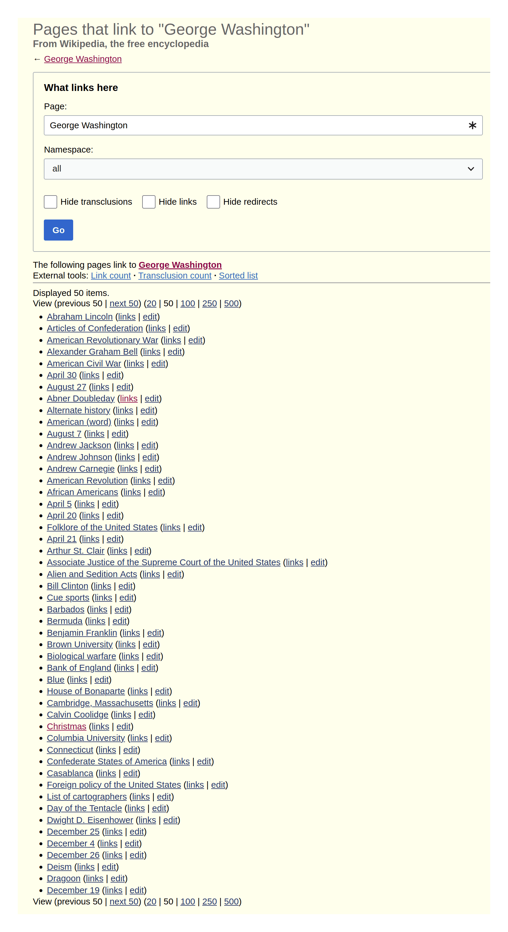