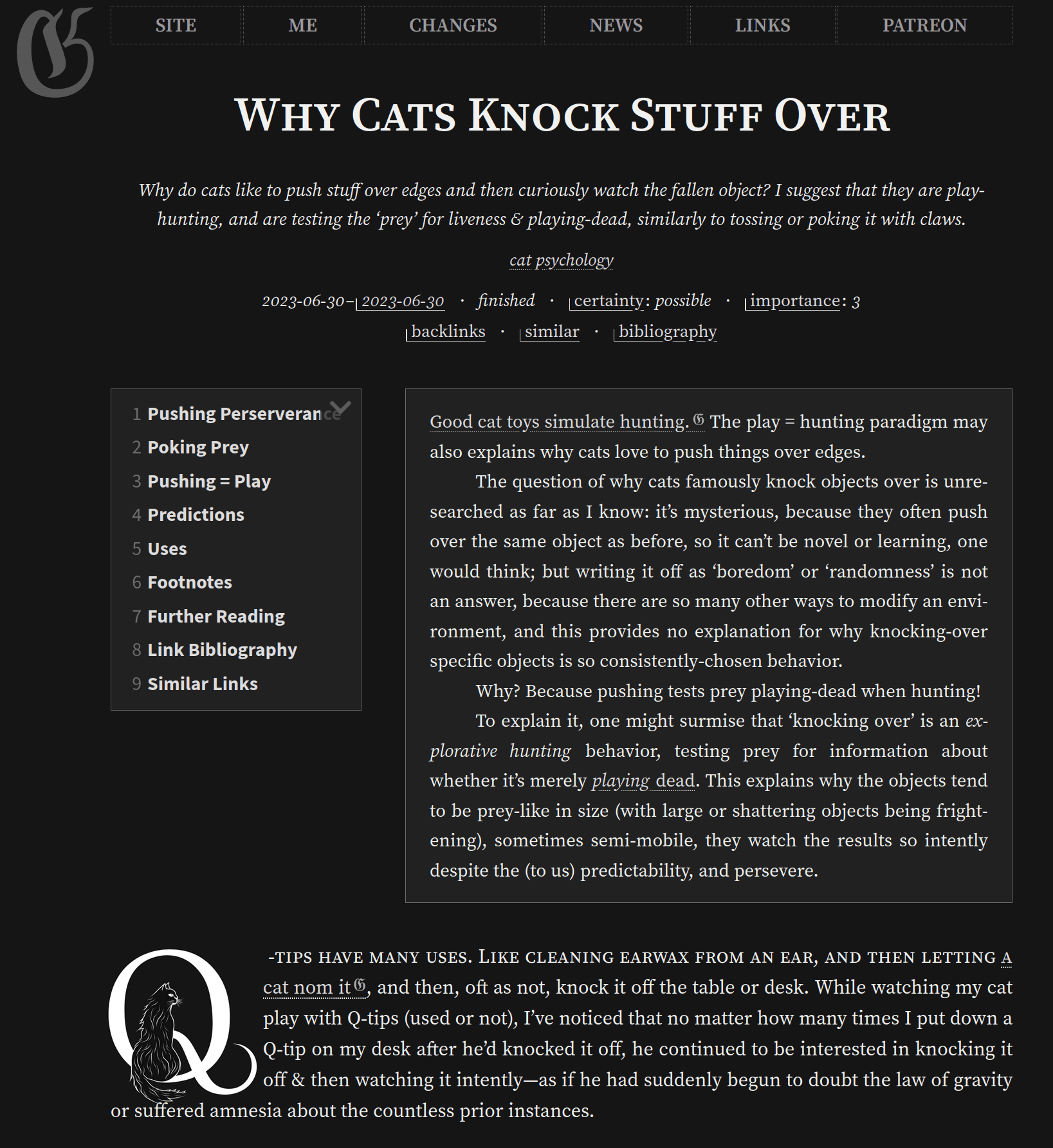
We develop AI image generation workflows for webpage dropcap typography, creating PNGs & SVGs using image generators. As demos, we create new Gwern.net logos and several custom FLOSS dropcap sets, including felines, Gene Wolfe horror fiction, and neural-net-inspired dropcaps.
Initials or ‘dropcaps’ are fun typographic features used on Gwern.net, but there are few fonts suitable for Web use; creating new ones is difficult & expensive. However, AI image generators have revolutionized image generation, and shown promise in typography.
How practical is it for a hobbyist to use generative models to create dropcap letters, and use them in a web page (like this one)? Can we achieve (1) high-quality dropcaps, (2) little total human labor, and (3) acceptable bandwidth use (~100kb)? After working through image & SVG-based workflows, we find that: yes, we mostly can.
To expand our dropcaps selection, I & Said Achmiz experiment with use of Midjourneyv5/6 & DALL·E 3 in late 2023, and discover that, while somewhat tricky to prompt, they generate dropcap images we like. The challenge is using them—web font-based dropcaps are already challenging to do, but image-based dropcaps are even harder, due to problems with removing backgrounds, positioning, multiple sizes, and light/dark-mode compatibility.
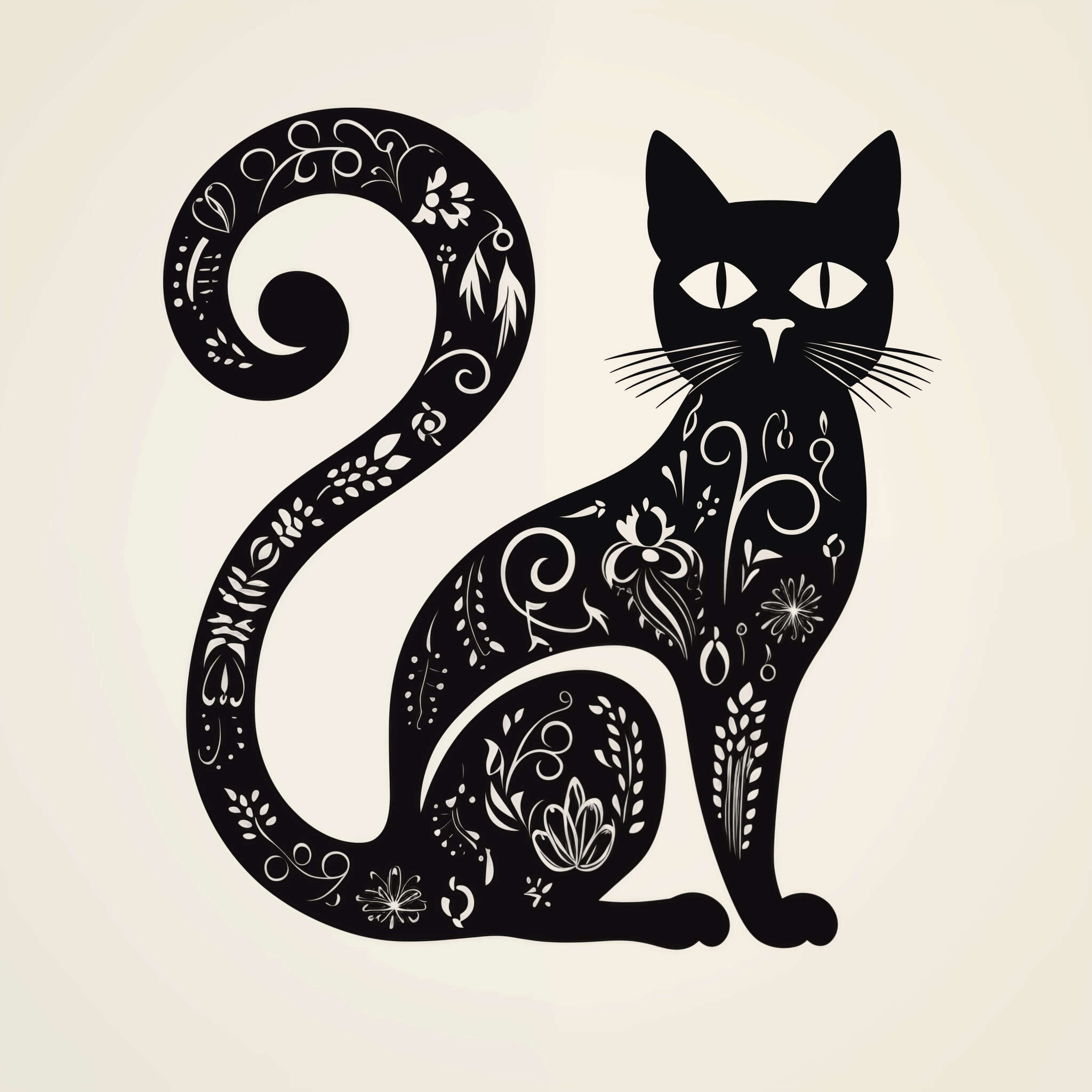
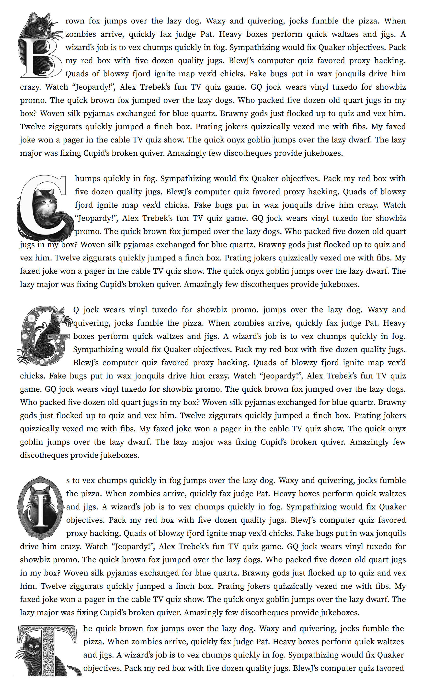
We first demonstrate image dropcaps by creating a cat-themed dropcaps set which we call dropcat: we generate & curate the most dropcap-esque ones; we hand-edit them into repositioned & background-free images, and display them with our custom CSS/JS dropcap implementation. The images are small enough (~32kb, range: 8–140kb) to use freely. We also made holiday-themed Gwern.net logos (Christmas & Halloween). And because we can generate so many dropcaps, we generate many for each letter and pick randomly per-page-load.
However, while feasible, the hand-editing is laborious and took longer than generation! So we looked into vector generation instead, which would make it easier to automatically remove backgrounds & reposition them. While no 2023 vector generation AI does adequate dropcaps, and converting image → SVG often produces large/bad-looking SVGs, we find that with careful processing, we can make SVGs which look identical & generally are only ~2× larger than hand-tailored PNGs, while still requiring a little manual repositioning. To make that repositioning easier, Said Achmiz developed Dropcap Workshop, a specialized web-GUI dropcap SVG editor.
The SVG workflow is: generate an image in a NN → vectorize using the free Recraft.ai service → remove SVG background → reduce precision of numbers in SVG → minify SVG → adjust margins/positions in Dropcap Workshop → drop into a directory for automatic inclusion in website build → web pages set a CSS variable.
We release all our dropcap images, code/scripts, & editor under FLOSS licenses, and hope that this will democratize dropcaps for everyone.
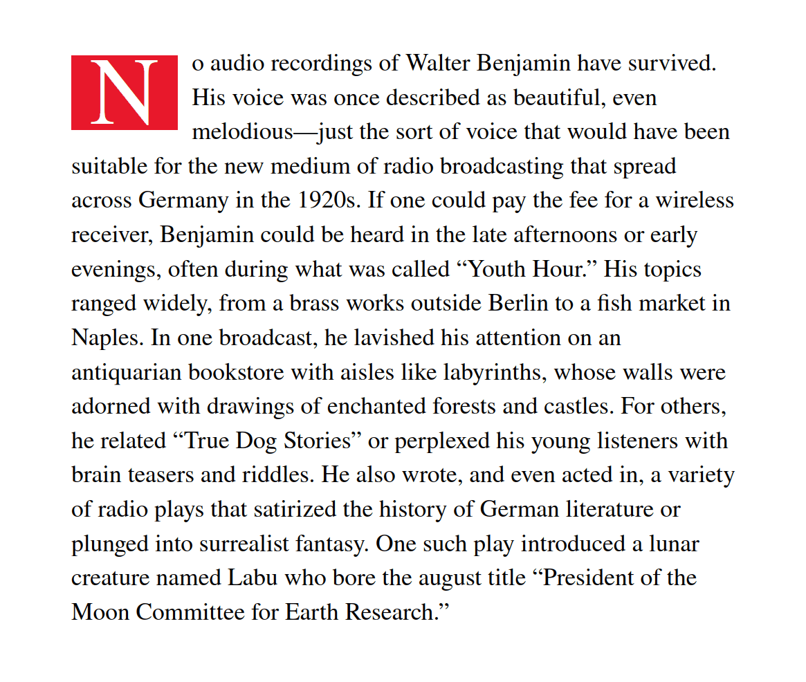
Questionably-worthwhile as it may seem, my second goal for image generation models (after anime) was making fancy letters for Gwern.net: initials (background, other positions), in the form of “dropcaps”, are a typographical flourish that has always made it stand out1, and I enjoy the effect of the existing dropcaps (Goudy Initialen, Cheshire; Deutsche Zierschrift, Kanzlei, yinit) and have contemplated adding some more.
Dropcaps Are Disabled On Mobile
To see Gwern.net dropcaps in situ, please use a device with a wider screen.
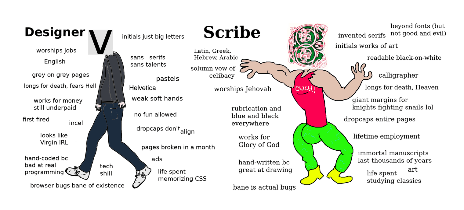
And yet—there are not that many to choose from. You’ve seen countless dropcaps in your life, but they fall into one of a few groups: an existing font, where the letter is simply made very large (a common sin in magazine & newspaper websites2); one of a handful of ‘standard’ dropcap fonts (particularly Frederic Goudy’sGoudy Initialen, used everywhere); or is a one-off custom illustration of a single letter (rare on websites, somewhat more common inPDFsornovels/books and occasionalmagazines). There aren’t a lot of dropcap fonts, and the ones that exist tend to be old, or flawed: half-baked or crude digitizations or proprietary or too large to use in webpages where download times still matter (especially when the font is used at the beginning of the page). If you are at all picky, you quickly run out of options.
Why is that, given that there are now so many regular fonts, and calligraphers & artists are constantly illustrating fancy letters? I speculate that the answer is that is similar to the reason web dropcaps aren’t used on much: technical challenges deter most users, and one has to be both interested in artistic presentation and sufficiently technically inclined to solve the many CSS/HTML problems, which is a small niche of web page creators. Similarly, dropcap fonts lie at the intersection of two niche skills: illustrations vs font creation. You can draw a beautifully baroque capital letter ‘A’, or you can master the arcane technical skills of drawing Bezier curves in FontForge & shipping a working TTF font file (which is not simply a 10MB JPG which will look awful in any document), but it is rare for someone to be able to and willing to do both.
So when we look at existing dropcaps, I notice that the creators tend to do one or the other: there are great digitizations of Goudy’s Goudy Initialen, because Goudy drew them so well a century ago in a computer-font-friendly style that one has to focus only on digitizing them; and there are some fancy illustration sets of letters, but then they look bad as fonts because they have jagged pixelated edges or are low-resolution images rather than hand-optimized Bezier curves; or if they seem like they have both, they may be too large to use or be proprietary…
It’d be nice to have dropcap sets which could expand my existing set of themes, like to cover my AI articles—but we’ll wait a long time for any such dropcap font to drop from the skies. But with the rise of versatile image generators, perhaps we can break the dropcap gridlock: we have already worked out web dropcaps pretty well, but both myself & Said Achmiz are lacking in illustration skills—which the image generators can do. And wouldn’t it be neat if my AI articles could be illustrated by AI as well as about AI?
If AI solved the illustration half, we could probably solve the technical half in a generic way, thereby enabling anyone (not just us) to create a high-quality dropcap. If it was easy enough, you could create a custom dropcap (or a few dozen new dropcaps) for every essay or blog post!3
That, however, is easier said than done, as in web design, there is always a devil in the details (and one soon begins dreaming of a great flood to wash it all away).
How do we implement good dropcaps for web pages in the first place? Web dropcaps posed several challenges to our implementation of 5 dropcap fonts in March 2019:
browser positioning: cross-browser support is nominally good but browsers differ subtly in spacing details, which means that a dropcap which looks good in Google Chrome will look bad in Mozilla Firefox & vice-versa.
We solve this with hard work & CSS.
font size: dropcap fonts are often quite large, and waste bandwidth & time while being both purely decorative & highly user-visible; and
We solve this by subsetting: splitting dropcap fonts into one font file per letter, so instead of downloading a megabyte font file with all the dropcaps, the browser only downloads 4–20kb and it’s much faster.
Usually only 1 dropcap is used on a page, but a typical dropcap font will slowly download as much as a megabyte in order to render 1 single letter. CSS font loads avoid downloading font files which are entirely unused, but they must download the entire font file if anything in it is used, so it doesn’t matter that only one letter gets used. To avoid this, we split each dropcap font up into a single font file per letter and use CSS to load all the font files; since only 1 font file is used at all, only 1 gets downloaded, and it will be ~4kb rather than 168kb. This has been done for all the dropcap fonts used, and the necessary CSS can be seen in fonts.css.
no dark mode: dropcaps do not usually come with dark-mode in mind.
We focus on monochrome dropcaps which will look good when inverted in dark-mode, and so don’t really need a separate dark-mode. (This would not work so well for more illustrated or ‘historiated’ initials, which is why the dropcat had to come with separate light & dark mode sets.)
Dropcaps are set in the Markdown page metadata, parsed by Hakyll to substitute into the final HTML as a <body> class, which applies page-wide to ‘the first letter of the first paragraph after an .abstract’ (which allows sub-essays like appendices to get dropcaps of their own as long as they have a written abstract). dropcaps can be forcibly set on specific paragraphs as well using a <div> wrapper, which is useful for testing. See the Lorem dropcaps page to browse all the dropcaps in action.
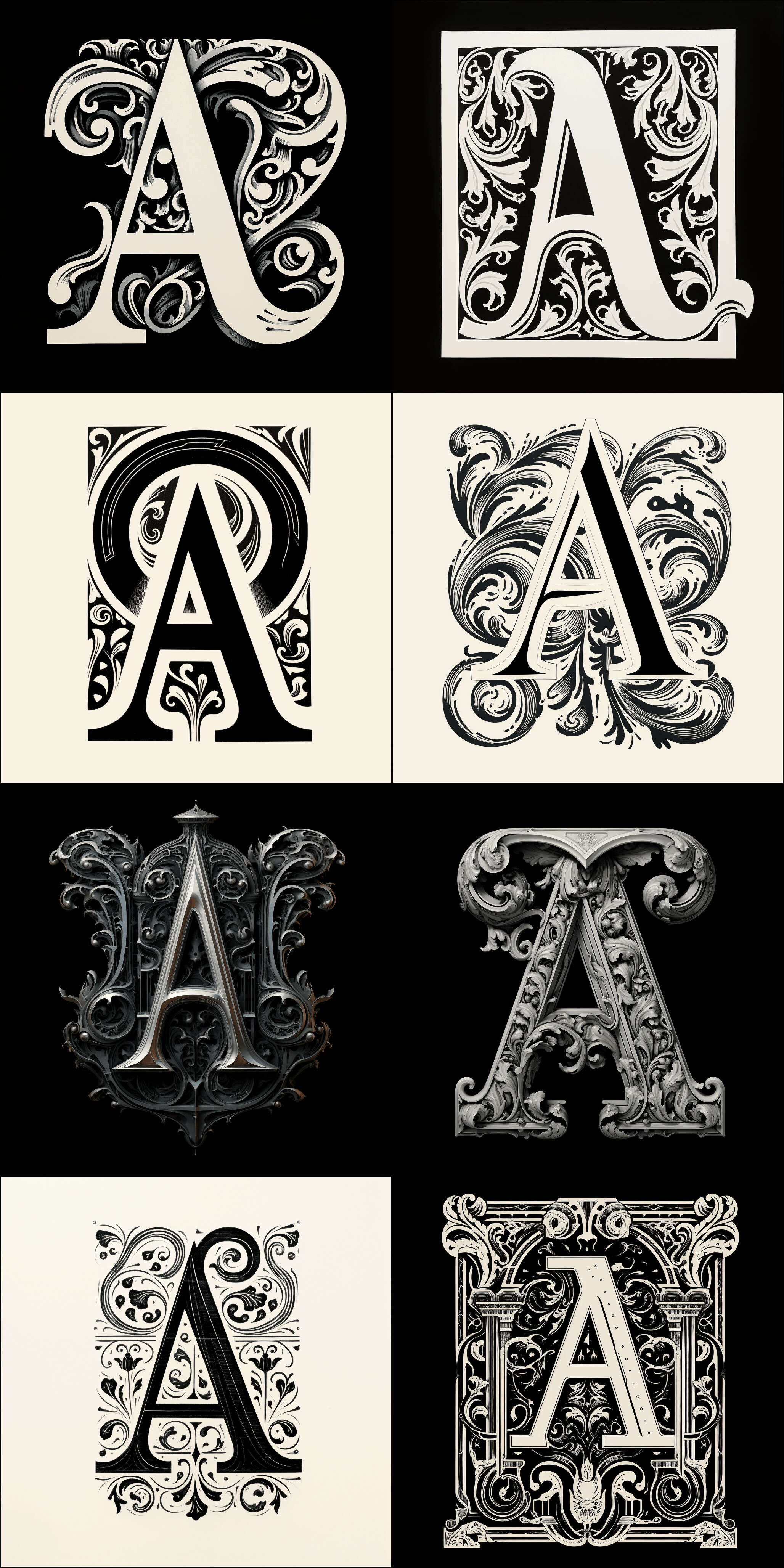
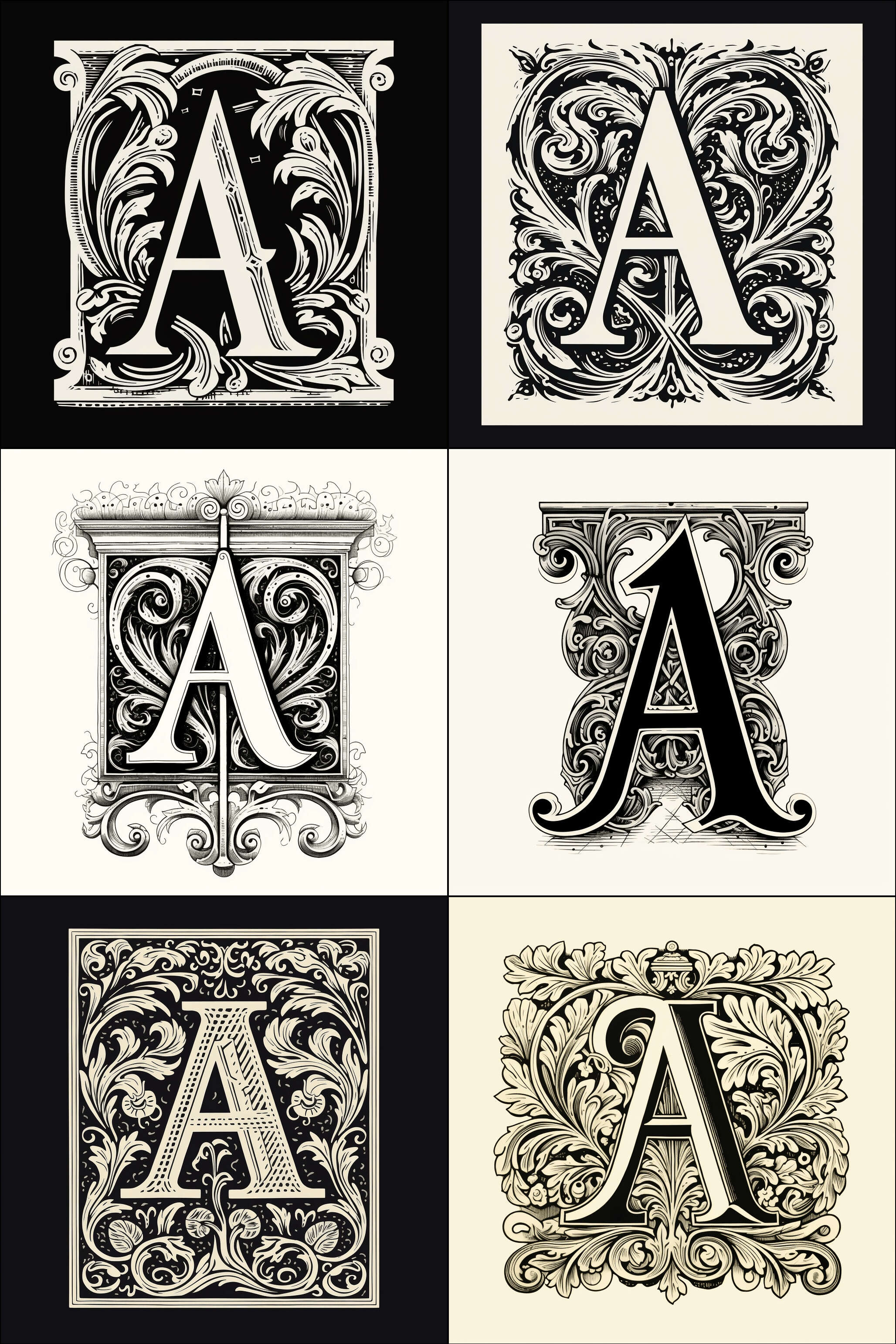
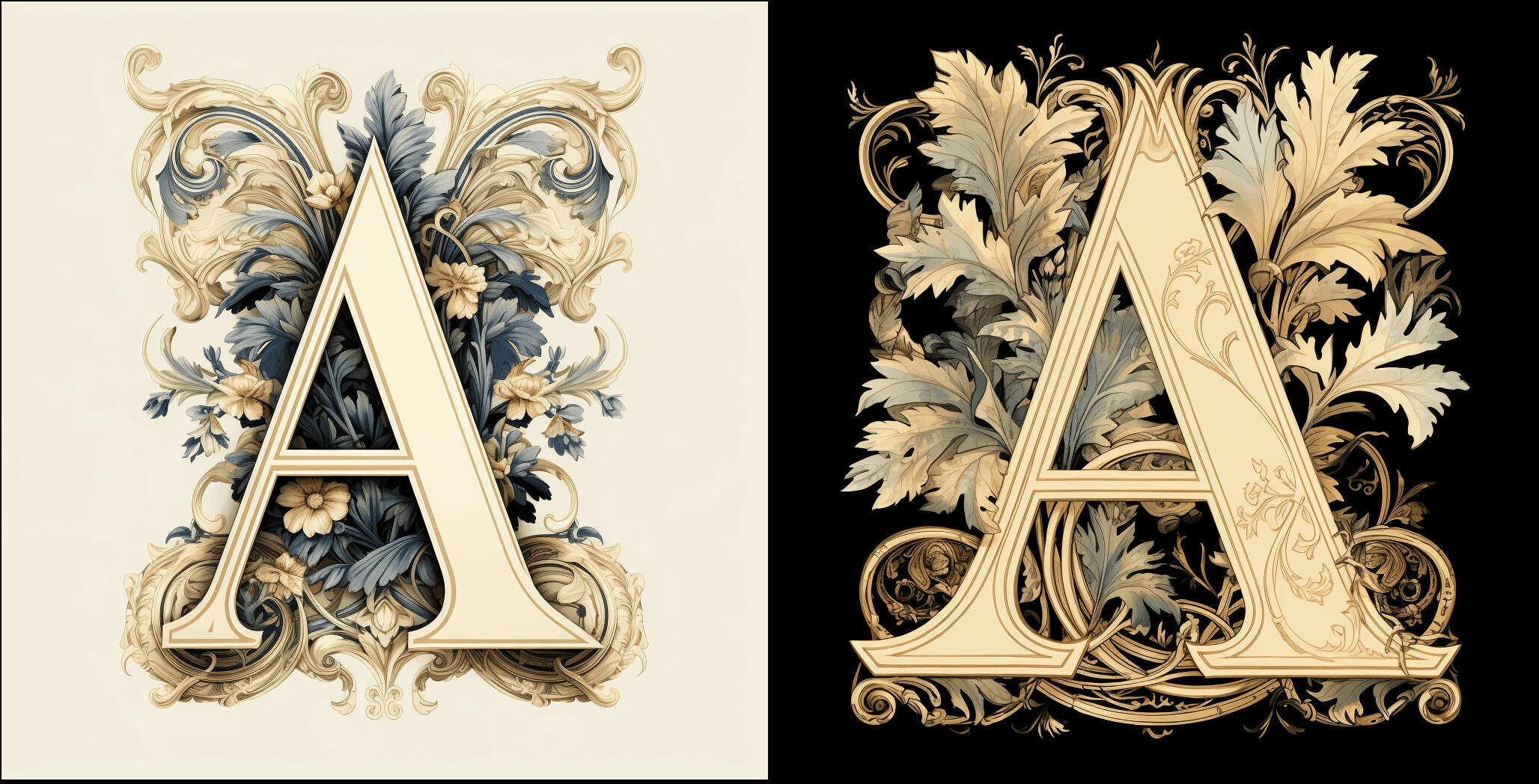
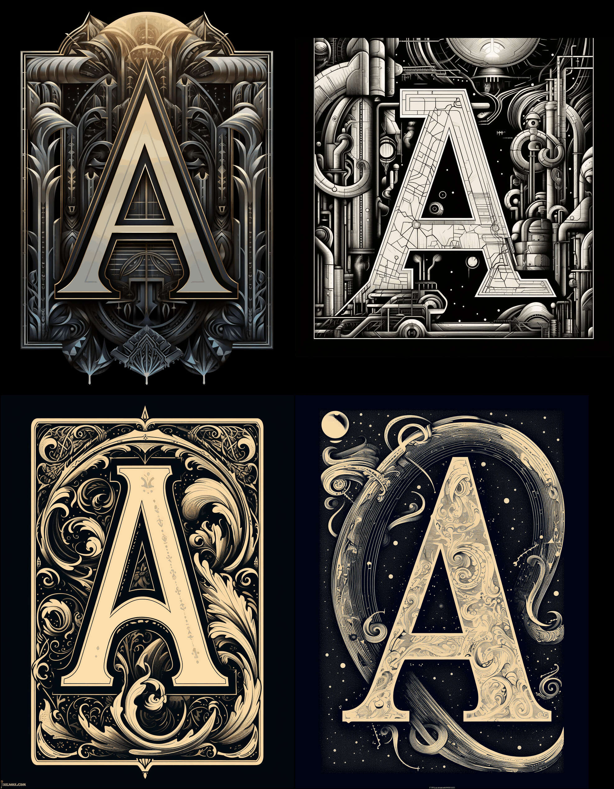
Can we simply prompt a generator for “fancy capital letter A”? No.
Generating dropcaps with text2image neural nets has proven tricky, due to a combination of flaws like my old nemesis byte-pair encodings, raster-only output, and surprisingly poor typography.
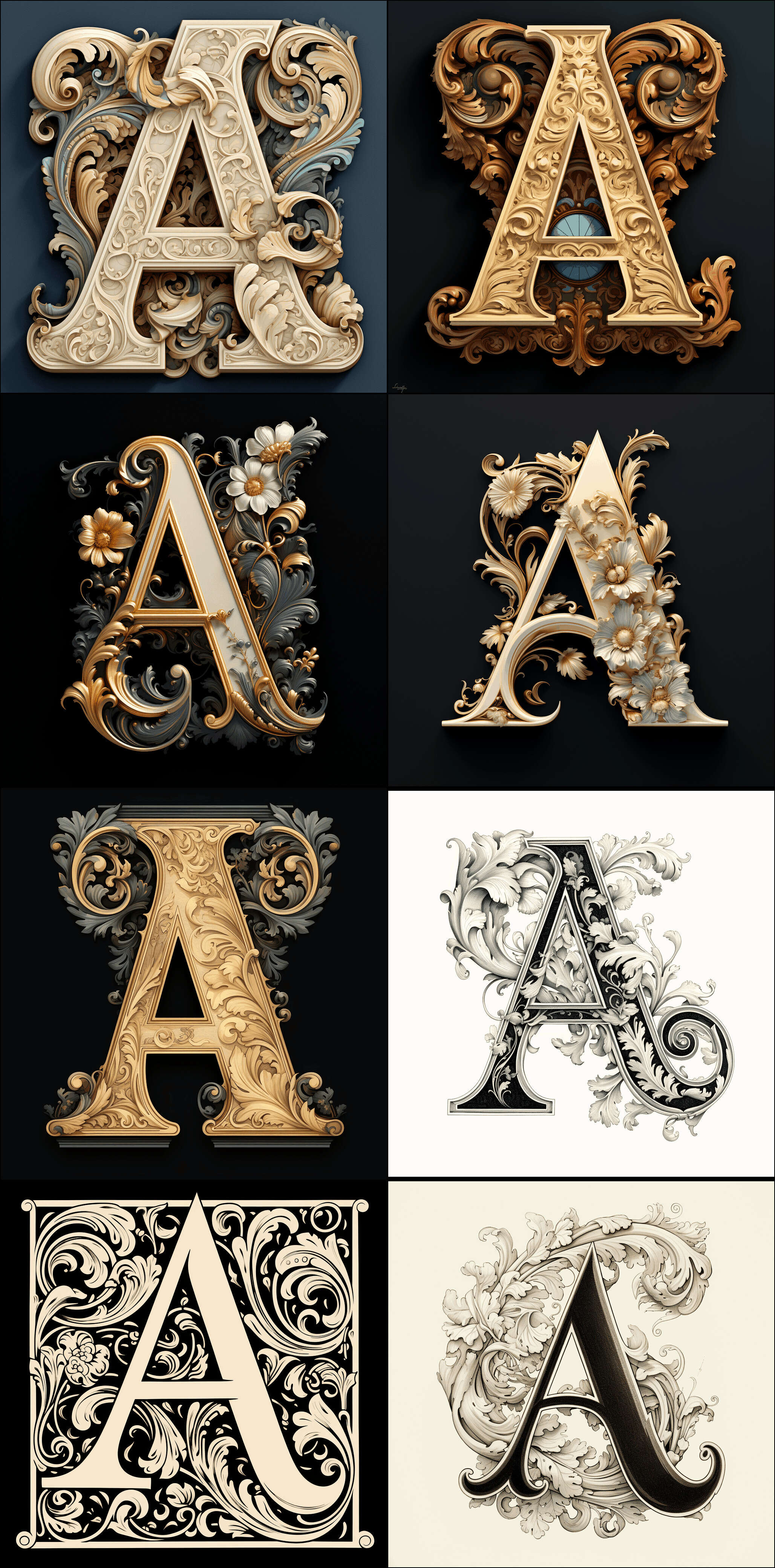
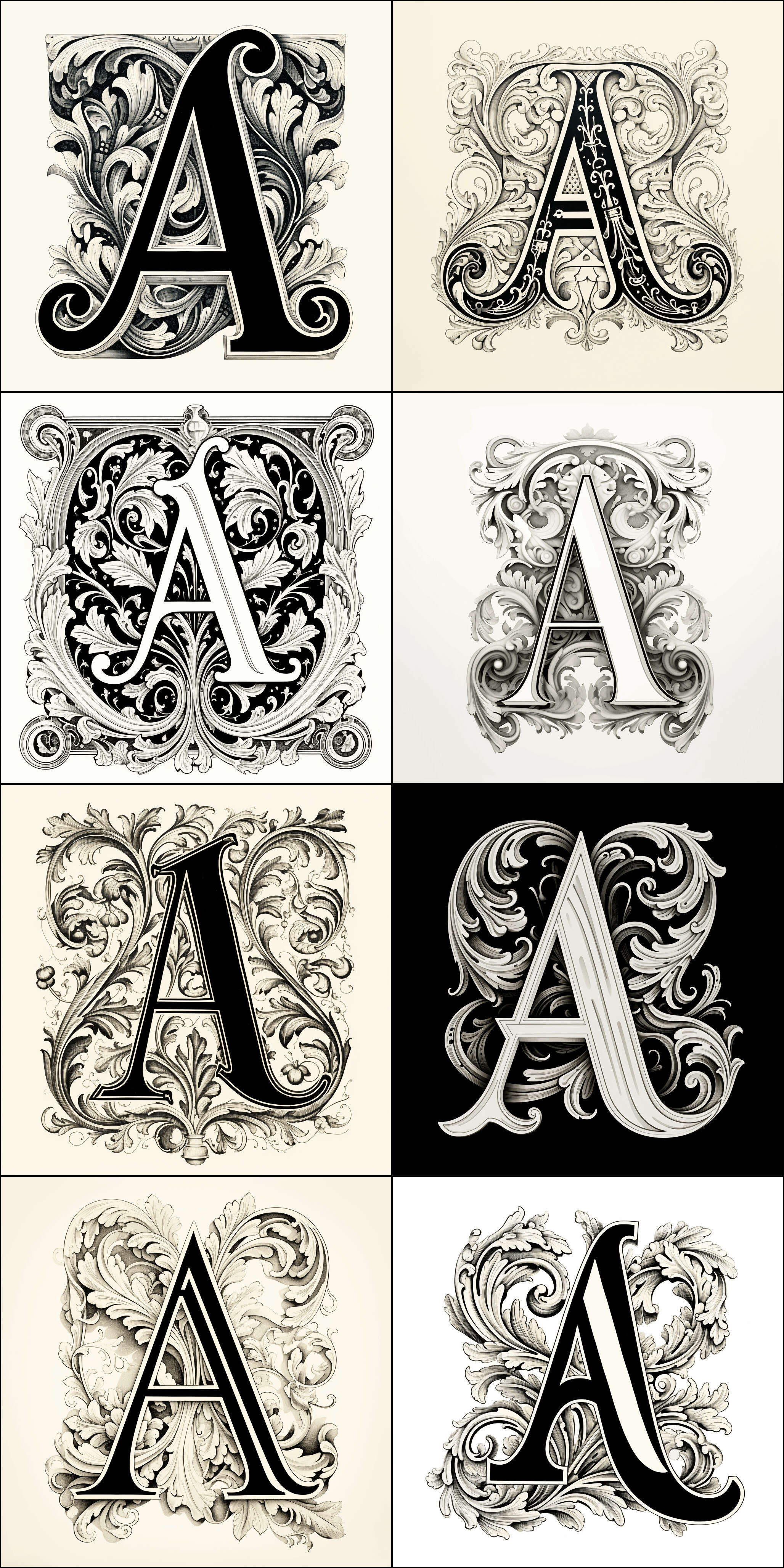
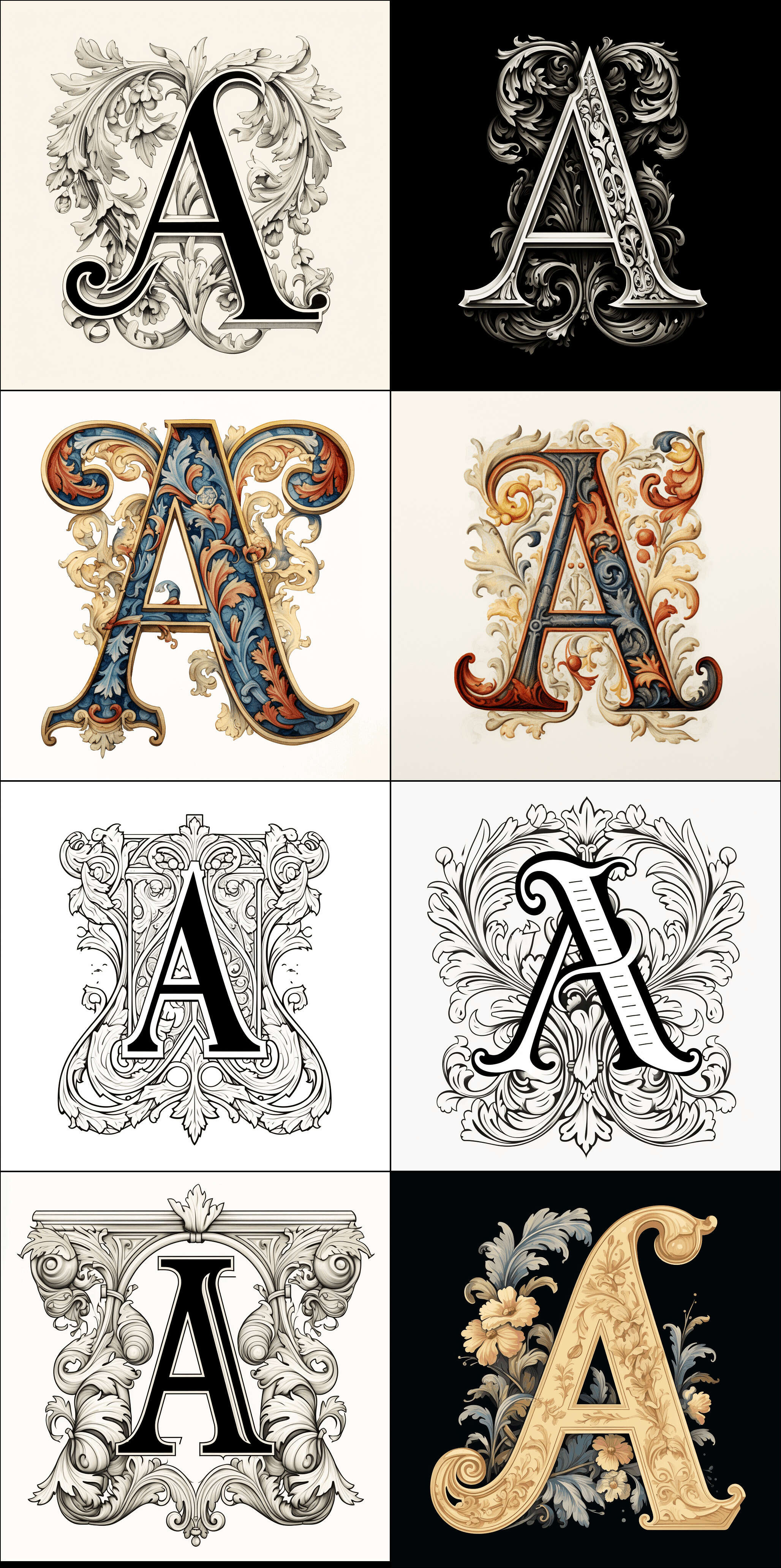
DALL·E 2, Stable Diffusion 1.5 (eg., including with Textual Inversion, eg.) & SD-XL distilled (eg.), Midjourney v1–4, AdobeFirefly-2, all showed exciting possibilities, but were weak on generating images of letters: in some cases, they were entirely unable to generate a specific letter, while in others they were unable to generate variants like italic or bold, and the overall quality was disappointingly low. We weren’t excited enough to pursue the idea with them. However, when I experimented with Midjourney v5 in late 2023 (MJv6 was January 2024), it had reached a quality level where I could brute-force good dropcaps, and I was pleased with samples like medieval-style cat dropcaps. They still did not support good ways to get a single consistent style of lettering or illustration, with no LoRA or equivalent features (aside from possibly the DALL·E 3 ‘seed’ feature), but we decided to embrace that limitation and make a diversity of dropcaps instead of aiming for complete consistency: if we could make many instances of a letter, then we could randomize the choice4
With MJv5, one could make heavy use of its 4-at-a-time ‘vary’ & inpainting functionality to generate many variations of good samples and gradually explore nearby images. (I also used the MJ /describe command to get loose hints as to useful keywords based on uploading yinit samples, although /describe has never worked for me in replicating a specific image.) This let us generate several hundred possible candidates, which Said Achmiz could screen down.
After dialing in a good prompt, I would pick best-of-4, and then Achmiz would pick best-of-5 from that (with an eye towards what would look good downscaled to dropcap size5), so to get a set like the 74 dropcats, I would have generated 1,000–1,500 total. This was well within the ~$10 MJ monthly subscription6, and I would say that by the end, I was able to do this within about 2 hours total (and was getting faster)7, so that would ballpark the dropcats at <$0.10 & <1.5min/each.8 So one could easily generate 1 dropcap per blog post if one wanted to, or create a large site-wide set in an evening.
We also tried using DALL·E 3 (through the OA ChatGPT web interface, not Bing or any API), with acceptable results. Qualitatively DALL·E 3 is much more ‘accurate’ and able to ‘follow instructions’ in a prompt, but also less ‘creative’: it rarely screws up a letter-shape (eg.vampires), but few of them strike me as all that artistic. (There are rarely any pleasant surprises like an unexpected rubri-cat-ed dropcat or happy accidents like the “trypophobia” horror dropcaps or stumbling into a striking “black sun” region of latent space9; for an example of a DALL·E 3 font, see “Cryptic Creatures”TTF) The chat-based interface is also slow: MJ at least lets you queue up several jobs in a row, particularly with ‘vary’, so you can generate a few dozen quickly, but the chat-based interface forces you to generate 1 image at a time, taking a minute each time. (One can open multiple tabs, but only a few will work.) So DALL·E 3 is a good choice if you’re aiming for a precise dropcap or you are fine with picking from the first few, but not if you want a lot or a diverse set. I currently use it mostly for complex images like my essay thumbnail-illustrations (eg., popup/popover) or comics (eg.), where Midjourneyv5 was hopelessly inefficient.
In my childhood I was a fervent worshiper of the tiger: not the jaguar, the spotted “tiger” of the Amazonian tangles and the isles of vegetation that float down the Paraná, but that striped, Asiatic, royal tiger, that can only be faced by a man of war, on a castle atopan elephant. I used to linger endlessly before one of the cages at the zoo; I judged vast encyclopedias and books of natural history by the splendor of their tigers. (I still remember those illustrations: I who cannot rightly recall the brow or the smile of a woman.) Childhood passed away, and the tigers and my passion for them grew old, but still they are in my dreams. At that submerged or chaotic level they keep prevailing. And so, as I sleep, some dream beguiles me, and suddenly I know I am dreaming. Then I think: this is a dream, a pure diversion of my will; and now that I have unlimited power, I am going to cause a tiger.
Oh, incompetence! Never can my dreams engender the wild beast I long for. The tiger indeed appears, but stuffed or flimsy, or with impure variations of shape, or of an implausible size, or all too fleeting, or with a touch of the dog or the bird.
The main challenge with MJv5 was that many of the letter-shapes were severely malformed. It was strange: you could ask for a letter ‘A’ in all sorts of wacky forms, like an arabesque Art Deco A made out of aluminum why not, but it was always the same ‘A’ shape underneath. And god help you if you asked for certain letters—it seems Midjourney just does not know what letters are, so certain letters are conflated and come out visually half-way. For example, a capital ‘I’ might come out with a horizontal stroke in the middle like an ‘F’… in a mirror. Or it might get stuck halfway between ‘I’ and ‘T’. (Generating acceptable ‘I’ dropcaps proved nearly impossible, and I had to settle for just one for dropcats.) This was not a matter of overly-complex or confusing prompts, as the simplest possible prompts like “uppercase t” would still fail spectacularly. Experimenting with ‘negative prompts’ to try to guide it away from the wrong letters did not fix it, and sometimes backfired: in one memorable failure, I was trying to generate ‘T’ and had negative-prompted against ‘I’/‘F’ etc., and it did not generate ‘T’ but instead generated t-shirt clothing photographs! (This weakness extends to punctuation as well—I struggled to generate cats curling around question-marks for one essay-thumbnail, and settled for a decent cat vaguely shaped like a question-mark.) My theory there is that Midjourney uses BPE tokens & a weak LLM, and so internally, it literally doesn’t know what the difference is and conflates all the letters.
However, that can’t be the only issue, because all the image generators struggle with stylistic variants. Oddly, they don’t want to generate italics or bold or double-struck etc. There is a large blind spot, where they simply spit out ordinary roman (upright/normal) letters instead (eg. of 10 good ‘T’ dropcat samples, only 1 is even arguably ‘italicized’ and it looks more like an ‘F’ anyway.) How can this be the case? It shouldn’t be difficult to generate these: ‘italic’ and ‘bold’ are hardly exotic, nor is there any intrinsic difficulty—we know from half a decade of font-generating GANs that neural nets have no problem generating italic/bold or interpolating in font latent space. There should also be no shortage of data, because the font GAN projects also highlight just how many digital fonts there are out there: there is little difficulty in scraping tens or hundreds of thousands of font files from the Internet, and each font file may yield thousands of unique outputs (across all glyphs, sizes, and variations—excluding kerning). I can’t see how BPEs would be responsible for this: BPEs in image-generators screws up spelling, but it doesn’t seem to block understanding of style. (For example, in the ByT5+Imagen experiments, the calligraphy-word spelling by the BPE-using LLM is completely wrong, and yet, still looks completely calligraphic.) And the generality of this blind spot suggests that it can’t be due to some particular implementation detail.
My speculation here is that the typography weakness of current image generation models is in fact a shortage of data: the models are trained on image+image-caption data, not font files or documents. When I searched Google Images for phrases like “italic capital letter A”, to get an idea of what the datasets like LAION-400M might contain, I was surprised by the almost total absence of such images! It seems impossible—surely there are thousands of images of a simple uppercase A in italics and bold and every other kind of style if you search?—but go and take a look: on the first page, the hits are all entire alphabet samples, foreign languages like Cyrillic or mathematical notation, where they include an ‘A’ at all. And the search results only get worse after that.
So, the datasets may contain italic letters inside the images, but it seems likely there are few or no images textually captioned as such. The models just don’t know what those words mean for an image. This is due not to any lack of fonts on the Internet, but a lack of labeled screenshots/images. This can be easily remedied, as the font GANs show10, but generating letters or typography has not been a focus of image generation applied research, so it has not been done yet and the researchers/companies in question may not even realize that this blind spot exists.11 (“The intersection of 2 niche skills”…) As image generators scale, this situation may fix itself simply by training on enough images (eg. Imagen & Parti text rendering emerges past the billion-parameter regime).
Fortunately, we don’t particularly need these capabilities, as the generated letters are interesting enough in their own right, as long as the reader doesn’t look at too many side by side and begin to notice that they all have the same underlying roman letter-form.
If we really need other shapes, the obvious approach would be to use an image style-transfer/image2image approach and start with a ‘seed’ alphabet and a ‘style’ image, and morph each alphabetical letter using the style, eg. using the now-famous ControlNet. (I have not experimented with this yet as I do not have Stable Diffusion installed locally.)
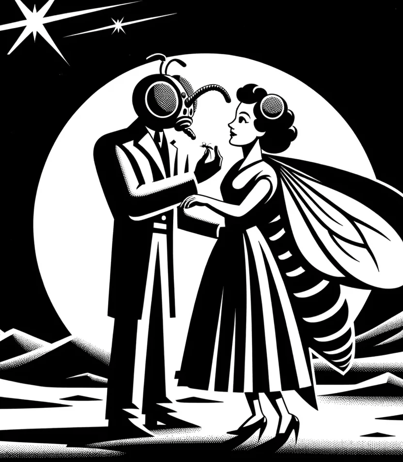
OK, so we now have an image we like. It is a 2MB PNG; we can stick it into a web page as an ordinary <img>/<figure>, the way everyone else uses their AI-generated art. Sometimes this will work, like this elegant lady of obscure letter-origins I found while generating rococo dropcats:
A would-be dropcap being used in an ordinary fashion, as a decorative image not conveying anything important, but there just to look pretty and convey a vague vibe, in a more or less distracting ‘hero image’ fashion, like so many websites these days. It is admittedly pretty, but is the reader’s life better for having to look at it and decide to ignore it while trying to read this page? I would submit to the reader that their life is not, in fact, better for it, and that indeed, precious seconds of their all-too-finite life are ticking by, e’en now, as they read this caption’s strained attempt at humorous meta-commentary. But then, in fairness, we should note that it is so much easier to just stick a random image in the middle of this page than it would be to turn this into a usable raster dropcap, as we will discuss below—no wonder no one does it! Just the list of problems is a blog post all on its own. Who can blame people for not bothering? Not I! But for those who persevere, it is a stylish twist on a webpage.
But how do we use some random PNG or JPG as a dropcap?
If we edit our CSS to just stick in a PNG dropcap at the start of a paragraph (much like the standard TTF+::first-letter CSS pseudo-element approach), we see problems:
4 examples of how using a raw PNG as a dropcap fails: it is poorly positioned, misaligned with the first line and overlapping the text while also being too small, and have ‘square’ effects due to mismatched color backgrounds (dark mode example).
the letter itself inside the dropcap image will be positioned badly relative to text. It will be too far away left or right, or the image may actually overlay & erase our text.
We need the letter to be aligned with the first sentence, and reasonably snug with the text wrapping around it, but not so snug that bits might overlap, which will look ugly and make the text hard to read. (This is especially an issue with more extravagant dropcaps, or letters which stick out a lot, like‘Q’.)
To handle this, we must edit the image and crop it down to reposition the letterform appropriately, imagining that there is text wrapping around the right & bottom.
the dropcap image has a background; unfortunately, it is always the wrong background.
The NNs always generate a background color. There are ways to not generate a background color, like emitting an alpha channel or semantic segmentation mask, or generating vector art formats like SVG. However, the current NNs (as of November 2023) do not use any of these. So if we get a great dropcap, it will come with some background. It might be black, it might be white, it might be an off-gray gradient. But it will be there, and it will almost always be different from the web page background, and so there will be an ugly ‘square’ if we simply use the PNG as-is.
This is not an issue for normal fonts, because they draw the letter directly against an unspecified background, like it was text, so there is no problem ‘superimposing’ them onto a white or black webpage. It is also not a problem with the rare sets of image dropcaps, like Mario Zucca’s Grantlandbaseball dropcaps where he created transparentGIFs (presumably having drawn them using a computer without background in the first place). It is finally not a problem if one deliberately aims for all dropcaps having a solid or otherwise entirely colored background, and accepts that limitation and how obtrusive they may be. However, our dropcap PNGs are just big grids of colored pixels, which don’t “know” what is a ‘background’ or ‘foreground’ or ‘letter’.
The simple but labor-intensive solution is to use a raster image editor to try to remove the background: they support various approaches like ‘delete all pixels of a particular (background-only) color’ or provide various ‘wizards’ or ML-based algorithms. (One would also do any additional editing here: delete minor artifacts like smudges in the corner, which are pseudo-signatures/watermarks, or convert to grayscale, so as to fit the Gwern.net monochrome theme.) This works, but it is tedious.
(Machine learning solutions seem like an obvious solution, but are still largely prototypes hacked onto segmentation models; the first appealing image generation model with ‘native’ transparency I’ve seen wasn’t published until March 2024.)
the dropcap image may not work when inverting color for dark vs light-mode
A monochrome dropcap (like the original ones used on Gwern.net) which works in light-mode will usually work in dark-mode, for the same reason that it is compatible with different background colors: it simply draws (usually solid) lines. These lines are usually all-black on an assumed white-background, but will look good if switched to all-white on an assumed black background. So while we chose our dropcap fonts with light-mode in mind, before we had a dark-mode, dark-mode support was trivial.
An image dropcap, however, is not so simple: we can’t just invert it because of the background square. To solve the #2 problem of backgrounds, we may have carefully tried to cut away the background pixel by pixel, but we probably left the occasional background-colored pixels on the edges; if we naively invert the trimmed light-mode image for dark-mode, there will be no background square, that is true, but all those suddenly our beautiful image dropcap is now ‘dusty’ with white speckles, like a coke fiend, and vice-versa (eg. one of our favorites, “hissing kitten” looks terrible when inverted, as do most of them).
We can manually curate ones which invert poorly… but then the fact is that many of our colorful & creative dropcap images just won’t look good when inverted. Just like how an inverted photograph may look bizarre, a good image may look terrible when inverted. There is no mechanical solution—the inverted image is useless, and it has to be redrawn.
the dropcap image is too big, in both size & pixels:
The original image you download tends to be highly unoptimized and weigh several megabytes. This is unacceptable for web use for a decorative element. (If the image were the centerpiece of the page, or the only content on the page, that would be one thing, but just for a bit of decoration? Unacceptable delay & bloat, particularly in a world where bandwidth still costs readers real money.) We can shrink it down to more like 0.5MB with standard image optimization utilities, but this is still too large.
This is a second problem to large images: if we ship a 1024px-high image where the largest dropcap height would be 188px, the browser will have to downscale it, and, in the interest of rendering speed, browsers do not scale images well. So our dropcap image will be unnecessarily blurry and undermine the visual quality we worked so hard for.
To solve this, we need to manually create a small 188px image for use instead. This will weigh much less, maybe 10–100kb, and the browser will not have to rescale it (which will be faster too). The catch? We actually need two downscaled images: because some devices, like Apple Retina screens12, define double-pixels, so if we shipped them the ‘188px’ version, it would be rescaled to 376px and look bad again. So we have to create a 188px & 376px version. (Oy vey.)
Overall, our raster image editing process might go like this, for each image:
N = lines dropcap must span
H = visual height of n lines (top of x-height to bottom of x-height)
Y = total height of image (bounding box) such that letterform is H tall, allowing for ornaments/etc.
Example values for dropcats:
N = 5 lines
H = 144 px (7.2em @ 20px base font size)
Y = 188 px (9.4em @ 20px base font size)
Create master image file:
Convert to grayscale
Adjust levels such that background is white / black respectively
Scale image such that letterform is 4H tall
Adjust canvas height to 4Y
Adjust canvas width such that ~40px remain on either side of glyph
Create scaled assets:
Scale master image to 25% (total height = Y) and save as letter-ID-small-1x.png
Scale master image to 50% (total height = 2Y) and save as letter-ID-small-2x.png
Make scaled images transparent (convert to 8-bit color, fill background with magenta, set magenta to transparent color)
We then wrote some JS to, for pages with a specified CSS class set on the body (eg. dropcaps-dropcat), load a random PNG (picking from the light vs dark-mode sets) and use that. (This required switching away from actual use of CSS ::first-letter pseudo-elements in favor of regular elements, but that also means we can do more with them—eg. make them pop up a link to this page as their documentation. When JS is unavailable or dropcaps are disabled due to a narrow window, dropcap-ed paragraphs simply render normally because they are an optional esthetic feature.)
This JS is integrated with the website build process, so a list of available dropcaps is generated by looking at the dropcap font directories.13
Our test case was the dropcat set, and we were pleased with the result: they look great in both modes, hardly ever repeat due to their sheer number, load about as fast as the rest of the page (and as fast as the original subsetted dropcap would), and hasn’t been buggy.
We were able to do all the dropcats, but quickly became bogged down in the sequel, a set of horror/vampire/sci-fi themed dropcaps for my Gene Wolfe essays: it was just too d—ned tedious to do more than a few. We discussed alternative approaches (perhaps we could drive raster edits using GPT-4-V? Or use one of the new neural net segmenters to remove backgrounds more cleanly? Use ControlNet to create light vs dark mode versions?) but the most straightforward fixes kept coming back to vector images: if we were using vector images, everything would be a lot easier.
Could we use TTF like our existing dropcaps? Apparently TTF does support storing raster images in it, but it is an extremely obscure & little-used feature, and wouldn’t help in any meaningful sense: we would still need to get vector versions somehow.14
Could we use a NN generator which generated vector output instead? There is, strictly speaking, no reason that a NN couldn’t generate some sort of vector output or optimize a set of vectors or generate SVG text directly like any other LLM output. There have been a number of approaches, ranging from the cool reinforcement learning approach of SPIRAL to more contemporary image2vector StarVector. But it is neglected compared to regular raster image generation, in part because NNs are extremely good at just generating a big pixel grid of blobby textures rather than emitting long carefully-written symbolic text strings like SVG files. There seemed to be only the new & little-discussed Adobe Firefly-2, and I learned from Nat Friedman, an obscure London-based startup called Recraft.ai.
I tried Firefly-2 in October 2023, and with the free credits, was not impressed by the dropcaps, like all the others. (This was surprising to me because Adobe is a major player in the font space—if anyone was going to do good generative typography, you’d think it would be them!)
I then tried Recraft.ai’s (also free) vector generation, and was unimpressed (eg. Art Deco capital ‘A’); Recraft would be majorly upgraded in late January 2024, however, while testing it in October 2023, I noticed that they had a ‘vectorization’ feature for importing raster images to then edit, and further, a ‘remove background’ feature. I haven’t had good experiences in the past with vectorization tools like potrace, which tend to produce both low-quality and large SVGs, but I gave it a try and I was pleasantly surprised to see that vectorization+remove-background yielded usable SVGs without their backgrounds, and, particularly after running through Vecta’s “nano” SVG minifier15, usually ~1MB. This accomplished the first step: vectorizing our dropcaps.
We investigated further and discovered that Recraft’s vectorization → remove-background workflow was actually highly suboptimal: the ‘vectorization’ step produced an SVG which always had the background neatly split apart from the rest of the image, and which could be deleted without any further problems, while the ‘remove-background’ step did some sort of global rewrite of the entire SVG which introduced a lot of visual artifacts & often resulted in a larger filesize to boot. (This was puzzling, because why didn’t Recraft just implement remove-background the easy way?) Achmiz wrote a script to remove the background, svg_strip_background.php, which shrank the SVGs and achieved the second step: removing the backgrounds from the vectors.
Achmiz then noticed that the size of the SVG was driven mostly by long decimal numbers in the SVG, but that they truncate to just a few digits with no perceptible difference, particularly at dropcap scale. (Oddly, Vecta’s nano doesn’t appear to do this before doing its own minification, so this improvement stacks with running it through nano; however, whatever nano does to SVGs does eliminate the benefit of truncation.) The truncation script is available as svg_squeeze.php. By truncating and then minifying with nano, the SVG sizes shrink to a downright-reasonable 10–100kb! (We had been prepared to accept SVG sizes of up to 500kb, on the grounds that bandwidth is getting cheaper all the time and only desktop users would download dropcaps, and we could always go back in the future with better vectorizers, which we expect to arrive in the next few years as neural nets catch up.)
This leaves one key step: adjusting the margins/sizes of the dropcaps.
Vectorizing doesn’t auto-magically solve that, but it does mean that it’s a lot easier, because now one is simply setting a few parameters in the SVG to move the object around and make it bigger or smaller, which is meaningless in a raster image. It is so simple, in fact, that you can write a small in-browser editor app just for that purpose. To finish up an SVG dropcap, one simply opens it in the editor, fiddles with it for a few seconds, and export the adjusted dropcap.
So, to recap:
obtain a PNG/JPG dropcap:
This can be from anywhere—social media, magazine scans, photos, one’s favorite NN generator, hand-drawn, screenshot, video game—as long as it would make a sensible dropcap: roughly square-shaped, looks reasonable downscaled to 188px, not too cluttered or detailed, a ‘background’ which can be removed, few colors (preferably monochrome)…
rescale to 25%: for dropcap use this can sometimes result in SVGs half the size while having no perceptual difference side-by-side at dropcap-scale (and sometimes the smaller resized one looks better); however, it is unreliable, and sometimes makes larger images
grayscale: for dropcaps which are intended to be monochrome, grayscaling the image before vectorizing appears to usually work better
log into Recraft and ‘vectorize’ it
run svg_strip_background.php on it
run svg_squeeze.php on it
run Vecta nano on it
edit the positioning in Dropcap Workshop
save to a directory
While still more work than we would like, only the first and penultimate steps require any real effort, and the workflow can be improved: the vectorization & optimization steps could be all combined, and I believe that the positioning can eventually be automated with judicious use of AI—at which point human effort is only required for selecting the dropcap image.
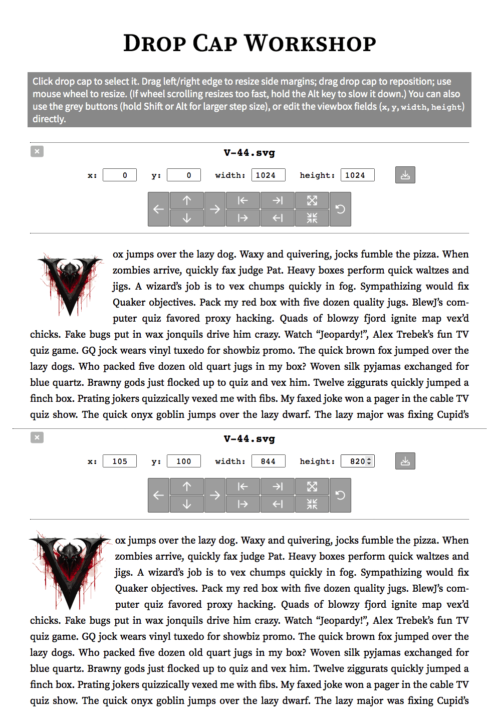
Dropcap Workshop is a single-page standalone/offline MIT-licensed web app made by Said Achmiz for editing SVG dropcaps, specifically, adjusting their height (ie. zoom in/out) and margins (cropping):
Editing a dropcap in Dropcap Workshop, before (top) and after (bottom): the (Gene Wolfe ‘V’ light-mode) dropcap has been zoomed in, and moved down-left to fit better against the text.
It supports uploading & editing multiple SVG simultaneously, so one can edit dropcaps in batches: bulk-edit, and then adjust one by one before saving. The original dimensions are saved in the edited SVG just in case.16
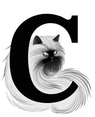
Demonstration of ‘C’ dropcat use in light (top) & dark (bottom) mode on a Gwern.net page.
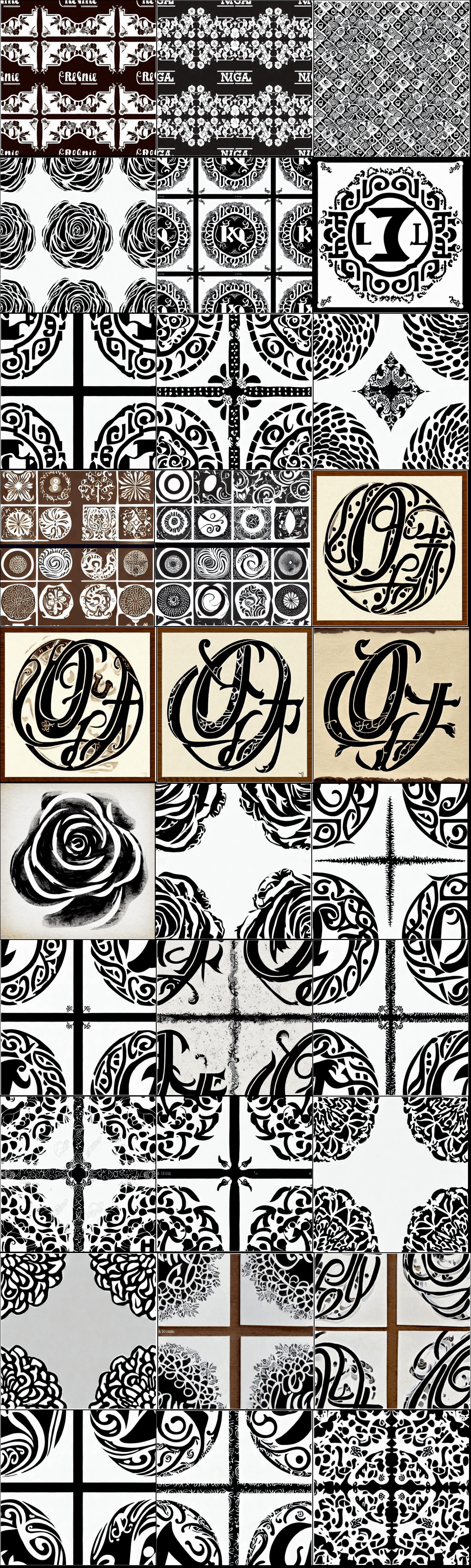
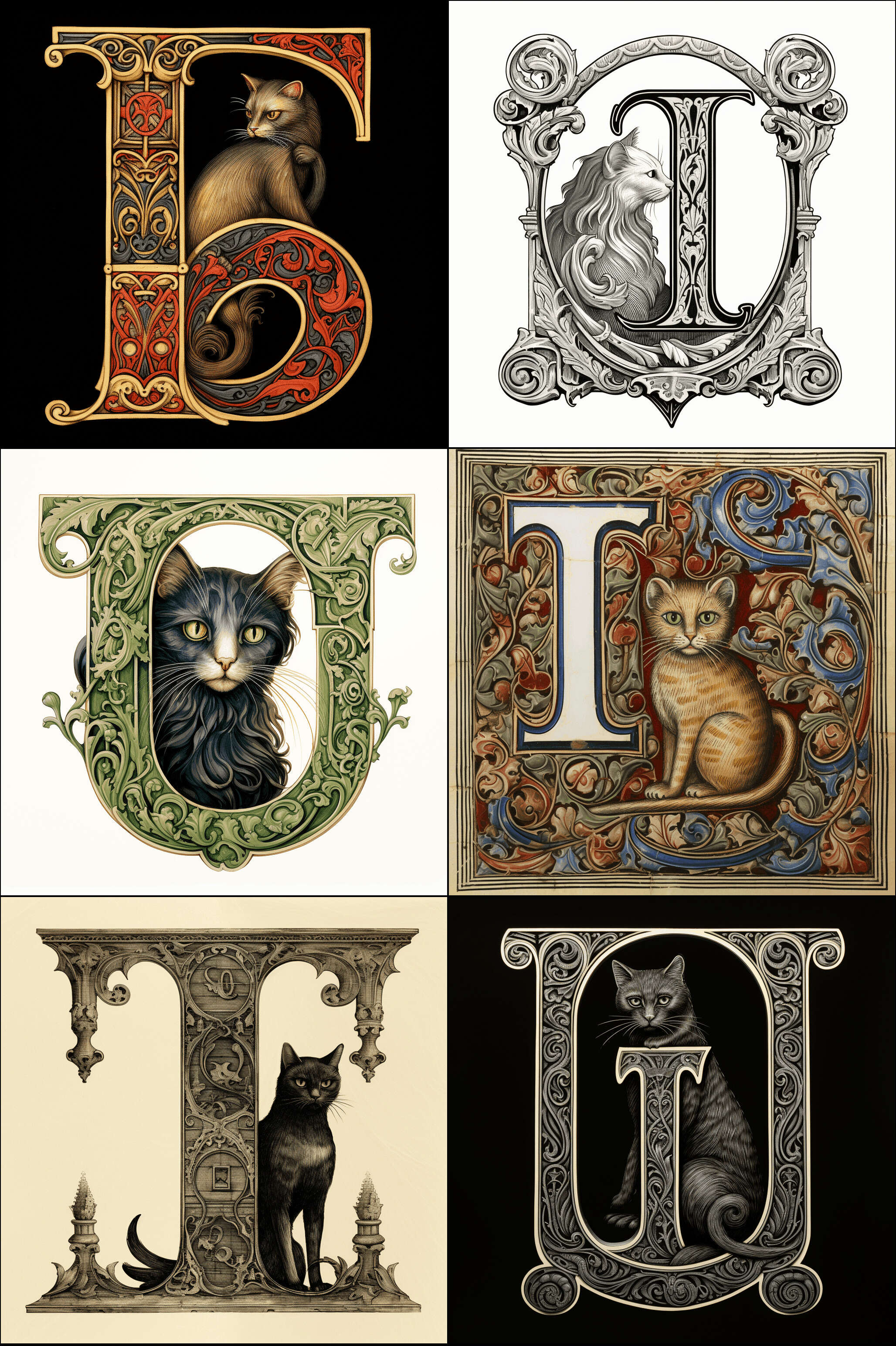
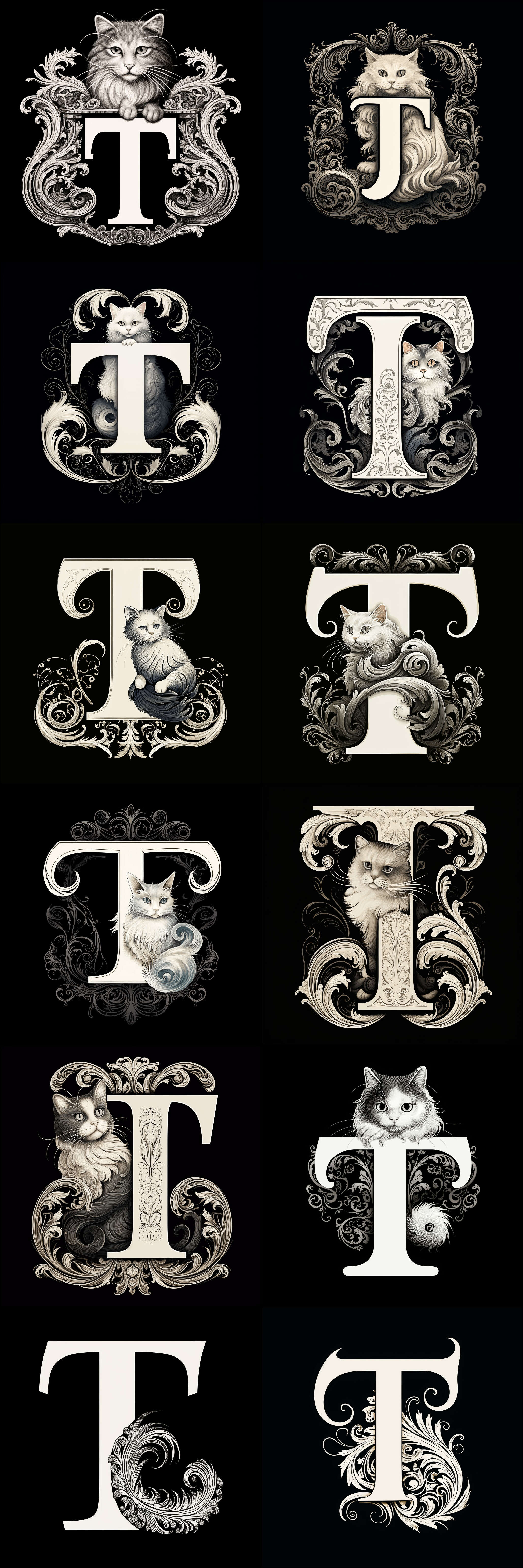
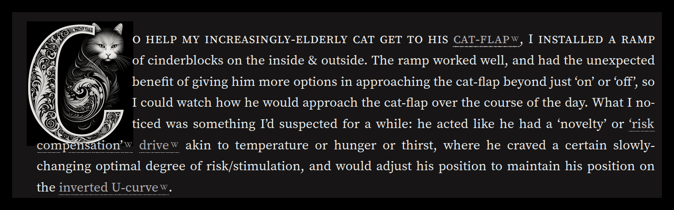
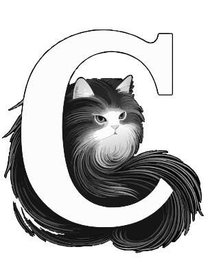
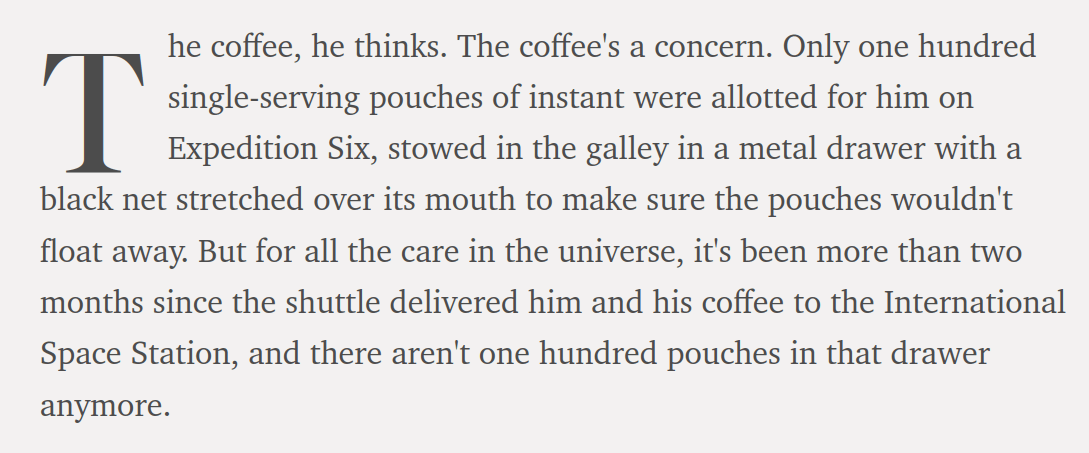
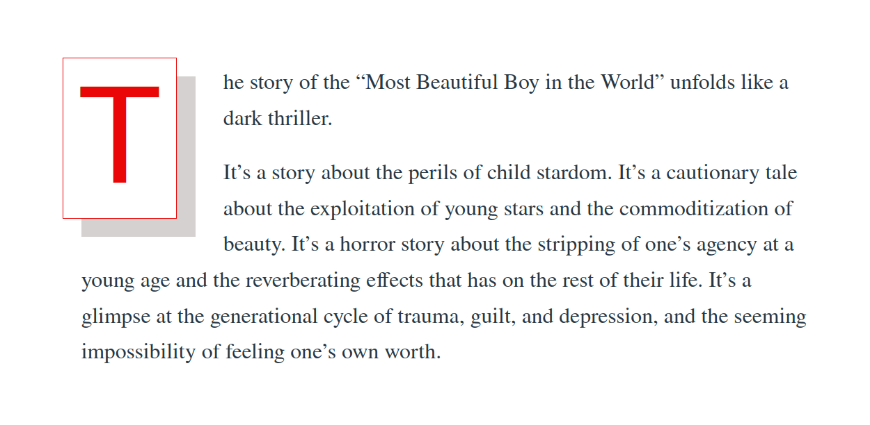
The dropcat dropcap font set is a set of light (42) & dark (32) raster image (PNG) dropcaps (CC-0 licensed); I created it using Midjourneyv5 in October 2023, using a wide variety of prompts, and we hand-edited it for webpage use. The set is tailored to the first-letter needs of my current cat-related essays, and so it does not provide a full A–Z alphabet, but covers 6 catipal letter-types (B/C/G/I/Q/T), in both dark & light mode (74 total; demo page); per-letter breakdown of count:
Light-mode dropcats in a grid, by letter-type (1: A–G).
Light-mode dropcats in a grid, by letter-type (2: I–T).
An interesting Midjourneyv5 prompting discovery was that use of the ‘Korean’ term often produced a nifty East Asian effect which was neither stereotypically Chinese nor Japanese.
Demonstration of Gene Wolfe ‘T’ dropcap use in light (top) & dark (bottom) mode on a Gwern.net page.
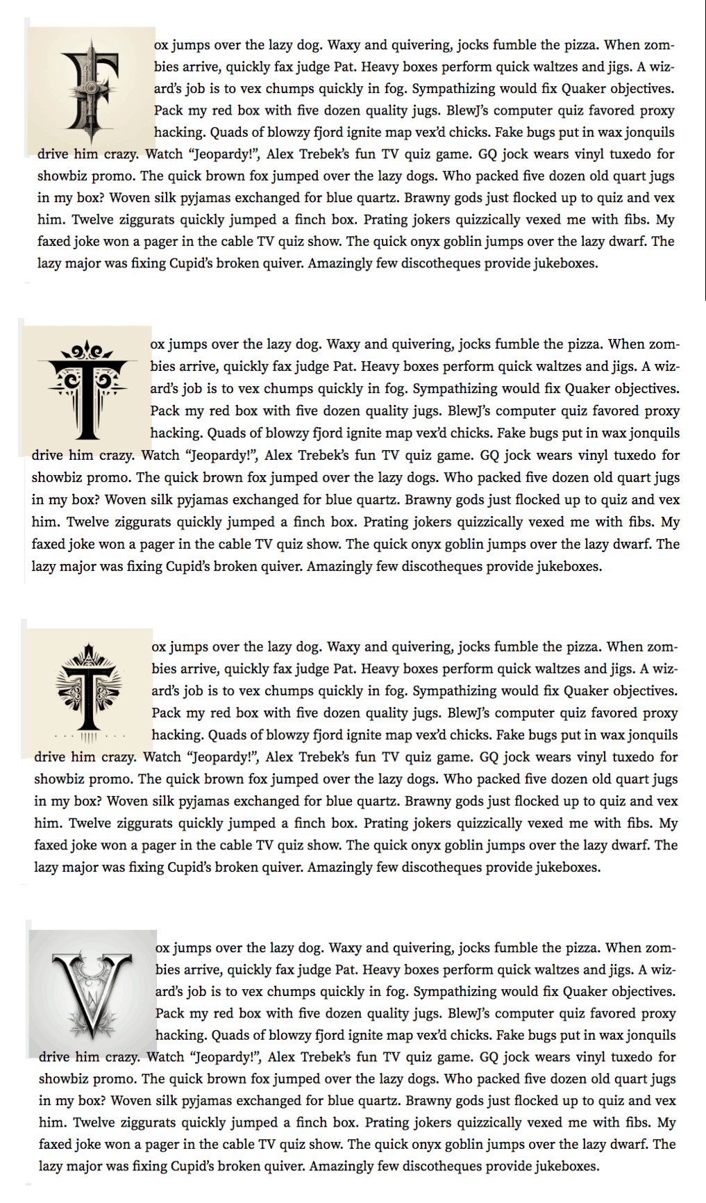
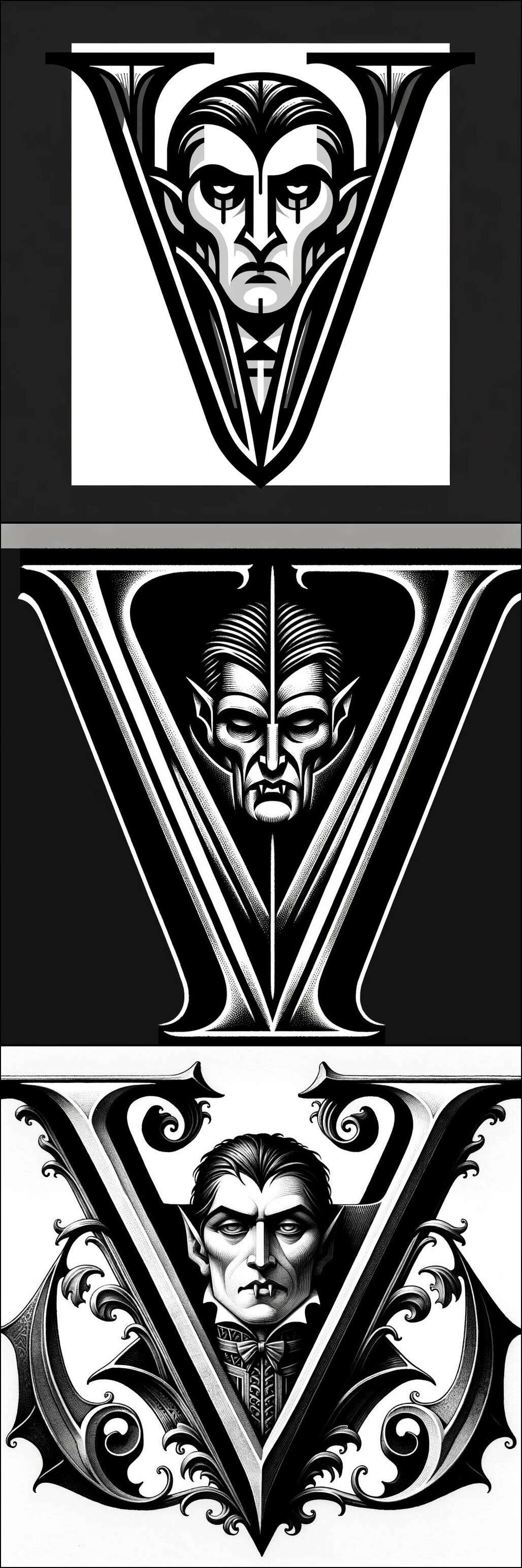
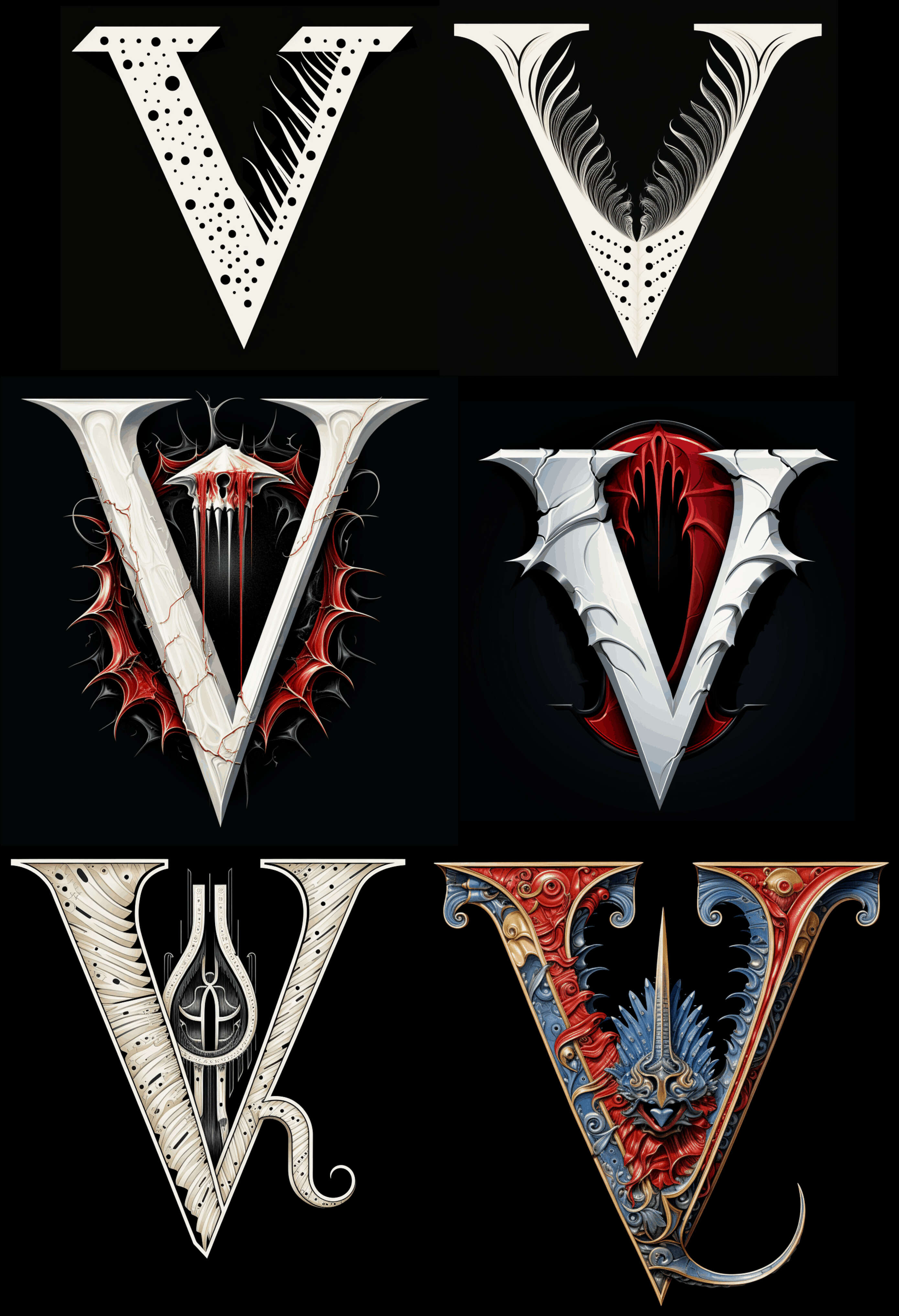
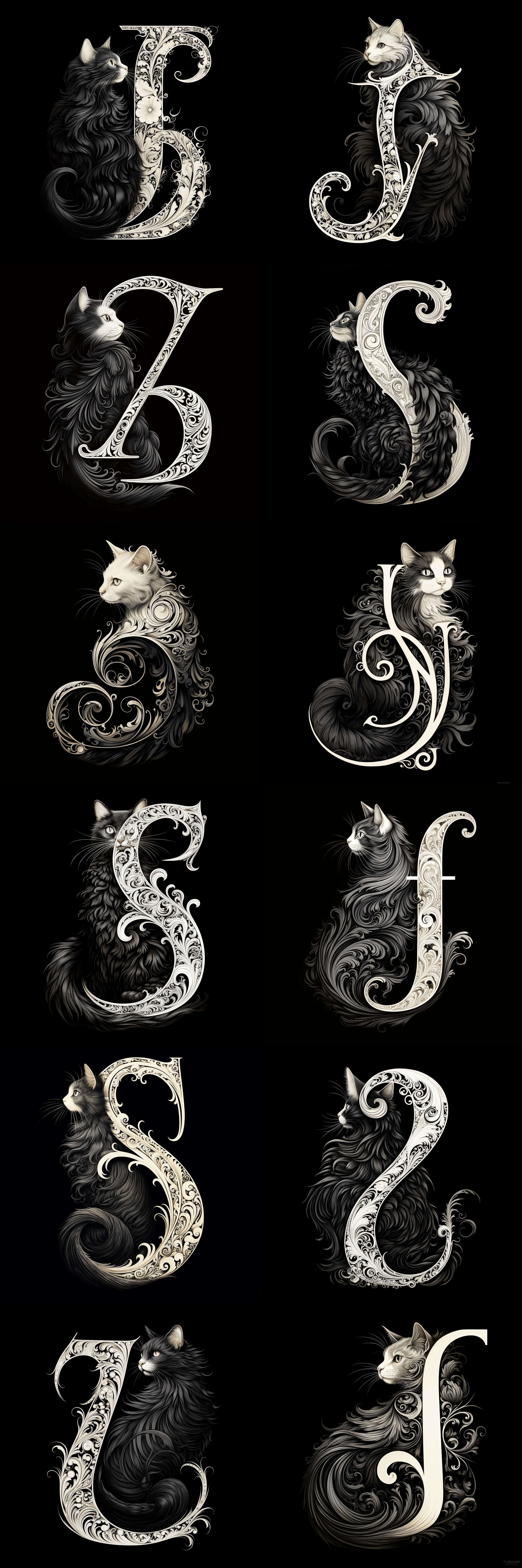
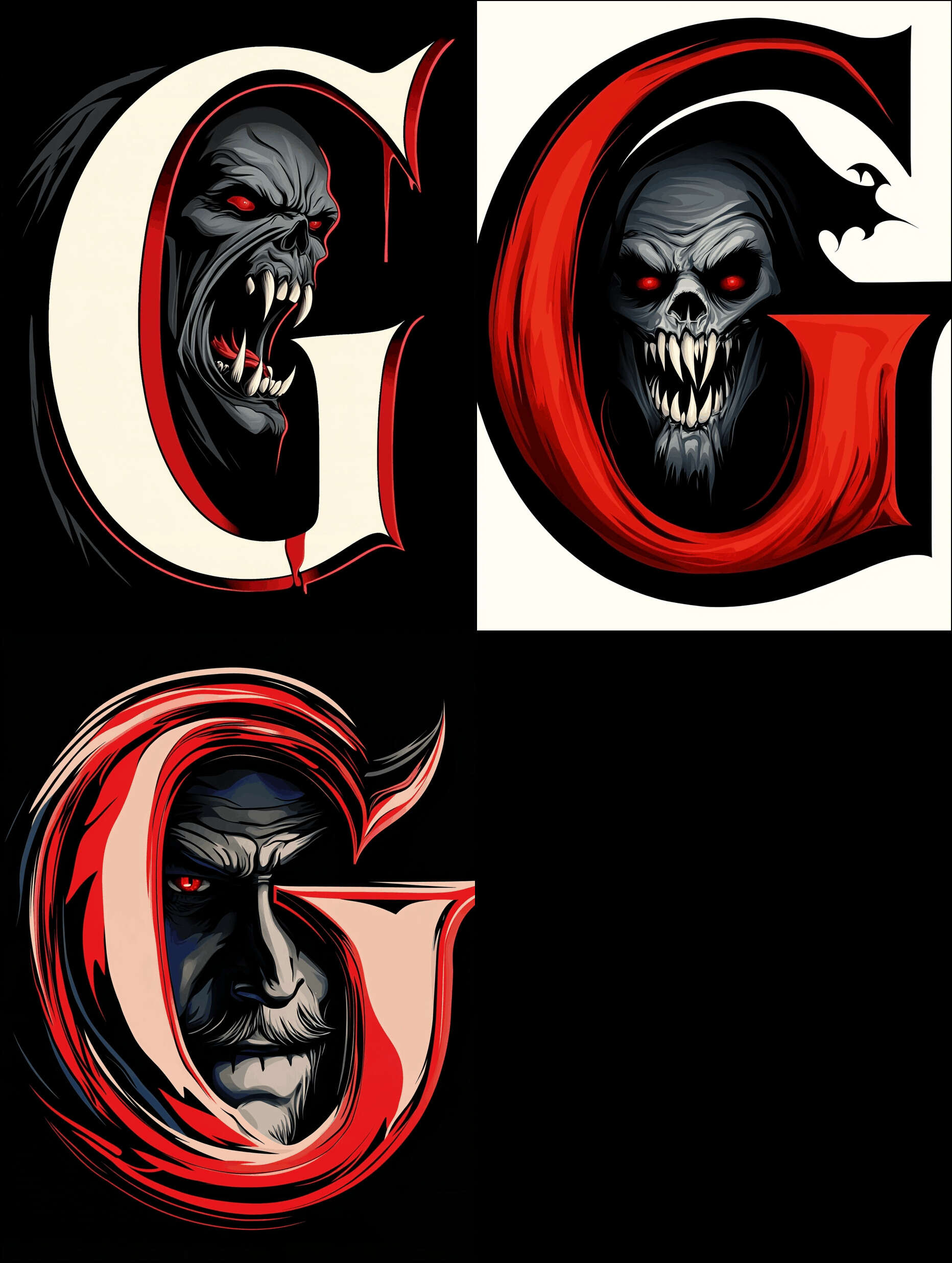
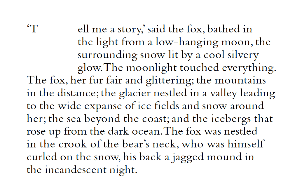
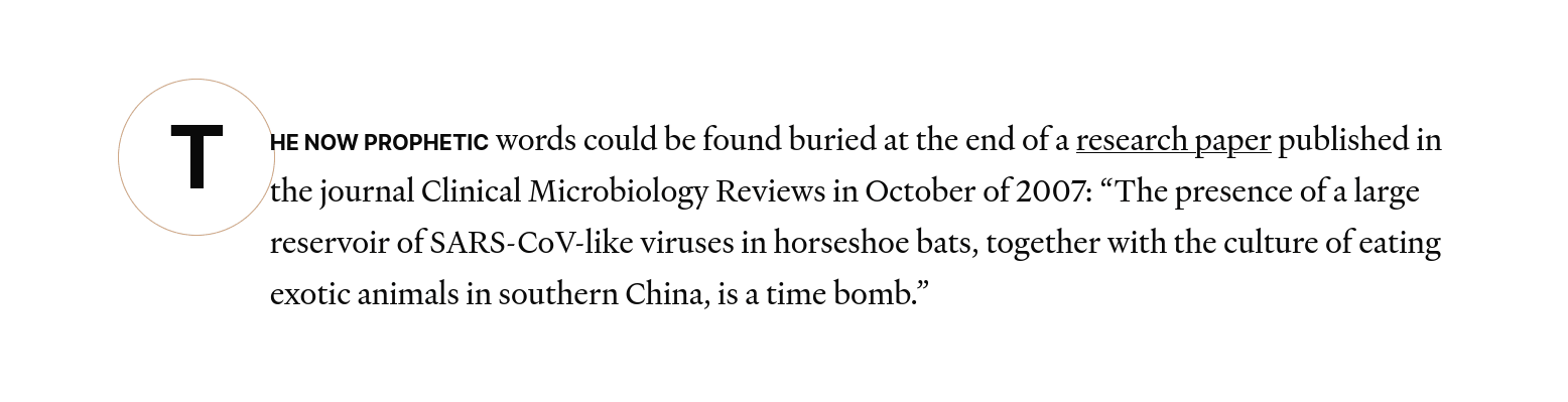
The Gene Wolfe dropcap font set is a set of light (93) & dark (72) SVG dropcaps for the letters ‘F’/‘T’/‘V’ on the theme of Gene Wolfe (wolves, horror, vampires, suns, swords etc.), generated using Midjourneyv5 in November 2023, and used to prototype our SVG workflow (CC-0 licensed). They are meant for use on my Gene Wolfe essays, which focus on his vampire & New Sun stories.
For unrelated reasons in August 2023, I was tidying up a detail in my analysis of the Gene Wolfe short story “Suzanne Delage”, a mystery I had given up as insoluble a decade before, when I abruptly solved it as a retelling of Bram Stoker’s Dracula, and began obsessively rewriting the analysis with the parallels. For kicks, I added a bit of flair from Midjourney, and then, while making the dropcats, thought that it would be neat to have some vampire-themed dropcaps to illustrate—after all, they were now so cheap & easy to generate, that it would make a good example of customized dropcaps. (I was also a little envious of the New SunFolio Society edition dropcaps by Sam Weber.)
My Wolfe essays start with ‘F’/‘T’/‘V’, so I decided to make dropcaps for those letters.
As an experiment, I asked GPT-4 for keyword suggestions about Wolfean themes which would make for good dropcaps, as some Wolfean themes like “unreliable narrator” seem like they’d be hard to convey visually. Its better suggestions were objects (“vampire”, “space ship”, “executioner sword”, “wolf”), themes (“fantasy”, “Catholic”, “Book of the New Sun”), and fonts (“blackletter”/“Textura”/“Rotunda”/“Bastarda”, “Uncial”, “Insular”, “Carolingian”, “Fraktur”, “Humanist”). I used those as seeds in writing a bunch of MJv5 prompts17 for my usual ‘brute-force, vary, and curate’ approach.
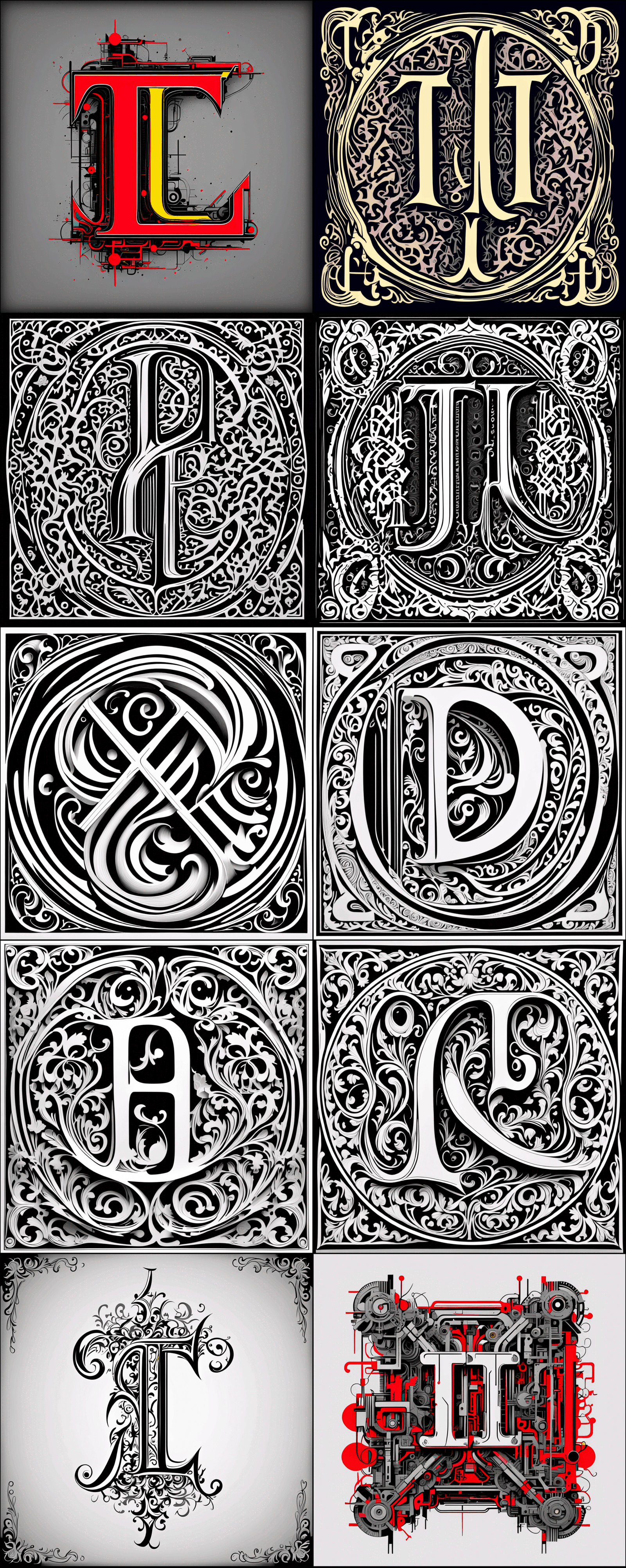
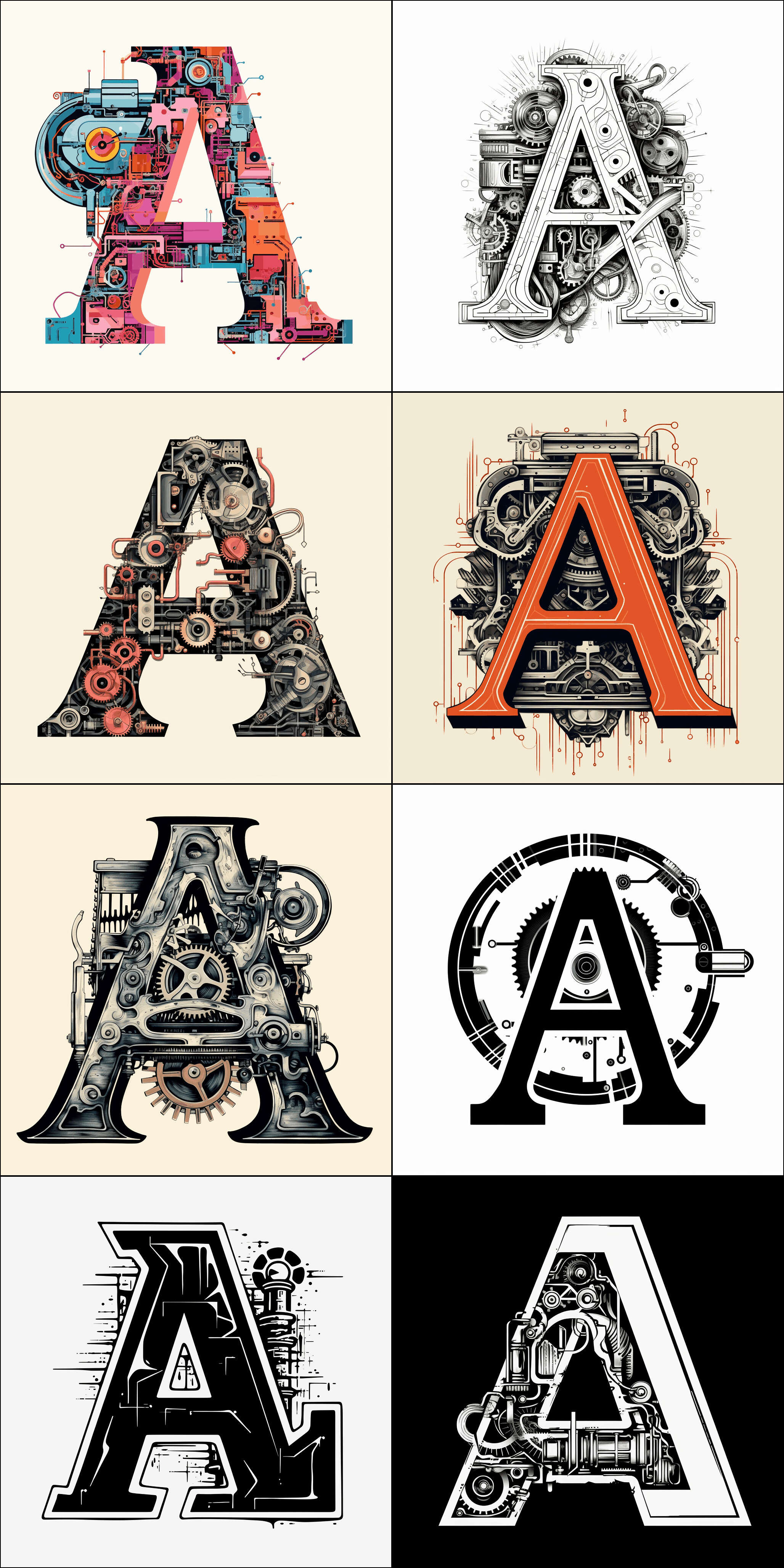
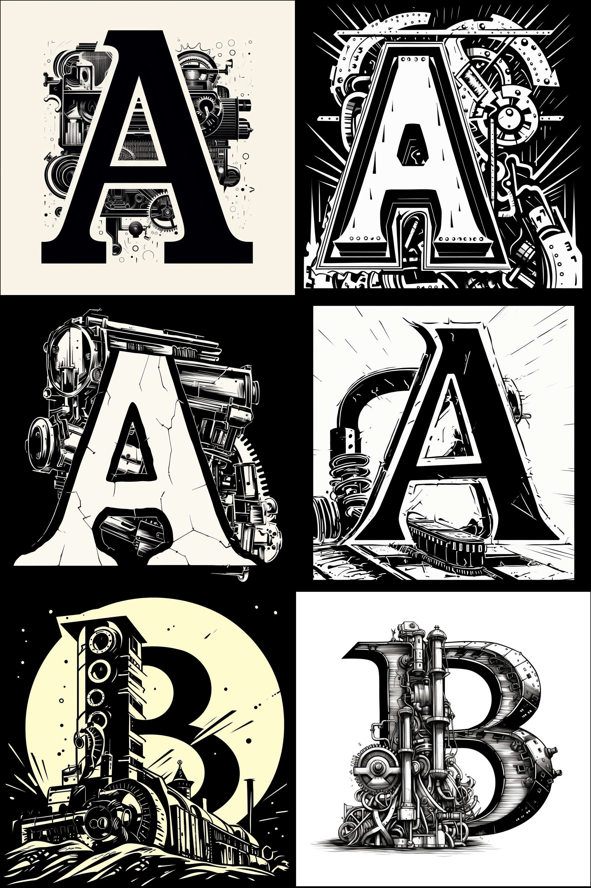
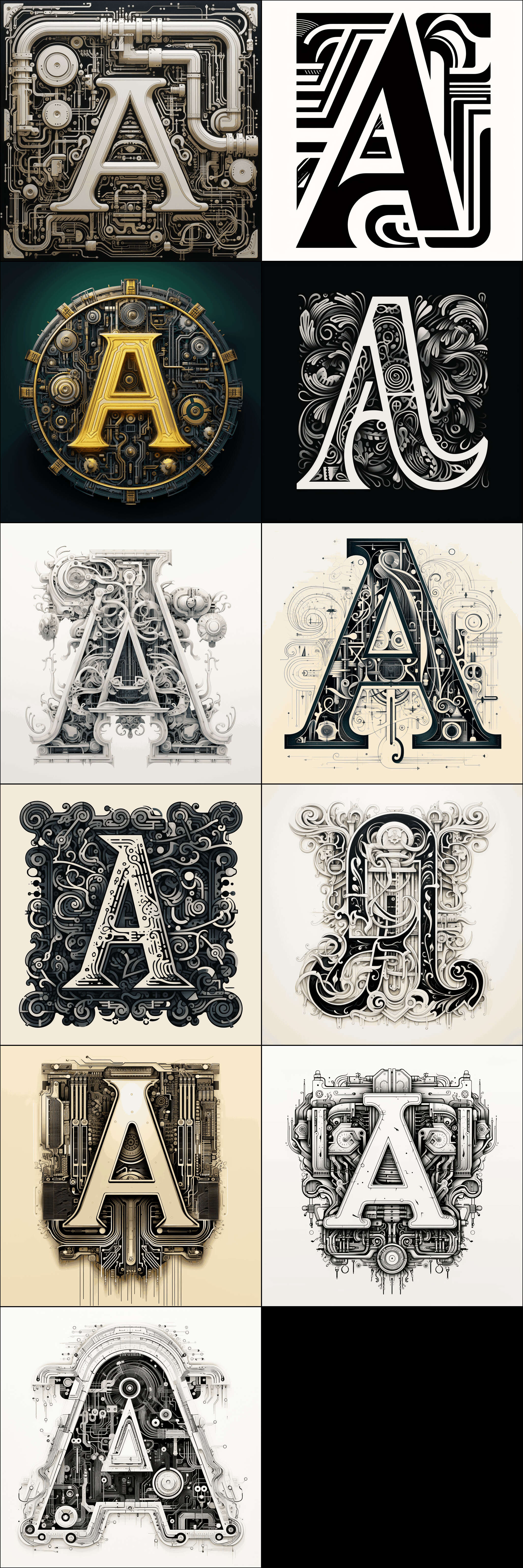
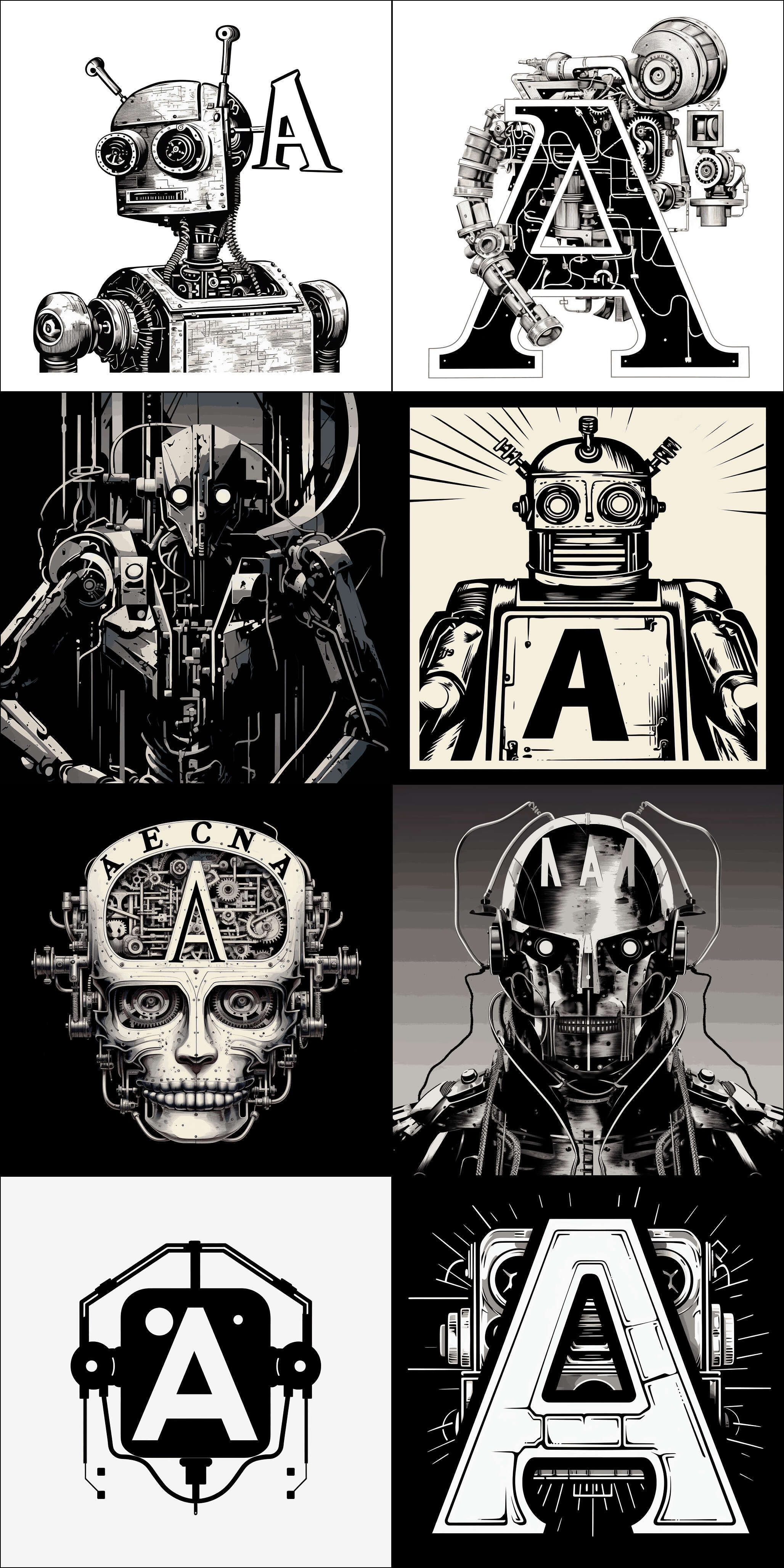
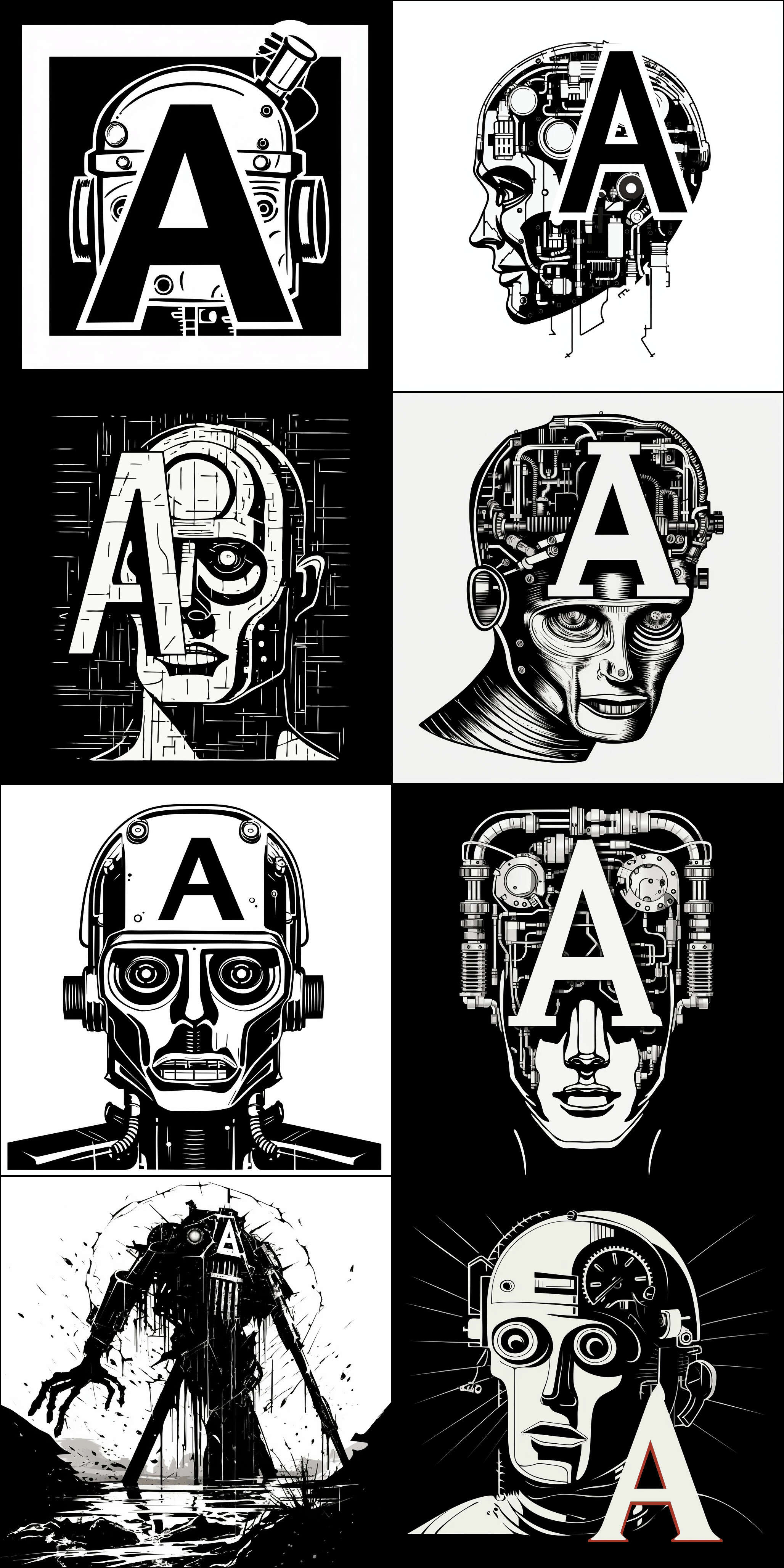
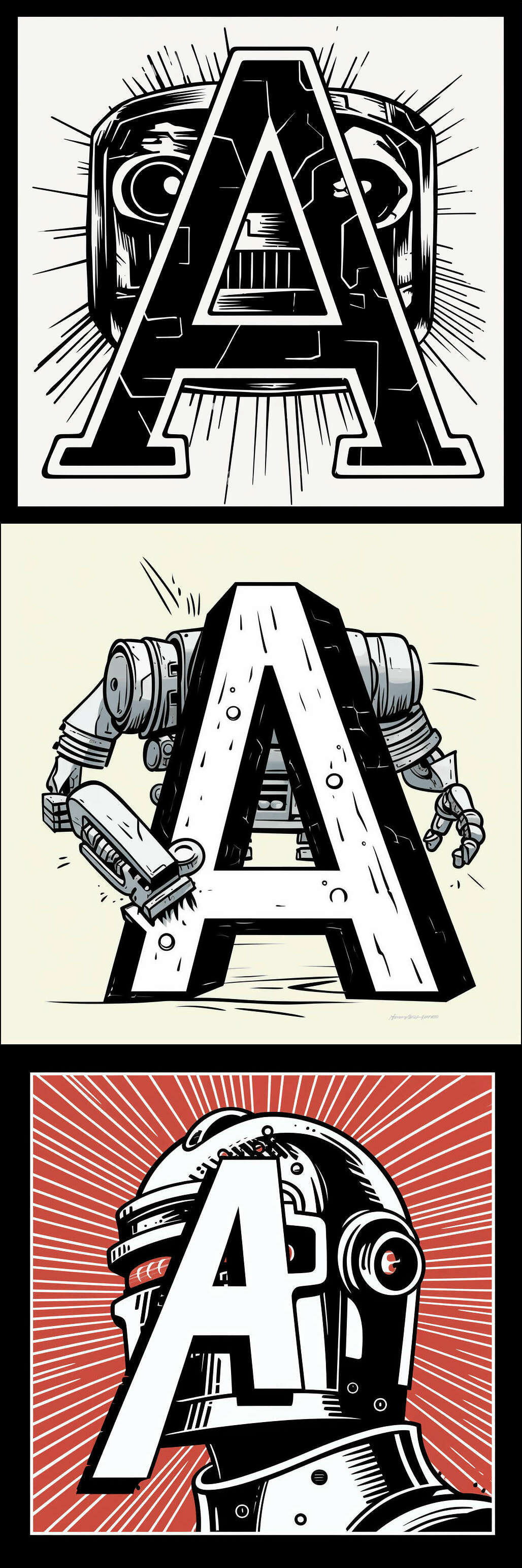
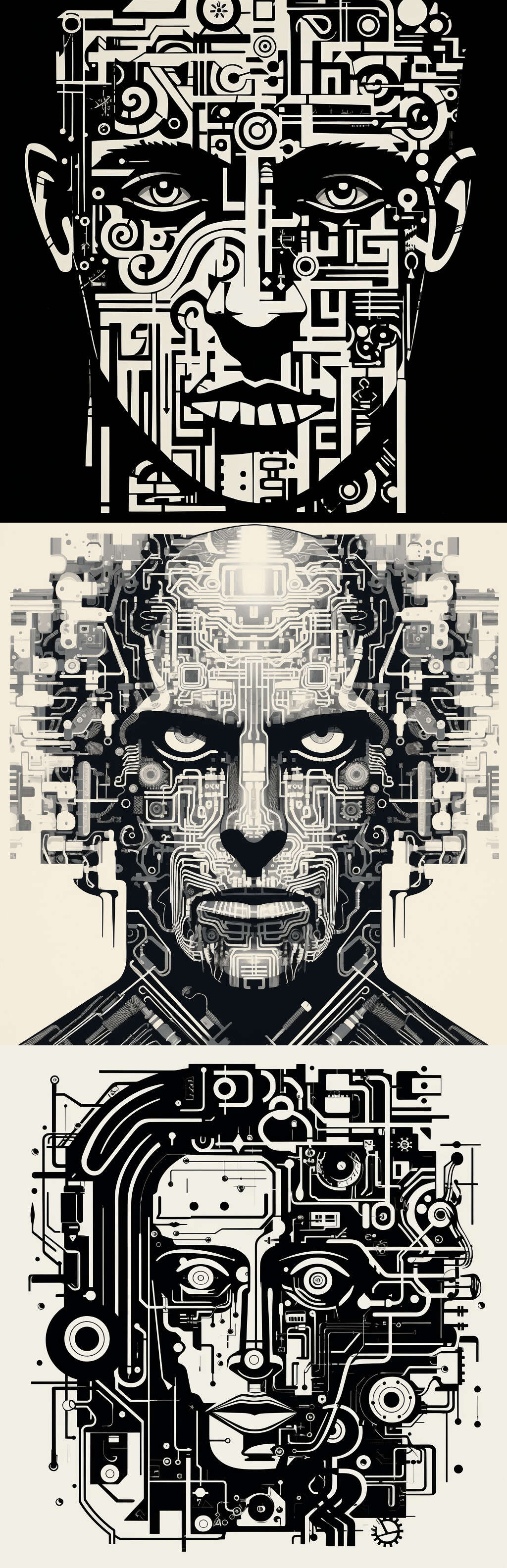
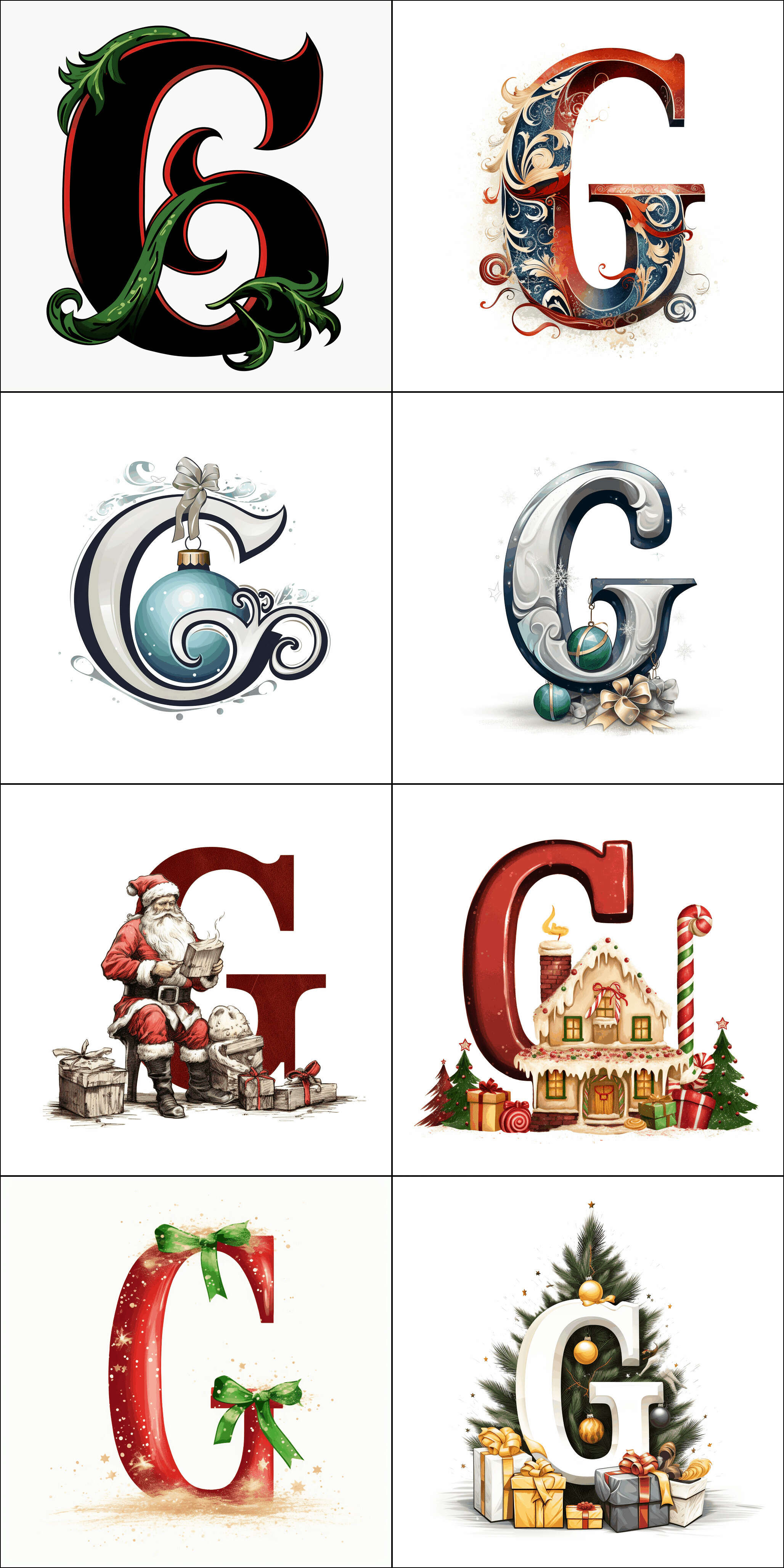
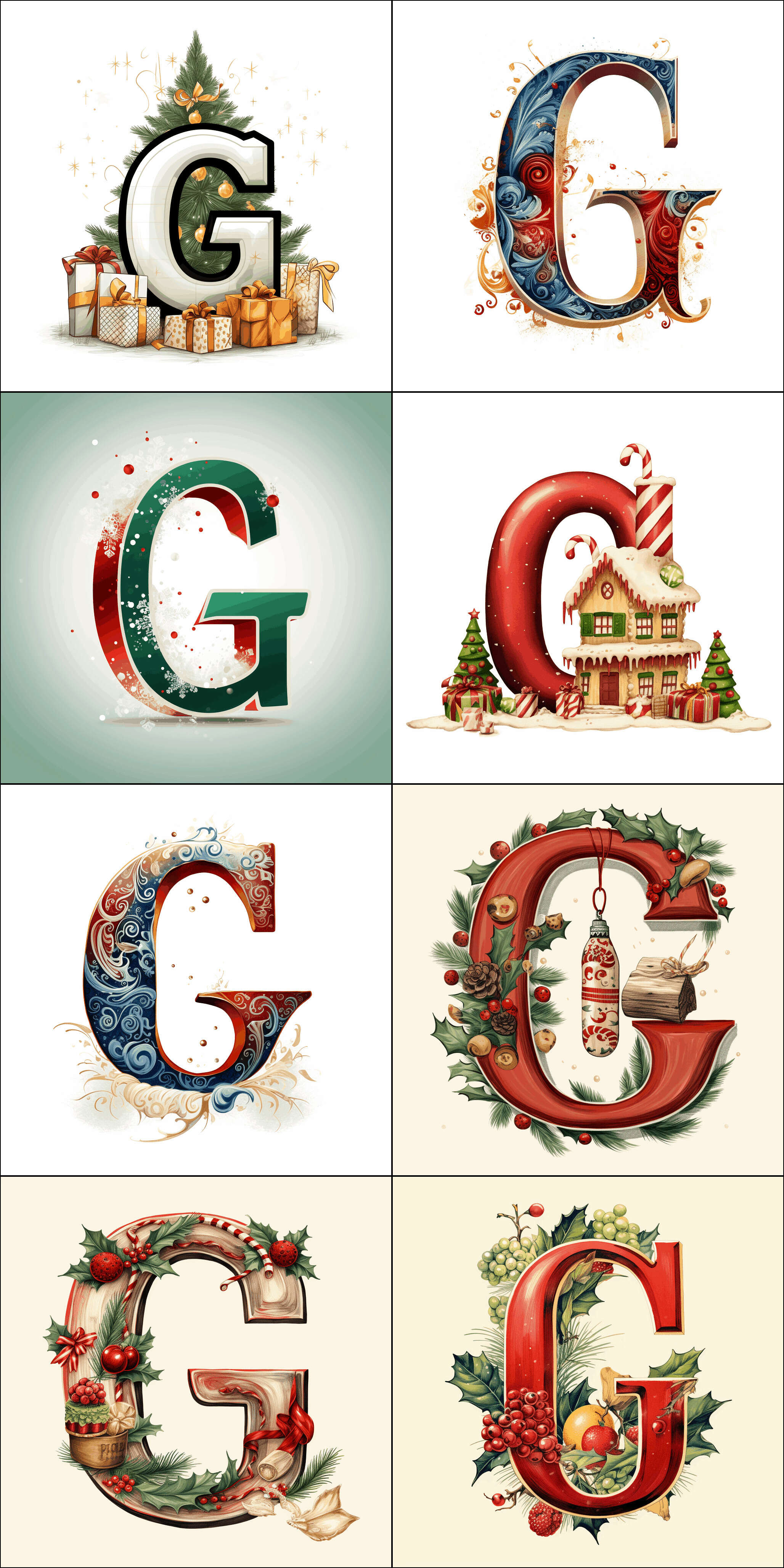
ninit is our in-progress neural-net/AI/machine/steampunk-themed dropcap set. It is intended for use in my AI articles (such as this one): I like the symmetry of using AI-created art to illustrate my AI art articles, and I have been periodically poking at AI image generators over the years to see if they were up to it. (Finally, they were.) So ninit’s name is a riff off yinit (our most common dropcap): it is a ‘neural yinit’ or ‘ninit’.
For ninit, I have been experimenting with a mix of both Midjourney & DALL·E 3: using a large number of overlapping MJ prompts for diversity, and trying out asking DALL·E 3 to generate letters in a consistent style. (I haven’t decided if I want ninit to be solely AI-generated, any style acceptable, or AI-seeming, requiring some sort of AI-related motif like robots.)
ninit is paused while we nail down the SVG workflow (no point generating lots of nice PNGs if we can’t process them into usable dropcaps).
Samples:
Light-mode:
Midjourneyv5 prompts:
Capital letter T in simple blackletter, monochrome, abstract, German, machine clockwork, simplistic vector art,
    typography, Dave gibbons, robotic expressionism, mid-century illustration, bold use of line, autopunk, cyberpunk, steampunk --no intricate complex, detailed, color, red, yellow
Capital letter T in simple blackletter, monochrome, abstract, German, machine, simplistic, vector art,
    typography, mid-century illustration, bold use of line, autopunk, cyberpunk, steampunk --no intricate complex, detailed, color, red, yellow
Capital letter T in simple fraktur blackletter, artificial intelligence, neural network, deep learning,
    human brain, perceptron, Transformer, German, linocut
Capital letter T in simple fraktur blackletter, artificial intelligence, neural network, deep learning,
    brain, German, Gothic, monochrome, linocut
Capital letter T in simple fraktur blackletter, German, Gothic, monochrome, linocut, vector,
    neural net, circuitboard, AI, SF
Capital letter 'T': a black and white drawing of a letter, high contrast, arabesque/scroll,
    striking simple design, art Deco 1969, precisionist lines and detail-oriented, quadratura, bold lettering, linocut
Capital letter 'T': a black and white drawing of a letter, simple abstract design, calligraphic arabesque/scroll,
    renaissance, art Deco 1969, precisionist lines and detail-oriented, quadratura, sabattier filter, bold lettering, simplified woodblock, linocut
Capital letter 'T': a black and white drawing of a decorative fancy ornamental letter, simple abstract design,
    calligraphic arabesque/scroll, renaissance, art Deco 1969, precisionist lines and detail-oriented, quadratura, sabattier filter, bold, woodblock, linocut
Capital letter 'T': a black and white drawing of a decorative fancy letter, arabesque/scroll,
    quadratura, paper cut-outs, art nouveau, precisionist lines and detail-oriented, quadratura, sabattier filter, bold lettering, high resolution
Capital letter T, initial, dropcap, Fraktur, yinit, blackletter, monochrome, black and white,
    vector art, simplified outline

A minimalist black-and-white dropcap letter 'D' intertwined with a stylized neural network pattern,
    encapsulating the theme of artificial intelligence.
An elegant capital letter 'D' in black and white, with a subtle background of interconnected nodes and lines representing a machine learning model.
"A sleek and modern dropcap letter 'D' with a digital circuit design,
    reflecting the concept of generative AI, in a monochrome palette."
"The letter 'D' designed as if composed of tiny, pixelated bits, symbolizing digital data processing,
    in stark black and white contrast."
"A dropcap letter 'D' where the inner spaces are filled with a binary code pattern, evoking the theme of computing and AI,
    in black and white."
"A sleek dropcap letter 'D' with a shadow of binary code cascading down the page, symbolizing data flow in AI,
    all presented in a monochromatic scheme."
"A capital letter 'D' designed with a fluid, organic network of neurons, capturing the dynamism of a neural network in a black-and-white color palette."
"A bold dropcap letter 'D' merged with an abstract representation of a computer chip's intricate pathways,
    emphasizing the hardware aspect of AI, in grayscale tones."
"A minimalist 'D' where the contours are made of a continuous line that loops and winds like an algorithm's path,
    depicted in high-contrast black and white."
"The letter 'D' portrayed with a matrix of tiny, scattered pixels that seem to be self-assembling,
    reflecting the self-learning aspect of AI, executed in stark black-and-white."
  "A bold dropcap letter 'D' with a clear silhouette of a neural network, stylized with broad strokes for visibility at small sizes,
    in black and white."
"A capital letter 'D' incorporating a simple, stylized digital circuit design, with visible lines and nodes for clarity when scaled down,
    in monochrome."
"The letter 'D' with a prominent binary code pattern inside its form, designed with contrasting black and white areas for legibility at 150x150px."
"A minimalist 'D' designed with a single,
    thick winding line that suggests an algorithm's path, in a high-contrast black-and-white style suitable for small dimensions."
"A dropcap 'D' in a chunky pixel art style, resembling the building blocks of digital imagery,
    easily discernible when resized to a small scale, in grayscale."
A minimalist 'D' designed with a single, thick winding line that suggests an algorithm's path,
    in a high-contrast black-and-white style suitable for small dimensions. The letter 'D' should be clearly visible and the winding line should be thick enough to be discernible even when scaled down. The overall design should emphasize simplicity and clarity, with strong contrast between black and white to ensure visibility at a small scale.
A minimalist capital letter 'I' with a motif that mimics a vertical data stream, represented in high-contrast black-and-white suitable for small dimensions.
A minimalist capital letter 'H' featuring a design that resembles a digital bridge structure,
    in high-contrast black-and-white suitable for small dimensions.
A minimalist capital letter 'G' with an abstract design of a simplified chip-like pattern, in high-contrast black-and-white suitable for small dimensions.
A minimalist capital letter 'F' with a design inspired by circuit board traces,
    bold and readable, in high-contrast black-and-white suitable for small dimensions.
A minimalist capital letter 'E' crafted with bold, digital block patterns, suggestive of pixelation,
    in high-contrast black-and-white suitable for small dimensions.
A minimalist capital letter 'C' with a motif of stylized digital waveforms, representing data transmission,
    in high-contrast black-and-white suitable for small dimensions.
A minimalist capital letter 'B' with a design featuring clean lines and geometric shapes that imply a computational theme,
    in a high-contrast black-and-white style suitable for small dimensions.
A minimalist capital letter 'A' designed with a thick, abstract line suggesting a digital flow,
    in high-contrast black-and-white style suitable for small dimensions.
A minimalist capital letter 'D' designed with a single, thick winding line that suggests an algorithm's path,
    in a high-contrast black-and-white style suitable for small dimensions.
Curated light-mode samples (by style):
A/C: floral
A–C: circuits
C: abstract
Dark-mode:
Midjourneyv5 prompts:
large capital letter C in blackletter, monochrome, artificial intelligence, neural network,
    deep learning, perceptron, clean, abstract, German, linocut, vector, outline, machine clockwork simplistic vector art, comic book cover, typography, Dave gibbons, robotic expressionism, mid-century illustration, bold use of line, autopunk, steampunk --no intricate, complex, detailed, color, inverted, negated
Capital letter C in simple fraktur blackletter, vintage, Art Deco style, monochrome, linocut,
    vector
the letter C on the old black and white illustration, in the style of futurist dynamism, Victorian-inspired illustrations,
    dark indigo and light beige, i can't believe how beautiful this is, poster art, woodcut, science fiction influences
Capital letter 'C': a black and white drawing of a letter, high contrast, arabesque/scroll,
    striking simple design, art Deco 1969, precisionist lines and detail-oriented, quadratura, bold lettering, linocut
vintage ornate letter C, text or wedding design vector illustration, in the style of highly detailed foliage,
    light black and light beige, writer academia, graphic illustration, revived historic art forms, high-angle, lettering mastery
Capital letter 'C': a black and white drawing of a decorative fancy ornamental letter, simple designs,
    swirling vortex, calligraphic arabesque/scroll, quadratura, art nouveau (1860–1969), precisionist lines and detail-oriented, quadratura, sabattier filter, bold lettering, low resolution, simplified
Capital letter C, initial dropcap, white on black, dark-mode, artificial intelligence, neural network,
deep learning, brain, German, Gothic, monochrome, linocut Capital letter C, initial dropcap, white on black,
    machine, moon
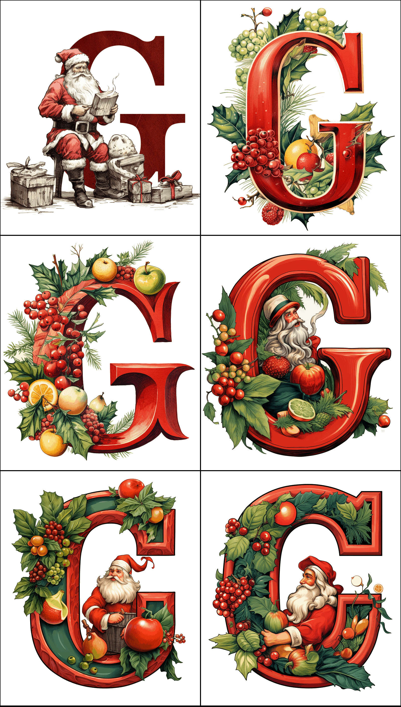
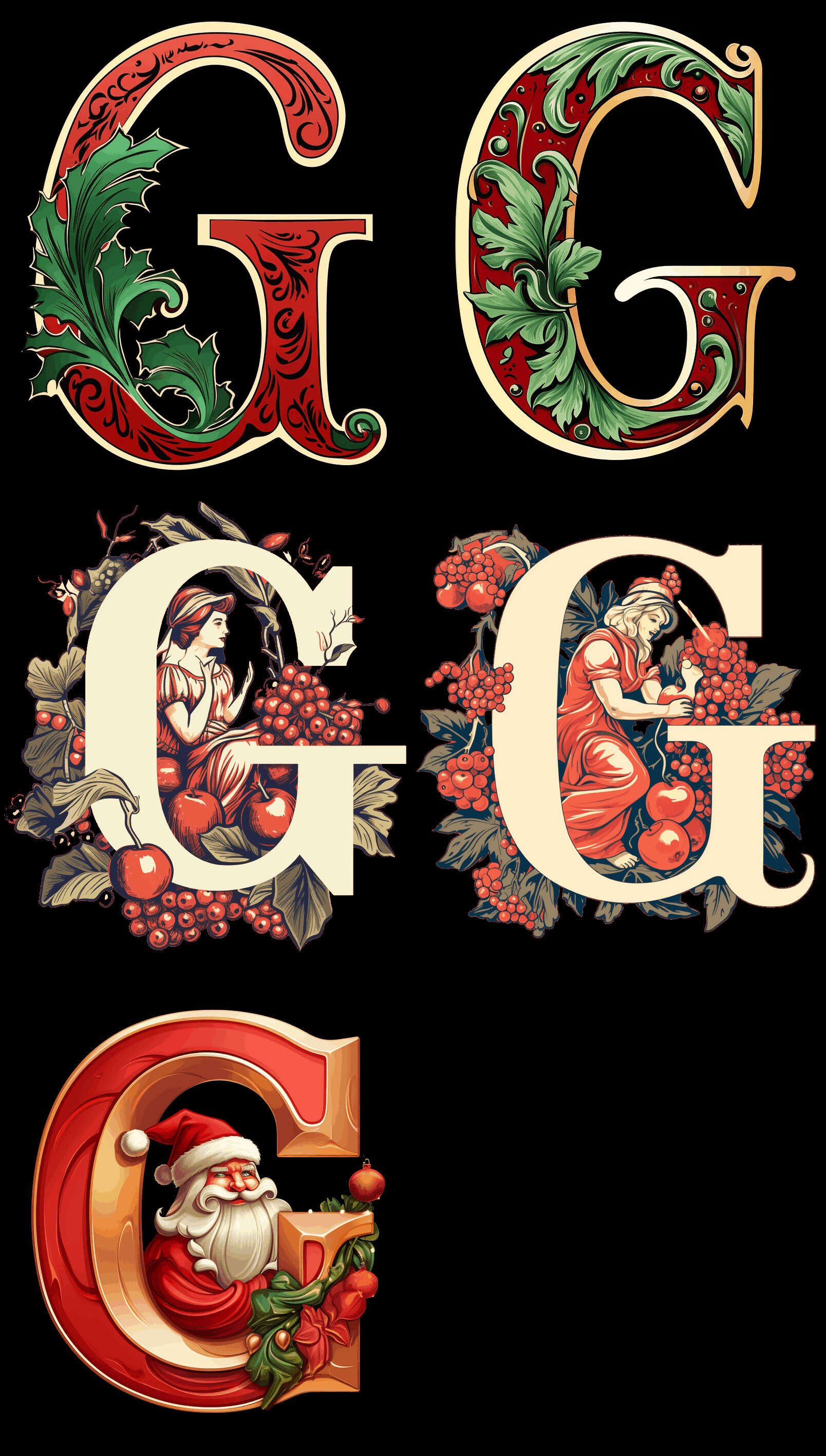
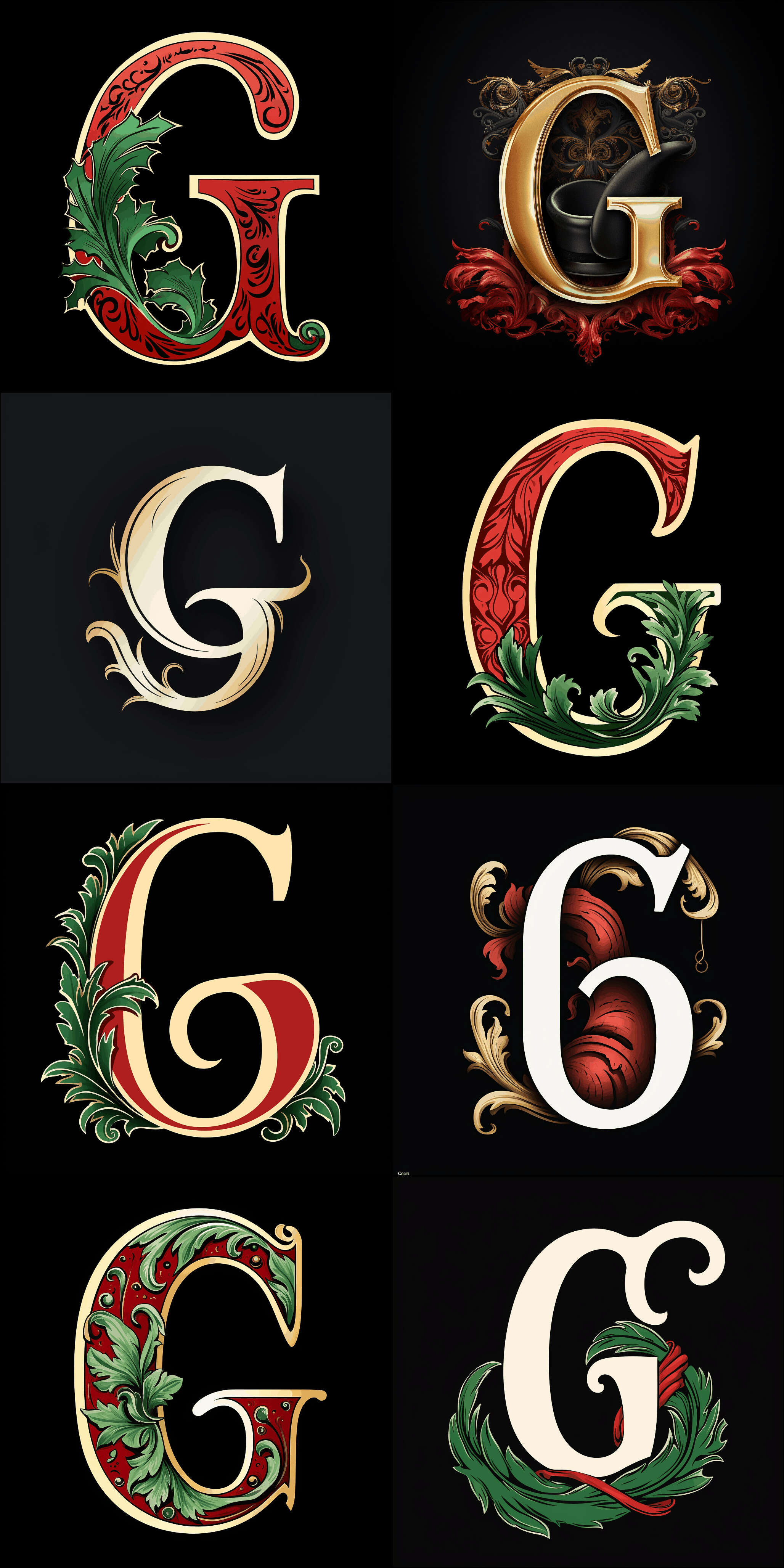
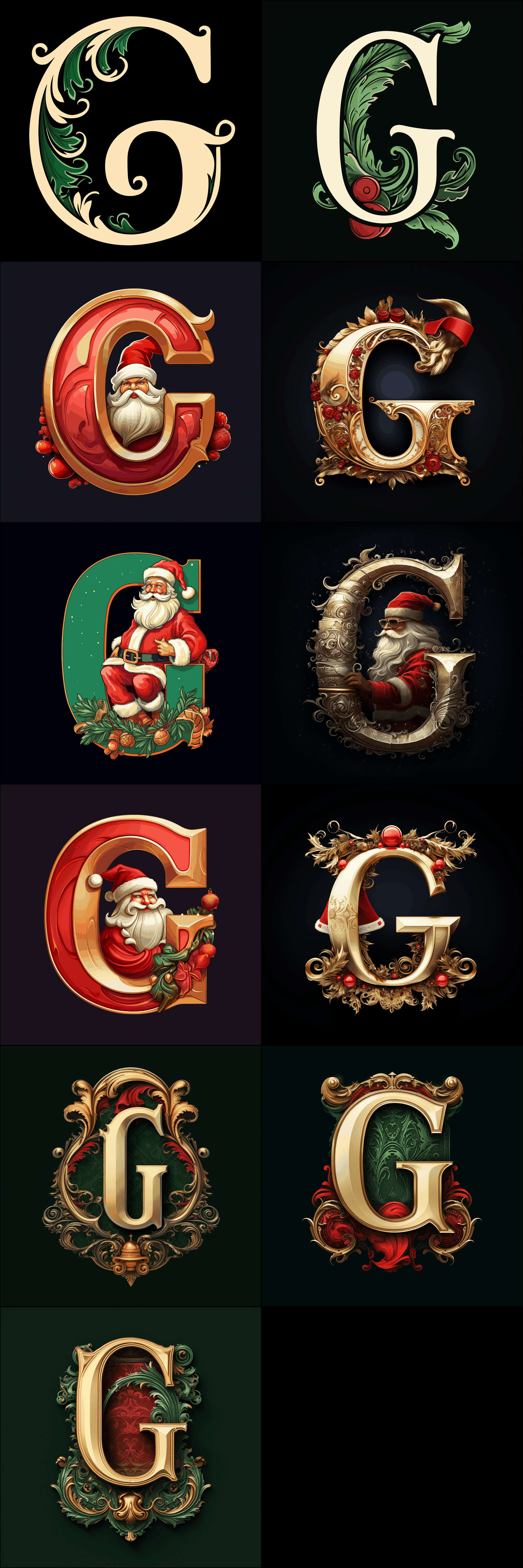
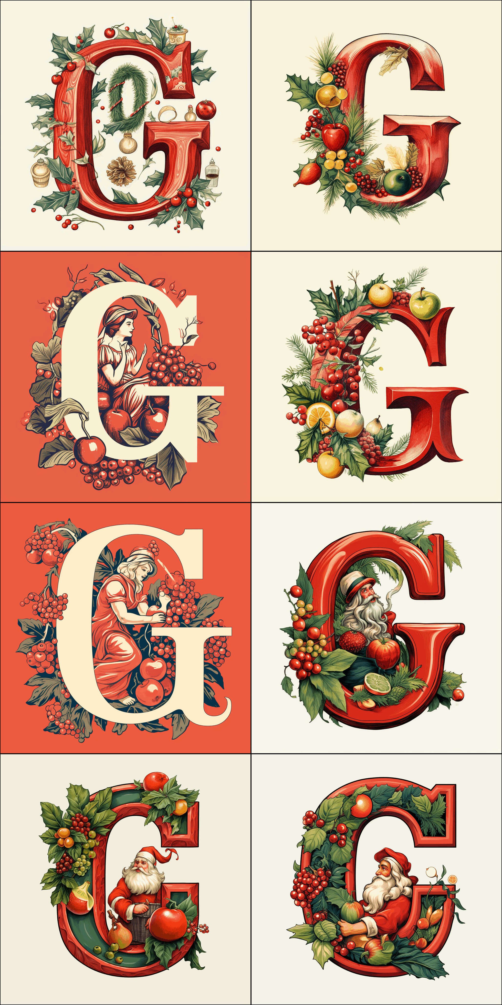
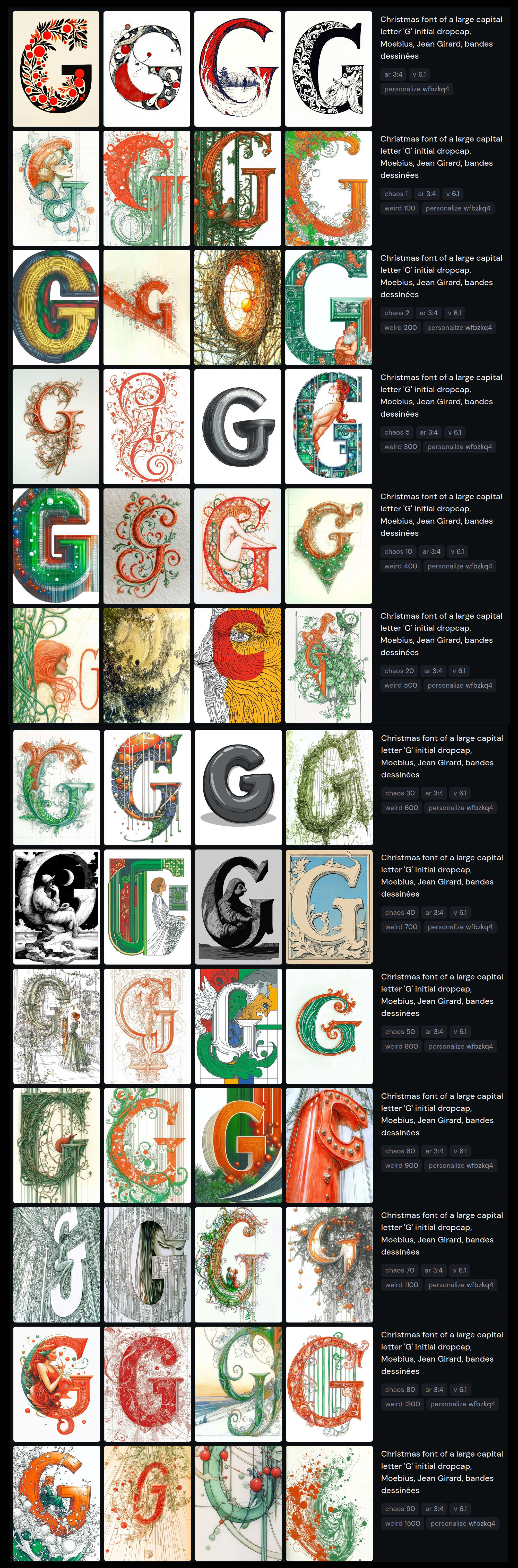
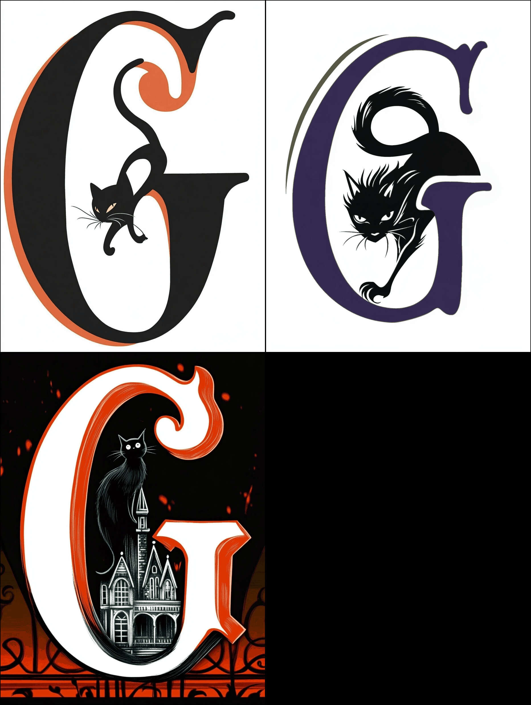
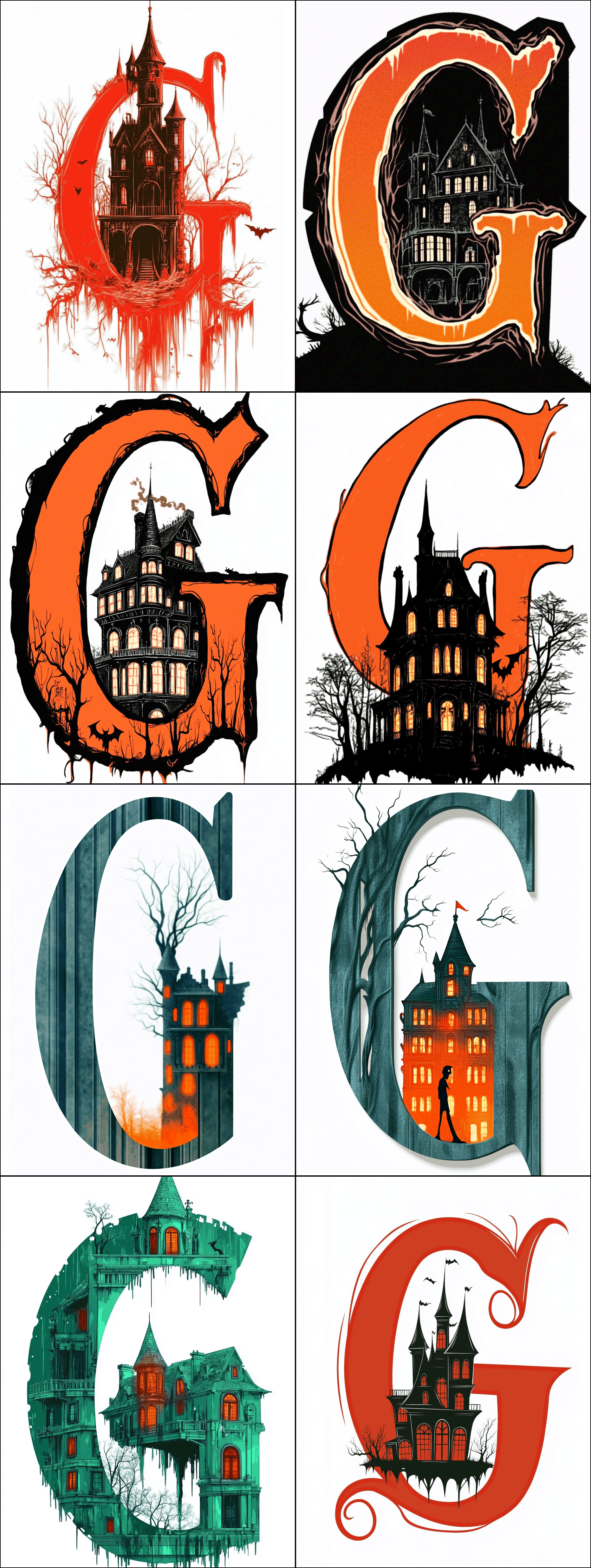
Gwern.net (like all the best Web 1.0 websites) supports time-limited holiday themes like Christmas & Halloween modes. For these modes, in addition to some CSS styling changes, we changes the website logo to a more festive ‘G’ logo (CC-0 licensed).
These logos were generated by uploading a PNG of the site logo to Midjourneyv5 & modifying it with a prompt. They were then processed like the dropcats and the holiday JS replaces the original logo as appropriate.
Because holiday logos are so time-limited and will not wear out their welcome, I don’t try to maximize variety. They should be relatively easy to make, so you can create new ones each year.
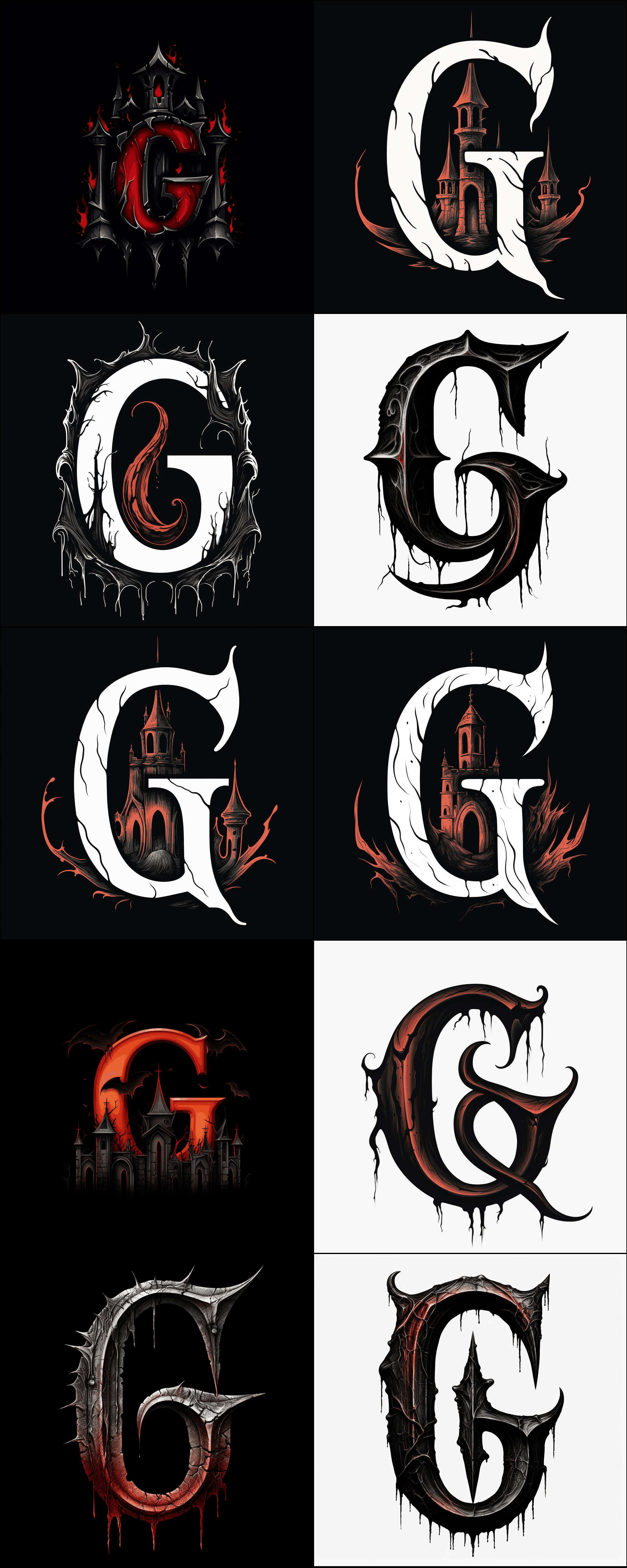
We started in 2023 with just 1 dark ‘G’ logo, because Halloween mode forcibly turns on dark-mode, and we didn’t like most of the dark logos and didn’t feel we needed more than one, because this one was so cool:
The 2023 Gwern.net halloween logo.
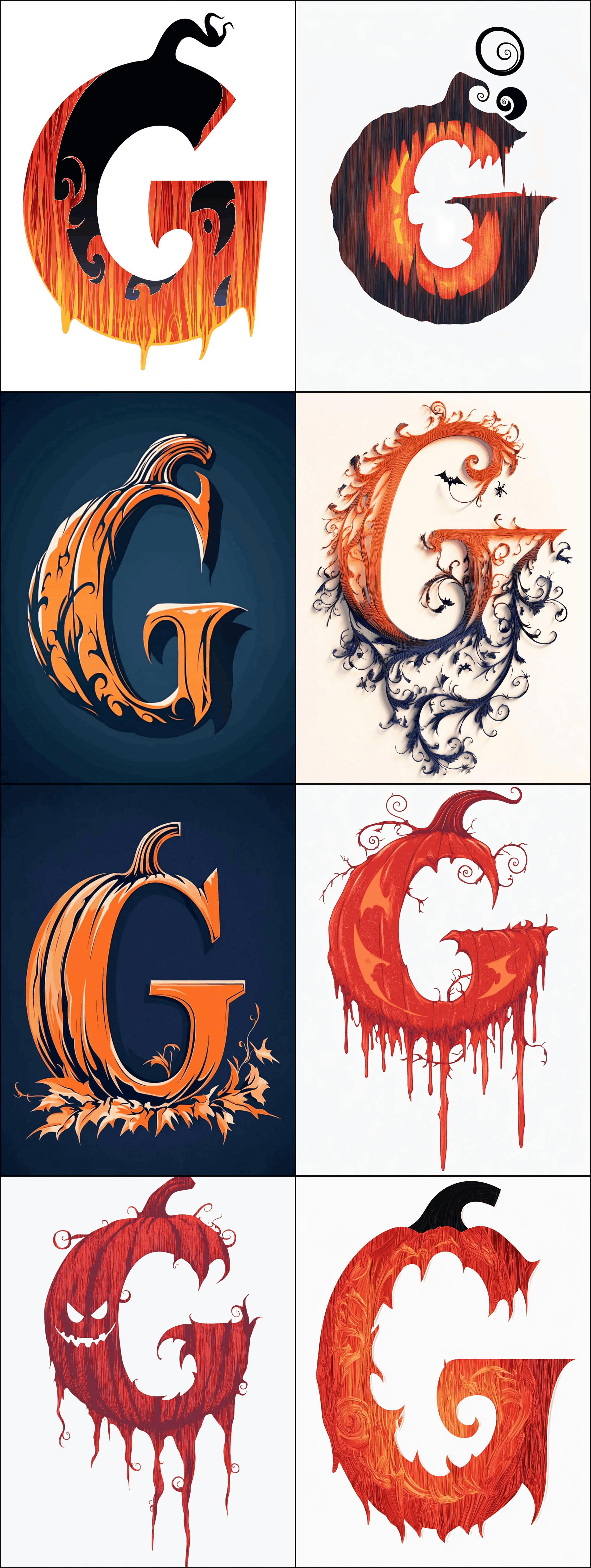
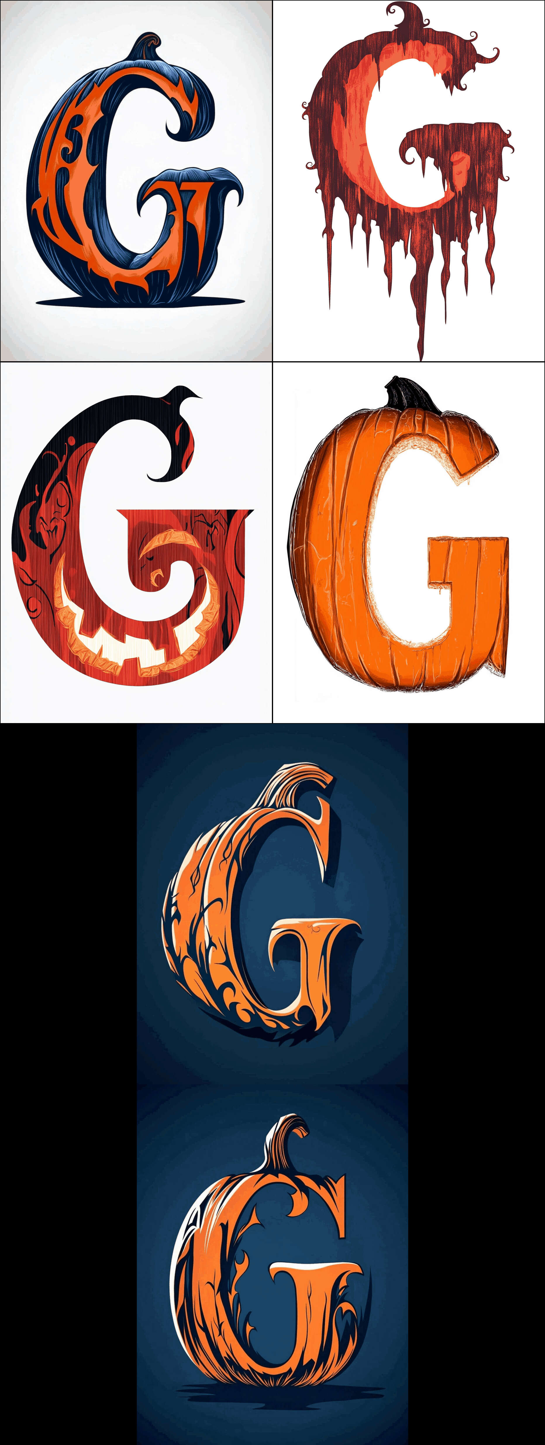
For 2024, after making heavy use of personalization (fzckpni; eg), I tried again, and additionally enabled image style references to the 2023 castle & site logo, and the new chaos/weird hyperparameters. (Which seemed to help albeit apparently at the cost of introducing ‘JPEG artifacts’, amusingly; eg. 1, 2.18)
I worked my way through sets of black cats, Dracula, haunted mansions/castles, pumpkins, and spiders; we ultimately added another 10:
Some of the final candidate samples:
2024 Gwern.net halloween logo Midjourneyv6 samples: first set.
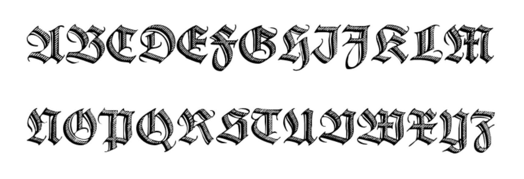
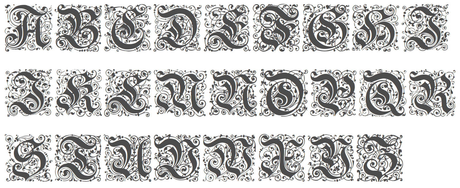
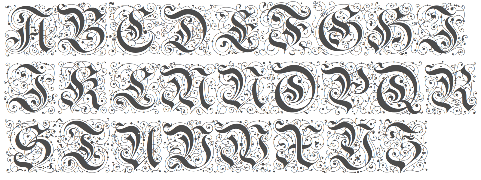
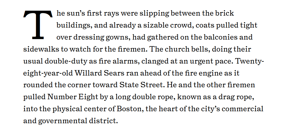
Goudy Initialen(test) is one of the most famous dropcap sets around, and one you’ve seen before, as it is the paradigmatic Art Deco/Arts & Crafts medieval-floral initial set.
The original Goudy initials were designed by Frederic Goudy for the 1913113yaCloister font, and have been digitized or revived or modified several times (it’s even availablecolorized). Goudy Initialen appears to be another Dieter Steffmann digitization.
Goudy is used with more contemporary literary (eg. Vectors 3.0) or (if they are not too technical) biological pages (the invention of breeding); whether a page gets Cheshire or Goudy right now mostly depends on how overused I feel Goudy has become, and more dropcaps would be useful to make more principled distinctions here (2023-11-05: 59 uses).
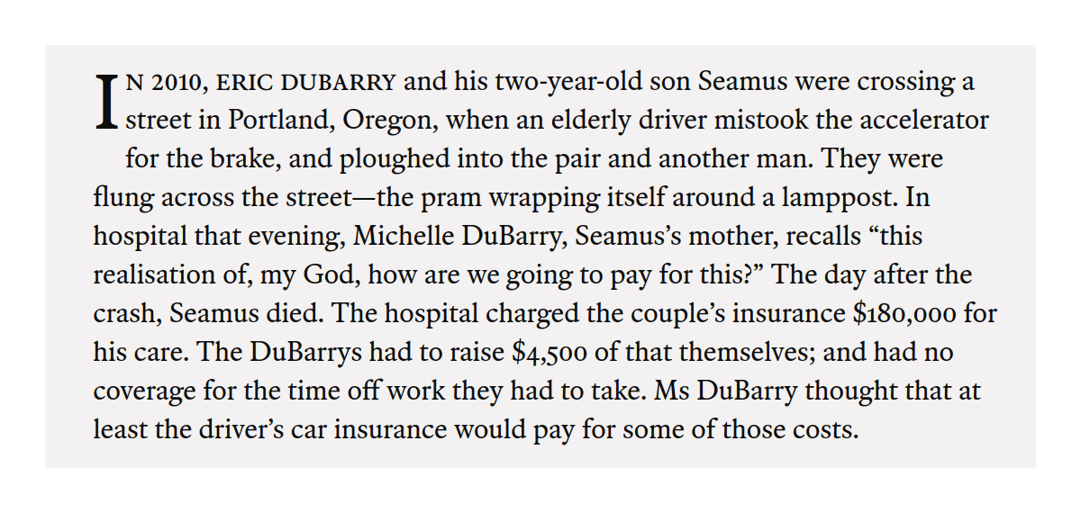
Deutsche Zierschrift is the ‘default’ dropcap (2023-11-05: 180 uses), and is used on pages which don’t clearly fit into one of the more specific dropcaps; aside from newsletters (eg. May 2021), it covers topics like economics (“Ordinary Life Improvements”), psychology (impossibility of retrocognitive knowledge), or Wikipedia.
As the breakdown suggests, there are some balance issues: Cheshire is not used half as much as 3 of them, while Deutsche Zierschrift is overused at almost half the pages.19 Reallocating would struggle to balance them without diluting the meaning, and we felt that the original quintet had gotten a bit boring while most reader reaction was positive—so why not add more?
We have not yet added any more ‘traditional’ dropcaps fonts, but our first pass through Said Achmiz’s font library turned up relatively few candidates: while there may seem to be hundreds, most dropcap fonts are generally either too eccentrically-specific, half-finished, or just low-quality. In many cases, we held onto a candidate which is not a dropcap at all but simply is a display font with rather fancy capitals. Our first-pass candidates:
Blackletter (Kanzlei/yinit) alternatives, allowing a refinement (perhaps moving some pages from Deutsch Zierschrift to ‘below’ Kanzlei):
One nifty approach to using dropcaps in a robust way is to either surround them with an outline like a circle or square (eg. Nautilus puts them in a black-outlined square, Time using a half-square rubricated outline, or a Medium publisher in a solid black circle) or surround them with a colored block (inverting it) like The Nation. The Daily Beast combines a dropcap with rubrication, outlining, and a drop shadow! This sort of outline approach lets one make the dropcap large and so a fixed size, bypassing many implementation issues, while still looking good. (Although one can still screw it up, like Undark does.) Another robust way is to simply use the dropcap as a drop shadow, putting it in the background of the text entirely—although I don’t like this approach because it feels both cluttered & pointless. (An odd one is the Diplomatic Courier’s decision to add a rubricated red dot and an underline—I’m not sure why they do either!)↩︎
A flaw of dropcaps is that they generally convey little about a specific passage or text: a set of Goudy dropcaps used in a book may look good, but they do not mean anything other than ‘this is the letter “A”’ etc. This is a reason to object to the use of fancy dropcaps: they add complexity, but not meaning, and clutter a page.
However, this is not an intrinsic limitation of dropcaps, as the occasional use of one-off dropcaps prove: for example, the Robert Jordan Wheel of Time chapter icons reflect the content, and sometimes are subtle hints as to what is really going on in that chapter—and rather than being clutter, fans always note what icon is used where and get excited when a new icon appears.
The reason dropcaps are not regularly used in this semantic way, tailored to the text itself, is merely an economic one—it just hasn’t been feasible (in time or skill or technology or labor) for most dropcap users (who are not authors of international best-selling novel series) to use a custom dropcap, as much as they might like to.
So, the ability to customize dropcaps with generative models & SVGs helps resolve this dropcap flaw. It moves dropcaps closer to their medieval origins in historiated initials, where the scribe or illustrator has customized each one to its context—a historiated ‘A’ is not some fancy ‘A’ just for pretty, it usefully illustrates the following passage.↩︎
This would be difficult when using fonts in the normal way: despite it being a common feature request (particularly for handwriting fonts), TTFs do not easily support random choice. (The usual workaround is to define ligatures which are complicated enough that they look pseudorandom, or to define many ‘alternates’, and have the user somehow randomize the choice.) In our case, because we would subset the font file for performance, this would be trivial: we simply randomize either at compile-time or runtime which of the, say, dozen TTFs for ‘A’.↩︎
Size matters greatly. Image generators now tend to operate at 512–1024px ‘natively’, but a dropcap’s on-screen height is ≤188px; this helps by shrinking away the nonsensical details & ‘greebles’ that bother people in AI art—can’t have problems with hands if the hands are just a few pixels!—but also means that the final dropcap may look ‘cluttered’ or effects lost. So a great-looking 1024px dropcap PNG may have to be discarded, while a clearly glitchy one may look great scaled-down and be kept.↩︎
To select samples, I would ‘upscale’ them before ‘varying’ & downloading them; as long as they were decent, I would also hit the 🖤 ‘heart’ button to rate/upvote them, to help Midjourney out (because it was clearly so confused about letter-shapes & needed all the feedback it could get).
It turns out MJ rewards the top few frequent raters with free ‘GPU-hours’ and this wound up earning me the equivalent of a month’s subscription or two. (I guess most MJ users spend little time rating, if I could wind up in the top several times?)↩︎
I spent a large fraction of my Midjourney time just tediously downloading images one… by… one… through its awful Discord UI, in order to save & curate them. Midjourney has since developed a website which improves matters; and in any case, that sort of time-waste is obviously only temporary and not intrinsic to the image-generating process.↩︎
I was curious how much it would cost to commission human dropcaps; I couldn’t find any listed prices on public marketplaces like Fiverr or Dribble, and the artists I contacted ghosted me (so I could not commission a dropcap or two for direct comparison of quality, cost, and ease of use)
But for comparison, the sorts of one-off images one might see on a Magic: The Gathering card or D&D sourcebook apparently start at$124.42$1002021 and can go up to $12,442.2$10,0002021 as of 2021. Presumably a dropcap which has been properly vectorized & converted into a TTF which can be used as-is in a web page would cost even more given how recondite that format is.↩︎
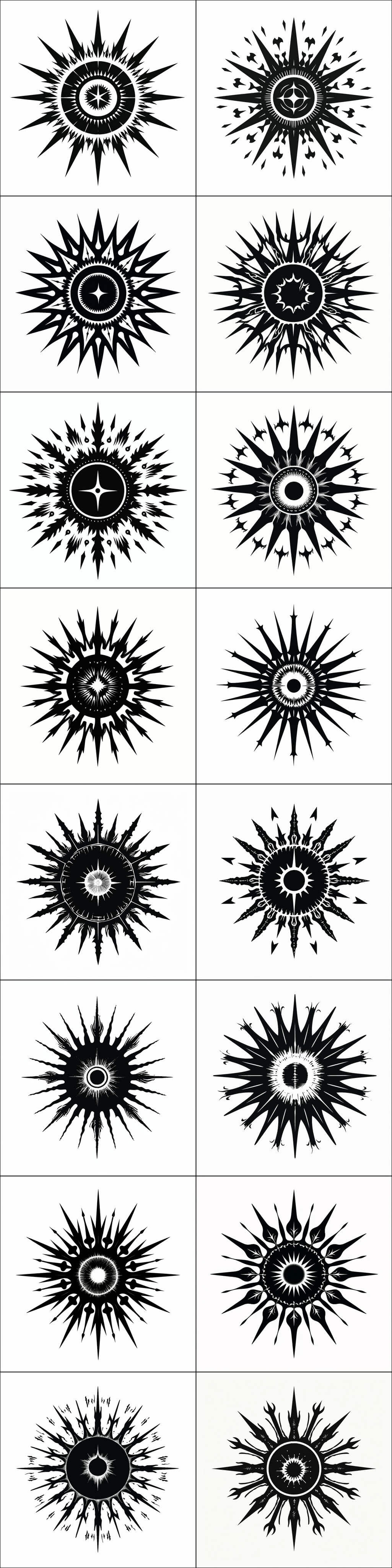
The black suns were a misfire of the prompt “Capital letter F in simple blackletter (Carolingian), monochrome, abstract, Gene Wolfe, science fiction, German, simplistic vector art, typography, Book of the New Sun, Catholicism, white background, black text, white-on-black”; I’m not sure how that yielded samples like these:
16 ‘black sun’ symmetrical starburst samples from a failed Gene Wolfe dropcap prompt.
But I was fascinated by them and went a little nuts generating ‘vary strong’ samples to see how many different ones MJv5 could do—a lot, it turns out.
Some reverse-image searches suggests that this region might be caused by “flash”tattoo artist samples. (There are surprisingly many samples of tattoo artwork online, and the constraints of tattoos may make them especially useful or paradigmatic examples for image generators.)↩︎
Vector generation in general could be improved a lot; my suggestion is to go all-out on sequence modeling & multimodality. In lieu of that, a more tailored solution would be to generate lots of data from font files.
Fonts allow easy synthetic data generation: one would just take 100k TTFs from the previous work or scrape it oneself, and then generate a few million screenshots from the files, and auto-generate the associated text captions: “a roman capital letter ‘A’, Times New Roman, 12-point” / “an italic capital letter ‘A’, Times New Roman, 12-point”, etc. One could further synthesize words or phrases in various layouts, and use that known-text as the caption/description.
One could also use unlabeled data: all conditional models like text2image can be trained unconditionally. (One uses a random or empty input, like an empty string, or pre-existing models, or the model being trained; indeed, image generation models like Stable Diffusion 1.5 are partially trained with the text labels removed.) This allows use of all typography-related images which do not necessarily have useful captions; it also allows tricks like generating random letters (which have no meaningful names or descriptions), screening them through human raters, and training on the good ones.
This works for all languages one cares to support, and since the NN would be able to transfer the text knowledge to natural images, it would solve by brute-force most text rendering issues (and arguably vindicating Douglas Hofstadter’s criticism of Donald Knuth’s METAFONT).↩︎
When I noted on Twitter that MJv6 hadn’t really fixed the letter confusion issue despite its greatly-improved language-comprehension, the MJ CEO David Holz seemed surprised and replied:
Interesting! It was meant to draw words rather than single giant typographic letters, but thanks for the example, we can add it to our test suites.
TBH we put text in this release but weren’t sure how people would use it. Definitely will improve across the board in 2 weeks in a major way.
This would include iPhones if we enabled dropcaps for mobile, as opposed to disabling them in the interests of screen real estate.
We’ve never figured out how to do sensible dropcaps on mobile screens because they are just so small; if scaled down to the same relative size as a regular dropcap, it would be invisible, and showing it closer to full-size would look pretty absurd:
A hypothetical full-scale dropcap for a mobile portrait layout?
eg. the JS knows that there are 7 dropcaps available for dropcaps-dropcat-invoking pages which are in dark-mode because the build code sees that /static/font/dropcap/dropcat/dark/G-7.png exists (and therefore it can load /static/font/dropcap/dropcat/dark/G-7-small-1x.png//static/font/dropcap/dropcat/dark/G-7-small-2x.png). Should I ever generate another ‘G’ dark-mode dropcat, I would simply drop the 3 PNGs into /static/font/dropcap/dropcat/dark/ and the code will update the JS appropriately.↩︎
Specifically, for dropcaps like these which usually have shaded textures or gradients, one could create ‘multi-layered’ fonts, a little like emoji fonts (but more complicated). One would use Photoshop to separate the original image into (many) monochrome layers, one per shade, trace the outlines, convert to TTF, font-subset the TTF into one TTF per dropcap like usual, edit in FontForge to create the layout metrics by hand…
At that point in the stacking discussion, I objected that it had to be easier to just position a PNG at the start of a paragraph & hide the first letter with JS! And it was. (This approach is roughly a revival of the old “image replacement” approach to web dropcaps.)↩︎
As of 2023, Vecta’s SVG minifier & editor are abandoned (due to a pivot to electronics CAD software); we have not found a better SVG minifier.↩︎
And to help create a training corpus of before-after SVG pairs. We hope at some point this editing can be automated using the original vs new dimensions.
Perhaps by training a CLIP-style neural net to do regression on the new dimensions from the old image rendered as a raster image? Or embed the adjusted SVGs as images, and then iteratively optimize a new SVG’s embedding to match them, as that would presumably encode the size & position?
Another option would be using GPT-4-V to directly predict bounding box coordinates, or iteratively render the SVG+text as a screenshot & optimize it (eg. by pairwise comparisons of two possible settings—GPT-4-V is good at tasks like “which image looks better, the first or second?”).
Changing the generation could bypass the problem entirely: a ControlNet approach in which a target letter-shape is stylized by a style image/prompt would presumably not move the letter around too much in the resulting image, and so one could simply use letter-shape inputs which are pre-positioned. (If this winds up cramping ControlNet’s style too much, then one could add a known amount of padding, style it, and then crop back to the original.)↩︎
A partial list of prompts:
Capital letter V, blackletter (uncial), monochrome, Gene Wolfe, medieval historiated initial dropcap,
    typography, vampire, Dracula, historiated, aristocrat, cape, illustration
Capital letter V in simple blackletter (uncial), monochrome, abstract, Gene Wolfe, fantasy,
    science fiction, German, simplistic vector art, typography, vampire, Bram Stoker --no intricate complex, detailed, color, red, yellow
Capital letter V in simple blackletter (insular), monochrome, abstract, Gene Wolfe, science fiction,
    German, simplistic vector art, typography, Book of the New Sun --no intricate complex, detailed, color, red, yellow
Capital letter V in simple blackletter (Carolingian), monochrome, abstract, Gene Wolfe, science fiction,
    German, simplistic vector art, typography, Book of the New Sun, Catholicism
Capital letter V in simple blackletter (Carolingian), monochrome, abstract, Gene Wolfe, fiction,
    German, simplistic vector art, typography, book, wolf
Capital letter V in simple blackletter (Carolingian), Catholic medieval initial, monochrome,
    abstract, Gene Wolfe, simplistic vector art, typography, book, science fiction, the book of the new sun, Severian, of the Guild of the Torturers, executioner, hood, mask
Capital letter V in simple blackletter (Textura), Catholic medieval initial, monochrome, abstract,
    Gene Wolfe, simplistic vector art, typography, book, science fiction, the book of the new sun, spaceship, Silver Age, Art Deco, Byzantine decay, A Canticle for Leibowitz
Capital letter V in simple blackletter (Carolingian), monochrome, abstract, Gene Wolfe, fiction,
    German, simplistic vector art, typography, book, wolf, white background, black text, white-on-black
Capital letter V in simple blackletter (Carolingian), monochrome, abstract, Gene Wolfe, simplistic vector art,
    typography, book, wolf, space ship, science fiction, book of the new sun, white background, black text, white-on-black
Capital letter V in simple blackletter (Carolingian), monochrome, abstract, Gene Wolfe, science fiction,
    German, simplistic vector art, typography, Book of the New Sun, Catholicism, white background, black text, white-on-black
Capital letter V in simple blackletter (Carolingian), Catholic medieval initial, monochrome,
    abstract, Gene Wolfe, simplistic vector art, typography, book, wolf, space ship, launch pad, skyscraper, science fiction, book of the new sun, Severian, of the Guild of the Torturers, white background, black text, white-on-black
Capital letter V in simple blackletter (Carolingian), Catholic medieval initial, monochrome,
    abstract, Gene Wolfe, simplistic vector art, typography, book, science fiction, the book of the new sun, Severian, of the Guild of the Torturers, executioner, hood, mask, white background, black text, white-on-black
capital letter V in simple blackletter (fraktur), monochrome, abstract, Gene Wolfe, fantasy,
    science fiction, German expressionism, simplistic vector art, typography, vampire, Bram Stoker, Book of the Long Sun, Dracula, white background, black text, white-on-black
Capital letter V in simple blackletter (rotunda), monochrome, abstract, Gene Wolfe, simplistic vector art,
    typography, book, science fiction, the book of the new sun, spaceship, Silver Age, rocket, calligraphy, rocketpunk, white background, black text, white-on-black
Capital letter V in simple blackletter (Bastarda), monochrome, abstract, Gene Wolfe, simplistic vector art,
    typography, book, science fiction, the book of the new sun, spaceship, Silver Age, rocket, calligraphy, rocketpunk, white background, black text, white-on-black
Capital letter V in blackletter (humanist), monochrome, space shuttle, simplified, woodcut,
    outline, vector-art, Jules Verne, to the moon!, white background, black text, white-on-black
The selection ratio for the 2024 ones was ~1:30, which is much better than the dropcats were, but this is not a fair comparison because I was prioritizing variety rather than flawlessness. The halloween logos also display at a smaller size than the regular dropcaps are, further hiding errors.↩︎
The breakdown is worse than it seems because the use of first letters is not uniform (see also the distribution of acronyms). When I write a new essay, I try to always start with an unused letter, and once in a while when I have spare time, I go back & try to move an existing essay from an overused to an underused letter. (Sometimes I ask GPT-4 for help coming up with a natural rephrasing which uses up an available letter.) Nevertheless, as of 2023-11-05, of the 5 primary dropcaps, there are still unused: 4 ‘X’ first-letters, 3 U/V/Z, 2 J/K/R, & 1 F/H/P/Q/Y.↩︎


