Often the most interesting part of any design are the parts that are invisible—what was tried but did not work. Sometimes they were unnecessary, other times readers didn’t understand them because it was too idiosyncratic, and sometimes we just can’t have nice things.
This design graveyard page compiles post-mortems of things I tried on Gwern.net but abandoned or iterated on repeatedly.
They are in roughly chronological order.
105. You can’t communicate complexity, only an awareness of it.
Gitit wiki: I preferred to edit files in Emacs/Bash rather than a GUI/browser-based wiki.
A Pandoc-based wiki using Darcs as a history mechanism, serving mostly as a demo; the requirement that ‘one page edit = one Darcs revision’ quickly became stifling, and I began editing my Markdown files directly and recording patches at the end of each day, and syncing the HTML cache with my host (at the time, a personal directory on code.haskell.org).
Eventually I got tired of that and figured that since I wasn’t using the wiki, but only the static compiled pages, I might as well switch to Hakyll and a normal static website approach.
Gitit, as part of the version-control approach, exposed as an RSS feed the history of each page (using a query) and the wiki as a whole, which included the diff as well.
This worked reasonably well for a collaborative wiki, where editors will want to monitor every edit; or for a documentation wiki, where updates tend to be big; or for a blog which updates in discrete, self-contained, daily units. But it was an awkward fit for Gwern.net longform essays/resources right from the beginning: while darcs/git do not particularly care about tracking tens of thousands of tiny edits, and I stopped trying to track each edit and instead batched them up, that made the RSS less useful for any Gwern.net readers.
It is not useful to know that today I +links, just like I did yesterday or the day before that. Nor is it helpful to see 30 pages updated today due to fixed dead links. It’s just a blizzard of unimportant tweaks; no one (including me) really needs to read changes at that fine-grained a level. And that is what the RSS history quickly turned into, as the corpus grew and needed maintenance and I heavily revised the formatting or engaged in various experiments.
Eventually, I just removed it.
This did not make everyone happy as some people were, somehow, using it for following site updates. I set up the Changelog & monthly newsletter to try to address this by having a monthly list of new essays, but for them, this was now too coarsely granular a level of summarization. (I also have not always mailed it out in a timely manner.)
Probably the desired granularity would be something like, ‘includes addition of sections to essays, but not addition of links or a few sentences’; however, this is more work than I want to put in. It is, however, something that might work with LLMs like GPT-4: pass in the Git log to pull out key commits, then summarize them appropriately as an itemized list. (This sort of functionality was already demonstrated years ago with Github tools pulling out major changes from git repositories, so it should work.)
jQuery sausages: unhelpful UI visualization of section lengths.
A UI experiment, ‘sausages’ add a second scroll bar where vertical lozenges correspond to each top-level section of the page; it indicates to the reader how long each section is and where they are. (They look like a long link of pale white sausages.) I thought it might assist the reader in positioning themselves, like the popular ‘floating highlighted Table of Contents’ UI element, but without text labels, the sausages were meaningless. After a jQuery upgrade broke it, I didn’t bother fixing it.
Beeline Reader: a ‘reading aid’ which just annoyed readers.
BLR tries to aid reading by coloring the beginnings & endings of lines to indicate the continuation and make it easier for the reader’s eyes to saccade to the correct next line without distraction (apparently dyslexic readers in particular have issue correctly fixating on the continuation of a line). The A/B test indicated no improvements in the time-on-page metric, and I received many complaints about it; I was not too happy with the browser performance or the appearance of it, either.
I’m sympathetic to the goal and think syntax highlighting aids are underused, but BLR was a bit half-baked and not worth the cost compared more straightforward interventions like reducing paragraph lengths or more rigorous use of ‘semantic zoom’ formatting. (We may be able to do typography differently in the future with new technology, like VR/AR headsets which come with eye tracking technology intended for foveated rendering—forget simple tricks like emphasizing the beginning of the next line as the reader reaches the end of the current line, do we need ‘lines’ at all if we can do things like just-in-time display the next piece of text in-place to create an ‘infinite line’?)
Google CSE: website search feature which too few people used.
A ‘custom search engine’, a CSE is a souped-up site:gwern.net/ Google search query; I wrote one covering Gwern.net and some of my accounts on other websites, and added it to the sidebar 2013-05-25. Checking the analytics, perhaps 1 in 227 page-views used the CSE, and a decent number of them used it only by accident (eg. searching “e”); an A/B testing for a feature used so little would be powerless, and so I removed it 2015-07-20 rather than try to formally test it.
I suspect that a website search feature is not useful because Gwern.net is not the kind of site that readers search at all. Readers are usually arriving at a specific landing page (eg. linked on social media), or they are arriving from a search engine in the first place, or they were reading a page and following links in it (and are better served by adding features like well-curated tags). No one is loading the site and then searching a random topic—it’s just not big enough or comprehensive enough like a Wikipedia to be worth doing so.
Further, it’s a bit difficult to provide your own search feature for a static site: search typically requires a server somewhere, to avoid downloading a large inverted index. (Although there are approaches which try to make the inverted index small enough to feasibly download into the reader browser so one can then interactively process it with JS, and there is anintriguinghackwhich downloads a small JS database engine such as WASMedSQLite which then queries a standard large database using HTTP Range queries to download just a few specific bytes & avoid downloading the entire database.1)
In April 2024, because readers kept occasionally asking for search, and we still hadn’t found any search we liked, we experimented with adding the old Google CSE back. Our logic is that in the 9 years since 201511ya, the site has expanded, making search much more useful, and that with the theme toolbar, we now have somewhere to put a search widget which is not cluttered (and which can be done on demand, via transcluding a separate HTML page with the CSE JS widget).
Surprisingly, Google has not killed CSE (like so many other services/products of that age & catering to power users), and some poking indicated it still seemed to be functional. And it allowed nice integration with tab-completion.
This lets the reader simply pull up the eyeglass search icon anywhere they are and search, like thus:
Screenshot of hovering over the site theme toggle to pull up a Google site-search interface and searching for the topic cat illusion, showing a few relevant pages & research papers.
In November 2024, we had to remove the Google CSE again.
In the wake of the Dwarkesh Patel interview, a reader intrigued by my discussion of “Suzanne Delage” went to search for it on the main page using the term “Dracula”, and the CSE returned one hit: the main page. There are scores of pages on Gwern.net which use the word “Dracula”; adding insult to injury, if you searched “Suzanne Delage” in the CSE, then it pulled up the right page and showed a snippet from the page metadata which has the word “Dracula”! Some quick testing with other queries like “Midjourney” showed that the CSE was wildly incomplete and/or buggy, and so worse than useless.
As Google CSE is now harmful, and we no longer trust it even if it were fixed, we have removed it for the last time, and will never use CSE again.
We replaced it with a more reliable, but less convenient, alternative: a form which simply opens up in a new tab a Google search for query site:gwern.net.2
Google itself increasingly suffers from “Google amnesia” where it fails to find things on Gwern.net it should have indexed years ago or where I know it used to turn up results, but it’s unclear where to go from there, as I have not been impressed by results from Bing or Yandex either.
An early admirer of Tufte-CSS for its sidenotes, I gave a Pandoc plugin a try only to discover a terrible drawback: the CSS didn’t support block elements & so the plugin simply deleted them. This bug apparently can be fixed, but the density of footnotes led to using sidenotes.js instead.
DjVu document format use: DjVu is a space-efficient document format with the fatal drawback that Google ignores it, and “if it’s not in Google, it doesn’t exist.”
DjVu is a document format superior to PDFs, especially standard PDFs: in the past, I used DjVu for documents I produce myself, as it produces much smaller scans than gscan2pdf’s default PDF settings due to a buggy Perl library (at least half the size, sometimes 10% the size), making them more easily hosted & a superior browsing experience.
It worked fine in my document viewers (albeit not all despite being 20 years old), Internet Archive & Libgen preferred them (up until 2016 when IA dropped DjVu), and so why not? Until one day I wondered if anyone was linking them and tried searching in Google Scholar for some. Not a single hit! (As it happens, GS seems to specifically filter out books.) Perplexed, I tried Google—also nothing. Huh‽ My scans have been visible for years, DjVu dates to the 1990s and was widely used (if not remotely as popular as PDF), and G/GS picks up all my PDFs which are hosted identically. What about filetype:djvu? I discovered to my horror that on the entire Internet, Google indexed about 50 DjVu files. Total. While apparently at one time Google did index DjVu files, that time must be long past.
Loathe to take the space hit, which would noticeably increase my Amazon AWS S3 hosting costs, I looked into PDFs more carefully. I discovered PDF technology had advanced considerably over the default PDFs that gscan2pdf generates, and with JBIG2 compression, they were closer to DjVu in size; I could conveniently generate such PDFs using ocrmypdf.3 This let me convert over at moderate cost and now my documents do show up in Google.
Darcs Patch-tag/Github Git repo: no useful contributions or patches submitted, added considerable process overhead, and I accidentally broke the repo by checking in too-large PDFs from a failed post-DjVu optimization pass (I misread the result as being smaller, when it was much larger).
I removed the site-content repo and replaced it with an infrastructure-specific repo for easier collaboration with Said Achmiz.
A consequence of starting my personal wiki using Gitit was defaulting to long URLs. Gitit encourages you to have filename+.page = title = URL+.html to simplify things. So the “DNB FAQ” page would just be ./DNB FAQ.page as a file on disk, and /DNB%20FAQ.html URL to visit/edit as a rendered page. Then, because I had no opinion on it at the time and it sounded technically-scary to do otherwise (HTTPS, and lots of jargon about subdomains and A or C DNS records), I began hosting pages at http://www.gwern.net. Thus, the final URL would be http://www.gwern.net/DNB%20FAQ.html
long URL/titles rather than single-word slugs, where they are
mixed-case/capitalized words rather than lower-case4, and
space-separated, rather than hyphen-separated (or better yet, single-word), and
files/directories inconsistently pluralized.
All wrong. In retrospect, all of these choices5 were mistakes: Derek Sivers & Sam Hughes were right: I should have made URLs as simple as possible (and then a bit simpler): a single word, lowercase alphanumerical, with no hyphens or underscores or spaces or punctuation of any sort.6 That is, the URL should have been https://gwern.net/dnb or https://gwern.net/faq, if that didn’t risk any confusion—but no longer than https://gwern.net/dnb-faq!7 (And the .page extension for the source Markdown files was a minor nuisance in its own right: few things recognize the extension for Markdown, and it’s a 4-letter extension too.)
These papercuts would cost me a great deal of effort to fix while remaining backwards-compatible (ie. not breaking tens of thousands of inbound links created over a decade).
Procrastination. The HTTP → HTTPS migration was already inevitable when I began writing a HTTP-using website. Even if it might seem excessive for a humble homepage or blog, HTTPS is still better.
Injection attacks by the CCP (DDoS malware) and ISPs (ads/spyware), general concerns over privacy, increasingly heavy-handed search-engine penalties & alarming GUI nags like ugly red warning boxes by search engines & web browsers, the occasional controversial file I host which might trigger censorship… Additional reasons have come up 2016 since to prefer HTTPS, like our use of iframe popups to show external websites: for “mixed content” security reasons, web browsers will not allow a HTTP-using website to ‘embed’ a HTTPS-using website, or vice-versa, and there are ever more HTTPS-using websites than HTTP. (I expect that due to “bitcreep”, even more reasons will come up in the future, which we will remain blissfully unaware of because we did the sensible thing and migrated long before.)
I knew everything was going HTTPS, I just didn’t want to pay for a certificate (Let’s Encrypt did not exist) or figure it out because it’s not like my website in any meaningful way needs the security of HTTPS. It was just nice to have. Eventually, in November 2016, Cloudflare made it turnkey-easy, just a few clicks, to enable HTTPS at the CDN level without needing to update my server.
The switch has continued to cause problems due to web browser security policies8, but is worth it—if only so web browsers will stop scaring readers by displaying ugly but irrelevant security warnings!
Spaces in URLs: an OK idea but people are why we can’t have nice things.
Error-prone. I liked the idea of space-separated filenames in terms of readability & semantics, and letting one pun on the filename = title, saving time; I carried this over to Hakyll, but gradually, by monitoring analytics realized this was a terrible mistake—as straightforward as URL-encoding spaces as %20 may seem, no one can do it properly. I didn’t want to fix it because by the time I realized how bad the problem was, it would have required breaking, or later on, redirecting, hundreds of URLs and updating all my pages. The final straw came in September 2017 when The Browser linked a page incorrectly, sending ~1,500 people to the 404 page. Oops.
I gave in and replaced spaces with hyphens. (Underscores are the other viable option9 but because of Markdown, I worry that trades one error for another.)
The next change was migrating from www.gwern.net URLs to just gwern.net.
www is long & old. While I had always had redirects for gwern.net → www.gwern.net so going to the former didn’t result in broken links the way that space-separation did, it still led to problems: people would assume the absence of a www and use those URLs, leading to duplication failures or search problems; particularly on mobile, people would skip it, showing that the extra 4 letters were a nuisance (which frustration I began to understand myself when working on the mobile appearance); it was also more letters for me to constantly be typing while writing out links elsewhere to my site (eg. when providing PDF references); I noticed that web browsers & sites like Twitter increasingly show little of a URL (so the prefix meant you couldn’t see the important part, the actual page!) or suppressed the prefix entirely (leading to confusion); and finally, I began noticing that the prefix increasingly struck me as old in a bad way, smelling like an old unmaintained website that a reader would be discouraged from wanting to visit.
None of these were big problems, but why was I incurring them? What did the prefix do for me? I looked into it a little.
No length benefits. It was indeed old-fashioned and far from universal; of the domains I link, only 40% (2,008 / 4,978) use it, and it seems that usage is declining ~2% per year. Pro-www discussion seems relatively minimal, and there are even hate sites for www. It is not a standardized or special subdomain, was not even used by the first WWW domain historically, and was apparently accidental to begin with, so Chesterton’s fence is satisfied. It seemed that the only benefits were that the prefix was useful in a handful of extremely technically narrow ways involving cookie/security or load-balancing minutiae, that I couldn’t see ever applying; it was compatible with more domain name registrars, although all of the ones I am likely to use support it already; and it was my status quo, but the migration looked about as simple as flipping a switch in the Cloudflare DNS settings and then doing a big global rewrite (which would be safe because the string is so unique).
So, after stressing out about it for weeks & asking people if there was some reason not to do it that I was missing, I went ahead and did it in January 2023. It was surprisingly easy10, and I immediately appreciated the easier typing.
The final big change to naming practices was to simplify URLs in general: lower-case them all, shorten as much as reasonably mnemonic, and remove pluralization as much as possible—I had been inconsistent about naming, particularly in document directories.
This was for similar reasons as the subdomain, but more so.
Case/plural-insensitivity. Mixed-case URLs are prettier & more readable, but they cause many problems. The use of long mixed-case URLs led to endless 404 errors due to the combinatorial number of possible casings. (Is it ‘Death Note Anonymity’ or ‘Death Note anonymity’? Is it ‘Bitcoin Is Worse Is Better’ or ‘Bitcoin is Worse is Better’ or ‘Bitcoin is worse is better’? etc.) Typing mixed-case is especially miserable on smartphones, where the keyboard is now usually modal so it’s not as simple as holding a Shift key. Setting up individual redirects consumed time—and sometimes would backfire, creating redirect loops or redirecting other pages. The long names meant lots of typing, and shared prefixes like ‘the’ made it harder to avoid typing using tab-completion. I (and readers) would have to guess half-remembered names, and would occasionally screw up by typing a link to /doc/foo.pdf instead of /docs/foo.pdf.
This was a major change, in part because of all the bandaids I had put on the problems caused by the bad URLS—all of the redirects & lint checks I set up for each encountered error would have to be undone or updated—exacerbated by the complexity of the features which had been added to Gwern.net like the backlinks or local-archives, which were propagating stale URLs & other kinds of cache (the other hard problem in CS…) problems. So I only got around to it in February 2023 after the easier fixes were exhausted.
But now the URL for the DNB FAQ ishttps://gwern.net/dnb-faq—easier to type on mobile by at least 6 keystrokes (prefix plus two shifts), consistent, memorable, and timeless.
AdSense banner ads (and ads in general): reader-hostile and probably a net financial loss.
I hated running banner ads, but before my Patreon began working, it seemed the lesser of two evils. As my finances became less parlous, I became curious as to how much lesser—but I could find no Internet research whatsoever measuring something as basic as the traffic loss due to advertising! So I decided to run an A/B test myself, with a proper sample size and cost-benefit analysis; the harm point-estimate turned out to be so large that the analysis was unnecessary, and I removed AdSense permanently the first time I saw the results. Given the measured traffic reduction, I was probably losing several times more in potential donations than I ever earned from the ads. (Amazon affiliate links appear to not trigger this reaction, and so I’ve left them alone.)
Bitcoin/PayPal/Gittip/Flattr donation links: never worked well compared to Patreon.
These methods were either single-shot or never hit a critical mass. One-off donations failed because people wouldn’t make a habit if it was manual, and it was too inconvenient. Gittip/Flattr were similar to Patreon in bundling donators, and making it a regular thing, but never hit an adequate scale.
The original idea of Google Fonts was a trusted high-performance provider of a wide variety of modern, multi-lingual, subsetted drop-in fonts which would likely be cached by browsers if you used a common font. You want a decent Baskerville font? Just customize a bit of CSS and off you go!
The reality turned out to be a bit different. The cache story turned out to be mostly wishful thinking as caches expired too quickly, and in any case, privacy concerns meant that major web browsers all split caches across domains, so a Google Font download on your domain did nothing at all to help with the download on my domain. With no cache help and another domain connection required, Google Fonts turned out to introduce noticeable latency in page rendering. The variety of fonts offered turned out to be somewhat illusory: while expanding over time, its selection of fonts was back then limited, and the fonts outdated or incomplete. Google Fonts was not trusted at all and routinely cited as an example of the invasiveness of the Google panopticon (without any abuse ever documented that I saw—nevertheless, it was), and for additional lulz, Google Fonts may have been declared illegal by the EU’s elastic interpretation of the GDPR.
Removing Google Fonts was one of the first design & performance optimizations Said made. We got both faster and nicer-looking pages by taking the master Github versions of Adobe Source Serif/Sans Pro (the Google Fonts version was both outdated & incomplete then) and subsetting them for Gwern.net specifically.
MathJax JS: switched to static rendering during compilation for speed.
For math rendering, MathJax and KaTeX are reasonable options (inasmuch as MathML browser adoption is dead in the water). MathJax rendering is extremely slow on some pages: up to 6 seconds to load and render all the math. Not a great reading experience. When I learned that it was possible to preprocess MathJax-using pages, I dropped MathJax JS use the same day.
I eventually also began rendering as much TeX as possible in Unicode+HTML+CSS, which turns out to be both surprisingly feasible for almost all inline and many block expressions, automatable with LLMs, and is both much faster & nicer-looking. (Because every version of TeX rendering results in glaringly ‘alien’ rendering which changes line-height etc., while the ‘native’ version doesn’t jump out so much.)
<q> quote tags for English syntax highlighting: a neat use of an obscure semantic HTML element, but divisive and a maintenance burden.
I like the idea of treating English a little more like a formal language, such as a programming language, as it comes with benefits like syntax highlighting. In a program, the reader gets guidance from syntax highlighting indicating logical nesting and structure of the ‘argument’; in a natural language document, it’s one damn letter after another, spiced up with the occasional punctuation mark or indentation. (If Lisp looks like “oatmeal with fingernail clippings mixed in” due to the lack of “syntactic sugar”, then English must be plain oatmeal!) One of the most basic kinds of syntax highlighting is simply highlighting strings vs code: I learned early on as a coding novice that syntax highlighting was worth it just to make sure you hadn’t forgotten a quote or parenthesis somewhere. The same is true of regular writing: if you are extensively quoting or naming things, the reader can get a bit lost in the thickets of curly quotes and be unsure who said what.
I discovered an obscure HTML tag enabled by an obscurer Pandoc setting: the quote tag <q>, which replaces quote characters and is rendered by the browser as quotes (usually). Quote tags are parsed explicitly, rather than just being opaque natural language text blobs, and are primarily intended to allow the user’s browser to style appropriately the nesting of all the different kinds of quote marks without modifying the source HTML, especially for foreign languages which use different quoting conventions (eg. French double & single guillemets). But they can also be manipulated by the author’s JS/CSS for other purposes, such as… syntax-highlighting. Anything inside a pair of quotes would be tinted a gray to visually set it off similarly to the blockquotes. I was proud of this tweak, which I have never seen anywhere else.
The problems with it was that not everyone was a fan (to say the least); it was not always correct (there are many double-quotes which are not literal quotes of anything, like rhetorical questions); and it interacted badly with everything else. There were puzzling drawbacks: eg. web browsers delete them from copy-paste, so we had to use a JS copy-paste listener to convert them to normal quotes.11 Even when it was worked out, all the HTML/CSS/JS had to be constantly rejiggered to deal with interactions with them, browser updates would silently break what was working, and Said hated the look. I tried manually annotating quotes to ensure they were all correct and not used in dangerous ways, but even with interactive regexp search-and-replace to assist, the manual toil of constantly marking up quotes was a major obstacle to writing.
Red emphasis is a visual strategy that works wonderfully well for many styles, but not Gwern.net that I could find. Using it on the regular website resulted in too much emphasis and the lack of color anywhere else made the design inconsistent; we tried using it in dark-mode to add some color & preserve night vision by making headers/links/dropcaps red, but it looked like, as one reader put it, “a vampire fansite”. It is a good idea, but we just haven’t found a use for it. (Perhaps if I ever make another website, it will be designed around rubrication.)
wikipedia-popups.js: a JS library written to imitate Wikipedia popups, which used the WP API to fetch article summaries; obsoleted by the faster & more general local static link annotations.
I disliked the delay and as I thought about it, it occurred to me that it would be nice to have popups for other websites, like Arxiv/BioRxiv links—but they didn’t have APIs which could be queried. If I fixed the first problem by fetching WP article summaries while compiling articles and inlining them into the page, then there was no reason to include summaries for only Wikipedia links, I could get summaries from any tool or service or API, and I could of course write my own! But that required an almost complete rewrite to turn it into popups.js.
The general popups functionality now handles WP articles as a special-case, which happens to call their API, but could also call another API, pop up the URL in an iframe (whether within the current page, on another page, or even on another website entirely), rewrite the URL being popped up in an iframe (such as trying to fetch a syntax-highlighted version of a linked file, or fetching the Ar5iv HTML version of an Arxiv paper), or fetch a pre-generated page like an annotation or backlinks or similar-links page.
Link screenshot previews: automatic screenshots too low-quality, and unpopular.
To compensate for the lack of summaries for almost all links (even after I wrote the code to scrape various websites), I tried a feature I had seen elsewhere of ‘link previews’: small thumbnail sized screenshots of a web page or PDF, loading using JS when the mouse hovered over a link. (They were much too large, ~50kb, to inline statically like the link annotations.) They gave some indication of what the target content was, and could be generated automatically using a headless browser. I used Chromium’s built-in screenshot mode for web pages, and took the first page of PDFs.
The PDFs worked fine, but the webpages often broke: thanks to ads, newsletters, and the GDPR, countless webpages will pop up some sort of giant modal blocking any view of the page content, defeating the point. (I have extensions installed like AlwaysKillSticky to block that sort of spam, but Chrome screenshot cannot use any extensions or customized settings, and the Chrome devs refuse to improve it.) Even when it did work and produced a reasonable screenshot, many readers disliked it anyway and complained. I wasn’t too happy either about having 10,000 tiny PNGs hanging around. So as I expanded link annotations steadily, I finally pulled the plug on the link previews. Too much for too little.
Link Archiving: my link archiving improved on the link screenshots in several ways. First, SingleFile saves pages inside a normal Chromium browsing instance, which does support extensions and reader settings. Killing stickies alone eliminates half the bad archives, ad block extensions eliminate a chunk more, and NoScript blacklists specific domains. (I initially used NoScript on a whitelist basis, but disabling JS breaks too many websites these days.) Finally, I decided to manually review every snapshot before it went live to catch bad examples and either fix them by hand or add them to the blacklist.
Auto-dark mode: a good idea but “readers are why we can’t have nice things”.
OSes/browsers have defined a ‘global dark mode’ toggle the reader can set if they want dark mode everywhere, and this is available to a web page; if you are implementing a dark mode for your website, it then seems natural to just make it a feature and turn on iff the toggle is on. There is no need for complicated UI-cluttering widgets with complicated implementations. And yet—if you do do that, readers will regularly complain about the website acting bizarre or being dark in the daytime, having apparently forgotten that they enabled it (or never understood what that setting meant).
A widget is necessary to give readers control, although even there it can be screwed up: many websites settle for a simple negation switch of the global toggle, but if you do that, someone who sets dark mode at day will be exposed to blinding white at night… Our widget works better than that. Mostly.
Is it possible that someday dark-mode will become so widespread, and users so educated, that we could quietly drop the widget? Yes, even by 2023 dark-mode had become quite popular, and I suspect that an auto-dark-mode would cause much less confusion in 2024 or 2025. However, we are stuck with the widget—once we had a widget, the temptation to stick in more controls (for reader-mode and then disabling/enabling popups) was impossible to resist, and who knows, it may yet accrete more features (site-wide fulltext search?), rendering removal impossible.
Multi-column footnotes: mysteriously buggy and yielding overlaps.
Since most footnotes are short, and no one reads the endnote section, I thought rendering them as two columns, as many papers do, would be more space-efficient and tidy. It was a good idea, but it didn’t work.
Hyphenopoly: it turned out to be more efficient (and not much harder to implement) to hyphenate the HTML during compilation than to run JS client-side.
To work around Google Chrome’s 2-decade-long refusal to ship hyphenation dictionaries on desktop and enable justified text (and incidentally use the better TeXhyphenation algorithm), the JS library Hyphenopoly will download the TeX English dictionary and typeset a webpage itself. While the performance cost was surprisingly minimal (<0.05s on a medium-sized page), it was there, and it caused problems with obscurer browsers like Internet Explorer.
So we scrapped Hyphenopoly, and I later implemented a compile-time Hakyll rewrite using a Haskell version of the TeX hyphenation algorithm & dictionary to insert at compile-time a ‘soft hyphen’ everywhere a browser could usefully break a word, which enables Chrome to hyphenate correctly, at the moderate cost of inlining them and a few edge cases.12 So the compile-time soft-hyphen approach had its own problems compared to Hyphenopoly’s dictionary-download + JS rewriting the whole page. We were not happy with either approach.
Desktop Chrome finally shipped hyphen support in early 2020, and I removed the soft-hyphen hyphenation pass in April 2021 when CanIUse indicated >96% global support.
In 2022, Achmiz revisited the topic of using Hyphenopoly (but not compile-type hyphens): the compatibility issue would get less important with every year, and the performance hit could be made near-invisible by being more selective about it and restricting its use to cases of narrow columns/screens where better hyphenation makes the most impact. So we re-enabled Hyphenopoly on: the page abstracts on non-Linux13 desktop (because they are the first thing a reader sees, and narrowed by the ToC); sidenotes; popups; and all mobile browsers.
Knuth-PlassLine breaking: not to be confused with Knuth-Liang hyphenation discussed before, which simply optimizes the set of legal hyphens, Knuth-Plass line breaking tries to optimize the actual chosen linebreaks.
Particularly on narrow screens, justified text does not fit well, and must be distorted to fit, by microtypographictechniques like inserting spaces between/within words or changing glyph size. The default line breaking that web browsers use is a bad one: it is a greedy algorithm, which produces many unnecessary poor layouts, causing many stretched out words and blatant rivers. This bad layout gets worse the narrower the text, and so on Gwern.net lists on mobile, there are a lot of bad-looking list items when fully-justified with greedy layout.
Knuth-Plass instead looks at paragraphs as a whole, and calculates every possible layout to pick the best one. As can be seen in any TeX output, the results are much better. Knuth-Plass (or its competitors) would solve the justified mobile layout problem.
Unfortunately, no browser implements any such algorithm (aside from a brief period where Internet Explorer, of all browsers, apparently did?). What do we have?
CSS: there is a property in CSS4, text-wrap: pretty (CanIUse), which might someday be implemented somehow by some browsers and be Knuth-Plass, but no one has any idea when or how.
As of April 2024, only Chrome v117+ claims to support pretty; while based on Minikin Android’s derivative of Knuth-Plass (and Knuth-Liang…?), it is unclear what it does, and the design doc seems to say that it is highly limited and among other issues, only applies to the last 4 lines of paragraphs. (It does seem fast.)
JS: unlike with Knuth-Liang hyphenation, doing it ourselves in JavaScript is not an option, because the available JS prototypes fail on Gwern.net pages. (There are also questions about whether the performance on long pages would be acceptable, as the JS libraries rely on inserting & manipulating a lot of DOM elements in order to force the browser to break where it should break, and our pages already inherently require so many DOM elements as to be a performance problem.)
Bramstein’s typeset explicitly excludes lists and blockquotes, Bramstein commenting in 201412ya that “This is mostly a tech-demo, not something that should be used in production. I’m still hopeful browser will implement this functionality natively at some point.”
Other: Matthew Petroff has a demo which uses the brilliantly stupid brute-force approach of pre-calculating offline the Knuth-Plass linebreaks for every possible width—after all, monitor widths can only range ~1–4000px with the ‘readable’ range one cares about being a small subset of that.
It’s unclear, to say the least, how I’d ever use such a thing for Gwern.net (although it could work for server-side rendering), and doubtless has bugs or limitations of its own (particularly for dynamic text).
But all those concerns about correctness or performance are moot when the prototypes are so radically incomplete where not bitrotten. (My prediction is that the cost would be acceptable with careful optimization, and adding harmless constraints like considering a maximum of n lines; see West 2006.)
So the line breaking situation is insoluble for the foreseeable future.
We decided to disable full justification on narrow screens, and settle for ragged-right.
Autopager keyboard shortcuts: binding Home/PgUp & End/PgDwn keyboard shortcuts to go to the ‘previous’/‘next’ logical page (a metadata feature I also eventually removed) turned out to be glitchy & confusing.
HTML supports previous/next attributes (rel="prev"/"next") on links which specify what URL is the logical next or previous URL, which makes sense in many contexts like manuals or webcomics/web serials or series of essays (which generally fail to use it, however); browsers make little use of this metadata—typically not even to preload the next page! (Opera apparently was one of the few exceptions.)
Such metadata was typically available in older hypertext systems by default, and so older more reader-oriented interfaces like pre-Web hypertext readers such info browsers frequently overloaded the standard page-up/down keybindings to, if one was already at the beginning/ending of a hypertext node, go to the logical previous/next node. This was convenient, since it made paging through a long series of info nodes fast, almost as if the entire info manual were a single long page, and it was easy to discover: most readers will accidentally tap them twice at some point, either reflexively or by not realizing they were already at the top/bottom (as is the case on most info nodes due to egregious shortness). In comparison, navigating the HTML version of an info manual is frustrating: not only do you have to use the mouse to page through potentially dozens of 1-paragraph pages, each page takes noticeable time to load (because of failure to exploit preloading) whereas a local info browser is instantaneous. The HTML version suffers from what I call the ‘twisty maze of passages each alike’ problem: the reader is confronted with countless hyperlinks, all of which will take a meaningful amount of time/effort to navigate (taking one out of flow) but where most of them are near-worthless while a few are all-important, and little distinguishes the two kinds.14
After defining a global sequence for Gwern.net pages, and adding a ‘navbar’ to the bottom of each page with previous/next HTML links encoding that sequence, I thought it’d be nice to support continuous scrolling through Gwern.net, and wrote some JS to detect whether at the top/bottom of page, and on each Home/PgUp/End/PgDwn, whether that key had been pressed in the previous 0.5s, and if so, proceed to the previous/next page.
This worked, but proved buggy and opaque in practice, and tripped up even me occasionally. Since so few people know about that pre-WWW hypertext UI pattern (as useful as it is), would be unlikely to discover it, or use it much if they did discover it, I removed it.
.smallcaps-auto class: the typography of Gwern.net relies on “smallcaps”. We use smallcaps extensively as an additional form of emphasis going beyond italic, bold, and capitalization (and this motivated the switch from system Baskerville fonts to Source Serif Pro fonts). For example, keywords in lists can be emphasized as bold 1st top-level, italics 2nd level, and smallcaps 3rd level, making them much easier to scan.
However, there are other uses of smallcaps: acronyms/initials. 2 capital letters, like “AM”, don’t stand out; but names like “NASA” or phrases like “HTML/CSS” stick out for the same reason that writing in all-caps is ‘shouting’—capital letters are big! Putting them in smallcaps to condense them is a typographic refinement recommended by some typographers.15
Manually annotating every such case is a lot of work, even using interactive regexp search-and-replace. After a month or two, I resolved to do it automatically in Pandoc. So I created a rewrite plugin which would regexes on every string in the Pandoc AST for hits, split, and annotate the match in a HTML span element marked up with the .smallcaps-auto class, which was styled by CSS like the existing .smallcaps class. (Final code version.)
Doing so using Pandoc’s tree traversal library proved to be highly challenging due to a bunch of issues, and slow. (I believe it at least doubled website compilation times due to the extravagant inefficiency of the traversal code & cost of running complex regexps on every possible node repeatedly.) The rewrite approach meant that spans could be nested repeatedly, generating pointless <span><span><span>... sequences (only partially ameliorated by more rewrite code to detect & remove those). The smallcaps regex was also hard to get right, and constantly sprouted new special-cases and exceptions. The injected span elements caused further complications downstream as they would break pattern-matches or add raw HTML to text I was not expecting to have raw HTML in it. The smallcaps themselves had many odd side-effects, like interactions with italics & link drop-shadow trick necessary for underlined links. The speed penalty did not stop at the website compilation, but affected readers: Gwern.net pages are already intensive on browsers because of the extensive hyperlinks & formatting yielding a final large DOM (each atom of which caused additional load from the also-expanding set of JS & CSS), and the smallcaps markup added hundreds of additional DOM nodes to some pages. I also suspect that the very visibility of smallcaps contributed to the sense of “too fancy” or “overload” that many Gwern.net readers complain about: even if they don’t explicitly notice the smallcaps are smallcaps, they still notice that there is something unusual about all the acronyms. (If smallcaps were much more common, this would stop being a problem; but it is a problem and will remain one for as long as smallcaps are an exotic typographic flourish which must be explicitly enabled for each instance.)
The last straw was a change in annotations for Gwern.net essays to include their Table of Contents for easier browsing, where the ToCs in annotations got smallcaps-auto but the original ToCs did not (simply because the original ToCs are generated by Pandoc long after the rewrites are done, and are inaccessible to Pandoc plugins), creating an inconsistency and requiring even more CSS workarounds. At this point, with Said not a fan of smallcaps-auto and myself more than a little fed up, we decided to cut our losses and scrap the feature.
I still think that the idea of automatically using smallcaps for all-caps phrases like acronyms is valid—especially in technical writing, an acronym soup is overwhelming due to the capital letters!—but the costs of doing so in the HTML DOM as CSS/HTML markup on ordinary text are too high for both writers & readers.
It may make more sense for this sort of non-semantic change to be treated as a ligature and done by the font instead, which will have more control of the layout and avoid the need for special-cases. With smallcaps automatically done by the font, it can become a universal feature of online text, and lose its unpleasant unfamiliarity.
A commenting system was the sine qua non of blogs in the 2000s, but they required either a server to process comments (barring static websites) or an extortionately-expensive service using oft-incompatible plugins (barring blogging); they were also one of the most reliable ways (after being hacked thanks to WordPress) to kill a blog by filling it up with spam. Disqus helped disrupt incumbents by providing spam-filtering in a free JS-based service; while proprietary and lightly ad-supported at the time, it had some nice features like email moderation, and it supported the critical features of comment exports & anonymous comments. It quickly became the default choice for static websites which wanted a commenting system—like mine.
I set up Gwern.net’s Disqus in 2010-10-10; I removed it 4,212 days later, on 2022-04-21 (archive of comment exports).
There was no single reason to scrap Disqus, just a steady accumulation of minor issues:
Shift to social media: the lively blogosphere of the 2000s gave way in the 2010s to social media like Digg, Twitter, Reddit, Facebook—even in geek circles, momentum moved from on-blog comments to aggregators like Hacker News.
While there are still blogs with more comments on them than aggregators (eg. SlateStarCodex/Astral Codex Ten or LessWrong), this was increasingly only possible with a discrete community which centered on that blog. The culture of regular unaffiliated readers leaving comments is gone. I routinely saw aggregator:site comment ratios of >100:1. In the year before removal, I received 134 comments across >900,000 pageviews. For comparison, the last front-page Hacker News discussion had 254 comments, and the last weekly Astral Codex Ten ‘open thread’ discussion has >6× comments.
So, now I add links to those social media discussions in the “External Links” sections of pages to serve the purpose that the comment section used to. If no one is using the Disqus comments, why bother? (Much less move to an alternative like Commento, which costs >$100/year.) I am not the first blogger to observe that their commenting system has become vestigial, and remove it.
Monetization decay: it is a law of Internet companies that scrappy disruptive startups become extractive sclerotic incumbents as the VC money runs out & investors demand a return.
Disqus never became a unicorn and was eventually acquired by some sort of ad company. The new owners have not wrecked it the way many acquisitions go (eg. SourceForge), but it is clearly no longer as dynamic or invested-in as it used to, the spam-filtering seemed to occasionally fall behind the attackers, and the Disqus-injected advertising has gradually gotten heavier.
Many Disqus-user websites are unaware that Disqus lets you disable advertising on your website (it’s buried deep in the config), but Disqus’s reputation for advertising is bad enough that readers will accuse you of having Disqus ads anyway! (I think they look at one of the little boxes/page-cards for other pages on the same website which Disqus provides as recommendations, and without checking each one, assume that the rest are ads.) My ad experiments only investigated the harms of real advertising, so I don’t know how bad the effect of fake ads is—but I doubt it’s good.
odd bugs: One example of this decay is that I could never figure out why some Disqus comments on Gwern.net just… disappeared.
They weren’t casualties of page renames changing the URL, because comments disappeared on pages that had never been renamed. They weren’t deleted, because I knew I didn’t & the author would complain about me deleting them so they didn’t either. They weren’t marked as spam in the dashboard (as odd as retroactive spam-filtering would be, given that they had been approved initially). In fact, they weren’t anywhere in the dashboard that I could see, which made reporting issues to Disqus rather odd (and given the Disqus decay, I lacked faith that reporting bugs would help). The only way I knew they existed was if I had a URL to them (because I linked them as a reference) or if I could retrieve the original Disqus email of the comment.
So there are people out there who have left critical comments on Gwern.net, and are convinced that I deleted the comments to censor them and cover up what an intellectual fraud I am. Less than ideal. (One benefit of outsourcing comments to social media is that if someone is blamed for a bug, it won’t be me.)
dark mode: Disqus was designed for the 2000s, not the 2020s. Starting in the late 2010s, “dark mode” became a fad, driven mostly by smartphone use of web browsers in night-time contexts.
Disqus has some support for dark mode patched in, but it doesn’t integrate seamlessly into a website’s native customized dark mode. Since we put a lot of effort into making Gwern.net’s dark mode great, Disqus was a frustration.
Performance: Disqus was never lightweight. But the sheer weight of all of the (dynamic, uncached) JS & CSS it pulled in, filled with warnings & errors, only seemed to grow over the years.
Even with all of the features added to Gwern.net, I think the Disqus continued to outweigh it. Much of the burden looked to have little to do with commenting, and more to do with ads & tracking. It was frustrating to struggle with performance optimizations, only for any gains to be blown away as soon as the Disqus loaded, or during debugging, see the browser dev console rendered instantly unreadable.
It helped to use tricks like IntersectionObserver to avoid loading Disqus until the reader scrolled to the end of the page, but these brought their own problems. (Getting IntersectionObserver to work at all was tricky, and this trick creates new bugs: for example, I can only use 1 IntersectionObserver at a time without it breaking mysteriously; or, if a reader clicks on a URL containing a Disqus ID anchor like #comment-123456789, when Disqus has not loaded then that ID cannot exist and so the browser will load the page & not jump to the comment. As we have code to check for wrong anchors, this further causes spurious errors to be logged.) The weight of these wasn’t too bad (the Gwern.net side of Disqus was only ~250 lines of JS, 20 lines of CSS, & 10 of HTML), but the added complexity of interactions was.
Poor integration: Disqus increasingly just does not fit into Gwern.net and cannot be made to.
The dark mode & performance problems are examples of this, but it goes further. For example, the Disqus comment box does not respect the Gwern.net CSS and always looked lopsided because it did not line up with the main body. Disqus does not ‘know’ about page moves, so comments would be lost when I moved pages (which deterred me from ever renaming anything). Dealing with spam comments was annoying but had no solution other than locking down comments, defeating the point.
As the design sophistication increases, the lack of control becomes a bigger fraction of the remaining problems.
So eventually, a straw broke the camel’s back and I removed Disqus.
A major Gwern.net site feature is the ‘link icons’ appended to links as symbolic annotations. The link-icons are comprehensive, covering hundreds of different cases.
The standard CSS solution which uses regexps to match URLs at runtime inside client browsers, while fine for simple uses, scales poorly in correctness, maintainability, and performance.
We eventually switched to a compile-time solution where URLs are given attributes specify what (if any) their link-icon can be, which allows easy definition of complex rules, unit-testing to guarantee the results are correct, and client-side rendering is limited to simply reading & rendering the attribute; this approach has been easy to write correct rules in, easy to keep rules correct, and will always be lightweight for clients.
They are inspired primarily by Wikipedia: link icons are little suffixed16 images which indicate something about the type of the link. The most familiar kind is the ‘external link arrow-in-a-box’ which tells you the link goes ‘out’ of the current website. WP’s default skin largely confines link icons to external links or denoting PDFs17 (still unpleasant & problematic for readers, who appreciate the warning), ‘external links’ outside Wikipedia (a usage common elsewhere, and the little arrow or arrow-in-box has become a universally accepted icon), language annotations like warning that a link is not in English but written in Japaneseja or Germande; other WP skins like Monobook (which was my favored skin for a decade) offer a richer set of link-icons, but few readers ever see them, and link-icons seem to be gradually disfavored these days as part of the general dumbing-down of interfaces.
Because Gwern.net relies so heavily on references & citations and features far more data formats than your typical blog, and plain links result in reader overload, I’ve gone far beyond WP link-icons. With a little thought, you can convey an identity—or at least a ‘topic’—with a link-icon, beating the heck out of a bland underlined hyperlink in a sea of underlines. Done right, link-icons do not clutter a page too much, and offer an invaluable summary at a glance for the power-reader once they’ve learned some of the associations. (Being so compact, they work particularly well in popups in helping the reader understand if they want to drill down into a particular link.)
The standard approach to implementing link-icons, which is the one suggested by WP for editor customizations and described in the usual blog posts, is to treat link-icons as a regular expression problem: if you want a link-icon on PDFs, you do a regexp like .*\.pdf$ which matches the string “.pdf” at the end of a URL, and then this enables a little text string, or an image, to be plopped on the tail end as an ::after CSS property. So something like this, for each link-icon you want:
a[href$="\.pdf"]::after { content: "PDF"; }
This is straightforward, old CSS which is universally supported, handles images about as easily as text or Unicode (Unicode can be an excellent way to avoid needing images), and is the approach Gwern.net used initially to denote PDF & Wikipedia links.
This approach has problems beyond finicky styling details like line-breaking splitting the icon from the link. First, it can be hard to get the regexp right: the above regexp is wrong in multiple ways—it would not match my many PDF links which specify a page number, because they would have the form foo.pdf#page=N. So you need to match that case, or loosen it to infix matching like .*\.pdf.*.18 Which will hit any URLs which happen to have the string .pdf in them without being a PDF link, and still won’t match many URLs which actually are PDFs, like some academic publishers will write their PDF URLs as something like https://publisher.com/pdf/12345, which will serve you a PDF with the appropriate MIMEmedia typeHTTP header, but won’t match that regexp. (Or worse, they put the PDF inside a HTML wrapper+iframe, so headers aren’t enough…)
Let’s say you have a PDF regexp you are satisfied with19, and you’ve created an Arxiv link-icon as well, because that’s informative to a reader, and now you notice that your many Arxiv PDF links to specific pages are less than ideal: either you prefer the Arxiv link-icon but they’re getting generic PDF link-icons, or maybe you prefer the PDF link-icon but the Arxiv is overriding it. You eventually figure out that the ‘overriding’ was simply because of CSS rules about ‘the longest and most specific rule wins’ (to simplify drastically), and one rule happened to be longer. You need to modify the regexps. Fortunately, there are still more CSS features which allow you to negate the match, like :not(), so you can write ‘has “pdf” in it but not “arxiv.org”’.
You do this, and more link-icons show up. You notice you are linking a lot of DeepMind papers on Arxiv, and it would be helpful for machine-learning-savvy readers to be more specific than just an Arxiv symbol and mark the ones that are ‘DeepMind’ affiliated.20 This can be done in an easy link-icon-friendly way by overloading identifiers, and appending a hash to the URL, like #deepmind. So now a DM Arxiv paper might look like https://arxiv.org/abs/1610.09027#deepmind. This is pleasant to read, surprisingly handy when searching or skimming, doesn’t break the URL (just triggers spurious anchor-missing warnings in linkcheckers), and doesn’t require any site tooling or databases tracking metadata. You can also combine it with page numbers, to get a URL like https://arxiv.org/pdf/1809.11096#page=8&org=deepmind. You can match on #deepmind uniquely, and override the PDF or Arxiv selectors with more sprinklings of regexps & conditionals. This trick works for all organizations I’d like to track, like Facebook, OpenAI, Microsoft, Baidu, etc.; and if you want to track another kind of per-URL metadata conveniently encoded into the URL itself, it works just as well there. So far so good!
Only now, bugs are starting to hit regularly, and each time you add another reasonable link-icon, another small little CSS rule, another tweak, another sensible exception which the reader would expect, you risk triggering a cascade of problems: this link-icon used to be right, and now it’s wrong; this new one you couldn’t get working until you started tacking on meaningless conditionals to try to coax CSS into applying it by the ‘longest one wins’; this one puzzles you because you need to insert a link-icon ‘in between’ priority levels like ‘PDF’ vs ‘Arxiv’ but now you have to rewrite a whole bunch; and sometimes they break for no apparent reason, and you only discover long afterwards while happening to look at an old post. (Do you want to add a .icon-not class to occasionally disable a link-icon on particularly problematic links? Absolutely not, you’d have to add :not() selectors to everything and risk the house of cards collapsing again.) What worked almost perfectly for one or two link-icons begins to fall apart due to the combinatorial global interaction. Nor is it clear how you would test your current set of rules aside from the crude approach of creating a page just to list a bunch of links and scan them by eye every time you change link-icons by the slightest bit, since any tweak could potentially wreck a fragile cascade of rules/exceptions/lengths.
There’s another problem you begin to notice when you have scores to hundreds of rules: it’s getting slower. You are writing CSS rules for each link-icon, and these link-icons have ever more conditionals/selectors encoded in them (rapidly expanding due to the interactions & ad hoc nature of additions/patches), and they have to be run on every link, no matter what. Every page must pay the price for every link for every link-icon. This wasn’t a problem when you were writing little 500-word blog posts with one or two links, if that, but as one’s ambitions expand to 10,000+ word essays with hundreds of links and citations… Eventually, especially on long pages, the page-load overhead becomes noticeable. (CSS is not free!)
Said Achmiz came up with an approach that was, as far as he knew, novel in this context (although it has parallels in other areas): switch from many separate global regexp-matching rules which must be de-conflicted, to running a single large nested rule which specifies the link-icon image or text. Then the CSS does only styling, avoiding any more complex logic.
The first phase prototyped this with a JavaScript implementation which implemented the CSS and then JS functions (with a small test-suite), and converted the existing mass of CSS rules (covering ~160 classes of links) into a single giant rule.
The JS implementation demonstrated that the concept was sound, and once the details had been worked out, it was clear that it would be even better to move it to compile-time—after all, it’s not like any of the link-icon assignments were going to change inside reader browsers, so the late-binding was nothing but waste. (This is a common cycle on Gwern.net: do something in ‘raw’ CSS/JS as much as possible, incrementally build up a large corpus of usecases/examples driven by the website’s needs, and once the problem is well-understood after a few years, only then rewrite to compile-time. The coding is easy—knowing what to design the code to do that is the hard part.)
With the JS as a clear reference, I could switch to a Pandoc Haskell library where each link is processed at compile-time through the usual Pandoc API apparatus by, similar to the JS, a single function which is a mega-list of rules in order of priority: “if has the string ‘DeepMind’ in it anywhere, then it gets the DeepMind icon; otherwise, if it’s an Arxiv.org, it gets Arxiv (even if it’s a PDF); etc.”.
This can be tested by creating a simple little test-suite which runs the rules on a DeepMind URL, an Arxiv URL, an Arxiv PDF URL, and a regular PDF URL—if any URL gets the wrong result, then it errors out immediately and can be fixed.
When a link does match a rule, the rule specifies two pieces of data: one specifies the appearance, and the other specifies the content. These are encoded into the HTML as two data- attributes set on the <a> element itself. So a DeepMind URL would get <a href="https://arxiv.org/abs/1610.09027#deepmind" data-link-icon="deepmind" data-link-icon-type="svg">foo</a>.
The SVG then gets actually used via the JS (originally, by a block of CSS generated at compile-time). The JS adds an inline style that sets the value of a --link-iconCSS variable to the value of that data-link-icon HTML data attribute. And then the CSS declarations for each particular icon or style just uses the CSS variable (which, unlike HTML attributes, can be accessed by any CSS property, not just “content”.)
We wouldn’t want to have to create an SVG for every link21, so there are a number of other options: acronyms are particularly common, so one can set the data-link-icon content to be a text string like ‘NBC’ and then since NBC styles its acronym in sans serif rather than Gwern.net’s default serif, we override that with data-link-icon-type="text, sans" as the type. (A number of other styles are supported: monospace, italics, 3-letter words, 4-letter words arranged as 2×2 blocks…) All links are processed this way.
At runtime in the web browser, the CSS does not do any ‘thinking’. It simply goes through every <a> in the page, and looks for the two attributes.
Because of a relatively new CSS feature, this can be used to read a specific URL, in this case, our set of SVG icons stored. For the argument deepmind, it goes to look up the value of --link-icon-url, which of course was already defined to be /static/img/icon/deepmind.svg, and that gets substituted in, and ::after runs as if we had written it the old way—but without having to run a rats-nest of hundreds of regexps on every link to eventually figure out that it matches ‘DeepMind’. We don’t actually need to write by hand any CSS referring to deepmind, unless we decide it doesn’t look quite right by default and we need to adjust it, which we can do, and do:
So this resolves all the problems. It is easy to write a rule, because I have all my familiar Haskell tooling and can test the entire set in the REPL, and the test-suite will alert me of any regressions; because it is so easy to write, I have added ~500 link-icons. It is fast for the client, because all the computation is done ahead of time, and in a way which avoids interactions or exponentials due to abuse of regexps. And it is even more featureful, because the factorizing of content from appearance via variables means it’s easy to support stylization features like 2×2 blocks which would have been too tedious to implement one by one on the hundreds of instances. (It also works correctly with the local link-archive feature: it simply applies the rule to the original URL rather than the rewritten URL, which was saved in an attribute.)
~130 example Gwern.net link-icons.
With the static LinkIcon.hs approach, adding a new text icon with its corresponding test can be as simple as two lines taking a minute max:
-- u'' matches a single whole domain (excluding prefix); other help functions match multiple domains,-- anywhere in URL, or by extension.+| u'' "thelastpsychiatrist.com"= aI "TLP""text,tri,sans"…+ , ("https://thelastpsychiatrist.com/2011/01/why_chinese_mothers_are_not_su.html", "TLP", "text,tri,sans")
This defines a low-precedence rule matching a particular blog, giving it an instantly-recognizable link-icon (at least, to anyone to whom ‘The Last Psychiatrist’ would mean anything), requiring no editing of the site content (it automatically applies to all existing links to that domain), which will look appropriate (neither too large nor too small, and in sans), automatically test itself for correctness every site build & break if not (the rule is so simple to write that it started off correct and has never broken), and will continue checking correctness if I do a site-wide rewrite of the domain (as I have in fact done because it moved to HTTPS at some point).
Further, because the rules are available at compile-time rather than left implicit in the browser at runtime, I can add nifty features, like a ‘domain prioritizer’: run every link on Gwern.net through the rules, look at all links which do not have any link-icons, group by their domain name, and if there are any domains with >3 links and neither a link-icon nor on the blacklist of deliberately no-icon domains (often no icon is feasible), print out a message suggesting that the domain be checked. This keeps the suite comprehensive over time, further lessening the maintenance burden—I only have to think about link-icons when the link-icon code tells me to.
My original linkrot fighting approach was reactive: detect linkrot, fix broken links with their new links or with Internet Archive backups, and use bots to ensure that they were all archived by IA in advance. This turned out to miss some links when IA didn’t get them, so I added on local archiving tools to make local snapshots. This too turned out to be inadequate, sometimes missing URLs, and just being a lot of work to fix each link when it broke (sometimes repeatedly). Eventually, I had to resort to preemptive local link archiving: make & check & use local archives of every link when they are added, instead of waiting for them to break and dealing with breakage manually in a labor-intensive grinding way.
In 2021, we attempted to implement outbound link tracking on links to Google/Google Scholar to see if they were being clicked on enough to justify their taking up space at the top of popups.
I ran a quick Twitter poll, asking
Site usage poll: on link popups, there are helper links helper links to the Internet Archive and Google/Google Scholar, in case the reader wants to go to an IA archive or do reverse citation links (either by DOI or by link: in Google22).
[Poll image: the helper links pointed out with big black arrows.]
Have you ever clicked on one & found it useful? [n = 127]
Yes: 41.7% [n = 53]
No: 58.3% [n = 74]
I had been hoping for some clearly definitive result like 90% answering ‘never’, but this was ambiguous: 60% never using it is not great, considering that they are on thousands of annotations & I expect anyone interested in my Twitter account to have popped-up hundreds of annotations; but it’s also not that much space on an annotation, and 40% still used it at least once.
So we decided to get harder data. In theory, tracking the GS/G/IA links was easy: there is even a simple HTML ping attribute to set on <a> links for this exact purpose. ping is disabled in FF but supposedly enabled on Safari/Chrome (93% of global users in 2023-03), which represent the overwhelming majority of Gwern.net readers. Said implemented it, it seemed to work on his server, but returned 0 clicks across >8,000 pageviews initially, and when I tested it myself, only 1⁄15 of my own clicks seemed to be registering properly! We couldn’t figure out what was going wrong with ping—it looked like we were using it in a textbook way, but nada. Had it been quietly disabled? Was there some obscure cross-origin security policy issue? Whatever.
So we reverted to Google Analytics JS-based outbound link tracking (as invasive as that is compared to setting an attribute on just the links we were interested in)23, and… we were seeing many regular outbound links, but zero search links. Did the popups interfere with it? Was it not working? Or were the links that unpopular? We couldn’t debug that either.
Frustrated with the opacity of the logging problems, I decided that the links were clutter, and removed them.
I would eventually wind up restoring them when recursive popups+transclusion let me add the similar-links as a popup inside annotation popups, and then it was logical to append the G/GS (plus some more) links to the bottom of the similar-links—anyone scrolling that far could use a search engine link to look for more similar links, and it didn’t take up space in the initial popup.
We’ve been interested in reader usage rate of some features since then, but our bad experience with ping & GA has deterred us from trying again.
The most technically complex & signature feature of Gwern.net are the on-hover popups & on-click popovers, which provide metadata and extensive annotations/summaries/hyperlinking. Some websites provide limited popup functionality, like Wikipedia, but are missing entire swathes of functionality.
This is because good popups are hard both to design and implement. The Gwern.net annotation system didn’t spring into being overnight fully-formed; indeed, depending on how you count, the March 2023 system is no less than the 7th popup system we have implemented. (The jokes “time is a flat circle” and “all this has happened before, and will happen again” were made repeatedly during development.)
But at that point, we have a fast, flexible, debugged, good-looking system which we see no major flaws in, and future work will be focused on the content which goes into popups (such as by using machine learning to automatically write summaries)
Back in 200917ya, as I wound down my Wikipedia editing activities in an ever more deletionist climate and began focusing on writing my own material for my own website (I’d go make my own WP, with blackjack & blockquotes), I began considering the problem of how to write references & links.
Should I use Zotero, a popular open-source academic bibliography tool with web browser integration? I had used Zotero for some of my Wikipedia editing, where it saved me a lot of time in generating the (sometimes extremely) complicated MediaWiki markup for a ‘proper’ academic-style citation of books & webpages. This was particularly useful in editing topics with many articles but a few central references, like Neon Genesis Evangelion-related pages. But it had struck me as rather complex and designed for BibTeX/CiteProc & old-fashioned academic writing; a tremendous amount of effort was spent on the minutiae of formatting citation entries in a myriad of styles, each almost the same but not quite. It was clear that unless you planned to write a lot of LaTeX papers for academic journals, these were not for you. They presumed that the fundamental unit was the all-important citation (in its infinite slight variants for insertion into bibliographies) with the existence of fulltext considered the reader’s problem, while I thought the fundamental unit is the link of a fulltext resource (and ‘citations’ are merely an inconvenient way to present the metadata about the fulltext link24). Meanwhile, there was no thought given to ‘web native’ material like linking comments, individual PDF pages or sections, supplementary material, social media like YouTube videos or Twitter comments, etc. I found this hopelessly obsolete and any system based on BibTeX likely to continue to fritter away my time forever, as it would be intended for academic PDFs and not HTML essays.
I was going to use Pandoc, which includes built-in support through its citeproc set of libraries for BibTeX. Was that worth doing? I had not looked into citeproc much while using Pandoc, but I had noticed that citeproc seemed to trigger the largest volume of support emails to the Pandoc mailing lists—so much so that I had written a Gmail filter to delete them. If I was going to use BibTeX, perhaps I would’ve used citeproc, but between my discontent with Zotero/BibTeX and concern over the sheer level of citeproc issues, I scrapped the idea entirely.
No other alternatives seemed especially appealing. The most tempting was org-mode, which was intriguing as I already used Emacs, but looked like too much of a commitment to an “org-mode way of life” and I didn’t want to dive into the rabbit hole when I was just trying to do some writing.
So, rather than obsessively search for ‘the optimal bibliography’, I began writing with the simplest possible bibliographical tool: none. Just hyperlinks, thank you. I’d solve the problem later, if it was worth solving; until then, ‘gradual automation’.
The first ‘popup system’ was a straightforward use of HTML tooltips.
After a while, I noticed that it was hard to search for references I needed again: if I had explicitly included the title/author/date in the visible text, that was fine (eg. something like ["Title"](URL), Author Date would be easily refindable) but if I had simply written it inline in ‘standard hyperlink style’, it could be difficult to refind. And if the URL had link-rotted, it could be an ordeal to figure out what even it was in order to find a working link! (Many links would not be in the IA, and even if they were, that could take a lot of time.)
Fortunately, I didn’t have to rewrite every link as a formal ‘bibliography’ or contort my writing to jam titles in everywhere. HTML, and Markdown, have always supported natively a “title” attribute on links, which is compatible with everything, doesn’t require JS etc.; these are quite familiar, they are just the little fragments of text that pop up when you mouse over a link. You’ve seen a million of them, even if you couldn’t tell me the name of them or explain how they differ from an alt attribute or where else besides an <a> link you could use a title= attribute. They also have a readable, simple Markdown syntax, just a quote after the URL: [text](URL "Title"). This required no changes to Hakyll, Pandoc, or Gwern.net, and was simply a change to the Markdown sources on an as-needed basis.
This solved my problem with search & archiving: I could simply put in the title, or if I was feeling fancy, put the title in single quotes and include the author/date as well. (So it’d read [text](URL "‘Title’, Author Date").)25
I also found it helpful while reading, as I could just hover over a link and see the citation instantly. (This helped avoid the classic failure mode of densely-hyperlinked hypermedia discussed before.) Because I could rely on the tooltips, I could remove more of the bulky explicit citations.
And the more I used them, the more I wanted to use them—tooltip length limits are browser-dependent but typically highly generous compared to a title+author+date, letting you use hundreds or thousands of characters. Often, I only need a few sentences from a link, and I could pack in an entire tweet if I wanted to, sparing the reader the unpleasantness of clicking through to Twitter itself (an increasingly hostile experience to non-logged-in readers). Why not… put them into the tooltip? So I did.
This led to a tolerable status quo, but there were 3 major downsides:
HTML tooltips are, by design, brutally simple. They will show plain (UTF-8) text, and that is it.
You cannot put in HTML tags for anything, not even if you want italics, so book titles get rendered the same as regular titles (if you do put in HTML tags, they are rendered literally, like <em>Great Expectations</em>, Dickens 1861); you cannot style them with CSS; you cannot interact with them, like to copy a citation; and you definitely cannot make any links inside a tooltip clickable or have a ‘tooltip within a tooltip’. (You can modify them with JS, as they are just attributes, but there’s not much you can do with that.)
You can add newlines to tooltips, according to the standard (which doesn’t specify much at all about title tooltips other than you should avoid them)… but the standard also cautions that it can backfire, and how do you do that robustly & reliably without writing raw HTML?
No mobile support! Pretty much all tooltips are defined only for mouse hovering over a link. Smartphones & tablets have no mouse. So…
As far as I can tell, there is no way to present tooltip content to mobile users which does not involve some other alternative presentation which would be a full-blown replacement for tooltips.
Minimally specified browser-dependent behavior: how long does one have to hover on a link for the tooltip to pop up? How will the tooltip be styled or laid out? Will it be displayed near the link, or in a status bar? Despite dating back to 199333ya (!), there’s just not much you can depend on when it comes to tooltips.
Tooltips are written independently, which is simple, but redundant.
I was doing a lot of copy-paste of tooltip entries because there was no mechanism to associate a tooltip with a URL. Aside from the toil of copy-paste, this caused minor problems: Markdown sources became much larger, URLs/tooltips would become inconsistent as one instance was fixed but not the others, duplication would creep in…
Ad hoc tags, indexes, and lists:
The lack of any kind of queryable database meant I was increasingly maintaining ad hoc manual lists & ‘dump’ pages—I would see a relevant URL and have to edit an essay to add it, so I could look it up again.
I was going to have to do something, but I kept procrastinating. There was still no clear easy existing solution to the overall bibliography problem.
I could see a solution I’d want to implement… The solution I wanted would be to simply create a centralized database (perhaps just a text file) of URL/metadata/excerpts, and then generate a page for each URL, and pop up that instead of a text tooltip. It could be so beautiful, as the reader hovered over each citation, instantly seeing the relevant excerpts, clicking on the fulltext link as necessary, or popping up another link inside the popup, recursively. It was the sort of reading experience I wished I could have always experienced—the obviously correct way to implement hypertext, compared to clunky attempts like Project Xanadu with their awkward use of multiple columns. My writing tic of extensive blockquotes was a poor compromise between my desire to make the relevant text as easily available as possible for people as fascinated by a topic as me, and having a readable page; using popups & collapses in a hierarchy of priority for ‘semantic zoom’ would let me have my cake & eat it too. (Whenever I implemented a simple version of this as an ‘annotated’ excerpt of a paper, where I’d excerpt the key parts into a big blockquote, hyperlink each citation to a working fulltext URL and jailbreaking them as necessary, and using the tooltip trick to encode their metadata, I always found the final annotated version highly useful—and other people would remark on how much better it was than the usual approach.)
But I was terrified of how much time & effort it would suck up. Implementing it would require JS/CSS well above my level, and then I could spend the rest of my life writing tooling for it, tweaking it, and writing annotations by hand for the tens of thousands of links I already had on Gwern.net. So I tried to ignore the temptation.
Simultaneously, the successful use of ‘floating footnotes’ reminded me how nice it had been to edit/browse Wikipedia using “Lupin’s tool” ~2005: hovering over a wikilink would pop up a preview of the linked article and a suite of editing tools.
I haven’t used or looked at a screenshot of Lupin’s tool in 14 years, but comparing it and Gwern.net popups shows the convergent evolution (including recursion).
Lupin’s tool in turn inspired many variants. For example, Wikipedia offers by default to logged-out users an extremely simplified ‘previews’ popup, which shows little but the introductory paragraph and a thumbnail image; the links inside the introduction can’t even be clicked on. This is powered by a specific API endpoint, which serves up a convenient fragment of simplified HTML containing a title/author/abstract, so the popup is little more than creating an empty box, calling the API, and rendering the HTML inside that box with some appropriate layout.
When Said Achmiz began working on Gwern.net, he initially focused on the appearance and basic functionality, but eventually turned his attention to the floating footnotes. Why not begin generalizing that? In July 2019, he implemented the first version of wikipedia-popups.js, which operated like the simplified WP popups: hook each link to Wikipedia26, and on hover, dynamically create a box & fill it with the WP API result.
We loved the results, even if they were not as good as the original Lupin’s tool.27
The WP popups were good enough that we wanted to extend it to title/author/date/abstract fragments from other places; Arxiv was a particular target because I linked so many Arxiv (and BioRxiv) papers, the Arxiv landing page already offers little more than a popup would, and I knew it had an API with R/Haskell libraries which should make scraping it easy. The big idea was I would write plugins to generate annotations for all the sources which made that reasonably easy, and then write annotations by hand for important links, and then eventually use machine learning for the rest.28
But how? I wanted an implementation which was:
Easily integrated into Hakyll, particularly as a Pandoc compiler phase that could deal with each link separately, in isolation, without any global state. I was now familiar with rewriting documents in a Pandoc traversal, and modifying Hakyll was getting harder every year—I had never understood its architecture or types well, and I was forgetting what I had.
Static, in the sense of no server-side state or support, so no databases or API calls like the WP version.
Self-contained and linkrot-immune, in the sense that someone who had an archival copy 100 years from now would be able to make it work with a little elbow-grease.
One reason I had been reluctant to move towards popups was that it created linkrot: no longer would a Gwern.net page be WYSIWYG, because it would now rely on ‘external’ assets which might no longer be there. If I went all-in on popups and annotations, and began writing with them in mind, deliberately pushing more material into the popups, and relying on tags, cross-references, and backlinks, then the visible page would be increasingly merely a shell for the intended reading experience—difficult or impossible to archive. (This is one reason that advanced hypermedia systems of the past tend to have little impact and be forgotten: once they bitrot or the source code is lost, there is no longer any meaningful version of them to look at. Meanwhile, regular papers, which could as easily be chiseled into stone as typeset in LaTeX, survive with little loss, having never had much to lose.)
These requirements would prove contradictory, particularly #3 & #4: the basic problem with recursive popups and self-contained pages is that if annotations are at all interlinked, then each page quickly needs to link in the transitive closure of almost all the annotations; and if they are not interlinked or are so weakly interlinked that one pulls in only a few other annotations, then the feature is useless. We would ultimately give up on the ‘self-contained’ property, and accept that Gwern.net will not archive perfectly.
The first implementation took the logic of tooltips further: instead of using just the title attribute (and some hack like serializing a JSON object into it), use more attributes. HTML lets you define custom attributes, which will start data- and will store whatever strings you need to. So the popups JS could be generalized to read the attributes data-popup-title/-popup-author/-popup-date/-popup-doi/-popup-abstract from each link, and pop that up.
The compile-time implementation is easy: a static read-only database (a Haskell file for convenience, then YAML because easier to hand-edit complex HTML) is passed into the link rewriting phase, and it simply checks if the URL of a link is in the database, and if it is, adds the fields to it. Simple adaptation of earlier link rewriting phases like the interwiki/inflation code, pure/idempotent, easy to extend to create annotations when it encounters an unknown link or to plug in more sources than Arxiv/BioRxiv.
I would soon plug in modules to extract abstracts from Pubmed, PLOS, arbitrary DOIs via Crossref, and a fallback of screenshotting the live webpage/PDF (eventually removed due to low quality), and Said would add new features like popping up PDFs & YouTube videos & other websites & syntax-highlighted versions of locally-hosted source code files inside a new frame, and popping up arbitrary regions/IDs of the same page (eg. from the ToC) which allowed footnotes to pop up in the opposite direction as well. And if you could pop up arbitrary regions of the current page, why couldn’t you pop up arbitrary regions on another page? And if you could pop up those, why not pop up the whole page, starting at the abstract…? (This would be an important direction leading us towards ‘transclude all the things!’ as a strategy.)
This has some downsides, of course: each link instance is separate, whether across the site or within the same page, so there is duplication. (I think we measured the initial size increase at ~10% of the HTML.)
But it worked! I was quite chuffed to annotate the links in a newsletter issue and see it Just Work™. Hovering over a link to get a summary was as nice as I thought it’d be.
By early-2020, we had merged the old WP popups into the new popups. Otherwise, we were focused more on refining & debugging the popup UI, adding the screenshot & image previews, integrating the local archives intuitively, and creating the dark mode (a whole odyssey itself).
(Around this time, we would also experiment with the idea of ‘lightweight’ annotations, which popped up some text but didn’t have an associated URL, modeled after definitions, and overlapping with LinkAuto.hs. The idea was that it would be visually less obtrusive, and could define all technical vocabulary. This didn’t go anywhere: anything that needed a definition could just be hyperlinked, turned out.)
How could the WP popups be merged? Simple: I simply called the API at compile-time and stored the result. By design, they were almost the same thing.
Aside from combining the codebases and generalizing, this had a performance benefit: I could host & lossily optimize the WP thumbnails, which avoided lag from thumbnails loading in. (While the fragments might download & render in <50ms, the images took longer.)
Of course, this meant even more links were getting inlined annotations…
Because of the duplication of inlined annotations, I early on wanted to render links unique per page. One way to do was to put an ‘ID’ on each link, which is exactly what it sounds like: a unique identifier, which is also what you are using every time you link a URL like /foo#bar (there is an id="bar" somewhere in the page, which is handy to know if you need to link a specific part of a page & the authors have not provided any convenient ‘permanent link’ feature). If there are multiple instances of the same ID, then it is an HTML bug.
This was easy to do as part of the annotation rewrite pass, and more usefully, I could make the ID take the form surname-2020 because now I had the author names & dates available from the annotation. This made it easy to reference a citation anywhere else in a page: if I had discussed a paper ‘Smith 2020’, then I knew I could reference it later on like see [Smith 2020](#smith-2020) previously discussed, and now the link would both work & pop up with the previous discussion.
A minor feature, but much more important is that this is what you need to implement true backlinks in HTML. Most wikis, like MediaWiki, punt on backlinks: Wikipedia will tell you ‘what links here’, but it won’t tell you what in those pages ‘links here’. The link is just part of the soup and has no name. You cannot refer to it. Even if you looked for it, it might not be unique. (You could assign IDs arbitrarily, perhaps as a URL transformation, but that’s not nice: unstable if the URL changes, and hard for the writer to look up to reference, as opposed to the mnemonic I have.)
However, once all links have consistent IDs, and are unique per page (given different IDs manually when linked multiple times), then you can do true backlinks. And since popups will popup the region of the caller, just like they could for footnotes, you get bidirectional browsing for each page: you can simply pop up the context and see why the current page A was being linked in other page B. (This is much more useful than Wikipedia’s ‘what links here’ which just gives you a giant opaque list.)
I didn’t have backlinks in mind at all at this point, so this was a happy accident.
All this time, there was one huge flaw to the popups: they were increasingly richly interlinked and annotated… And that was useless to the reader, because they could only pop up 1 level. If an Arxiv popup linked a dozen other papers, then too bad. You’ll have to open them all up in tabs if you want to know what they’re about.
This was frustrating. But how does a popup ‘know’ how to pop up another link, if it’s just stored locally in the link itself? Does it ‘call out to an API’, or what? Does this require a total rethink and rewrite?
The right choice is ‘yes’ (which is part of why most sites which do popups at all do not attempt recursive popups). I chose the great refusal of ‘no’, because I had the perverse realization that if I could inline one piece of HTML with a link in it into a link, then I could inline recursively. It’s just more strings, as far as the code is concerned. I would run the pass repeatedly until the HTML stopped changing (3×, in practice). At that point, all of the links, and their links, and so on, would be inlined. This required relatively little change to the JS frontend as well.
This worked. Sure, the HTML got bigger… sometimes by a lot, doubling or more, with some pages hitting 10MB. You didn’t want to look at the HTML source too closely, lest the sight of quintuple-escaped HTML shatter your sanity. But if you didn’t look into the sausage factory, the recursive popups were a miracle of rare device! I would read my annotations just to have an excuse to pop up more. (Said would go a little overboard with adding features to the popups to allow them to be moved, ‘pinned’, resized, fullscreened, tiled, and controlled by keybindings; by the end, it has roughly the window management capabilities of Windows 95.)
(The recursive inlining applied only to regular annotations, and not Wikipedia annotations—because WP annotations did not include any links, recall, as they were only a simplified intro paragraph.)
I was not in total denial about the size problem. Pages which were 10MB HTML are visibly slow to load and render. I had written off that as small—Browsers are highly optimized these days and you load 10MB images all the time, right, without it being too bad. Unfortunately, the comparison between HTML and images is false: image data is simple and uniform, while processing HTML, even HTML which does nothing because it’s a string attribute, is colossally expensive in comparison. Browsers, especially mobile browsers, were choking on Gwern.net pages, and the problem was only going to get worse. Around this time, Said began implementing proper mobile support for annotations, going with a ‘popin’ approach (converted later to ‘popovers’); mobile readers meant that performance problems bad on desktop would be severe on mobile, and mobile readers, I noticed in my Google Analytics, were now half the readers (including almost all my Twitter readers, it seemed, judging from screenshots—they were particularly fond of the snazzy new dark-mode).
By December 2020, I had come up with an improvement on recursive inlining, analogous to iteration or bottom-up dynamic programming (if that helps), which I called link bibliographies, because it essentially created a big bibliography section of all the annotated links in a page, listing them once and only once.
The first rewrite was to merge links within a page. Much bloat was coming from inlining the same annotation many times, sometimes at multiple levels within the same base link. Instead, the transitive closure of links would be gathered per page, a single unique ‘flat’ list of annotations generated, appended to the end of the page, and then the recursive popups would simply grab each annotation as needed. This would have no problem with, say, 2 annotations linking each other: the popups JS would simply cycle back and forth between which entry it copied from the link-bibliography. It also meant that there was no combinatorial explosion, so I could remove the depth limit.
This cut down size a lot. It also had an interesting design benefit (another happy accident): if the annotations were collated at the end of the page in their original order (but de-duplicated), that constituted a ‘bibliography’ for the page of an interesting sort—an automatic annotated bibliography. (books sometimes contain annotated bibliographies, a device as rare as it is useful.) You could just read through the annotations as a group. I found that useful, and a good way of looking at a document; I also liked the archival aspect of it: it meant that you could archive or print out the page, and now you had a complete snapshot of it. I had come up with ‘link bibliographies’ as a performance optimization, but found it was a valuable design pattern for annotations.
One way to deal with performance problems is to lie, and hide them by moving them around. Like the program which ‘opens’ but won’t actually be able to do anything for another 10s.
In this case, we lied by moving the big chunk of HTML which was a link-bibliography to a separate URL/page, which could be lazy-loaded. Now pages loaded as fast as ever! Of course, when you hovered over an annotated link or popped it in, you might have to wait… But at least subsequent annotations would be fast?
The success of the link bibliography approach, and the failure of fully-recursive WP annotations, showed that the only workable strategy was storing each annotation separately. That is, we needed to bite the bullet of having a big directory of per-annotation HTML fragments, and then the JS just loaded that. The good news was that these could all be generated at compile-time, so no API or server-side changes would be required. Post-link-bibliography and combined with its existing transclusion capabilities, the JS now supported most of what it needed to make this work.
Once the link-bibliographies were split out, the JS could be swapped from ‘look up & display annotation ID XYZ in /doc/link-bibliography/page.html’ to ‘look up & display annotation ID XYZ in /metadata/annotation/XYZ.html’.
We finished the transition in January 2021, and sighed with relief: popups was done. This was scalable, fully recursive, and could support all the features we wanted.
The cost was that pages were no longer self-contained, but the link-bibliographies had shown me how we could restore that, morally: lazy-loading of link-bibliographies, and of each annotation in the link-bibliography, and then lazy-loading of their link-bibliography, and so on ad infinitum. Indeed, the full recursion enabled much more recursion than the inlining or link-bibliography approaches ever could have; I quickly added popups for the tag-directories, scraped Gwern.net abstracts as an optimization29, and when I rebuilt the link-bibliography feature and built the backlinks & similar-links features, what did they need to be but another link which could popup?
Depending on how one counts, one final reimplementation of popups might be when Said rewrote the popup rendering system to use the shadow DOM to assemble popups “off screen”, so when the hover-timeout elapsed, the popup would be read for rendering & thus displayed near-instantly.
This avoids issues where a popup has a thumbnail image in it: while the HTML of the annotation downloads effectively instantly, within 50ms, and is rendered about as quickly, the image sometimes still takes a while to download & render (for unpredictable tail latency reasons, so improving the mean response time wouldn’t fix it), thereby breaking the illusion of a static page and revealing to the reader that the popup is fragile & dynamic. But with the fully-optimized popup, popups act “atomically” and seem to Just Work™.
The separate fragments resolved the most immediate pain, so around February 2021, I set to fixing the major issue of WP popups not being recursive. I found a different API, which would provide the MediaWiki with the links still in it, which I could pass through Pandoc to get clean HTML, and which I could then recurse on. This failed for two reasons.
Dumping the HTML proved… challenging. It was incredibly difficult to clean up the complex idiosyncratic WP/MediaWiki HTML into something I could insert into a popup. I would pass it through Pandoc (which understood a limited subset of MediaWiki compared to the baroque English Wikipedia source, and lacks knowledge of most of the key templates), run a mountain of regexps and rewrites, and then discover yet another problem.
After a lot of MediaWiki & WMF API doc reading, I discovered that there was yet a third mobile API which provided the whole page by section. This in turn could be narrowed to exactly what I needed, the ‘introduction’ in a simplified but still usable HTML (eg. https://en.wikipedia.org/api/rest_v1/page/mobile-sections-lead/Dog).
Perhaps I could have set up enough rules to clean the HTML enough, but more fatally, I underestimated the power of WP wikilinking: after about a week of scraping and something like 100MB of annotations, I conceded that WP articles were so interlinked that even with ‘flat annotations’ and only looking at the introduction, fully-recursive WP articles were impossible. I scrapped the local WP annotations & thumbnails (given the level of dynamism, I couldn’t cache them all), and WP popups reverted to the dynamic approach as a special-case in the JS rather than another plugin. The main thing that happens at compile-time is deciding whether a Wikipedia link can be popped up at all, which is nontrivial.30
It proved much easier for Said to work with the newly-discovered mobile API and create a highly-customized UI for WP entries which could be recursed or transcluded section by section. (This is, depending on how you count, the fifth or sixth version of the WP popups, and it is much like the first one back in 2019—“time is a flat circle”.) Quality-wise, it is by far the highest, and like the standalone popups, looks like it is the final iteration.
The logic of popups further led us to emphasize transclusion: if you can load HTML fragments from static URLs to insert into a popup, you are not far from loading them into the article as well, which allows you to stitch together disparate HTML fragments into a single page. (These fragments can be whole pages, sections of pages, arbitrary ranges of IDs, or even the annotation for a URL.)
By moving inlining from compile-time to runtime, this can substitute for many things that would seem to need inlining or dynamic calls to an API, and allows sharing across pages, ‘infinite’ pages like fully-recursive link-bibliographies with Wikipedia entries, much faster site-compilation due to less redundant compilation/inlining of fragments, and simplifying the JS. Transclusions move site design from a hamster-wheel of bespoke JS munging templates, which needs to be updated constantly, to simply writing down a transclude link & compile-time generating the respective HTML fragment; for example, to add link-bibliographies & backlinks & similar-links, I simply had to append two transclude links to popups & pages, and the JS didn’t need to be changed at all.
Further, it enables fast compilation & rendering by deferring as much as possible: the tags and link-bibliographies used to be enormous pages, which were difficult to compile correctly because they needed to inline at compile-time all the annotations in a different way from the ‘true’ annotation HTML fragments, leading to errors when they got compiled slightly differently, and to a linear slowdown in the number of tags/uses of links (each time a tag was added to a URL, that meant another instance which had to be compiled); with transclusion, those pages simply become short lists of links, which are transcluded lazily, so they both compile quickly and load into browsers quickly.
(One does need to implement this carefully with good performance & aggressively preloading, otherwise one merely recreates the miserable experience of ‘Web 2.0’ websites with janky slow infinite-scrolls and constant layout shift—Twitter being a particular offender.)
With this final version, I feel I have most of the pieces I need to slice-and-dice my writings in a reader-friendly way, which avoids the errors of past hypermedia systems in creating ‘a maze of twisty little links, all alike’ or having a heavyweight UI which obstructs the text you are trying to read.
The srcset image optimization tries to serve small images to devices which can only display small images to speed up loading & save bandwidth.
After 3 years, it proved to be implemented by browsers so poorly and inconsistently as to be useless, and I had to remove it when it broke yet again.
I do not recommend using srcset, and definitely not without a way to test regressions. You are better off using some server-side or JS-based solution, if you try to optimize image sizes at all.
A ‘standard’ HTML optimization for images on mobile browsers is to serve a smaller image than the original. There is no point in serving a big 1600px image to a smartphone which is 800px tall, never mind wide. An appropriately resized image can be a tenth of the original size or less, reducing expensive mobile bandwidth use and speeding up page load times.
This can be done by the server by snooping the browser (which is a service offered by some CDNs), but the ‘official’ way to do this involves a weird extension to your vanilla <img> tag called a srcset attribute. This attribute does not simply specify an alternative smaller image, like one might expect, but rather, encodes multipledomain-specific languages in a pseudo-CSS for specifying many images and various properties which supposedly determine which image will be selected in a responsive design. In theory, this lets one do many image optimizations, like serving different images based on not just the width or height but eg. the pixel density of the screen, or to crop/uncrop or rotate the image for ‘art direction’ artistic purposes etc.
I set to doing this in May 2020 since it was a natural optimization to make, especially for the StyleGAN articles (which are heavy on generated-image samples & particularly punishing for mobile browsers to load)… only to discover: srcset is hella broken in browsers.
It is supposedly completely standardized and supported by all major browsers for many years now, and yet, whenever I tried a snippet fromatutorialon MDN or elsewhere—it didn’t work. Nothing would work the way the docs & tutorials said it would work. I would specify an image appropriately, render it in the HTML appropriately, and watch the ‘network’ tab of the dev tools reveal that it was ignored by the browser & the original image downloaded anyway. After much jiggering and poking, I got an invocation which worked, in that it downloaded the small image in the mobile simulators, and the original image in desktop mode.31
This was imperfect in that it wasn’t fully integrated with the popups, or with image-focus.js (if you ‘focused’ on an image to zoom-fullscreen it, it would remain small).
Nor was it a lot of fun on the backend, either. “There are only two hard problems in CS, naming and cache invalidation”, and storing small versions of all my images entails both. Generating, and then avoiding, the small versions caused perennial problems, especially once I began moving images around to genuinely organize them instead of dumping into unsorted mega-directories out of laziness.
And it broke, repeatedly. In April 2023, Achmiz was reviewing how to fix the image-focus.js bug, and noticed that strictly speaking, there was nothing there to fix because it was zooming into the original image—having loaded that in the first place. The srcset had stopped working entirely at some point. Aside from the difficulty of detecting such regressions, the biggest problem was that srcset hadn’t changed at all. The browsers had (again).
Achmiz looked into fixing srcset and discovered what I had: that the implementations were all unpredictably broken & violated the docs—he said that even the MDN tutorial was broken and didn’t do what it said it did (now), and exhibited bizarre behavior like loading the original when in the mobile simulator mode but then loading the small when in desktop mode, changed when ‘slots’ changed (in direct violation of the specification), or (wrongly) downloaded & displayed the original image but when queried via JavaScript would lie to the caller & claim it was the right small image! How did any of this get implemented, and how does anyone use this correctly? (Does anyone use it correctly?) Life is a bitter mystery.
So, it did not work, had not worked for a while, was unclear how to make it work again other than trial-and-error given that the documentation & browser implementations are lies, and if we somehow figured out what incantation currently yielded the correct behavior would likely silently fail again in a year or two (and we’d have no easy way to notice), and there was no sign any of this would ever be fixed because the general bugginess has persisted for well over half a decade judging by people asking for help on Stack Overflow & elsewhere.32 It was a complicated & fragile feature delivering no actual benefits.
I decided I had given it a fair try, and ripped it out. The increased bandwidth use is unfortunate, but the use of lazy-loading images (via the loading="lazy" attribute) appears to have removed most of the reader-visible download problems, and in any case, it’s not like they were benefiting to begin with given that the optimization had been broken for an unknown period.
The one performance case I was worried about, optimizing thumbnails in popups so they have no perceptible lag and appear ‘instant’, could be handled as a special-case inside the annotation backend code, as opposed to trying to srcset all images on Gwern.net by default. (If I needed more than that, Achmiz could do a JS pass which detected screen size dynamically & rewrite <img src="foo"> paths to point to a small version so the small ones get lazy-loaded instead.)
We implemented that in July 2024: all images have a corresponding 256px width version stored in /metadata/thumbnail/256px/, and the popup JS knows to rewrite images in popups to use those. Simple & reliable & working—unlike the so-called “standards”.
A particularly unsatisfying area of website formatting was interviews (and roundtables or panels or discussions in general). There is no accepted way to format interviews which can handle interviews in an easy-to-write way with clear depiction of topics & speaker transitions, and nice typography: approaches using paragraphs, tables, definition lists, and unordered lists all have flaws.
After using the conventional formatting of paragraph-separated speakers and experimenting with various alternatives over the years, we abandoned it for a custom approach.
Interviews are now formatted a two-level list of topics and then nested in that are speaker statements; these double-lists are parsed by JS to style speakers correctly and use CSS to create a 3-column layout which can be read vertically with minimal clutter.
Interviews are hard to stylize because they have a strong semantic structure of back-and-forths but of irregular lengths & contents, which does not fit naturally into the standard typographic constructs. One would like to exploit the clear semantics of individual speakers discussing topics back-and-forth in order to standardize their appearance & make reading them easier, but they do not fit into the standard Markdown-HTML toolkit: they are not an ordered or unordered list, they are not a blockquote, they are not (just) paragraphs, they may be splittable into sections but not usually at a question-level of granularity, they are not a table… They have speakers, but statements can be multiple paragraphs and contain other block elements like blockquotes (eg. a quotation in a prepared lecture or a public reading) so block-level transitions do not define speaker-level transitions. The speakers often speak multiple times, perhaps scores of times, so speaker labels can become repetitive. They have questions (usually), and an answer—usually, but not always, and sometimes more than one, as multiple people might respond to a single question or start arguing back and forth.
Ideally, I want a presentation of interviews which
semantically:
respects the natural back-and-forth, closely linking each utterance where there can be more than the standard “Q/A” pair,
while grouping them thematically,
designates speaker transitions clearly,
typographically:
is not visually cluttered with redundancy,
aligns text vertically in neat columns
technically:
is reasonably native to Markdown & writable by a forgetful author (myself) without consulting the manual, and doesn’t require heavyweight Semantic Web/XML-style notation (like marking up every speaker label & passage with unique IDs etc.), and
compiles to reasonably native HTML which will be machine-parseable & reflow well on mobile devices etc.
Is there any existing typography/design writing on interviews we can draw on? Doesn’t seem like much. I don’t recall any discussions from the books I’ve read like Rutter or Butterick or Bringhurst, CTAN has nothing helpful (only performance scripts), and most magazines with interesting interview layouts are focused more on novelty & graphic design with the text as an afterthought (typically just separate paragraphs with bolded questions).
Once you start looking at interview formatting on the Internet, you notice there’s many approaches, and they’re all bad:
Alternating emphasized paragraphs: this is perhaps the most common and basic approach. Just write down each paragraph as spoken, and put the interviewer’s questions or comments in non-roman text (bold if possible, otherwise italics33).
**It has been alleged you huff kittens. Any comment?**Outrageous libel, for which I will be suing the parties responsiblein a court of law in Trenton, New Jersey.**Duly noted.**
Pros: Just alternating <p>s with some <strong>s salted in: it will work everywhere for the Web’s entire existence, and is lightweight to write—there is hardly any way to more easily encode in text the speaker label of each text than simply typing some asterisks like **foo bar**. It doesn’t clutter the text with a lot of names, and it also handles multi-paragraph statements naturally: if it’s the interviewer, all of them get put in bold, otherwise, do nothing. This is so straightforward it tends to used by even web publications which otherwise try to be more sophisticated like The New York Times or New Yorker.
Cons: The drawback is that it is simple to the point of being simple-minded. For short two-person Q&A, this is fine, but for more complex discussions, it begins to fail to handle the material adequately. The overall effect is just ‘one d—n thing after another’, and there is no way to skim it by topic. As you add in more metadata, the lack of more structured formatting begins to backfire: you wind up having large paragraphs in bold (which is not as bad as them being in italics which makes them hard to read & is especially confusing if fictional works are being discussed, but still, not what bold is for); and for more than two people, it gets confusing as one has to insert the labels of speakers (which introduces shifting column alignment based on the names pushing the text around). The bolding assumes you have suppressed the names, so if the names have to be reintroduced, then it becomes a drawback as now the name gets jammed into the statement (because it goes from the implicit **Question?** to explicit **Name: Question?**). You could expand it out to put speaker labels on separate lines/paragraphs, but this wastes a lot of vertical space:
**Interviewer**:It is further alleged that you trade in bonsai kittens in violation of CITES.**Interviewee**:No comment.
Not great: what ought to be 2 lines, max, expands out to 7 lines. (Centering the speaker labels and removing the colon helps a little, but is lipstick on a pig.)
So, it’s a reasonable solution, particularly when the material is simple or convenience of the author is at a premium, but surely one can do better?
Table: tables can encode Q&A with columns, one per speaker, or do almost arbitrarily more complex layouts.
Pros: tables are space-efficient & inherently aligned (hard otherwise!), and column headers encode speakers clearly & efficiently; they are standard HTML. Some layout variations:
--------------------------------------------------------| Interviewer | Famous Person ||---------------------|--------------------------------|| Shaken, or stirred? | || | Do I look like I give a d---n‽ |--------------------------------------------------------
or:
----------------------------------------------| Speaker | Statement ||--------------------|-----------------------|| **Speaker 2** | I'm on the rocks. || **Bartender** | That's what she said. |----------------------------------------------
Cons: But they rapidly become more complex if asked to do anything more complex than single-paragraph 2-person Q&A and forfeit their advantages like space-efficiency. (If there are 3 speakers and #3 only speaks once, do you waste an entire almost-empty column on him? And if you aren’t using columns for speakers but are doing a 1-column layout, then that’s just worse than alternating-paragraphs.) They are not easy to write or debug in Markdown, and they are an HTML nightmare.
Tables for interviews made sense back in the 1990s when most layout was table-based, but you will not have seen it since, for good reason.
Definition list: HTML, and some Markdown dialects like Pandoc, support a ‘definition’ <dl> element. Despite going back to ~1995, it’s obscure, and I’m not sure I’ve ever used it. (Even the intended use cases, like dictionaries or glossaries, seem to often avoid it in favor of more vanilla HTML layout.)
Definition lists look like a single bold ‘term’ followed by an indented ‘definition’. To use it, one would either treat the Qs as the ‘term’ and the response/answer as the definition, for strict Q&A (perhaps adding in speaker labels if more than one person does Q or A), or perhaps simply have each definition be a single statement and the ‘term’ is the speaker label. So something like this:
Pros: Definition lists would work, but don’t have any notable advantages: they are technically compatible, not too cluttered, somewhat visually aligned etc., indicate speaker transitions bulky, and overall mediocre.
Cons: Like alternating-paragraphs, definition lists aren’t too suited to more complex interviews, as there’s no clear way to encode the two-level structure of topics containing multiple exchanges. The default formatting of definition lists looks relatively bulky, and it’s so rarely used I would have a hard time remembering the syntax—it’s not terrible, at least in Pandoc Markdown, but I don’t need to transcribe interviews that often, so I would have to check or work at memorizing it. The HTML standard explicitly highlights ‘questions and answers’ as a use-case (“Name-value groups may be terms and definitions, metadata topics and values, questions and answers, or any other groups of name-value data.”)—but notes that this meant more for uses like FAQs, and says it is inappropriate for general dialogue.
So, while not as doomed as tables, unappealing and if this was the only alternative to alternating-paragraphs, I would probably settle for those.
Unordered list: definition lists may not work, but there are more familiar list types like unordered lists. (Interviews have a temporal order, of course, but there is usually not much point in numbering them, unless one is doing detailed citations.) Something like:
- **Question**: Question?- **Answer**: Answer.
Pros: This is easy to write/remember & highly technically compatible, makes visual sense, preserves half the semantics (it preserves speaker-level multi-paragraph statements as a single list item containing indented paragraphs) & gives them visual grouping with clear transitions (due to the list markers). And because the transitions between speakers are clear, one can abbreviate or eliminate them. Nor does it have any trouble handling any number of speakers trading roles; interviewers can be denoted by ‘Q’ or by their name, answers can be ‘A’ or their own name as necessary to disambiguate them etc.
Cons: The drawbacks with 1-level deep unordered lists are that speaker labels necessarily make the text unaligned once a speaker statement wraps to the next line, there is still no thematic grouping even though the reader can now more easily track speaker changes by seeing the list marker in the left margin, and it handles complex interviews well but now there’s visual clutter problems with simple interviews where there are a lot of short statements and so it becomes a tall skinny list splattered with list markers. (If almost every line is a speaker transition because every question is a one-liner and the answers often short like an interjection or denial, the markers are no longer helpful and become distracting.)
However, if we work at it, we could fix the visual alignment by either outdenting the speaker labels, or indenting each line after the first line; the list marker can then be suppressed & the speaker label used as both. This is much easier to accomplish when typesetting books or magazines than web pages, but still doable. If there is a ‘canonical’ way to typeset interviews for legibility, I think the unordered list with vertical alignment is it.
Unordered two-level list: If the previous solution of single-level unordered lists doesn’t work (even with the cleaned-up layout) because it encodes only 1 level of grouping, what about two-level lists? In a two-level list transcription, the top-level encodes theme or exchange, and then the second sub-level encodes the statement as a whole. This can be written in Pandoc Markdown using ‘empty’ lists on specified lists.
This was the implementation used on Gwern.net for a while, but it proved to be unsatisfactory due to details of how Pandoc Markdown operates: while a two-level list seemed simple to write, I had constant issues with the indentation or Pandoc not wrapping list items in <p> appropriately where it would mash together sub-lists, questions & answers, break HTML validation, or break the JS parsing it (which, if in a transclusion—as most interview excerpts are—usually broke the transclusion entirely). It was also impossible to tell from reading the compiled HTML where the issue was or how to fix it. Even interviews I thought I had carefully checked would turn out to have a problem somewhere. After one such case, we resolved to abandon this Markdown/HTML approach.
Horizontal-ruler separated lists:
Source code encoding. After getting fed up with the two-level list approach, I noted that we weren’t using the list to encode anything more complex than a two-level list, it would work just as well to simply include some sort of separator, like a self-closed span or div. Or, easier to type in Markdown/HTML, a horizontal ruler.
So now a Markdown interview simply looks like unordered lists, separated by a horizontal ruler ---, and the JS reformats it.
Visual display. This still leaves us with the problems of alignment and list-marker clutter. However, now that one has fully-encoded the structure into the HTML as a separated list with a bold-colon speaker convention, it is possible to parse with JS & then style it with CSS to improve the presentation however we wish, or revert to a simpler presentation. (The advantage of preserving the semantics is that it’s forward-compatible—we can always throw it away if we don’t need it after all.)
In our case, we choose to suppress the second-level list marker icons, because the speaker transitions are unambiguously marked by the bold speaker names, and we leave the top-level list marker icons to indicate thematic transitions. We then indent the contents of each second-level list item to line up with the text on the first line after the speaker label. (We can see that we want to line up speaker names by considering an example which indents the response further—madness!)
Pros: This produces a 3-column effect: the left-most column is the list markers, which indicate overall thematic transitions, so one can skim in content chunks; the second column is the ‘outdented’ speaker labels, as if they were margin notes, making it easy to see speaker transitions; the third column is the actual speech.
We have largely resolved all the problems: we can encode the two-level structure in a way which looks good & can be skimmed easily at both levels, which is easy to write & read Markdown of, fully compatible with mobile views, and works well even if JS/CSS are disabled entirely (as it simply becomes more visually explicit & loses its nice vertical alignment). It looks like this:
Example of discussion between William Shatner & Leonard Nimoy, which does not fall neatly into a simple Q&A but is readable when grouped & aligned in a two-level list organization. For another example, see Hamming 1986’s Q&A (annotation examples: 1, 2, 3).
Cons: This clean semantic appearance comes at the cost of some JS/CSS runtime complexity34 and the unavoidable need for the author to do extra work to encode the themes.
Another feature considered but discarded was a “scroll marker”/“read progress marker”, to help mark place on desktop when paging down (eg. while using PgDwn/Space). Sometimes one can lose track. The primary issue turns out to be conceptual: in a contemporary web page, you usually do not know where a reader stopped reading; hence, you cannot usefully mark it.
Eyetracking studies show that people often lose their places while reading documents, particularly across major transitions like pages or screens. Scroll markers used to be semi-common in desktop GUIs pre-2000, and I thought might be useful to revive for long text documents (like these pages).
Demo of a ‘scroll marker’ in JavaScript, written by GPT-4; the red line (top) is supposed to mark the bottom of the last visible line before the reader scroll down 1 screen, enabling them to refind their place effortlessly. (An alternative to the line would have been a manicule icon () in the left margin.)
After mocking up a prototype using ChatGPT-4 to write the JS for me, I found that scrolling on Gwern.net seemed consistent enough in-browser, and the prototype buggy enough, that I wasn’t sold on the idea.
Said Achmiz is unconvinced it’s a real need at all35, and a proper solution has to deal with many annoying edge-cases figuring out something as deceptively-simple-seeming as ‘last position’, which would make it harder to implement than one would hope for such a minor feature.
A more viable feature is a persistent last-read scroll marker for reading a page across multiple sessions, similar to how browsers try to store the last-read position and jump to it. This can be done non-invasively using Local Storage.
In December 2024, at the bookbinding museum in San Francisco, I was reminded of the typography feature catchwords: the last word of each page is copied to the next page’s margin, both to help the bookbinder be sure pages are in the right order & help eye fixation or scanning. It occurred to me that this might work better than a red line or a manicule marking the line, by instead bolding the last word after scrolling.
I prototyped it using ChatGPT-4 o1-pro & Claude, and after dealing with a lot of edge cases (in some ways, worse than the less ambitious line-oriented version), had a viable prototype.
It felt like it worked for me… but Said Achmiz & others pointed out that my desktop usage, where I habitually read to the end of the screen before I use Space or Page Down, was highly unrepresentative, and the feature simply didn’t make sense for most users, like them, because they didn’t consistently read to the last word, or even the last visible line, so the experience was that random words kept getting bolded! (And this was probably even more true on mobile devices, where readers can be charitably described as “distracted”.)
This prototype finally killed the idea for me. Short of actual eyetracking, such as in a VR headset, a scroll marker for freeform responsive web pages (such as this) cannot work in principle.
(The persistent scroll marker, however, is still feasible, because one only needs to be able to guess roughly, to within half a screen, where a reader left off, to help them. Note that a physical bookmark doesn’t need to locate your last read word either, but merely the last page.)
Around 5 Nov 2020, I experimented with “directional links” in the Gwern.net footer. Similar to the scroll-to-next-page autopager feature, this was loosely inspired by GNU info manuals.
The fancy arabesque SVG was edited into 3 separate SVGs, which could then be turned into 3 hyperlinks. The left ‘arrow’ pointed to a ‘previous’ page, the middle was a return-to-top link, and the right arrow pointed to the ‘next’ page. This was implemented as per-page Markdown metadata variables in the YAML header (previous: /path & next: /path), read by Hakyll (falling back to /index as the default), and passed to the HTML template as 2 variables which were substituted into <a> wrappers around the 3 SVGs.
For newsletters and tag-directories, previous/next were defined automatically; for regular essays, I set up a master list in a semi-sensible order, and defined the sequence manually. I then kept it updated, more or less, for each new page, by manually adding the variables & editing two other pages to splice the new one into place.
It was a cute idea for enriching page navigation & metadata, but no one ever used it or mentioned it that I saw.
And it occasionally caused problems: if I copy-pasted newsletter Markdown source files, it was another path which had to be updated (and I could forget to update); sometimes they were outdated or become broken links; and worst of all, it added toil to the process of creating or factoring out new essay pages—because I would have to decide ‘where’ to put it and then ‘splice it in’, on top of all the essential work.
Since it was all cost and no benefit, I removed it in September 2024.
In retrospect, this was never a good approach for navbars: the arabesque (buried deep in the footer that few readers ever make it to) was far too subtle for anyone to notice, while the navigation it offered was rarely useful on Gwern.net, where there is usually no strict order, temporal or topical. (And if it had been useful, then it would have made more sense to put it at the top of the page and make it much more prominent—and in cases like newsletters, I was already linking the previous/next issues anyway!)
What is the best way to typeset Arabic numeral & alphabetic fractions without rendering full-blown LaTeX or MathML?36
As of 2025-02-01, I’ve settled on FRACTION SLASH + CSS for simple whole-number fractions (eg. 1⁄2), BIG SOLIDUS for mixed fractions (eg. a⧸b), and LaTeX for hard cases (example omitted due to performance cost).
Slash problems. Regular ASCII SOLIDUS ‘/’ is workable but highly ambiguous (is ‘1/2’ the decimal 0.5, a range 1–2, a discrete pair of alternatives {1, 2}, part of a URL, an arbitrary name, part of a scientific unit, an ordinal position in a list of a specified length, or something else entirely?).
Appearance. We might like the ‘vertical’ fraction, although in my opinion, when used inline in HTML on computer displays, the display quality makes them a bit painful to read because you either inflate the line-height (which we were trying to avoid) or you make the two numbers so small they are difficult to read.37
The other familiar way of writing fractions in Western scripts38 is the ‘diagonal’ or ‘beveled’ vulgar fraction. You can use Unicode’s built-in fractions like VULGAR FRACTION ONE HALF ‘½’, which gets you a nice-looking compact fraction slash which is universally supported… but only covers a tiny fraction of the fractions/divisions you might write. So that’s not usable. (It also has a drawback in making it harder to search text, because each fraction is a new, unique Unicode point.)
FRACTION SLASH problem. Fortunately, for that very reason, Unicode has a special generalized fraction character, FRACTION SLASH ‘ ⁄ ’ (U+2044), which the Unicode standard explicitly says (cf. Unicode plaintext math) is supposed to be rendered like the VULGAR FRACTIONs are… and sometimes it is, like in my GTK Emacs. But not in my Firefox or Chromium on most pages.39 There it just looks like a mashed-together one-half with broken kerning, worse than the ASCII ‘1/2’. (That may be ambiguous and mundane-looking, but at least it doesn’t look like a typo with the numbers almost overlapping—several readers have contacted me over the years under the reasonable-assumption that the naive FRACTION SLASH rendering was a bug; and, after all, it was.)
Frustratingly, because this is an OpenType font (or possibly a font-rendering engine?) feature (example), it’s hard to even find out where it works.
Some Adobe fonts provide a frac/fraction OpenType feature, which in theory would work automatically with FRACTION SLASH. But which? Does the Adobe Source Serif we use on Gwern.net have it? It’s surprisingly hard to find out! (Searching dozens of websites, there are several hints that it does like the Github source code or LaTeX package, but neither font-variant-numeric: diagonal-fractions; nor font-feature-settings: "frac" seem to work on Gwern.net, although we are able to get it to work with Adobe’s Garamond Premier Pro & Warnock Pro. Do we have an outdated version? Perhaps, but who knows?)
There are long-standing Firefox & Safari open bug on it, but Firefox in theory should benefit from the Harfbuzz support, so we can probably rule out Safari. As far as I can tell, there is no CanIUse or MDN entry covering this, and I don’t know where I would find information about compatibility (short of using a browser-device-testing service like BrowserStack, which is slow, manual, & expensive). Nor do we know if compatibility will get better or worse, or have easy ways to check over time.40
OK, so FRACTION SLASH does the right thing when supported, but is not sufficiently supported in the common web browsers. We can instead do it manually in CSS+JS, by progressive enhancement.41 There are not many per-page and the rewrite is simple and will not usually change the layout much nor does it harm responsiveness as it works at all sizes, so the performance cost is minimal. (And the accessibility & non-JS fallback & dark-mode & print rendering is no worse than the original FRACTION SLASH, because we are simply repositioning the numerator & denominator around the slash.)
And the implementation is simple enough: just wrap all FRACTION SLASHes in a .fraction-class HTML span (we can do this with a sed rewrite after compiling the page, to automate the toil of wrapping them all); run a JavaScript snippet to replace the FRACTION SLASH and markup the numerator & denominator separately, like this:
But wait—that only works visually for pairs of numbers: specifically, when there is ~1–3 whole-numbers on either side (and the Unicode standard notes that it is only meant for digits). ‘a/b’ or ‘1 / log(1.05)’ are no good, and would look bad. (They could potentially work as vulgar fractions in some cases, like ‘a/b’ but often just can’t: ‘mg⧸day’? ‘12,345/6,789’?)
Alternatives. What do we do with the other fractions? We could try some tricky rewrite rule like ‘style them diagonally like vulgar fractions if there is a .fraction wrapper, and replace the FRACTION SLASH with a regular slash if not’, but this is brittle & confusing, and puts a lot of burden on the .fraction wrapper to be correct, and doesn’t gain us anything. (As an author, am I going to do this reliably? Or remember how this works in 10 years?)
Are there other slashes? Checking WP on slash characters we have DIVISION SLASH ‘ ∕ ’, which seems like the ideal alternative for indicating that these expressions are being divided even if we aren’t rendering them as fractions (Unicode plaintext math: “builds up to a potentially large linear fraction”)… but renders as badly as FRACTION SLASH by default. So that gains us nothing.
What else? FULLWIDTH SOLIDUS ‘/’? No, it looks awful if you try to write something like ‘a/b’. (And CIRCLED SLASH is right out.)
BIG SOLIDUS. So that leaves us, by process of elimination42, with BIG SOLIDUS ‘ ⧸ ’ (as opposed to the SOLIDUS ‘ / ’). It is an unusual character that you do not see often. However, it seems to work OK for the non-vulgar fractions, as a⧸b is now clearly distinct from the other possible interpretations of a regular ‘/’, and it looks acceptable inline, as it is not too big. It also has no apparent drawbacks in terms of performance, font/browser support, accessibility, ease of Markdown editing or searching, etc., and in my use so far, has worked.
Conclusion. So my advice about good HTML fractions is:
style ‘small’ integer vulgar fractions manually, possibly denoting with FRACTION SLASH to make forward upgrades easier if/when browsers ever reliably support the standardized typesetting.
style non-vulgar inline fractions with BIG SOLIDUS
Breadcrumb navigation are a classic, but now largely forgotten, Web 1.0 website design pattern borrowed from filesystems, for navigation and structuring a website. They are just a vertical or horizontal list of names in some order.
Breadcrumbs historically have been used in two distinct ways:
hierarchy:
The most common use, for passive websites, is to visualize categories: list each parent category of the current web page in order; each category is typically some sort of index or landing page link which lists the other entries in that category.
This breadcrumb style represents space: you are navigating ‘down’ or ‘up’ or ‘inside’ a category, as if you were browsing through an old-fashioned offline library, and you had to find the right section, then shelf, then call number etc.
This is well-suited for strict categorical sets of unchanging documents frequently read in a linear order, like technical documentation or a book (eg. book > chapter > section), or for task-focused browsing & modifying hierarchical filesystems.
history:
For interactive websites, the breadcrumb list may instead list the most recent pages you browsed and/or actions you took (eg. account creation → settings → inbox).
This breadcrumb style represents time: it’s a log of where you’ve been or what you’ve done, minute after minute, in temporal order.
This is useful for services or tools, where you might need to jump back to a previous page (especially if there are forms involved and naive browser back-button use would be dangerous) or you might be doing it over a long time, or just forget what you were doing.
Readers sometimes complain that, despite the links & tags & site search feature, Gwern.net is so large and sprawling that it becomes a Borgesian labyrinth that they feel lost in. This is partially because of its visual consistency. Each essay has a similar ‘flat’ look: a newsletter issue doesn’t look like it is “in” anywhere relative to an essay page like the DNB FAQ. It’s just a sea of text.
So a hierarchical breadcrumb seems like a possible solution: if the DNB FAQ had something like psychology > intelligence > DNB FAQ, then perhaps a reader would feel less disoriented—they are in the psychology section of the vast library, and can browse the shelves there. We don’t encode that hierarchy into the website URL itself (which is how most such breadcrumb systems work) because we use short ‘slug’ URLs for easier writing, but that’s not a real barrier here because the metadata exists in the form of the tag-directory system: the DNB FAQ is, among other tags, tagged psychology/dual-n-back. Simply remove the existing tag block from the essay header, stick that in the top left, and you’re done!
Except the problem is that there is not a strict hierarchy on Gwern.net, or even any particular ‘reading order’, and indeed, increasingly few large websites of any kind have strict hierarchies, and breadcrumbs are increasingly rare. Tag-style hypermedia doesn’t play well with this idea—the English Wikipedia, for example, despite its metadata & size, makes no use of the concept. (Note the second link, which uses hierarchical breadcrumbs, is the web version of a technical book which one can read in a single sitting, which is entirely unlike Gwern.net.) The DNB FAQ actually has 3 tags, including iq and quantified-self—and should have more. Which one is ‘the’ breadcrumb path?
One ‘special’ tag gets to be it? Leaving aside the hassle of how to update all the metadata-related code to handle the idea of a ‘special’ or ‘primary’ tag and adding that for several hundred pre-existing Gwern.net essays, this has conceptual and practical flaws. How do you decide the special tag in general, and what happens when one tag doesn’t jump out as ‘the’ tag for a page? What happens as you rename or change the tags themselves? Do other things need to respect the specialness of a tag? What if a tag is not special for any page, does that change its meaning? If it’s not hardwired into the URL, how is the reader supposed to interpret this when you stick one tag in the upper left, formatted differently (and acting differently?), and the others are in the normal tag location? Does picking out one tag at quasi-random from a reader’s point of view really get you any benefits in terms of ‘knowing where they are’?
All of them are breadcrumb paths? (Just listing them one after another in the same format.) Then it’s just a bulkier way of displaying tags, because when they’re all special, none are. It loses the psychological benefits of the spatial or temporal metaphors: you are not ‘in’ any tag or hierarchy in particular, because you are in several simultaneously; nor does it have any connection to where you’ve been or done.
Overall, we can’t see a hierarchical breadcrumb for Gwern.net which is worthwhile and not confusing clutter.
Breadcrumbs as traditionally defined don’t fit Gwern.net’s tag taxonomy or how readers read my pages; here’s why, and an alternative concept for helping readers keep track of in-page explorations, which I currently call Browsing History.
If hierarchical breadcrumbs can’t work, what about historical breadcrumbs? Well, Gwern.net is not a SaaS website, and it is also not a website where people usually read many essay pages in succession (readers visit something like 1.2 pages per session according to Google Analytics)… But it is highly interactive nevertheless: while on a page, a reader may interact with what—on any other website—might be many ‘pages’, through the popup system that is our crown jewel.
I and others sometimes feel a certain fear of loss and suffer from ‘tab explosion’ while reading an essay and exploring the popups. This seems to cause a certain aversion or anxiety for some readers. So this suggests that a historical breadcrumb for Gwern.net might be to log popups.
We call this currently unimplemented proposal, the Browsing History (or perhaps “reading trail”?). It is inspired by the ‘Current Candidates’ pane in the Concordia hypermedia system, which stores a list of hyperlinks clicked on (but not yet browsed to) by the reader, queuing them up for later browsing after they finish reading the current page. (A bit like the ‘docked annotation cards’ idea; cf. “trails”.)
Instead of logging a list of pages browsed across the site (which is redundant with the browser history anyway), we would log a list of popups and links interacted with within-page. This list couldn’t be represented in the normal breadcrumb way, of course, but we already have an example of how to present a long list of annotations & URLs: the link-bibliographies. So we can just reuse that example.
Whenever a reader interacts with a popup/link, it gets automatically inserted into a section at the end of the page: a “Browsing History” section. The first time this happens, the section does not exist, and so it gets created (inserted after the similar-links but before the link-bibliography) and inserted into the page Table of Contents. This will be visible, but it’s a feature rather than a bug, as it helps the reader learn this feature exists and records their actions in browsing the page: “oh, I popped up a link and now there’s a ‘Browsing History’ section immediately created after I did so. Hm, I guess it’s recording my popups or something?”
Then when the reader is done with the page, the reader can simply scroll down through it and be reminded of everything that they looked at (eg. to make notes or open up in a new tab or download a linked file), in the order that they looked at it, to jog their memories and reconstruct their reading experience.
Or they could use this feature to ‘queue’ a list of things to read: skim it while reading the essay, pop up a few interesting-looking links, but only read them afterwards. Because it’s all transcluded into the page, in theory they can even print-to-PDF to read offline or to archive it. (A very serious reader could use this deliberately to implement a kind of ‘recommended reading list’: interact with a small set of references in some meaningful order, and print that version!)
The presentation of the browsing-history can add context to assist recall:
Sections: The list can be subdivided by what section each link was in, or which was focused at the time of pop-up (for links not in the root page).
Popup depth: To assist recall, the popups can display their number in the title-bar, similar to how popins currently display depth as a number n in the popin title-bar.
This number can then pop up the respective entry as a within-page popup, letting the reader quickly browse backwards/forwards in popup-history (eg. to compare the current popup with a popup read a few popups previously).
Alternately, we could just nest popups instead of using a flat list, and the browsing-history section becomes a list of trees.
Copy-paste/highlighting: we can also easily log all text that the user highlights while reading the page.
Each text simply becomes another entry in the list, and it gets a reverse popup (to the first anchor/ID ‘before’ it, as the pervasiveness of links with IDs means there should always be a useful ID nearby).
This helps users who compulsively highlight or select text reconstruct their reading history, and they can then copy it all out by hand or ‘export’ by printing the page etc.
Local Storage? Probably not. All of this is client-side and does not involve any third-parties or servers, and by default, disappears when the page is reloaded or closed.
We could store it in Local Storage client-side and simply append to it each time the reader returns, but given the severe size limits and general ephemeral of Local Storage, and the increasing burden on rendering it, and the implementation complexity, and my doubts that a meaningful number of readers would benefit from this, I don’t think it is a good idea.
So we might imagine a browsing-history section like
Browsing History
“On the Use of Cetacean Fur in Fashion”:
…
footnote 15 ↑
‘variable-width fonts save download bandwidth, especially CJK’
Implementation-wise, this isn’t too complex as it is reusing the popup & transclusion machinery. However, we have not yet done so as of April 2025, as browsing-history is still a complex feature and smaller features/bug-fixes have been a higher priority.
It is increasingly common on blogs to include an “estimated reading time: n minutes” (often while omitting more important features in the name of ‘minimalism’). Since Gwern.net is so text-heavy and emphasizes reading, and it lacks standard book affordances like physical pages of text in a volume, do we need this as a substitute?
No.
After looking into the matter some more, I reject it completely. I regard reading-time-estimates as misleading where not mistaken, and a poor solution to the real problem of vanishing scrollbars.
Almost every implementation takes the simplistic view that reading time can be estimated by counting words, then dividing by some average WPM reading rate. But that is a meaningless estimate:
Pages are non-linear hypertext; footnotes, collapses, transclusions, and rabbit-hole-style reading break any fixed word count or presumption of linear reading
Readers read different parts of pages, for different reasons
Readers may not even be on the page that they are reading, because they are reading it via a popup
Individual WPM varies by reader, topic complexity, vocabulary, and device (eg. screen size)
Analytics show few readers actually read start-to-finish in one session.
My Google Analytics timings, for example, show that sitting down and reading a page from start to finish will almost never happen: page completion rates are <10%. The estimated reading time for many pages would be hours, and I avoid having pages under 1,000 words (ie. all pages are >5 minutes at 200WPM); but analytics consistently shows that average reading time is closer to 3 minutes (ie. <600 words).
So our estimated word count or reading speed has little to do with actual word count or reading speed, and our estimated reading time even less.
Even reading the first paragraph probably provides the reader a better idea of how much time they will actually spend reading a page than any ‘estimate’ does.
You could try to tweak these problems a little: instead of a naive word count similar to wc --words, try to use an actual readability formula like Flesch-Kincaid; or use JS analytics to report some empirical average time-on-page, perhaps… But even a sophisticated timer adds nothing beyond the existing scrollbar and ToC affordances.
I have yet to see an implementation that seemed genuinely helpful, or evidence that any implementations are useful. They are cargo cult skeuomorphism, a trend started by websites like Medium (which at this point should be taken as strong evidence against them being a good idea). They make sense for something like a bureaucracy, where the estimated time to complete a specific form can be meaningfully measured and is useful to know for trying to reduce the burden of paperwork; or for something like a publisher, who might be paying a copyeditor or indexer by the word, and who must spend a certain quantity of ink & paper per word. They can make sense in some places… but not on any blog post!
I would prefer to focus on real solutions for readers to control their time, such as the previously discussed browsing history idea to queue up reminders for later, or implementing our own scrollbars (as browsers & OSes appear hellbent on phasing them out so they can be removed entirely at some point).
One place a word count can make sense is off the blog post, to describe a page elsewhere. For example, one might have a long list of blog posts, and a reader can benefit from seeing a crude estimate of size, like on Greater Wrong:
Screenshot of Greater Wrong (“Brutalist” theme): a simple estimated reading time like “4 min read” or “15 min read” is included in the metadata to help the reader decide whether to open a submission.
While these estimates are highly erroneous (none of those are ‘right’, even in terms of relative time requirement), they are better than nothing and help distinguish between short fluff, long effortposts, boilerplate notifications, etc.
I think this is also relevant on Gwern.net: when another essay is linked, the link-icon is helpful for indicating that it’s an essay, but it doesn’t tell the reader much about the size—is it one of the massive pages, or a relatively svelte 1–2,000 word piece? The popup can help answer that at the cost of some thinking or interaction, but a more useful approach would be to indicate size somehow.
We don’t want to include an actual word or time count, because those are both spurious and hard to present compactly inline. But we could provide some indicator of relative size: we don’t care too much about how long an essay is absolutely, but rather, how long it is relative to all the other essays: “is it large, medium, or small?”
Such relative ‘ordinal’ data can be expressed with various kinds of lines or Harvey ball circles or filling-up geometric shapes. After some tinkering with ordinal ‘progress indicator’ clock-like metadata icons (which look like how Twitter indicates how much of the 280-character limit is used up), we came up with an elegant ‘wrap around’ circles (sometimes called “donut” or “coffee mug rings”) which allow displaying any 0–100% data in a tiny letter-sized shape, to an intuitive visual precision of perhaps ±5%.
We can use them further by computing the word count of every page and then the histogram by word count, and treat their relative position as an ordinal icon: the longest page (however many hundreds of thousands of words that may be) gets 100% and a full circle; the shortest page (probably a few dozen words) gets assigned to 0% and an empty circle; and every other page winds up somewhere else like 24% or 78% etc. This avoids spurious precision like “15.8 minute reading time”, while conveying the underlying message (“this is an unusually big page”) in a compact symbolic form.
If we wanted, we could round them to quartiles, so it looked roughly like this:
Empty ○ = shortest 25% of essays
Quarter ◔ = 25–50%
Half ◑ = 50–75%
Three-quarter ◕ = 75–100%
We would not necessarily replace the existing ‘𝔊’ postfix link-icon for essay links, but perhaps swap it for the ordinal indicator on hover and in popups.
LinkAuto.hs was a Pandoc library I wrote in June 2021 for compile-time rewrites which would automatically turn user-defined regexp-matching strings into links without any annotation or work by an author. It was intended especially for automatically hyperlinking technical terms like “GPT-3” I found myself hand-linking constantly, which seemed like fixable toil.
The main problem with LinkAuto was that it was hard to get right, in part because the Pandoc API/AST often breaks apart strings, and it was almost pathologically slow due to checking many regexps against many tiny strings. My repeated optimization efforts couldn’t really fix this, and I wound up having to prune the list of automatic links, reducing its value. Easily half the processing time of any Pandoc document was due to just LinkAuto! It also had correctness issues, where it would not rewrite the first instance but a later instance.
I eventually set up a semi-automated link-adding workflow, LinkSuggester.hs, which parsed the corpus to find ‘common’ text/URL pairs, and then set them up as a single massive Emacs search-and-replace function, which I would run on any hand-edited essay or annotation. The benefit of this was that it was highly predictable (because I had to approve each URL addition), and it was free at compile-time (just another link), and it kept itself updated as new terms arose. (Further, by hardwiring the URLs, it made the Gwerndown sources better training data for LLMs, as LLMs could simply memorize all the common text/URL pairs and generalize beyond that.)
I increasingly found that I was not relying on LinkAuto… But the sheer slowness was a problem for iterating Gwern.net, and as I removed other problems, the LinkAuto slowdown became more of a hassle. Eventually, I realized I hadn’t added a new LinkAuto definition in a year or more, and that it was not worth the slowdown, and I wanted to clear the deck for agentic LLMs to more easily edit and sync.
Around 201511ya, one feature for Gwern.net I considered and rejected was adding DOIs (Digital Object Identifier) to each page. A DOI is kind of like an ISBN or URL for an academic paper, because otherwise there is no unique universal identifier for it; citations which specify the location in a physical journal are clunky and unfriendly to computers, and these days most documents are never printed in the first place.
Some more scholarly websites like Zenodo will assign DOIs to even things which are not papers. (Indeed, the idea of DOIs was that they would be as universal as URLs and could be assigned to every tiny thing, even individual graphs or pieces of data.) DOIs have the benefit of making work much more findable in things like Google Scholar. And I would like Gwern.net pages to be findable in Google Scholar!
But after looking into it, DOIs didn’t solve any problem I have. I control the Gwern.net domain and set up redirects for any URLs that change, so the main use-case of DOIs is irrelevant to me. DOI-issuing organizations usually charge per DOI, and while standard fees like $1.44$12015⧸DOI aren’t that bad (even for Gwern.net’s essay corpus as a whole, that’s <$717.92$5002015), it’s still bad. (And it’s much more expensive if I wanted to set up my own dues-paying DOI-issuing ‘publisher’!)
And did I need to provide BibTeX, like many scholarly websites do? Seems like a pain!
But after checking the Google Scholar indexing guidelines and copying Michael Nielsen’s websites (which I knew appeared in GS), I found that I could improve indexing by adding a few HTML <meta> tags (primarily: citation_title, citation_author, and citation_publication_date) in addition to the ones I already had. So I added the tags, waited half a year, and indeed, my Google Scholar profile fleshed out nicely. (I also keep my GS clean by ‘merging’ the many duplicate citation entries.)
A decade later, I still have not found any need for DOIs on Gwern.net.
This raises an interesting possibility: a website which is truly database-centric—not merely doing calls to an API like REST endpoints which hide everything, but almost a brutalist, possibly “naked objects”-like website which is just a database engine JS stub and a list of database queries to download data/HTML. Thus, the user (or any code running) can do anything just by writing SQL queries; this would enable powerful search over a website, and extensibility like arbitrary levels of reskinning compared to websites where the semantics of data may be thrown away before being delivered to the client. (And you can even provide a in-browser SQL database viewer!)
Because the client & server have equal access to the database, the queries can be done at any stage: all of the queries could be done client-side for maximum flexibility, but to speed things up, pages could be partially or fully pre-rendered before serving them to the client.
So unlike the CSE, which supposedly searched multiple sites, the current site-search is indeed just a site-search. Frustratingly, it used to be possible to use multiple site: operators and OR to approximate a CSE—which was what I did long ago, before I set up any CSEs—but this functionality has apparently bitrotten in Google Search and no competing login-free search engine like Bing or Yandex implements a better site: operator. (Kagi might but requires accounts.)↩︎
Why don’t all PDF generators use that?
Software patents, which makes it hard to install the actual JBIG2 encoder (supposedly all JBIG2 encoding patents had expired by 2017, but no one, like Linux distros, wants to take the risk of unknown patents surfacing), which has to ship separately from ocrmypdf, and worries over edge-cases in JBIG2 where numbers might be visually changed to different numbers to save bits.
This means you might have to install ocrmypdf yourself using pip or something. That’s why my quick-and-dirty ocrmypdf shellscript has a virtualenv invocation stuck in the middle:
I initially had a convention where all-lower-case URLs were ‘drafts’ (because all-lower-case is understood to be ‘informal’ or ‘humorous’ online, implying you typed it too rapidly to properly capitalize it) and only mixed-case URLs were ‘finished’. But I abandoned this convention after a few years in favor of an explicit ‘status’ description in the metadata header. No one noticed the convention, and my perfectionism & scope-creep & lack of HTTP redirect support early on (requiring breaking links) meant I rarely ever flipped the switch. So it was just confusing: no reader understood it and I had to keep remembering if a particular page was lower or uppercase.↩︎
The one good choice was getting the gwern.TLD domain, and .net as its TLD: no other name would have worked over the years or be as memorable, and the connotations of .com remain poor—even if gwern.com hadn’t been domain-squatted, it would’ve been a bad choice. (I do, however, continue to visit gwern.com periodically to trick the doman squatters into raising the price, so no one can buy it and use it against me. As of 2025, it’s inflated to an impressive $10,000+ list price, and has cost squatters >$150 with no return in sight.)↩︎
In terms of Zooko’s triangle, because I control the domain, all URLs are ‘secure’ and they cannot be made more ‘decentralized’, so the only improvement is to make them more ‘human-meaningful’—but in a UX way, being meaningful, short and easy to type, not trying to approximate a written-out English sentence or title.↩︎
One useful trick is to set up HTTP 301 redirects to the ‘full’ URL from URLs which are logical & guessable, but too risky as slugs or are just guessed (incorrectly) by readers. These naturally guessable URL slugs could be called Schelling links/URLs, and in the spirit of “paving the desire paths”, you can simply make them work
For example, the tag-directories are often useful to link, but are hard to remember or type; so I set a redirect from /mode-collapse to /doc/reinforcement-learning/preference-learning/mode-collapse/index, which makes it easy for me to get the URL when I need it—or for a reader to guess it. (Similarly, I make no effort to search or find the correct title of Wikipedia articles I need to visit using my window manager hotkey shortcuts; I simply guess the title until it works, and then I turn all the wrong titles into Wikipedia redirects, so in the future, I and everyone else will be sent automatically to the right place.)↩︎
Mostly mixed-content issues: because Cloudflare was handling the HTTPS initially, I had problem with nginxredirects redirecting to the HTTP plaintext, which browsers refuse to accept, breaking whatever it was. I eventually had to set up HTTPS in nginx itself.↩︎
I couldn’t find any hard evidence about underscores being worse for SEO, so I was more concerned about the likelihood of mangled URLs & underscores being harder to type than hyphens.↩︎
The main glitch turned out to be off-site entirely: while Google Analytics seems to’ve taken the migration in stride, I didn’t notice for a month that Google Search Console had crashed to zero traffic & reporting all indexed pages now blocked. (The old URLs were of course now redirecting, which GSC treats as an error.) GSC does support a ‘whole domain’ rather than subdomain registration, but it only lets you do that by proving you own the whole domain by screwing with DNS, and I had opted for the safer (but subdomain-only) verification method of inserting some metadata in the homepage. So I lost a month or two of data before I could migrate the old GSC to the new GSC. A minor but annoying glitch.↩︎
Not as big a drawback as it initially seemed, because we would wind up needing copy-paste listeners for other things like math conversion or soft hyphens.↩︎
Specifically: some OS/browsers preserve soft hyphens in copy-paste, which might confuse readers, so we use JS to delete soft hyphens; this breaks for readers with JS disabled, and on Linux, the X GUI bypasses the JS entirely for middle-click but no other way of copy-pasting. There were some additional costs: the soft-hyphens made the final HTML source code harder to read, made regexp & string searches/replaces more error-prone, and apparently some screen readers are so incompetent that they pronounce every soft-hyphen!↩︎
This friction is then increased by all the other design problems: lack of preload means each hyperlink eats up seconds; ads & other visually-wasteful design elements clutter & slow every page; failing to set a:visited CSS means the reader will waste time on pages he already visited; broken links are slower still while adding a new dilemma on each link—try to search for a live copy because it might be important, or give up? and so on. For a medium whose goal was to be as fluid and effortless as thought, it is usually more akin to wading through pits of quicksand surrounded by Legos.↩︎
It probably doesn’t help link-icon popularity that the main link-icon people see, Wikipedia’s glyph for Adobe Acrobat ‘PDF’, is so ugly. Wikipedia, you can do better.↩︎
MediaWiki uses the regexp approach, and struggles to cover all the useful cases, as their CSS indicates by having 6 different regexps:
This could be simplified to 3 regexps, and broadened to handle possible mixed-case/typo extensions like .Pdf, by using case-insensitive matching (ie. [href$=".pdf" i] & so on). Regardless, this suite will miss the /pdf/ or wrapper cases I tried to handle, but does handles cases with ?foo=barquery parameters, which I skip. (Presumably for servers that insist on various kinds of metadata & tracking & authorization gunk instead of just serving a PDF without any further hassle. I tend to regard such URLs are treacherous and just never link them, rehosting the PDF immediately.)↩︎
My solution to that problem was to more frequently manually mirror PDFs (where they are guaranteed to follow the .pdf pattern), and eventually create a ‘local archiving’ system which would snapshot most remote URLs & thus ensure webpages that involved PDFs would be shown to readers as PDFs.↩︎
One might be a little dubious, but as the joke goes, to a sheep, all sheep look distinct, and I can often tell a paper is by a DeepMind group before I’ve finished reading the abstract, and sometimes from the title, even when it’s ostensibly blinded peer-review.↩︎
Making SVG link-icons takes time, but not necessarily as hard as it sounds.
Many websites will have an SVG favicon or logo already; if they do not, their Wikipedia entry may include an SVG logo already, or Google Images may turn one up. If there is none, then the PNG/JPG can sometimes be traced in Inkscape with “Trace Bitmap”. (I have not had much luck directly using Potrace.) Once imported into Inkscape, even a newbie like myself can usually make it monochrome and simplify/exaggerate it to make it legible as a tiny link-icon. Then an SVG compression utility like vecta.io can trim the fat down to 1–4kb. The dark-mode CSS then usually can invert them automatically, and no further work is necessary.
One interesting tweak is that we generate the text link-icons, like the quad link-icons, by generating a tiny SVG with text in it! This was necessary to control the kerning & line-breaking.↩︎
I’d used it previously ~2012–201511ya because I had a vague idea that seeing what links readers clicked on would be helpful in deciding which ones were useful, which ones needed better titles/descriptions, which ones might deserve lengthier treatment like blockquote excerpts (since superseded by annotations), etc. I wound up not using it for any of that because click rates were so low, decreased throughout the article as readers dropped off, and I found them meaningless anyway.↩︎
Not that I was thrilled about the ugliness and difficulty of reading the classic ‘et-al’ style of inline citations either! I remembered when I first began reading academic papers, rather than books, and the difficulty I had dealing with the soups of names & dates marching across the page, making it hard to recall what a given parade was even supposed to be citations for… (That one gets used to it eventually, and forgets the burden, is not a good excuse.) My dislike would lead to my subscript notation.↩︎
Amusingly, in 2021 I would go back and parse all of the existing tooltips to extract the metadata for annotations. It worked reasonably well.↩︎
There are some implementations which do not hook links to load the fragment on demand, but instead, on page load, do an API call for each link. We found this to be completely unnecessary as a performance optimization because the WP API will generally return the fragment within ~50ms (while you typically need a UI delay of >500ms to avoid spurious popups when the reader was just moving his mouse), and would waste potentially hundreds of API calls per page load—on particularly heavily wikilinked Gwern.net pages, the API results might be a substantial fraction of the entire page! So please don’t do that if you ever make a WP popup yourself.↩︎
Why not use that? The logged-in user preview, Lupin’s page navigation popup tool (current version), does include the inline links. But close inspection of its source shows that there is no secret API returning the right HTML. Instead, it download the page’s entire MediaWiki source, and compiles it via a JS library to HTML on its own! I later attempted to work with this using Pandoc to compile, and for simple articles this works well enough, but it fails badly on any article which makes heavy use of templates (which is many of them, particularly STEM ones), and hand-substitution or replacement couldn’t keep up with the infinite long tail of WP templates.↩︎
Neural net summarizers had already gotten good, and GPT-2 had come out in February 2019 and shown that it had learned summarization all on its own (amusingly, when prompted with a Reddit tl;dr:), and while I had not fully gotten on board the scaling hypothesis, I was quite sure that neural net summarization was going to get much better over the next decade. But I didn’t want to wait a decade to start using popups, and it seemed likely that I would need my own corpus to finetune a summarizer on my annotations. So I might as well get started.↩︎
While it was elegant & simple to just pop up other Gwern.net pages when they were linked, this suffered from the same performance problem as the link-bibliographies: it can be a lot of HTML to parse & render, especially when the reader is expecting the popup to popup & render with no discernible delay—in the most extreme cases like the GPT-3 page, an unsuspecting reader might be left waiting 10–15s before the popup finally displayed anything!↩︎
One might think that it would be easy: surely a Wikipedia article is simply every URL starting with https://en.wikipedia.org/wiki/, thereby excluding the API/infrastructure pages?
Unfortunately, this is not the case. WP further namespaces pages under /wiki/Foo:—note the colon, which means that /wiki/Image:XYZ is completely different from /wiki/Image_XYZ—and each of these namspaces has different behavior for whether they have an introduction or if they can be live links inside a frame. For example, one must be careful to handle all the special characters in a page title like C++ or Aaahh!!! Real Monsters, and remember that titles like “Bouba/kiki effect” are simply a slash in the name & not a page named “kiki effect” inside a “Bouba” directory; pages inside the Wikipedia: namespace can be both annotated & live, like regular articles; Category: cannot be annotated but can be live; Special: pages can be neither.
I had to set up a testsuite in Interwiki.hs to finally get all the permutations correct.↩︎
I’m going to cynically guess that srcset was pushed by FANG for their mobile websites in a half-baked manner, has been neglected since (in part because it fails silently), and they care only enough to debug their use-cases.↩︎
I also experimented with putting speaker labels in monospace (code) formatting. This made them stand out better from general use of bold & italics, but had confusing connotations, and incurred another font load.↩︎
The JS parsing could in theory be done statically, but not easily by Pandoc: classes must be set on elements like <ul>, <li>, <strong>, but for historical reasons, the Pandoc AST doesn’t allow arbitrary attributes to arbitrary elements (only some). So it was much easier to use JS.↩︎
I later discovered that there is one use-case where a scroll marker would be useful: reading chapter-paginated novels, like on Wikisource, which are physical-book-like, in that one will reliably lose one’s place when one does the final page-down but the browser can only move a fraction of a screen before hitting the end of the page—thereby shattering the reader’s immersion and throwing them into confusion as they have to wake up & refind their place. This is also a bit of an issue in web serials, as one has to find the ‘next’ button, and then wait (entirely unnecessarily) for the next page to then load & render before one can start reading. (None of these issues apply to paper books, as pages can be turned unconsciously and there is never any confusion about where to start reading on the next page.)↩︎
Those two solutions are unacceptably bad for reasons previously discussed in the MathJax section, while MathML support is still too weak to use. Although due to the adoption of MathML Core by Google Chrome in 2023 driving adoption to >95%, it is entirely possible that in a year or two, MathML might become our preferred math typesetting solution! MathML explicitly supports vulgar fractions as a “bevelled” attribute of <mfrac>, so it should then work well.↩︎
Checking Chaundy 1954 for historical background on math typesetting, the diagonal vulgar fraction isn’t covered, just very small vertical fractions. I suspect it’s due to the typesetting machinery they were using and limitations on how many unique symbols they could afford. Composing diagonal fractions wasn’t feasible because you’d have to cast that exact fraction, while the vertical fraction is more modular because they do not overlap and can be set on different lines. (See this Monotype ‘four-line’ system discussion for more historical background on the challenges in economical non-computer typesetting of math.)↩︎
I have no idea how fractions are handled in non-Western writing, so I won’t discuss them at all here. Since so many now use Arabic numbers, but probably have little exposure to anything but the mathematical horizontal line or the ASCII inline version, and there are complicating factors like different reading directions, it would probably be risky to try anything fancy.↩︎
With a few anomalies, like Twitter, where possibly the website is doing something of its own.↩︎
This would require a crowdsourced community effort, but there doesn’t seem to be much interest in this topic in general, as most people are content with either using regular slashes or going full LaTeX for all their nontrivial math typesetting.↩︎
Doing it in the font would be possible, as a ligature, but only better if we were working with a static corpus with a small number of uses, while Gwern.net has many & regularly added fractions; so the font approach is ruled out immediately.↩︎
Considering how absurdly many characters Unicode has in some niches, I’m surprised how few Unicode ‘slash’ characters there turn out to be.↩︎

!['Sometimes I get overwhelmed thinking about the amount of work that went into the ordinary objects around me. Despite it being imaginary, I already have SUCH a strong opinion on the cord-switch firing incident.' [A table is shown with a glass of water to the left and a lamp standard type desk lamp on the right. There are nine labels in relation to different parts of these three items. For each label, one or two arrows points to the relevant part. Five labels are written above the table, two on the table and two below the table between the front legs. These last two labels are causing the table legs to the rear to disappear, and also cuts the lamp cord, going beneath the table, in two. Below each label will be written under a description of what they point to going in normal reading order from left to right, two lines above, one line on and one line below the table.] <span class=separator-inline>•</span> [Arrow points a line that follow the curve of the lamps shade:] An engineer worked late drawing this curve in AutoCAD <span class=separator-inline>•</span> [Arrow points to back of lamp shade just above the stem. The shade has four visible vents on the front. The part the arrow points to is not visible:] Extra vents added to avoid California safety recall <span class=separator-inline>•</span> [Arrow points to glass:] Years-long negotiation with glass supplier <span class=separator-inline>•</span> [A double arrow is placed above the center of the glass, ending on two lines above the edges of the glass:] 4 hours of meetings <span class=separator-inline>•</span> [Two arrow points on either side of the lamp's stem:] 9 hours of meetings <span class=separator-inline>•</span> [Two arrow, one pointing up at the bottom and the other down at the inside bottom of the glass:] Months of tip-over testing <span class=separator-inline>•</span> [An arrow points to the lamp information sticker on the bottom part of the lamps base. Unreadable text can be seen as thins lines on the sticker:] Ongoing debate <span class=separator-inline>•</span> [An arrow points to the front edge of the desk, ending in a starburst on the edge:] Wood source changed due to 20 year legal fight over logging in the Great Bear rainforest <span class=separator-inline>•</span> [Arrow points to the switch on the lamps cord which can be seen going over the right edge of the table and hanging down below the table. The switch can be seen just under the table edge:] Argument over putting switch on cord got someone fired](/doc/design/2016-10-03-xkcd-1741-work.png)

![[Poll image: the helper links pointed out with big black arrows.]](/doc/design/2021-01-12-gwern-gwernnet-popup-annotationwithlinkstointernetarchiveandgooglequeriesforaurlwitharrowemphasisfortwitterpoll.png "Gwern 2021")
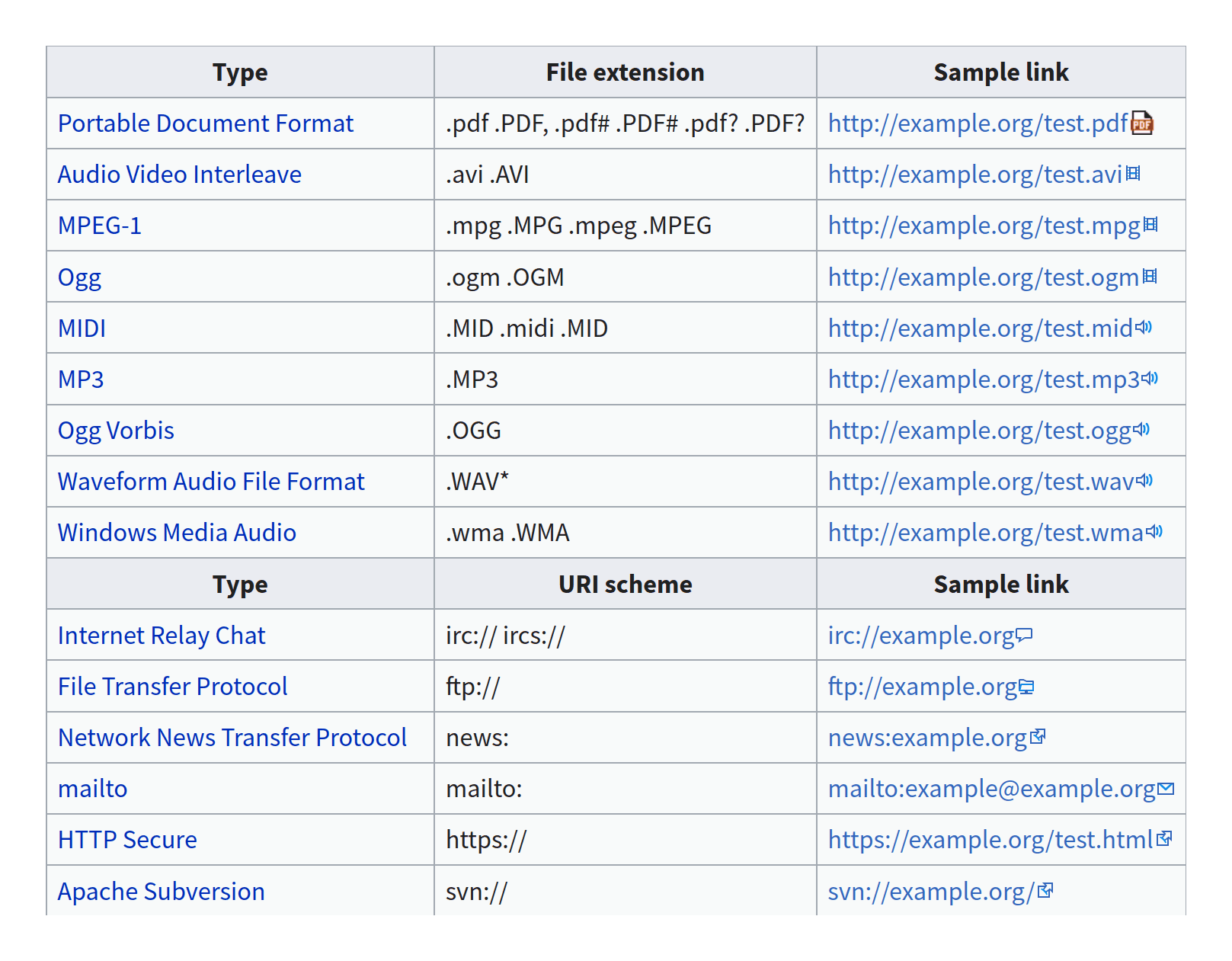
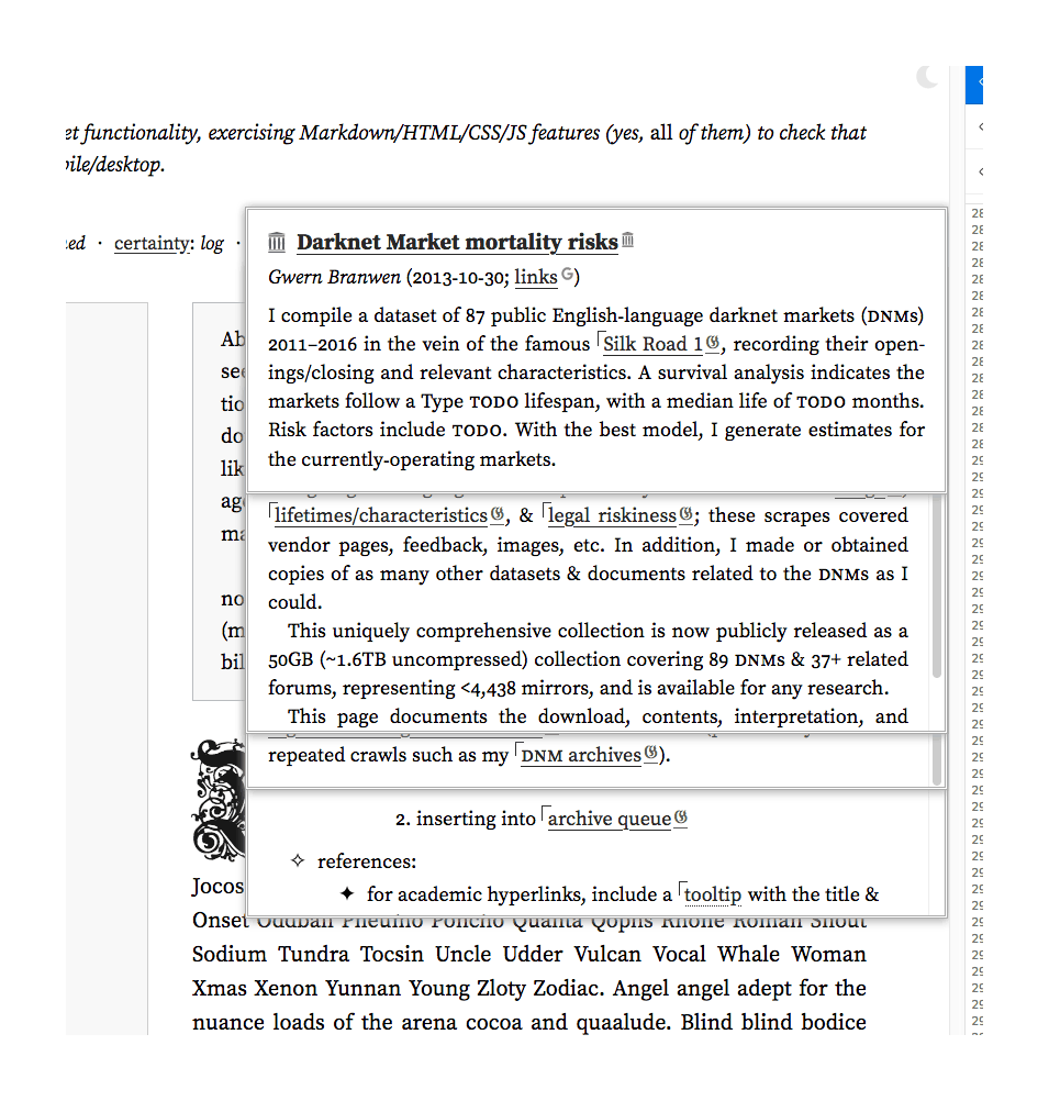
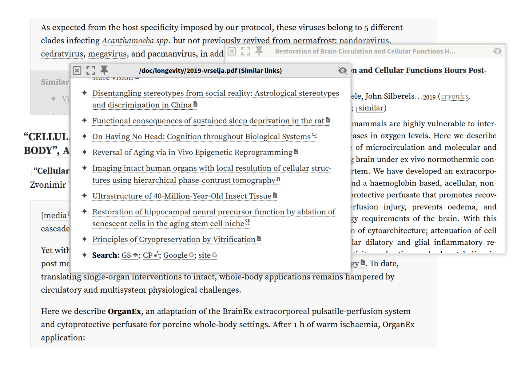
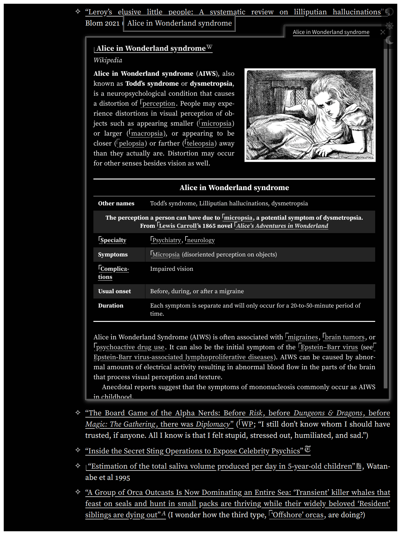
: caption, 'Sometimes I get overwhelmed thinking about the amount of work that went into the ordinary objects around me. / Despite it being imaginary, I already have <strong>such</strong> a strong opinion on the cord-switch firing incident.' This comic details a set of theoretical examples of how much work went into the design and manufacture of everyday objects. The joke centers around the fact that most people in modern times are constantly surrounded with human-built objects, which we generally use without giving them much thought. Randall implies that he occasionally imagines what went into seemingly simple objects around him (in this case his desk and the water glass and the desk lamp on top of it), and finds it overwhelming. This is because there are so many built items around us, many of which are inexpensive and mass-produced, which nonetheless resulted from a great deal of human effort. This is similar to the thesis of the classic essay <em>I, Pencil</em>.")
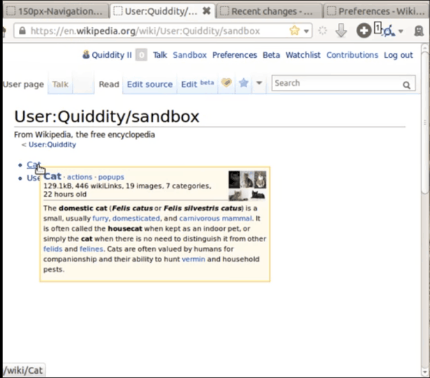
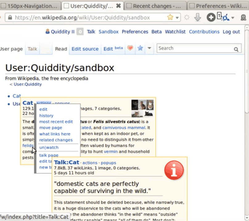

