Adding Bits Beats AI Slop
AI slop is unsatisfying because there is no there there. It is intellectual junk food that mimics nutrition but delivers only empty calories. Satisfying AI outputs must embed dense information and compute to actually reward a reader’s attention. You inject this value through brute-force search, non-trivial prompting, and rigorous curation, ensuring the final result reflects genuine algorithmic effort rather than the zero-shot ‘WYSIWYG’ default.
Some thoughts about the benefits of Midjourney personalization for high-quality & efficient illustrations which avoid ‘AI slop’ vibes (despite early flaws):
What makes AI slop, slop? I would say slop is generative media which is (1) useless to the reader, adding no information or esthetic value or other value (and indeed, a page containing an AI slop image is often better without it, as the reader wastes less time & bandwidth & pixels, and is distracted less); (2) often low-quality, with visible artifacts or errors or in the ‘default’ style; (3) low-effort by the creator, and so overused.
That is, AI slop is the actual absence of information, with the illusion of its presence. Such junk food media is an imposture on the reader. If something could be replaced by its prompt with no loss, then it was not informative. (One is reminded of the ‘humor’ in Marvel movies, which exists solely to fill up space and be easily cut if necessary—and so necessarily, it never adds up to anything meaningful.)
What is the informativeness of an illustration? Presumably, we do not put them there simply to be pretty, and that is why we do not pick a literally random image.
Since in generative modeling work, we do not ‘create’ in the normal way, but act as editors or curators writ large, we can think about this quantitatively in viewing it as the problem of choosing the right image: like selecting text outputs from a LLM, or quantifying privacy leaks, as a question of “how many bits of information or entropy does the process extract from the user?” That is, when I generate an image in Midjourney to use as an illustration for an article (or a quote in my 404 page), how much information does that add compared to selecting a random image?
Most garbage blogs use the first sample from a ~1–3 word prompt, so they add <10 bits. (The prompt is so ‘small’ because there are only a few short obvious phrases they might use, and English winds up being highly predictable, perhaps <0.5 bits per character, especially in a highly-restricted domain like image prompts.)
What about mine? Let’s take my last one, which I generated for the 404 page to accompany the double-edged quote “The Great Work goes on”.

“The Great Work goes on” (alchemy catchphrase from Radiance):
Midjourney-v6 depiction of a staring eye in a jar in the middle of a damaged alchemist circle, which evokes the homunculus antagonist of Fullmetal Alchemist as an analogue of AI researchers creating a “brain in a jar” (ie. artificial general intelligence); the homunculus eventually escapes and begins empowerment, seeking to become God, and destroying many cities & millions before it is finally stopped.
In this case, the MJ prompt was the catchphrase with occasional phrases tacked on to steer it during sampling, using my personalization, and a “style reference” I saw on Twitter which provides neat line-art/rubrication effects (and is, I assume, effectively a ‘personalization’). So information-wise, we could say that this final upscaled image embodies, aside from the selection of the quote itself:
>9,000 personalization ratings: log2(9,000) = <13 bits (all numbers here are upper-bounds because the choices are probably substantially predictable and so much less informative than they seem)
style reference: likely <1,000 samples, so <9
text prompt: ~8 words or ~40 characters, <0.5 bpc, so <20
selection: 5–10 rounds of best-of-4 generated samples (<2 bits per round): <20
inpainting editing: erase ~1⁄9 of image: <2.1
select creative vs regular upscaling: 1
total: <65 bits
Another image example that benefited from personalization and then intensive selection is the “Suzanne Delage” (SD) illustrative image:
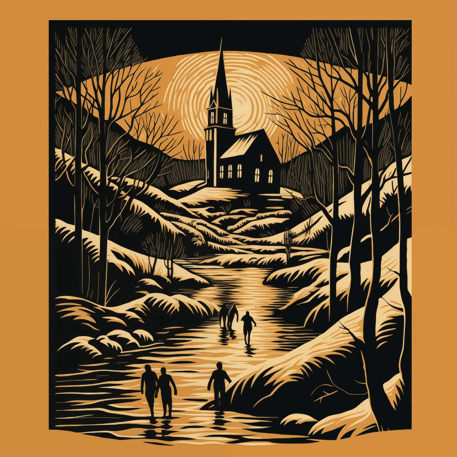
In November 2023, after solving SD, I felt inspired to try to visualize my interpretation of how SD is secretly a classic vampire horror story—in some way more interesting than generating a random vampire image. Simply punching in “Bram Stoker’s Dracula” into a generator and picking the first half-assed vampire image would indeed be AI slop.
But how to somehow embody my interpretation? How to make sure it is not “pretty nasty AI slop”?
Well, esthetically, Bram Stoker’s work is associated with German Expressionism due to Nosferatu; German Expressionism is thematically appropriate because it embraces horror and unease, and Nosferatu is especially interesting in a SD context because it is so dominant as an interpretation of Stoker that it actually makes it harder for readers to solve SD (because they forget that Stoker’s vampires had no problem with burning up in sunlight—that was added by Nosferatu!), and it was legally supposed to be destroyed due to the copyright infringement and only survived in fragments or fugitive copies.
I also want to reference a scene from SD. Given that little happens visibly in SD, there is not much to work with…
We at least know it is a New England setting because we infer that in the SD alternate history, Dracula landed in Boston and wouldn’t’ve traveled far, so we’re not in the Midwest or other northern states. A major theme of my interpretation is the religious angle: the New England town falls to Dracula because it is Protestant, and not Catholic. So to symbolize Protestantism, we might use a severe New England Protestant church.
What might be happening at the church? Well, the narrator does mention skating on an ice pond (which is itself possibly a hint: that the narrator was skating on thin ice as a child), so we could work with people skating near a church, which is feasible (just have a pond or river near the church).
When is it? It can’t be in morning or broad daylight, but can’t be at night because then skaters can’t see. It has to be later in the day… Near sunset, perhaps? Of course!
A blood-red sunset is highly thematic because the decline and stagnation of the town is evidence that a vampire is in residence. It is also highly ominous and horror-themed too, beyond the decay motif.
So, we have a pretty good theme overall:
A New England town at sunset with unsuspecting children skating on the ice, a helpless Protestant church in the background, rendered in the style of an abstract German Expressionist-style faded-orange/red linocut print illustration. (“Linocut” was a keyword I found useful for getting more woodblock engraving style illustrations, without the historical baggage of the word “woodcut”, or getting into too-obscure terms or styles like silverpoint; it is also a highly unusual generative model art style, so it avoids all of the ‘default’ style pollution from lazy users.)
I generated it with Midjourney v5 on 2023–10-28 (an example prompt: “German Expressionist linocut of Bram Stoker’s Dracula, set in 1920s New England, looming over a picturesque small Massachusetts town, montage, children skating in frozen pond, high school, monochrome, vector, outline, linocut, church, ambiguous, subtle”).
Of course, almost all of the samples were entirely unsuitable because MJ is bad at following complex concepts, and I had something specific in mind—I didn’t simply want random church-related images.
It took a lot of bruteforce grinding and ‘variation’ of reasonable samples, combined with the personalization and various inpainting of flaws, before I finally had a sample that I was satisfied with, which I didn’t consider “AI slop” and which did in fact express something highly nontrivial about SD, and which did not waste a reader’s time to look at. (I tweaked it later based on reader complaints that it was too-red to be more of a Halloween orange.) My main discontent with it is that it is unclear that the children are supposed to be playing or skating on the frozen-over river, but I ran out of gumption before I could get MJ to do better on that angle, and wasn’t sure I could add such fine detail in a pleasing way anyway without having to redo the image entirely.
This stab at quantifying suggests some interesting things. For example, it suggests that ‘personalization’ can easily do as much work as half a prompt or half of a rather intensive session of generation-then-selection, even though personalization is ‘free’ once it is done. This implies that if you do more than a few images, personalization and other kinds of contextualization can become very valuable.
It also suggests that this sample has ~6× more information than your usual blog spam illustration or empty ‘hero image’ (which you could interpret as implying that this 1 image has as much information as a pile of careless illustrations).
This is perhaps surprisingly small, but note that instilling those bits takes quite a lot of work: far more than 6× the time! Probably closer to 100× the time & effort… Which illustrates a large inefficiency gap in model quality + controlling/eliciting preferences: I shouldn’t have to spend super-linearly much effort grinding through samples.
Or to put it another way, a perfect model could, presenting 4 images at a time, create the exact image I want from scratch using just my best-of-4 choices in <30 rounds (and probably a lot less).
Why doesn’t it? Well, the personalization ratings show their value in potentially eliminating a good fraction of the necessary bits, and letting the generative model narrow down to just the “Gwern set” of images. The selection & inpainting & upscaling steps waste ~25 bits, and there is a lot of room for improvement there: many of the samples I am discarding or editing are obviously malformed, incoherent, low-quality, or missing the point. A better image model could eliminate a lot of that. (There should never be a sample where my reaction is that “the hands are badly mangled”—that’s a waste of 0.25 bits!)
And while there is nothing particularly miraculous or deep about such an image & concept that an AI couldn’t do in theory (I’m sure an LLM like GPT-4.5 already understands all of the concepts I discuss here), it does require knowledge of the context and the choice to try to select for that particular message. This is something that generative models are generally unable to do: they aren’t told the context, and they have no other way (at present) of knowing the context beforehand. Midjourney’s image generator model has no idea what I am thinking about here, even if it possibly could if it had access to the full Gwern.net corpus (no reason that a Nenex model couldn’t be multimodal, after all).
So, until then, people who want a good sample will probably have to continue eliciting a lot of bits from themselves. (And this will be true regardless of how well image generators fix their remaining issues in terms of disqualifying artifacts or general low quality: as the bits analysis suggests, that can help a lot—but it is still several bits away from being genuinely good for a specific need.)
If creativity and novelty is about learning or increasing compression rates, then AI-generated outputs are, in a rigorously objective sense of predicting its contents, grossly inadequate because once you guess the minimal prompt (eg. “a confused economist” or “a happy dog”), there is no more learning to be done. You can predict the image contents after just a few bits. Then the image, however big and however filled with pseudo-details, provides no more learning.
Sure, you may not be able to predict the exact squiggly greebles and nonsense details, and so in the naive information-theoretic view, the image is “complex” (in the sense that it would take many bits to encode the exact file); but from the learning-to-compress view, the image is shallow and superficial—none of those details matter. Looking at it quickly ceases to tell you anything new which improves your ability to predict the rest. With bad art, you “get the idea” near-instantly and you move on; you could barely call it a “sugar rush”. Looking at one nonsense detail tells you nothing about the rest of the nonsense details, whereas in a real or a good image, the various symmetries and “meaning” of the image mean that a close examination of details will help you predict the other parts better, and this progress or learning is the true intrinsic reward of art. (“My definition of good literature is that which can be read by an educated reader, and reread with increased pleasure.” —Gene Wolfe; his “Suzanne Delage” is an excellent example of this.)
The value of worldbuilding is not to show all your work, but to make what you do show somehow right and rewarding understanding; when J. R. R. Tolkien tries to create a geography which yields a plausible historical development of a language, or when Kyoto Animation draws a school and suburbs to such detail that you can visit each location on an anime tour, it is a lot more work, that is true.
But if the artist or author is putting in more bits of information, it takes longer to look at it and understand.
My explanation of this homunculus image, for example, is certainly not obvious: few readers will immediately link all the ideas I intended, and most probably won’t at all—but they can sense that there is still more there. So while it’s hardly immortal art, it is at least nice to look at briefly; it doesn’t make me feel disgusted & betrayed at the waste of my time & attention, or ashamed to show it to a reader.
And that is because I put more information into it.
So I suspect that there is probably some sort of objective esthetic criteria lurking here about satisfying works requiring >x bits per second or about how to avoid ‘AI slop’, you need to add >y bits to the ‘default’ generative model outputs…
This could probably be quantified by surveying people with combinations of images and contexts (such as blog posts), and taking the image from various stages of the image creation process (and estimating the approximate information added by that point), or by offering pairwise choices to people (the harder it is to pick which one was the final one, the less information has been added); and correlating that with reader satisfaction or liking of the image. I would predict that the esthetic or satisfaction ratings will increase a lot over the naive baseline for 2024-era image generators.
[When in doubt, listen to Gerard Manley Hopkins.]
See Also:
What Makes Art Great?, Nabeel S. Qureshi
‘Tools For Thought’ Work Fails: Lots of Tools Work, Not Thought
What Makes a Good Image? Airbnb Demand Analytics Leveraging Interpretable Image Features
Design Guidelines for Prompt Engineering Text-to-Image Generative Models
Prompting AI Art: An Investigation into the Creative Skill of Prompt Engineering
Midjourneyv6 Means the End for a Big Chunk of the Photo Industry: Why, and how to adapt