
The graphic train schedule based on a line grid (often falsely attributed to Étienne-Jules Marey) is an influential early visualization method for railway traffic. Here is everything you need to know about it.
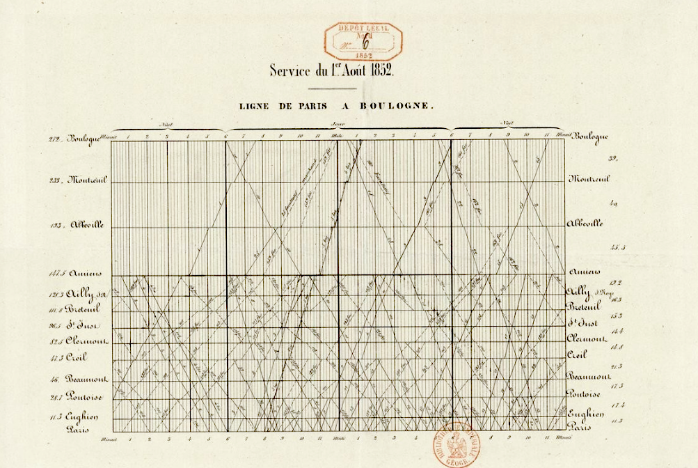
Ligne de Paris à Boulogne, 1852. Courtesy Bibliothèque nationale de France.
Where do I know this from?
Of course you’ve seen this before! It is one of Edward Tufte’s grand achievements to have established through his books an awareness of the long and rich history of information visualization. He showed us many captivating works, and he was so thrilled by this type of graphics that he used it on the cover of his seminal book “The Visual Display of Quantitative Information,” first published in 1983. He had found the train schedule in a seminal 19thcentury visualisation book: Étienne-Jules Marey’s “La méthode graphique.” That is a rich tome full of best practice examples by Marey and his contemporaries (among which also Minard’s famous Napoleon graph).


Why is it so cool?
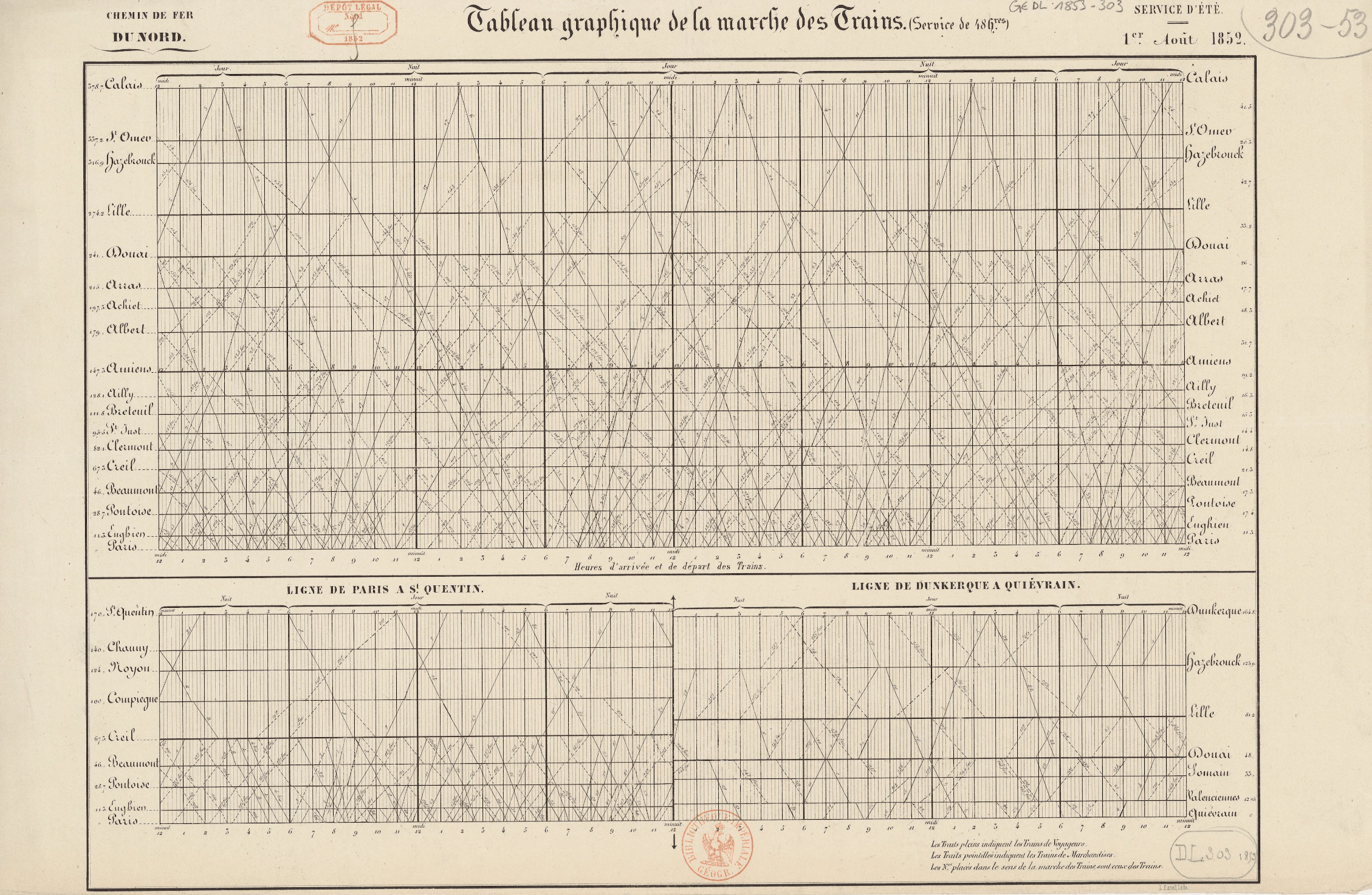
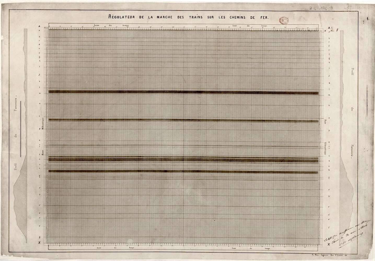
Marey explains that the method was invented by a Mr. Ibry in order to show all trains on a given railway route over the course of a day. The diagram has the geographical route of the railway line inscribed on the vertical axis, and the hours of the day inscribed on the horizontal line. Therefore, the slope of each line shows where each train is headed, how fast it travels and where it pauses – a highly elegant and efficient visualisation of quite a few movements. Some examples are enhanced by a geographic profile of the route shown along the vertical axis, and encode further information by differentiating between different types of lines. We have to imagine that most of the early railway routes operated on a single track for both directions! For the managers, it was crucial to always have a clear picture of traffic in both directions in order to avoid deadly accidents.
So who is this Ibry guy?
Unfortunately, not much is known about Charles Ibry. He was an engineer with the French Northern Railroad company. We are talking mid-1840s, so we’re in the earliest days of the French national railroad system. Only in June 1842, the French parliament had decided to build a national network. Before that, only four short railroad lines operated in all of France. Within a few years only, a substantial number of routes were built all throughout France. During these years, when the railroad was this exciting new technology which transformed travelling to the core, Charles Ibry was in charge of managing traffic on the route from Paris to Rouen, which had been operating since May 1843.


How do we know all this?
Well, this is the cool part: we knew some of those things before, but during my research on Minard, I stumbled upon a formerly unknown article from 1847 in the Annales des ponts et chaussées,the engineering journal edited by the École des ponts et chaussées, the institution in charge of educating traffic engineers and fostering technology research. The piece reports how the method was invented by Charles Ibry, what its advantages were for the daily management of the routes, and that by the time of its publishing (1847) the method had been in daily use at the French Northern Railway since a few years.

But what is MOST EXCITING is that the article features a graphic showing a hardware instrument for plotting the schedules (see above). Check this out – this piece does not simply show a diagram, it shows a board with a flexible ruler screwed onto a little plate which can glide along the bottom of the diagram. By adapting the angle of the ruler, the engineers were able to schedule an individual speed for each train. This chart is absolutely unique – it makes us understand that these charts were not just meant to display a pre-conceived schedule—no! The charts and the instrument were actually used to set up the schedule in the first place.
Can I see some more?
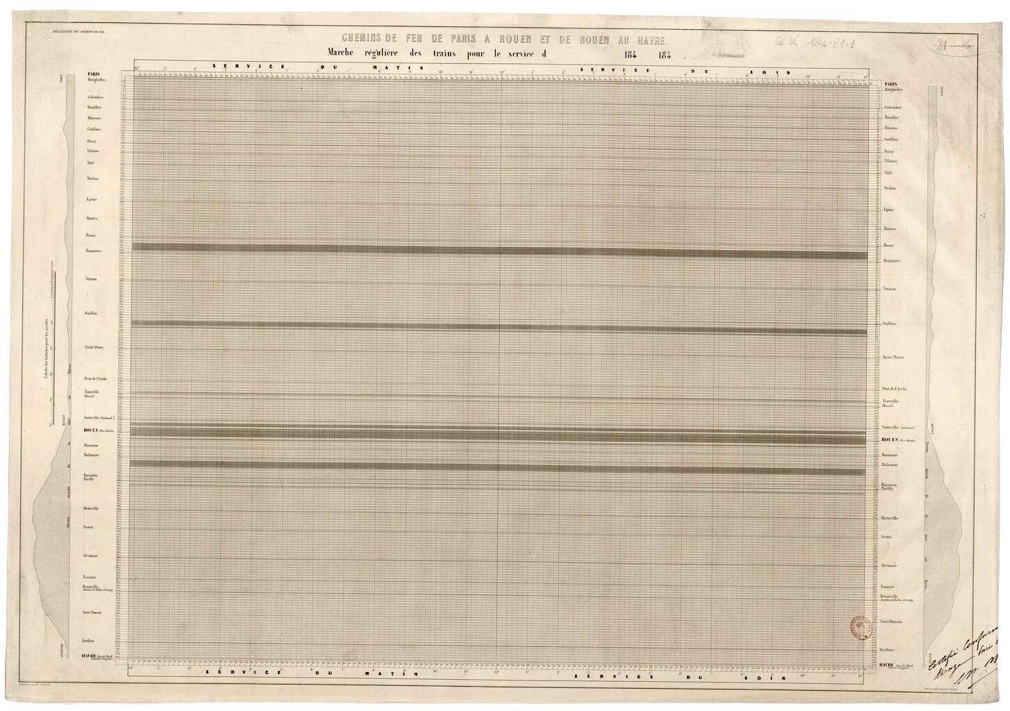
Sure! Beside the two schedules for specific services and periods shown above, we also have these two raw papers from the Bibliothèque nationale (above and below) – which feature only an empty grid of hours of the day and geographical route. This suggests that the railroad companies had these papers pre-printed for each route, later to be filled in whith a specific up-to-date schedule. However, as the schedules were ephemeral pieces that wouldn’t be conserved after they grew outdated, only a few examples seem to have survived – what you are seeing on this page are all surviving examples from the 1840s and 1850s that I am aware of, except for this Russian piece from 1854.

Great early finds! I’d not seen those 1852 examples before. I’ve been obsessing over these things for years. I have a collection of about 40 including many from France (1880s-1970s), some recent ones from Germany and Czechoslovakia, and two manuscript examples from early 20th-century UK. My favourites are a crazily dense 1920s Italian example, a 1930s small booklet of dozens of French PLM services, and a WW2 German manual on how to create them.
In my own research I came across not only the 1847 article and the device with the ruler, but also the section in Marey’s 1890 article for La Nature [1] and in his book “Le Mouvement” (1894), pp.36-48 [2], in which he describes and illustrates the use of a machine to plot time-distance traces directly onto clock-driven rolls of paper inside a train equipped with an odometer cable. “Cette manière … identique à celle qui a été imaginée par Ibry,” writes Marey. At first I read this to mean Ibry had proposed or built a similar clockwork machine, but I think Marey is referring only to the graphical result.
[1] http://sciences.gloubik.info/spip.php?article130
[2] https://gallica.bnf.fr/ark:/12148/btv1b8626089q
Great addition, thanks Laurence! Do you have a selection of your collected examples online somewhere?
Not yet! Working on it though.
Hi, In case you’re not aware, train graphs are still used by railway operators to compile timetables, as it’s easy to identify pathing conflicts (ie where trains get in each others’ way) and check that speeds, station dwell times etc are all correct. Modern timetabling software often have train graphs as outputs. Years ago I saw a hand-drawn one dating back to the 1950’s of the approach to London Bridge station in the rush hour where there are trains passing through every minute or so, which was pretty impressive, I’d like to find a copy of that.
Hi Joseph, yes – I am aware that the design has had a long life in railway planning and is still in use in some instances, however my knowledge about recent examples is very vage! So, if you come across anything please feel free to share it with our readers here!
Thanks for writing this, I enjoyed seeing the earlier examples. I made my own graphic train schedule last year and incorrectly attributed the style of diagram to Marey. After reading this I went back and updated my post- https://chriszetter.com/blog/2018/05/11/visualizing-changes-to-rail-services/
Awesome, thanks Chris!
Sandra, thank for your amazing page and also for your book on Minards work. I am a civil engineer who works in the field of project scheduling, and I have been fascinated by the use of time-distance diagrams, mainly in my field of planning and scheduling of construction work for linear projects.
The diagrams are effectively used to present the “where, when and what” information in a vastly superior way to traditional Gantt charts used in project management. Similar principles to the railway timetables are used, the angle of lines represent production rates for construction crews, and static elements are also displayed. All together used to ultimately optimise the project schedule.
Many different terms are used for such diagrams in my industry – time location, time distance, march charts, velocity diagrams, flow lines, linear schedules, time chainage (and many others) but all are effectively the same concept as the works you present on this page, where one axis represents time and the second axis represents physical location/space.
The technique has fallen away from being a popular method as PCs and computer technology has made other methods favourable, but I am trying to being this method back into popular use – to the extent I am developing and selling software that can create such diagrams to construction project management industries.
Now I know the technique is not new, as well as the railway timetable examples, there is a classic representation of this available for viewing on the visitors area of the Empire State Building (You may see my post on LinkedIn regarding this: https://www.linkedin.com/feed/update/urn:li:activity:6676452118725046272/) . I am hoping to research into other historical use of such diagrams for construction or project management, but as I am not a researcher, don’t know where to begin!
Thank you so much for this – I teach Physics, and this is a superb example of the practical use of a Distance/time graph.